一、设计稿
要实现下面这样一个效果,本文重点说的是下面“自动续费,可随时取消”这部分的实现。
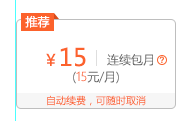
我把问题简化一下,变成了

二、解决问题的思路
1、p标签加背景色
一般,很容易想到用p标签实现,代码如下:


<style type="text/css">
    .box {
        width: 154px;
        height: 90px;
        float: left;
        border: 1px solid #bfbfbf;
        border-radius: 8px;
        margin: 20px 9px 0 0;
        position: relative;
    }

    p {
        margin: 0;
        margin-top: 50px;
        color: #fd632b;
        background-color: #f7f7f7;
        font-size: 12px;
        text-align: center;

    }
</style>
<body>
<div class="box">
    <p>自动续费,可随时取消</p>
</div>
</body>
但是会发现p的背景色是是矩形的,并不会按照父容器的border-radius来约束自己的背景色。会超出去如下。

2、父元素overflow:hidden
一般情况可以通过.box的overflow:hidden 让溢出部分不显示。
    .box {
        overflow:hidden;
    }
<style type="text/css">
    .box {
        width: 154px;
        height: 90px;
        float: left;
        border: 1px solid #bfbfbf;
        border-radius: 8px;
        margin: 20px 9px 0 0;
        position: relative;
    overflow:hidden;
    }

    p {
        margin: 0;
        margin-top:74px;
        color: #fd632b;
        background-color: #f7f7f7;
        font-size: 12px;
        text-align: center;

    }
</style>
<body>
<div class="box">
    <p>自动续费,可随时取消</p>
</div>
</body>

但是我的设计稿里有一个推荐的标签,我直接让父元素overflow:hidden了,那这个推荐标签也无法显示出来了。。
<style type="text/css">
    .box {
        width: 154px;
        height: 90px;
        float: left;
        border: 1px solid #bfbfbf;
        border-radius: 8px;
        margin: 20px 9px 0 0;
        position: relative;
        overflow: hidden;
    }

    p {
        margin: 0;
        margin-top: 74px;
        color: #fd632b;
        background-color: #f7f7f7;
        font-size: 12px;
        text-align: center;

    }
    .label {
        position: absolute;
        top: -6px;
        left: 10px;
        height: 18px;
        font-size: 12px;
        line-height: 18px;
        font-style: normal;
        color: #fff;
        padding: 0 6px;
    }

    .label.rec {
        background-color: #fd632b;
    }
</style>
<body>
<div class="box">
    <em class="label rec">推荐</em>

    <p>自动续费,可随时取消</p>
</div>
</body>

3、p加border-radius
现在很容易想到,给p也加上一个border-radius。
    p {
    border-radius:0 0 8px 8px;
    }
<style type="text/css">
    .box {
        width: 154px;
        height: 90px;
        float: left;
        border: 1px solid #bfbfbf;
        border-radius: 8px;
        margin: 20px 9px 0 0;
        position: relative;
    }

    p {
        margin: 0;
        margin-top: 74px;
        color: #fd632b;
        background-color: #f7f7f7;
        font-size: 12px;
        text-align: center;
    border-radius:0 0 8px 8px;

    }
    .label {
        position: absolute;
        top: -6px;
        left: 10px;
        height: 18px;
        font-size: 12px;
        line-height: 18px;
        font-style: normal;
        color: #fff;
        padding: 0 6px;
    }

    .label.rec {
        background-color: #fd632b;
    }
</style>
<body>
<div class="box">
    <em class="label rec">推荐</em>

    <p>自动续费,可随时取消</p>
</div>
</body>

4、另一种思路
也可以通过给父元素设置背景色来实现。
<style type="text/css">
    .box {
        width: 154px;
        height: 90px;
        float: left;
        border: 1px solid #bfbfbf;
        border-radius: 8px;
        margin: 20px 9px 0 0;
        position: relative;
        background-color: #f7f7f7;
    }

    .other {
        height: 74px;
        background-color: #fff;
        border-radius: 8px 8px 0 0;

    }

    p {
        margin: 0;
        color: #fd632b;

        font-size: 12px;
        text-align: center;
        border-radius: 0 0 8px 8px;

    }

    .label {
        position: absolute;
        top: -6px;
        left: 10px;
        height: 18px;
        font-size: 12px;
        line-height: 18px;
        font-style: normal;
        color: #fff;
        padding: 0 6px;
    }

    .label.rec {
        background-color: #fd632b;
    }
</style>
<body>
<div class="box">
    <em class="label rec">推荐</em>
    <div class="other"></div>
    <p>自动续费,可随时取消</p>
</div>
</body>
虽然最后还是要设置border-radius,并不是最佳实践,但也是一种解决问题的思路。
本文作者starof,因知识本身在变化,作者也在不断学习成长,文章内容也不定时更新,为避免误导读者,方便追根溯源,请诸位转载注明出处:http://www.cnblogs.com/starof/p/6728473.html有问题欢迎与我讨论,共同进步。