一、背景:之前使用过echarts图表,最新公司根据客户需求准备开发个仪表盘美工出图如下。
由于公司产品集成highcharts,发现highcharts仪表盘不满足需求,顾个性化开发。
二、过程:
echarts:百度开发,Api目前支持不好,主要采用canvas画图。
highcharts: 国外产品,Api全面,还有各路大神的个性化图表,主要采用svg画图。
也有人说:echarts相当于中国的WPS,而highchart相当于微软office
建议,如果使用百度地图展示图表,那么使用echarts(ps:支持国产)
如果以上两款不满足需求,那么可以上手 d3js,图表更多更强大。
官网地址: https://github.com/d3/d3/wiki/Gallery
api地址(中文的):https://github.com/d3/d3/wiki/API--%E4%B8%AD%E6%96%87%E6%89%8B%E5%86%8C
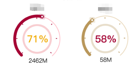
三、结果:
上图:(虽然差别还是有,基本满足需求)

上代码:https://code.hcharts.cn/demos/hhhhiD 打开地址,直接复制粘贴,运行看结果。
js:
// 公共配置
Highcharts.setOptions({
    chart: {
        type: 'solidgauge'
    },
    title: {
        text: '',
    },
    pane: {
        center: ['50%', '60%'],
        size: '100%',
        startAngle: -140,
        endAngle: 140,
        background: {
            backgroundColor: (Highcharts.theme && Highcharts.theme.background2) || '#fff',
            innerRadius: '60%',
            outerRadius: '100%',
            shape: 'arc'
        }
    },
    tooltip: {
        enabled: false
    },
    yAxis: {
        plotBands: {
            //borderColor:'#000000',
           // borderWidth:0,
            from: 0,
            to: 250,
            color: '#FFCCFF' // green
        },
        stops: [
            [0.1, '#55BF3B'], // green
            [0.5, '#DDDF0D'], // yellow
            [0.7, '#DF5353'] // red
        ],
        lineWidth: 0,
        minorTickInterval: null,
        tickPixelInterval: 100,//像素间隔
        tickWidth: 2,
        tickAmount: 10,//刻度总数
        tickPosition: 'inside',// 刻度线位置 内外
        tickLength: 15,
        //tickmarkPlacement:'between',
        tickColor: '#ffffff',
        // visible:false,//坐标轴是否显示
        title: {
            y: -50
        },
        labels: {
            enabled:false,
            y: 16
        }
    },
    plotOptions: {
        solidgauge: {
            dataLabels: {
                y: -20,
                borderWidth: 0,
                useHTML: true
            }
        }
    }
});
// 速度仪表
var chart1 = Highcharts.chart('container-qtd', {
    yAxis: {
        min: 0,
        max: 200,
        title: {
            text: 'QTD'
        }
    },
    credits: {
        enabled: false
    },
    series: [{
        data: [{
            y:150,
            innerRadius: 80,
            // radius: 98,
            name:'dd',
        }],
        dataLabels: {
            style: {
                fontWeight: 'bold',
                fontSize: '20px',
                color: 'black'
            },
            format: '<div style="text-align:center"><span style="font-size:25px;color:' +
            ((Highcharts.theme && Highcharts.theme.contrastTextColor) || 'black') + '">{y}%</span><br/>' +
            '<span style="font-size:12px;color:silver">2462M</span></div>'
        }
    }]
});
// 转速仪表
var chart2 = Highcharts.chart('container-mtd', {
    yAxis: {
        min: 0,
        max: 150,
        title: {
            text: 'MTD'
        }
    },
    credits: {//取消官网链接highcharts.com
        enabled: false,
        //添加自己的链接地址
        // text: 'www.baidu.com',
        //  href: 'https://www.baidu.com'
    },
    series: [{
        name: 'RPM',
        data: [{
            y:58,
            innerRadius: 80,
            // radius: 98,
            name:'dd',
        }],
        dataLabels: {
            style: {
                fontWeight: 'bold',
                fontSize: '20px',
                color: 'black'
            },
            format: '<div style="text-align:center"><span style="font-size:25px;color:' +
            ((Highcharts.theme && Highcharts.theme.contrastTextColor) || 'black') + '">{y}%</span><br/>' +
            '<span style="font-size:12px;color:silver">58M</span></div>'
        }
    }]
});
html:
<div style=" 600px; height: 300px; margin: 0 auto">
    <div id="container-qtd" style=" 300px; height: 200px; float: left">
    </div>
    <div id="container-mtd" style=" 300px; height: 200px; float: left">
    </div>
</div>
后记:
当图表值太大,有时间图表显示不全,显示一半,官方解释:https://api.hcharts.cn/highcharts#yAxis.max
max值自动向上取整问题,刻度线 tickAmount导致的。
tickAmount不设置就不会影响最大值问题。即max设置多少显示多少,
tickAmount设置为null、 0、2 都不管用。直接删掉就好!不需要设置!!!