前面已经学习了bootstrap环境搭建以及基本布局方面的知识,下面将学习下关于bootstrap的相关组件,知识点有点多。
关于bootstrap组件知识点目录:
- Bootstrap--代码显示
- Bootstrap--表格
- Bootstrap--表单
- Bootstrap--按钮
- Bootstrap--图片
- Bootstrap--辅助类
- Bootstrap--响应式实用工具
- Bootstrap--字体图标
- Bootstrap--下拉菜单
- Bootstrap--按钮组
- Bootstrap--按钮下拉菜单
- Bootstrap--输入框组
- Bootstrap--导航元素
- Bootstrap--导航栏
- Bootstrap--面包屑导航
- Bootstrap--分页
- Bootstrap--标签
- Bootstrap--徽章
- Bootstrap--超大屏幕
- Bootstrap--页面标题
- Bootstrap--缩略图
- Bootstrap--警告
- Bootstrap--进度条
- Bootstrap--多媒体对象
- Bootstrap--列表组
- Bootstrap--面板
- Bootstrap--Wells
1.Bootstrap 代码
Bootstrap 允许您以两种方式显示代码:
- 第一种是 <code> 标签。如果您想要内联显示代码,那么您应该使用 <code> 标签。
- 第二种是 <pre> 标签。如果代码需要被显示为一个独立的块元素或者代码有多行,那么您应该使用 <pre> 标签。
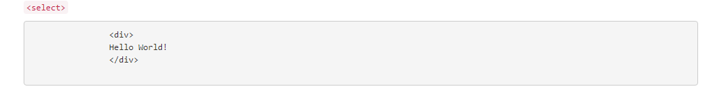
请确保当您使用 <pre> 和 <code> 标签时,开始和结束标签使用了 unicode 变体: < 和 >。
<div class="container"> <div class="row"> <p><code><select></code></p> <pre> <div> Hello World! </div> </pre> </div> </div>
显示效果:
2.Bootstrap 表格
Bootstrap 提供了一个清晰的创建表格的布局。下表列出了 Bootstrap 支持的一些表格元素:
| 标签 | 描述 |
|---|---|
| <table> | 为表格添加基础样式。 |
| <thead> | 表格标题行的容器元素(<tr>),用来标识表格列。 |
| <tbody> | 表格主体中的表格行的容器元素(<tr>)。 |
| <tr> | 一组出现在单行上的表格单元格的容器元素(<td> 或 <th>)。 |
| <td> | 默认的表格单元格。 |
| <th> | 特殊的表格单元格,用来标识列或行(取决于范围和位置)。必须在 <thead> 内使用。 |
| <caption> | 关于表格存储内容的描述或总结。 |
表格类
下表样式可用于表格中:
| 类 | 描述 |
|---|---|
| .table | 为任意 <table> 添加基本样式 (只有横向分隔线) |
| .table-striped | 在 <tbody> 内添加斑马线形式的条纹 ( IE8 不支持) |
| .table-bordered | 为所有表格的单元格添加边框 |
| .table-hover | 在 <tbody> 内的任一行启用鼠标悬停状态 |
| .table-condensed | 让表格更加紧凑 |
<tr>, <th> 和 <td> 类
下表的类可用于表格的行或者单元格:
| 类 | 描述 |
|---|---|
| .active | 将悬停的颜色应用在行或者单元格上 |
| .success | 表示成功的操作 |
| .info | 表示信息变化的操作 |
| .warning | 表示一个警告的操作 |
| .danger | 表示一个危险的操作 |
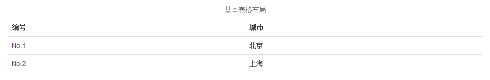
基本的表格
如果您想要一个只带有内边距(padding)和水平分割的基本表,请添加 class .table,如下面实例所示:
<div class="row">
            <table class="table">
                <caption class="text-center">基本表格布局</caption>
                <thead>
                    <tr>
                        <th>编号</th>
                        <th>城市</th>
                    </tr>
                </thead>
                <tbody>
                    <tr>
                        <td>No.1</td>
                        <td>北京</td>
                    </tr>
                    <tr>
                        <td>No.2</td>
                        <td>上海</td>
                    </tr>
                </tbody>
            </table>
        </div>
显示效果:
可选的表格类
除了基本的表格标记和 .table class,还有一些可以用来为标记定义样式的类。下面将向您介绍这些类。
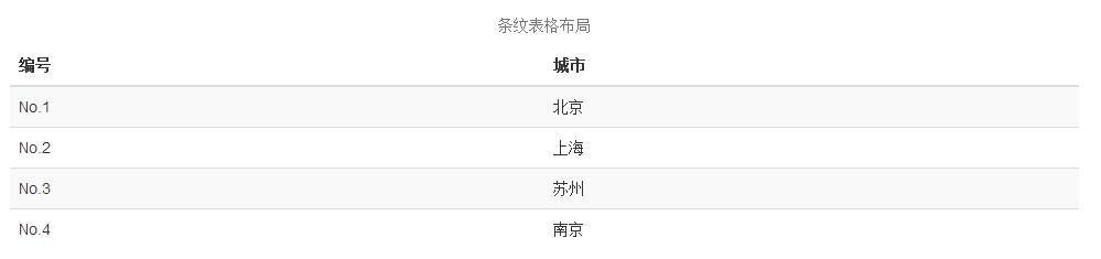
条纹表格
通过添加 .table-striped class,您将在 <tbody> 内的行上看到条纹,如下面的实例所示:
<div class="row">
            <table class="table table-striped">
                <caption class="text-center">条纹表格布局</caption>
                <thead>
                    <tr>
                        <th>编号</th>
                        <th>城市</th>
                    </tr>
                </thead>
                <tbody>
                    <tr>
                        <td>No.1</td>
                        <td>北京</td>
                    </tr>
                    <tr>
                        <td>No.2</td>
                        <td>上海</td>
                    </tr>
                    <tr>
                        <td>No.3</td>
                        <td>苏州</td>
                    </tr>
                    <tr>
                        <td>No.4</td>
                        <td>南京</td>
                    </tr>
                </tbody>
            </table>
        </div>
显示效果:
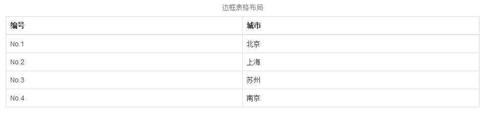
边框表格
通过添加 .table-bordered class,您将看到每个元素周围都有边框,且占整个表格是圆角的,如下面的实例所示:
<div class="row">
            <table class="table table-bordered">
                <caption class="text-center">边框表格布局</caption>
                <thead>
                    <tr>
                        <th>编号</th>
                        <th>城市</th>
                    </tr>
                </thead>
                <tbody>
                    <tr>
                        <td>No.1</td>
                        <td>北京</td>
                    </tr>
                    <tr>
                        <td>No.2</td>
                        <td>上海</td>
                    </tr>
                    <tr>
                        <td>No.3</td>
                        <td>苏州</td>
                    </tr>
                    <tr>
                        <td>No.4</td>
                        <td>南京</td>
                    </tr>
                </tbody>
            </table>
        </div>
显示效果:
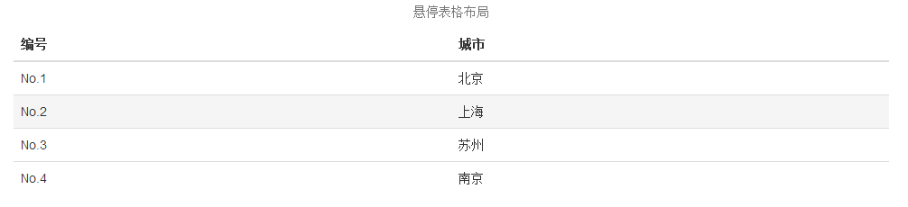
悬停表格
通过添加 .table-hover class,当指针悬停在行上时会出现浅灰色背景,如下面的实例所示:
<div class="row">
            <table class="table table-hover">
                <caption class="text-center">悬停表格布局</caption>
                <thead>
                    <tr>
                        <th>编号</th>
                        <th>城市</th>
                    </tr>
                </thead>
                <tbody>
                    <tr>
                        <td>No.1</td>
                        <td>北京</td>
                    </tr>
                    <tr>
                        <td>No.2</td>
                        <td>上海</td>
                    </tr>
                    <tr>
                        <td>No.3</td>
                        <td>苏州</td>
                    </tr>
                    <tr>
                        <td>No.4</td>
                        <td>南京</td>
                    </tr>
                </tbody>
            </table>
        </div>
显示效果:
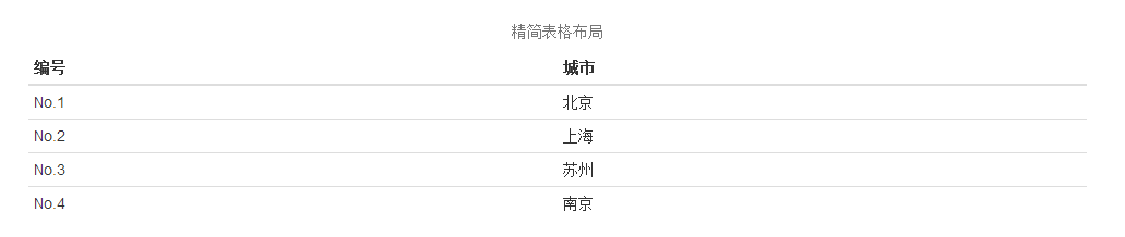
精简表格
通过添加 .table-condensed class,行内边距(padding)被切为两半,以便让表看起来更紧凑,如下面的实例所示。这在想让信息看起来更紧凑时非常有用。
<div class="row">
            <table class="table table-condensed">
                <caption class="text-center">精简表格布局</caption>
                <thead>
                    <tr>
                        <th>编号</th>
                        <th>城市</th>
                    </tr>
                </thead>
                <tbody>
                    <tr>
                        <td>No.1</td>
                        <td>北京</td>
                    </tr>
                    <tr>
                        <td>No.2</td>
                        <td>上海</td>
                    </tr>
                    <tr>
                        <td>No.3</td>
                        <td>苏州</td>
                    </tr>
                    <tr>
                        <td>No.4</td>
                        <td>南京</td>
                    </tr>
                </tbody>
            </table>
        </div>
显示效果:
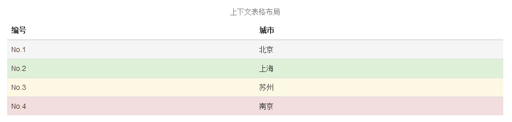
上下文类
下表中所列出的上下文类允许您改变表格行或单个单元格的背景颜色。
| 类 | 描述 |
|---|---|
| .active | 对某一特定的行或单元格应用悬停颜色 |
| .success | 表示一个成功的或积极的动作 |
| .warning | 表示一个需要注意的警告 |
| .danger | 表示一个危险的或潜在的负面动作 |
这些类可以用到<tr>、<td>、<th>中,如下面实例所示:
<div class="row">
            <table class="table">
                <caption class="text-center">上下文表格布局</caption>
                <thead>
                    <tr>
                        <th>编号</th>
                        <th>城市</th>
                    </tr>
                </thead>
                <tbody>
                    <tr class="active">
                        <td>No.1</td>
                        <td>北京</td>
                    </tr>
                    <tr class="success">
                        <td>No.2</td>
                        <td>上海</td>
                    </tr>
                    <tr class="warning">
                        <td>No.3</td>
                        <td>苏州</td>
                    </tr>
                    <tr class="danger">
                        <td>No.4</td>
                        <td>南京</td>
                    </tr>
                </tbody>
            </table>
        </div>
显示效果:
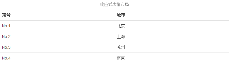
响应式表格
通过把任意的 .table 包在 .table-responsive class 内,您可以让表格水平滚动以适应小型设备(小于 768px)。当在大于 768px 宽的大型设备上查看时,您将看不到任何的差别。
 <div class="table-responsive">
        <table class="table">
            <caption class="text-center">响应式表格布局</caption>
            <thead>
                <tr>
                    <th>编号</th>
                    <th>城市</th>
                </tr>
            </thead>
            <tbody>
                <tr>
                    <td>No.1</td>
                    <td>北京</td>
                </tr>
                <tr>
                    <td>No.2</td>
                    <td>上海</td>
                </tr>
                <tr>
                    <td>No.3</td>
                    <td>苏州</td>
                </tr>
                <tr>
                    <td>No.4</td>
                    <td>南京</td>
                </tr>
            </tbody>
        </table>
    </div>
显示效果:
3.Bootstrap 表单
表单布局
Bootstrap 提供了下列类型的表单布局:
- 垂直表单(默认)
- 内联表单
- 水平表单
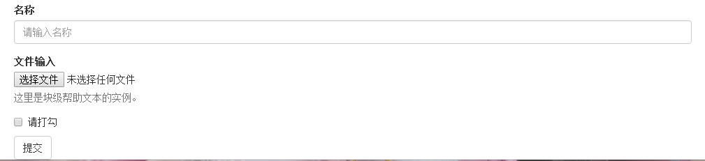
垂直或基本表单
基本的表单结构是 Bootstrap 自带的,个别的表单控件自动接收一些全局样式。下面列出了创建基本表单的步骤:
- 向父 <form> 元素添加 role="form"。
- 把标签和控件放在一个带有 class .form-group 的 <div> 中。这是获取最佳间距所必需的。
- 向所有的文本元素 <input>、<textarea> 和 <select> 添加 class .form-control。
<form role="form">
                <div class="form-group">
                    <label for="name">名称</label>
                    <input type="text" class="form-control" id="name"
                        placeholder="请输入名称">
                </div>
                <div class="form-group">
                    <label for="inputfile">文件输入</label>
                    <input type="file" id="inputfile">
                    <p class="help-block">这里是块级帮助文本的实例。</p>
                </div>
                <div class="checkbox">
                    <label>
                        <input type="checkbox">
                        请打勾
                    </label>
                </div>
                <button type="submit" class="btn btn-default">提交</button>
            </form>
显示效果:
内联表单
如果需要创建一个表单,它的所有元素是内联的,向左对齐的,标签是并排的,请向 <form> 标签添加 class .form-inline。
<form role="form" class="form-inline">
                <div class="form-group">
                    <label for="name">名称</label>
                    <input type="text" class="form-control" id="name"
                        placeholder="请输入名称">
                </div>
                <div class="form-group">
                    <label for="inputfile">文件输入</label>
                    <input type="file" id="inputfile">
                    <p class="help-block">这里是块级帮助文本的实例。</p>
                </div>
                <div class="checkbox">
                    <label>
                        <input type="checkbox">
                        请打勾
                    </label>
                </div>
                <button type="submit" class="btn btn-default">提交</button>
            </form>
显示效果:

- 默认情况下,Bootstrap 中的 input、select 和 textarea 有 100% 宽度。在使用内联表单时,您需要在表单控件上设置一个宽度。
- 使用 class .sr-only,您可以隐藏内联表单的标签。
水平表单
水平表单与其他表单不仅标记的数量上不同,而且表单的呈现形式也不同。如需创建一个水平布局的表单,请按下面的几个步骤进行:
- 向父 <form> 元素添加 class .form-horizontal。
- 把标签和控件放在一个带有 class .form-group 的 <div> 中。
- 向标签添加 class .control-label。
<form class="form-horizontal" role="form">
   <div class="form-group">
      <label for="firstname" class="col-sm-2 control-label">名字</label>
      <div class="col-sm-10">
         <input type="text" class="form-control" id="firstname"
            placeholder="请输入名字">
      </div>
   </div>
   <div class="form-group">
      <label for="lastname" class="col-sm-2 control-label">姓</label>
      <div class="col-sm-10">
         <input type="text" class="form-control" id="lastname"
            placeholder="请输入姓">
      </div>
   </div>
   <div class="form-group">
      <div class="col-sm-offset-2 col-sm-10">
         <div class="checkbox">
            <label>
               <input type="checkbox"> 请记住我
            </label>
         </div>
      </div>
   </div>
   <div class="form-group">
      <div class="col-sm-offset-2 col-sm-10">
         <button type="submit" class="btn btn-default">登录</button>
      </div>
   </div>
</form>
显示效果:

支持的表单控件
Bootstrap 支持最常见的表单控件,主要是 input、textarea、checkbox、radio 和 select。
输入框(Input)
最常见的表单文本字段是输入框 input。用户可以在其中输入大多数必要的表单数据。Bootstrap 提供了对所有原生的 HTML5 的 input 类型的支持,包括:text、password、datetime、datetime-local、date、month、time、week、number、email、url、search、tel和 color。适当的 type 声明是必需的,这样才能让 input 获得完整的样式。
<form role="form">
  <div class="form-group">
    <label for="name">标签</label>
    <input type="text" class="form-control" placeholder="文本输入">
  </div>
 </form>
显示效果:

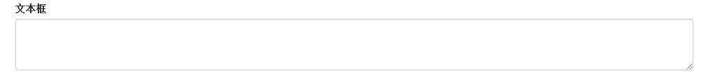
文本框(Textarea)
当您需要进行多行输入的时,则可以使用文本框 textarea。必要时可以改变 rows 属性(较少的行 = 较小的盒子,较多的行 = 较大的盒子)。
<form role="form">
  <div class="form-group">
    <label for="name">文本框</label>
    <textarea class="form-control" rows="3"></textarea>
  </div>
</form>
显示效果:
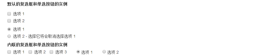
复选框((Checkbox)和单选框(Radio)
复选框和单选按钮用于让用户从一系列预设置的选项中进行选择。
- 当创建表单时,如果您想让用户从列表中选择若干个选项时,请使用 checkbox。如果您限制用户只能选择一个选项,请使用 radio。
- 对一系列复选框和单选框使用 .checkbox-inline 或 .radio-inline class,控制它们显示在同一行上。
<label for="name">默认的复选框和单选按钮的实例</label>
<div class="checkbox">
   <label><input type="checkbox" value="">选项 1</label>
</div>
<div class="checkbox">
   <label><input type="checkbox" value="">选项 2</label>
</div>

<div class="radio">
   <label>
      <input type="radio" name="optionsRadios" id="optionsRadios1"
         value="option1" checked> 选项 1
   </label>
</div>
<div class="radio">
   <label>
      <input type="radio" name="optionsRadios" id="optionsRadios2"
         value="option2">
         选项 2 - 选择它将会取消选择选项 1
   </label>
</div>
<label for="name">内联的复选框和单选按钮的实例</label>
<div>
   <label class="checkbox-inline">
      <input type="checkbox" id="inlineCheckbox1" value="option1"> 选项 1
   </label>
   <label class="checkbox-inline">
      <input type="checkbox" id="inlineCheckbox2" value="option2"> 选项 2
   </label>
   <label class="checkbox-inline">
      <input type="checkbox" id="inlineCheckbox3" value="option3"> 选项 3
   </label>
   <label class="checkbox-inline">
      <input type="radio" name="optionsRadiosinline" id="optionsRadios3"
         value="option1" checked> 选项 1
   </label>
   <label class="checkbox-inline">
      <input type="radio" name="optionsRadiosinline" id="optionsRadios4"
         value="option2"> 选项 2
   </label>
</div>
显示效果:
选择框(Select)
当您想让用户从多个选项中进行选择,但是默认情况下只能选择一个选项时,则使用选择框。
- 使用 <select> 展示列表选项,通常是那些用户很熟悉的选择列表,比如州或者数字。
- 使用 multiple="multiple" 允许用户选择多个选项。
<form role="form">
   <div class="form-group">
      <label for="name">选择列表</label>
      <select class="form-control">
         <option>1</option>
         <option>2</option>
         <option>3</option>
         <option>4</option>
         <option>5</option>
      </select>

      <label for="name">可多选的选择列表</label>
      <select multiple class="form-control">
         <option>1</option>
         <option>2</option>
         <option>3</option>
         <option>4</option>
         <option>5</option>
      </select>
   </div>
</form>
显示效果:

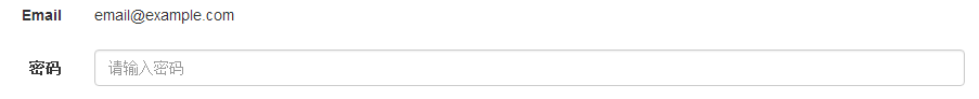
静态控件
当您需要在一个水平表单内的表单标签后放置纯文本时,请在 <p> 上使用 class .form-control-static。
<form class="form-horizontal" role="form">
  <div class="form-group">
    <label class="col-sm-2 control-label">Email</label>
    <div class="col-sm-10">
      <p class="form-control-static">email@example.com</p>
    </div>
  </div>
  <div class="form-group">
    <label for="inputPassword" class="col-sm-2 control-label">密码</label>
    <div class="col-sm-10">
      <input type="password" class="form-control" id="inputPassword"
         placeholder="请输入密码">
    </div>
  </div>
</form>
显示效果:
表单控件状态
除了 :focus 状态(即,用户点击 input 或使用 tab 键聚焦到 input 上),Bootstrap 还为禁用的输入框定义了样式,并提供了表单验证的 class。
输入框焦点
当输入框 input 接收到 :focus 时,输入框的轮廓会被移除,同时应用 box-shadow。
禁用的输入框 input
如果您想要禁用一个输入框 input,只需要简单地添加 disabled 属性,这不仅会禁用输入框,还会改变输入框的样式以及当鼠标的指针悬停在元素上时鼠标指针的样式。
禁用的字段集 fieldset
对 <fieldset> 添加 disabled 属性来禁用 <fieldset> 内的所有控件。
验证状态
Bootstrap 包含了错误、警告和成功消息的验证样式。只需要对父元素简单地添加适当的 class(.has-warning、 .has-error 或 .has-success)即可使用验证状态。
<form class="form-horizontal" role="form">
   <div class="form-group">
      <label class="col-sm-2 control-label">聚焦</label>
      <div class="col-sm-10">
         <input class="form-control" id="focusedInput" type="text"
            value="该输入框获得焦点...">
      </div>
   </div>
   <div class="form-group">
      <label for="inputPassword" class="col-sm-2 control-label">
         禁用
      </label>
      <div class="col-sm-10">
         <input class="form-control" id="disabledInput" type="text"
            placeholder="该输入框禁止输入..." disabled>
      </div>
   </div>
   <fieldset disabled>
      <div class="form-group">
         <label for="disabledTextInput"  class="col-sm-2 control-label">
            禁用输入(Fieldset disabled)
         </label>
         <div class="col-sm-10">
            <input type="text" id="disabledTextInput" class="form-control"
               placeholder="禁止输入">
         </div>
      </div>
      <div class="form-group">
         <label for="disabledSelect"  class="col-sm-2 control-label">
            禁用选择菜单(Fieldset disabled)
         </label>
         <div class="col-sm-10">
            <select id="disabledSelect" class="form-control">
               <option>禁止选择</option>
            </select>
         </div>
      </div>
   </fieldset>
   <div class="form-group has-success">
      <label class="col-sm-2 control-label" for="inputSuccess">
         输入成功
      </label>
      <div class="col-sm-10">
         <input type="text" class="form-control" id="inputSuccess">
      </div>
   </div>
   <div class="form-group has-warning">
      <label class="col-sm-2 control-label" for="inputWarning">
         输入警告
      </label>
      <div class="col-sm-10">
         <input type="text" class="form-control" id="inputWarning">
      </div>
   </div>
   <div class="form-group has-error">
      <label class="col-sm-2 control-label" for="inputError">
         输入错误
      </label>
      <div class="col-sm-10">
         <input type="text" class="form-control" id="inputError">
      </div>
   </div>
</form>
显示效果:

表单控件大小
您可以分别使用 class .input-lg 和 .col-lg-* 来设置表单的高度和宽度。
<form role="form">
   <div class="form-group">
      <input class="form-control input-lg" type="text"
         placeholder=".input-lg">
   </div>

   <div class="form-group">
      <input class="form-control" type="text" placeholder="默认输入">
   </div>

   <div class="form-group">
      <input class="form-control input-sm" type="text"
         placeholder=".input-sm">
   </div>
   <div class="form-group">
   </div>
   <div class="form-group">
      <select class="form-control input-lg">
         <option value="">.input-lg</option>
      </select>
   </div>
   <div class="form-group">
      <select class="form-control">
         <option value="">默认选择</option>
      </select>
   </div>
   <div class="form-group">
      <select class="form-control input-sm">
         <option value="">.input-sm</option>
      </select>
   </div>

   <div class="row">
      <div class="col-lg-2">
         <input type="text" class="form-control" placeholder=".col-lg-2">
      </div>
      <div class="col-lg-3">
         <input type="text" class="form-control" placeholder=".col-lg-3">
      </div>
      <div class="col-lg-4">
         <input type="text" class="form-control" placeholder=".col-lg-4">
      </div>
   </div>
</form>
显示效果:

表单帮助文本
Bootstrap 表单控件可以在输入框 input 上有一个块级帮助文本。为了添加一个占用整个宽度的内容块,请在 <input> 后使用 .help-block。
<form role="form">
   <span>帮助文本实例</span>
   <input class="form-control" type="text" placeholder="">
   <span class="help-block">一个较长的帮助文本块,超过一行,
   需要扩展到下一行。本实例中的帮助文本总共有两行。</span>
</form>
显示效果:

4.Bootstrap 按钮
以下样式可用于<a>, <button>, 或 <input> 元素上:
| 类 | 描述 |
|---|---|
| .btn | 为按钮添加基本样式 |
| .btn-default | 默认/标准按钮 |
| .btn-primary | 原始按钮样式(未被操作) |
| .btn-success | 表示成功的动作 |
| .btn-info | 该样式可用于要弹出信息的按钮 |
| .btn-warning | 表示需要谨慎操作的按钮 |
| .btn-danger | 表示一个危险动作的按钮操作 |
| .btn-link | 让按钮看起来像个链接 (仍然保留按钮行为) |
| .btn-lg | 制作一个大按钮 |
| .btn-sm | 制作一个小按钮 |
| .btn-xs | 制作一个超小按钮 |
| .btn-block | 块级按钮(拉伸至父元素100%的宽度) |
| .active | 按钮被点击 |
| .disabled | 禁用按钮 |
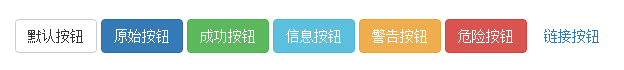
<!-- 标准的按钮 -->
<button type="button" class="btn btn-default">默认按钮</button>

<!-- 提供额外的视觉效果,标识一组按钮中的原始动作 -->
<button type="button" class="btn btn-primary">原始按钮</button>

<!-- 表示一个成功的或积极的动作 -->
<button type="button" class="btn btn-success">成功按钮</button>

<!-- 信息警告消息的上下文按钮 -->
<button type="button" class="btn btn-info">信息按钮</button>

<!-- 表示应谨慎采取的动作 -->
<button type="button" class="btn btn-warning">警告按钮</button>

<!-- 表示一个危险的或潜在的负面动作 -->
<button type="button" class="btn btn-danger">危险按钮</button>

<!-- 并不强调是一个按钮,看起来像一个链接,但同时保持按钮的行为 -->
<button type="button" class="btn btn-link">链接按钮</button>
显示效果:
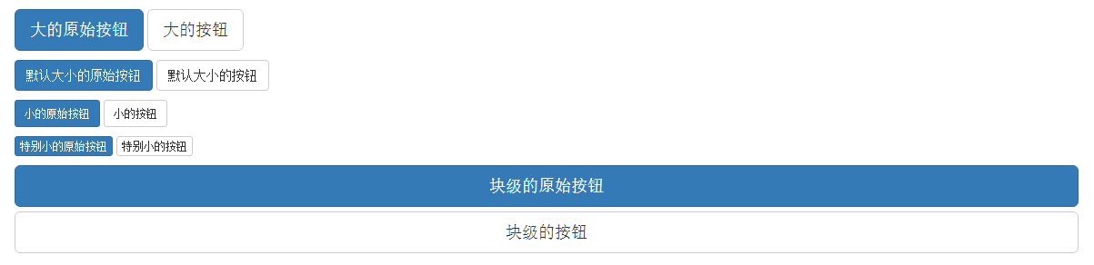
按钮大小
下表列出了获得各种大小按钮的 class:
| Class | 描述 |
|---|---|
| .btn-lg | 这会让按钮看起来比较大。 |
| .btn-sm | 这会让按钮看起来比较小。 |
| .btn-xs | 这会让按钮看起来特别小。 |
| .btn-block | 这会创建块级的按钮,会横跨父元素的全部宽度。 |
<p>
   <button type="button" class="btn btn-primary btn-lg">
      大的原始按钮
   </button>
   <button type="button" class="btn btn-default btn-lg">
      大的按钮
   </button>
</p>
<p>
   <button type="button" class="btn btn-primary">
      默认大小的原始按钮
   </button>
   <button type="button" class="btn btn-default">
      默认大小的按钮
   </button>
</p>
<p>
   <button type="button" class="btn btn-primary btn-sm">
      小的原始按钮
   </button>
   <button type="button" class="btn btn-default btn-sm">
      小的按钮
   </button>
</p>
<p>
   <button type="button" class="btn btn-primary btn-xs">
      特别小的原始按钮
   </button>
   <button type="button" class="btn btn-default btn-xs">
      特别小的按钮
   </button>
</p>
<p>
   <button type="button" class="btn btn-primary btn-lg btn-block">
      块级的原始按钮
   </button>
   <button type="button" class="btn btn-default btn-lg btn-block">
      块级的按钮
   </button>
</p>
显示效果:
按钮状态
Bootstrap 提供了激活、禁用等按钮状态的 class,下面将进行详细讲解。
激活状态
按钮在激活时将呈现为被按压的外观(深色的背景、深色的边框、阴影)。
下表列出了让按钮元素和锚元素呈激活状态的 class:
| 元素 | Class |
|---|---|
| 按钮元素 | 添加 .active class 来显示它是激活的。 |
| 锚元素 | 添加 .active class 到 <a> 按钮来显示它是激活的。 |
<p>
   <button type="button" class="btn btn-default btn-lg ">
      默认按钮
   </button>
   <button type="button" class="btn btn-default btn-lg active">
      激活按钮
   </button>
</p>
<p>
   <button type="button" class="btn btn-primary btn-lg ">
      原始按钮
   </button>
   <button type="button" class="btn btn-primary btn-lg active">
      激活的原始按钮
   </button>
</p>
显示效果:

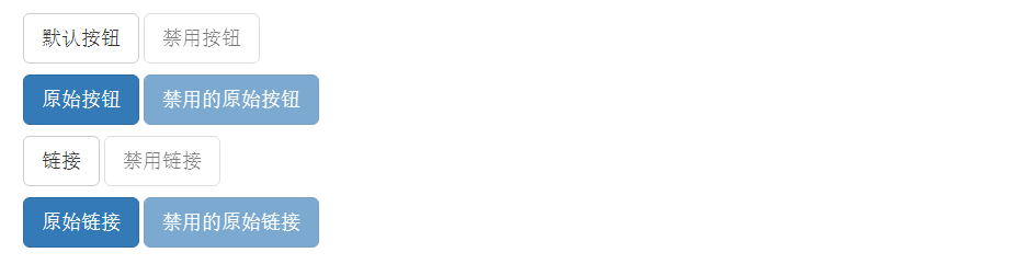
禁用状态
当您禁用一个按钮时,它的颜色会变淡 50%,并失去渐变。
下表列出了让按钮元素和锚元素呈禁用状态的 class:
| 元素 | Class |
|---|---|
| 按钮元素 | 添加 disabled 属性 到 <button> 按钮。 |
| 锚元素 | 添加 disabled class 到 <a> 按钮。 注意:该 class 只会改变 <a> 的外观,不会改变它的功能。在这里,您需要使用自定义的 JavaScript 来禁用链接。 |
<p>
   <button type="button" class="btn btn-default btn-lg">
      默认按钮
   </button>
   <button type="button" class="btn btn-default btn-lg" disabled="disabled">
      禁用按钮
   </button>
</p>
<p>
   <button type="button" class="btn btn-primary btn-lg ">
      原始按钮
   </button>
   <button type="button" class="btn btn-primary btn-lg" disabled="disabled">
      禁用的原始按钮
   </button>
</p>
<p>
   <a href="#" class="btn btn-default btn-lg" role="button">
      链接
   </a>
   <a href="#" class="btn btn-default btn-lg disabled" role="button">
      禁用链接
   </a>
</p>
<p>
   <a href="#" class="btn btn-primary btn-lg" role="button">
      原始链接
   </a>
   <a href="#" class="btn btn-primary btn-lg disabled" role="button">
      禁用的原始链接
   </a>
</p>
显示效果: