}最近在巩固CSS揭秘,在文档里看到几段代码觉得不错
想拿来给大家分享一下
用渐变几乎可以创建任何种类的几何图案,只不过这种方法不太实际,我们可能稍不留神就弄出一大块无法维护的代码
当我们把多个渐变图案组合起来,让它们透过彼此的透明区域显现时,神奇的事情就发生了
希望以下的可以帮助到你!
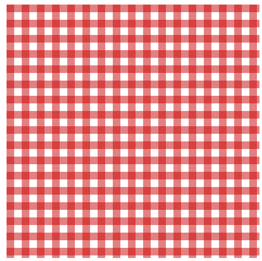
div{
500px; /*宽*/
height:500px;/*高*/
background: white;/*背景颜色*/
background-image: linear-gradient(90deg,rgba(200,0,0,.5) 50%, transparent 0),linear-gradient(rgba(200,0,0,.5) 50%, transparent 0);/*背景图片:线性渐变(90度),色彩模式,背景透明*/
background-size: 30px 30px;/*背景大小*/
}
效果图
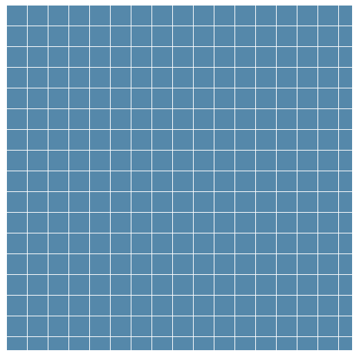
div{
background: #58a;
background-image:
linear-gradient(white 1px, transparent 0),
linear-gradient(90deg, white 1px, transparent 0);
background-size: 30px 30px;
}
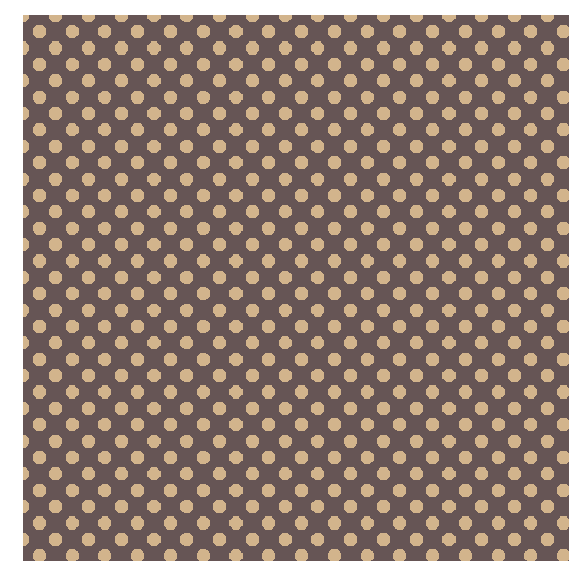
div{
background: #655;
background-image: radial-gradient(tan 30%, transparent 0),
radial-gradient(tan 30%, transparent 0);
background-size: 30px 30px;
background-position: 0 0, 15px 15px;
}
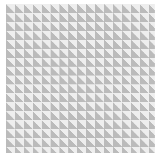
div{
background: #eee;
background-image:
linear-gradient(45deg, #bbb 50%, transparent 0);
background-size: 30px 30px;
}