浮动
传统网页的三种布局方式
-
标准流(普通流/文档流)
-
浮动
-
定位
比如说下面这个,使用标准流很难做(一个在左边,一个在右边):

又比如说,下面鼠标滚动的时候,圈中的盒子是固定的,使用标准流也很难做:

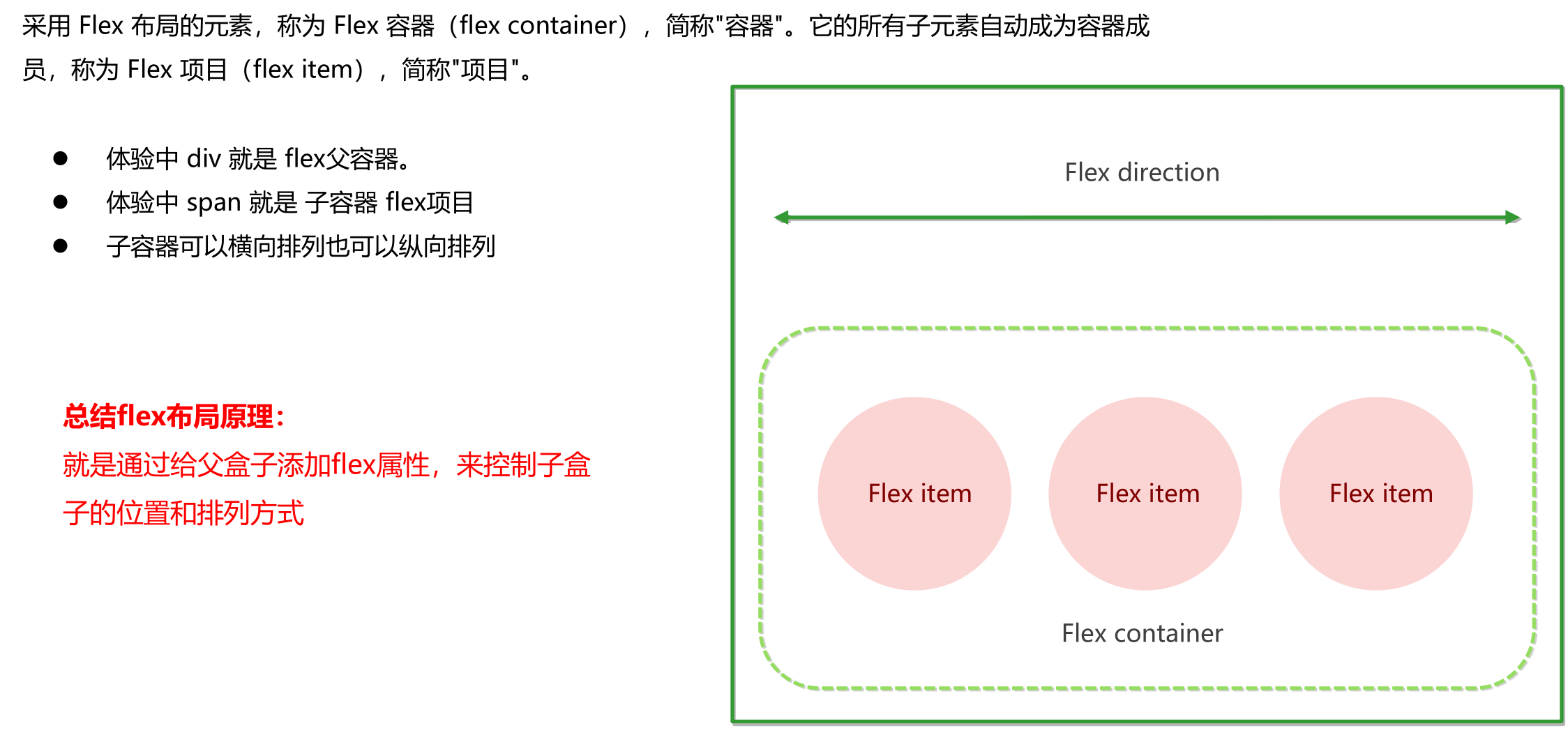
flex布局
传统布局与flex布局的比较

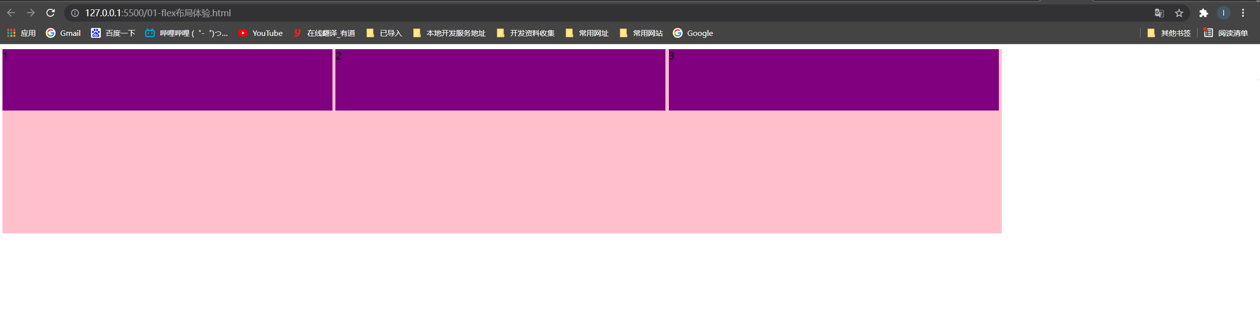
flex布局体验
<head>
    <meta charset="UTF-8">
    <meta name="viewport" content="width=device-width, initial-scale=1.0">
    <meta http-equiv="X-UA-Compatible" content="ie=edge">
    <title>Document</title>
    <style>
        div {
            display: flex;
             80%;
            height: 300px;
            background-color: pink;
            justify-content: space-around;
        }

        div span {
            /*  150px; */
            height: 100px;
            background-color: purple;
            margin-right: 5px;
            flex: 1;
        }
    </style>
</head>

<body>
    <div>
        <span>1</span>
        <span>2</span>
        <span>3</span>
    </div>
</body>
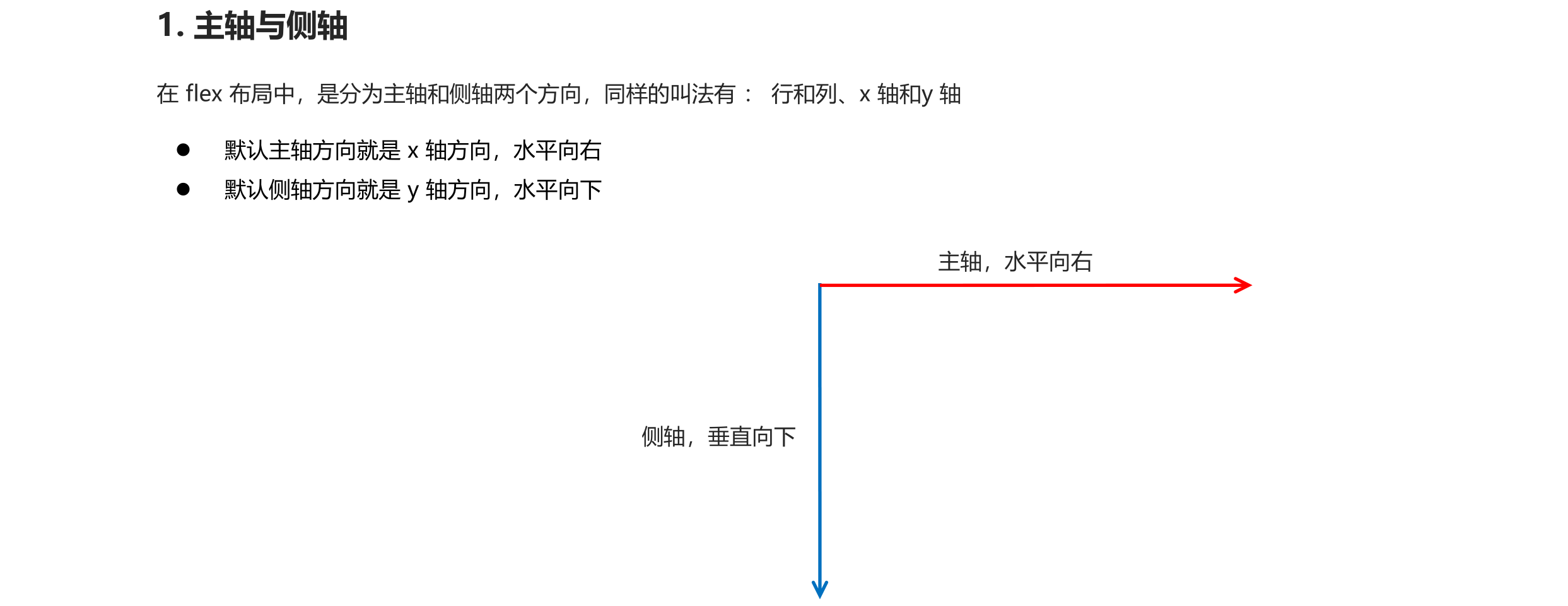
flex布局原理
flex 是 flexible Box 的缩写,意为"弹性布局",用来为盒状模型提供最大的灵活性,任何一个容器都可以指定为 flex 布局。
- 当我们为父盒子设为 flex 布局以后,子元素的 float、clear 和 vertical-align 属性将失效。
- 伸缩布局 = 弹性布局 = 伸缩盒布局 = 弹性盒布局 =flex布局
flex布局父项常见属性
以下由6个属性是对父元素设置的
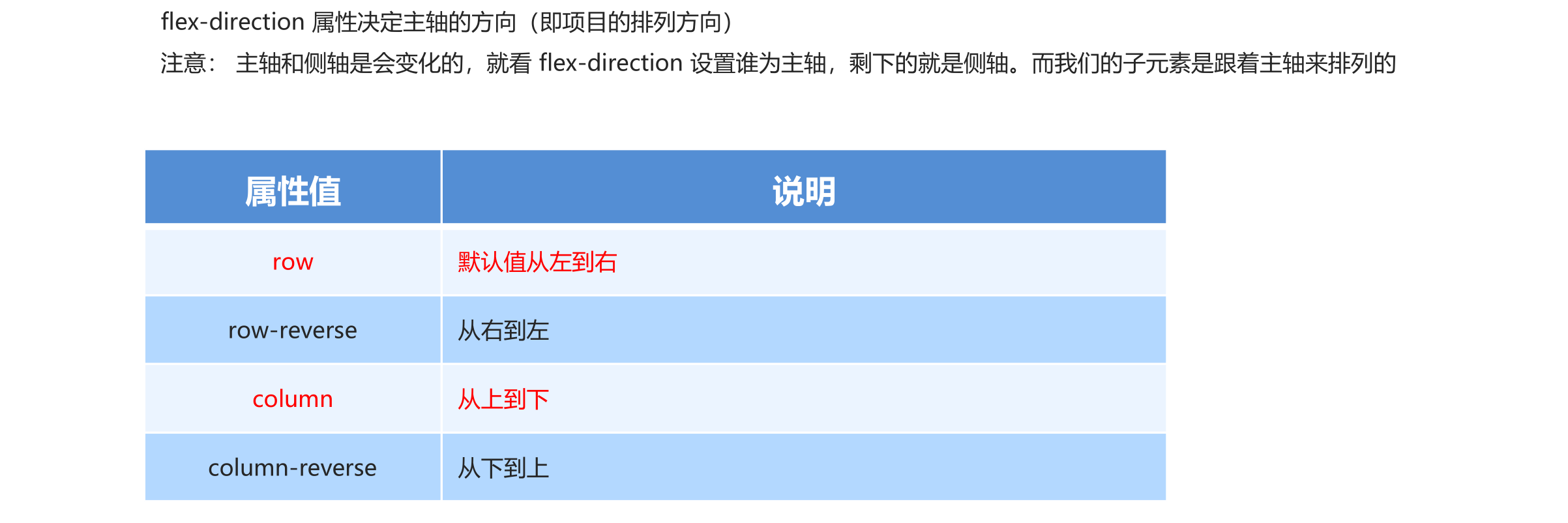
- flex-direction:设置主轴的方向
- justify-content:设置主轴上的子元素排列方式
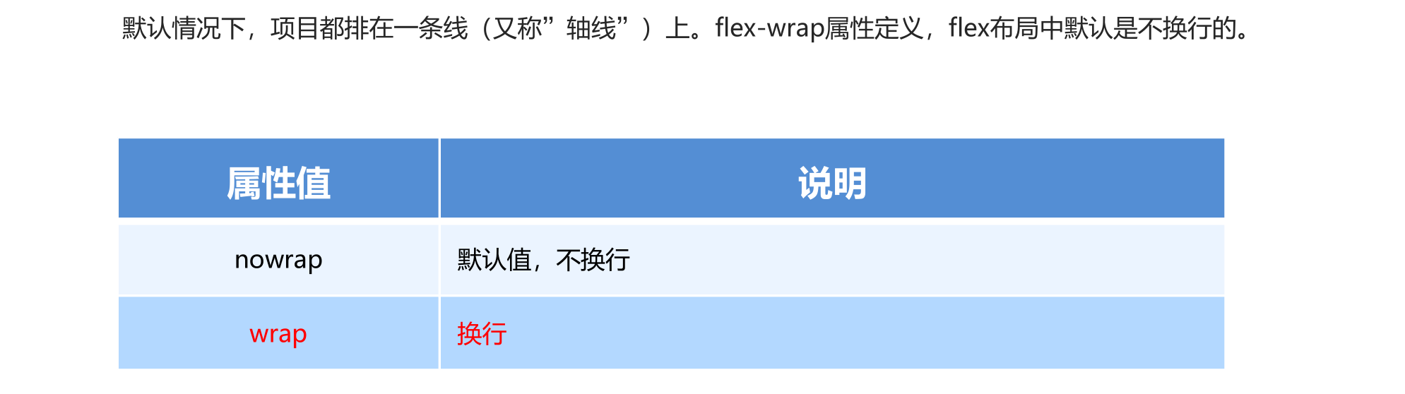
- flex-wrap:设置子元素是否换行
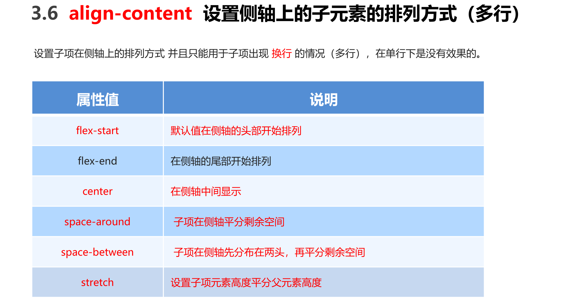
- align-content:设置侧轴上的子元素的排列方式(多行)
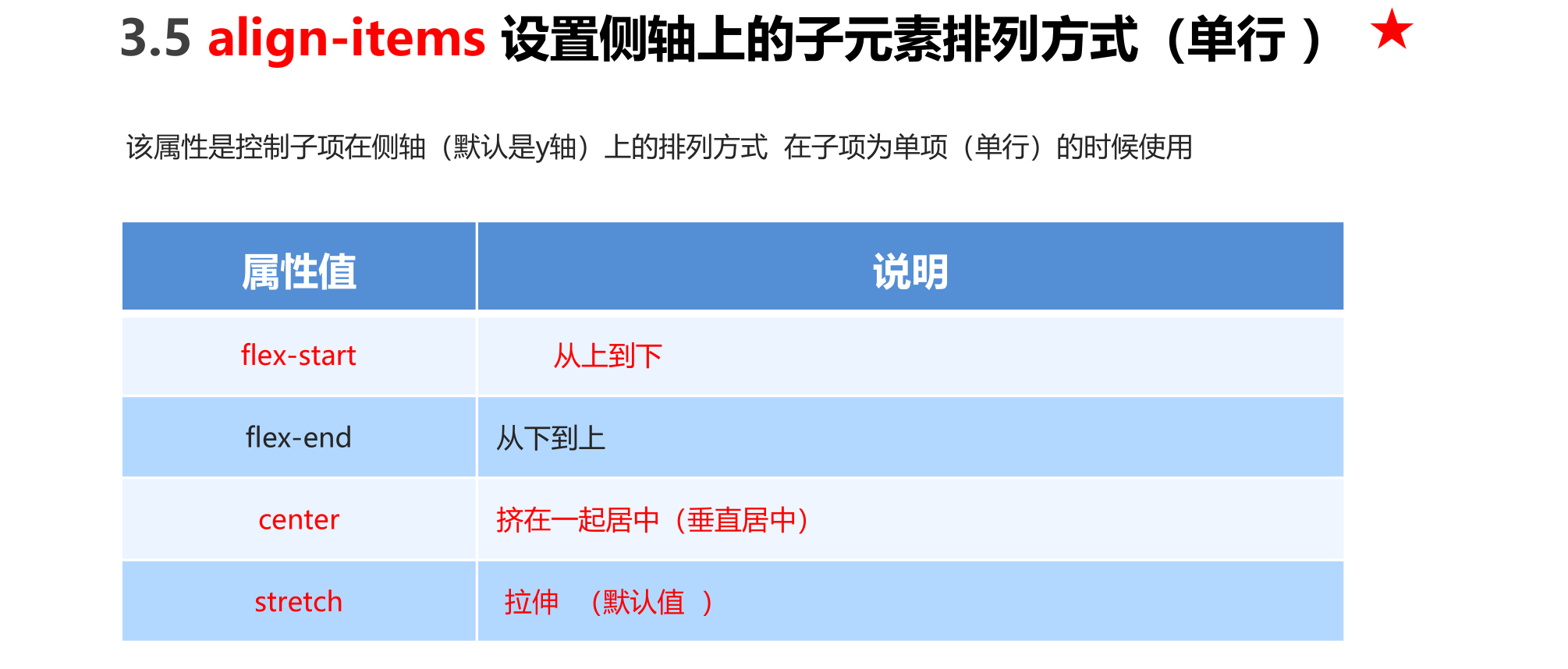
- align-items:设置侧轴上的子元素排列方式(单行)
- flex-flow:复合属性,相当于同时设置了 flex-direction 和 flex-wrap
flex-direction设置主轴方向
<head>
    <meta charset="UTF-8">
    <meta name="viewport" content="width=device-width, initial-scale=1.0">
    <meta http-equiv="X-UA-Compatible" content="ie=edge">
    <title>Document</title>
    <style>
        div {
            /* 给父级添加flex属性 */
            display: flex;
             800px;
            height: 300px;
            background-color: pink;
            /* 默认的主轴是 x 轴 行 row  那么y轴就是侧轴喽 */
            /* 我们的元素是跟着主轴来排列的 */
            /* flex-direction: row; */
            /* 简单了解 翻转 */
            /* flex-direction: row-reverse; */
            /* 我们可以把我们的主轴设置为 y轴 那么 x 轴就成了侧轴 */
            flex-direction: column;
        }

        div span {
             150px;
            height: 100px;
            background-color: purple;
        }
    </style>
</head>

<body>
    <div>
        <span>1</span>
        <span>2</span>
        <span>3</span>
    </div>
</body>
盒子竖着排列

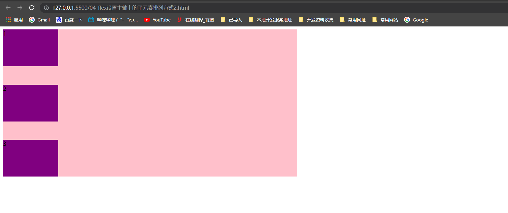
justify-content设置主轴子元素排列

<head>
    <meta charset="UTF-8">
    <meta name="viewport" content="width=device-width, initial-scale=1.0">
    <meta http-equiv="X-UA-Compatible" content="ie=edge">
    <title>Document</title>
    <style>
        div {
            display: flex;
             800px;
            height: 300px;
            background-color: pink;
            /* 默认的主轴是 x 轴 row */
            flex-direction: row;
            /* justify-content: 是设置主轴上子元素的排列方式 */
            /* justify-content: flex-start; */
            /* justify-content: flex-end; */
            /* 让我们子元素居中对齐 */
            /* justify-content: center; */
            /* 平分剩余空间 */
            /* justify-content: space-around; */
            /* 先两边贴边, 再分配剩余的空间 */
            justify-content: space-between;
        }

        div span {
             150px;
            height: 100px;
            background-color: purple;
        }
    </style>
</head>

<body>
    <div>
        <span>1</span>
        <span>2</span>
        <span>3</span>
        <span>4</span>
    </div>
</body>
这里只展示了一种效果,如果想看其它的效果,将上面代码中的对应注释放开即可

主轴设置y轴,垂直居中
<head>
    <meta charset="UTF-8">
    <meta name="viewport" content="width=device-width, initial-scale=1.0">
    <meta http-equiv="X-UA-Compatible" content="ie=edge">
    <title>Document</title>
    <style>
        div {
            display: flex;
             800px;
            height: 400px;
            background-color: pink;
            /* 我们现在的主轴是y轴 */
            flex-direction: column;
            /* justify-content: center; */
            justify-content: space-between;
        }

        div span {
             150px;
            height: 100px;
            background-color: purple;
        }
    </style>
</head>

<body>
    <div>
        <span>1</span>
        <span>2</span>
        <span>3</span>
    </div>
</body>
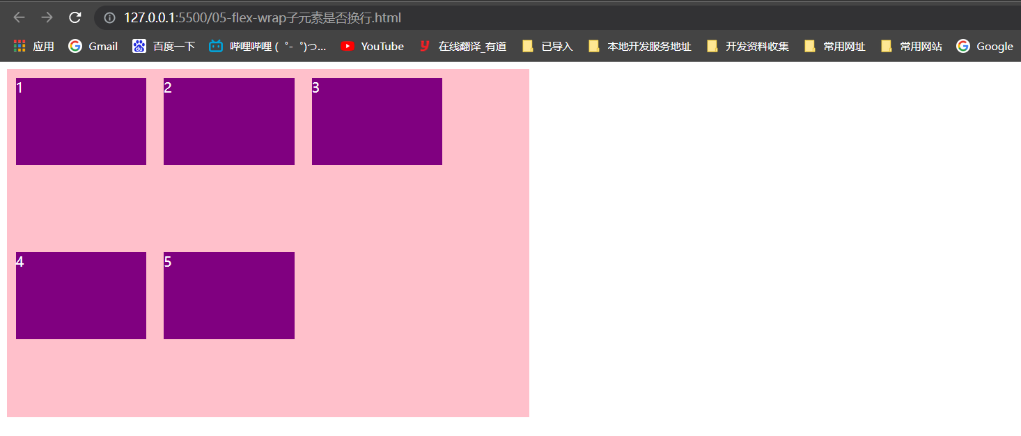
flex-wrap 设置子元素是否换行
<head>
	...
    <style>
        div {
            display: flex;
             600px;
            height: 400px;
            background-color: pink;
            /* flex布局中,默认的子元素是不换行的, 如果装不开,会缩小子元素的宽度,放到父元素里面  */
            /* flex-wrap: nowrap; */
            flex-wrap: wrap;
        }

        div span {
             150px;
            height: 100px;
            background-color: purple;
            color: #fff;
            margin: 10px;
        }
    </style>
</head>

<body>
    <div>
        <span>1</span>
        <span>2</span>
        <span>3</span>
        <span>4</span>
        <span>5</span>
    </div>
</body>
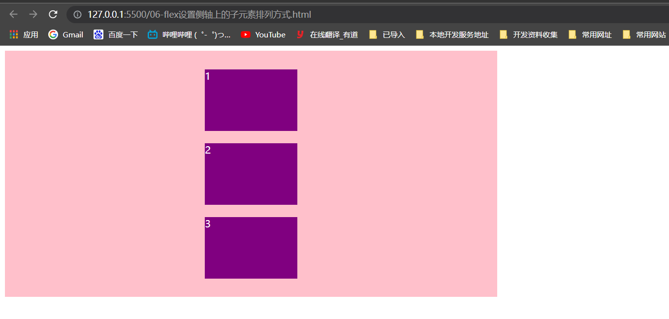
结合align-items实现水平居中且垂直居中
<head>
	...
    <style>
        div {
            display: flex;
             800px;
            height: 400px;
            background-color: pink;
            /* 默认的主轴是 x 轴 row */
            flex-direction: column;
            justify-content: center;
            /* 我们需要一个侧轴居中 */
            /* 拉伸,但是子盒子不要给高度 */
            /* align-items: stretch; */
            align-items: center;
            /* align-content: center; */
        }

        div span {
             150px;
            height: 100px;
            background-color: purple;
            color: #fff;
            margin: 10px;
        }
    </style>
</head>

<body>
    <div>
        <span>1</span>
        <span>2</span>
        <span>3</span>
    </div>
</body>
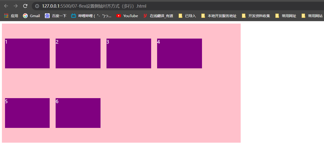
设置侧轴对齐方式(多行)
<head>
	...
    <style>
        div {
            display: flex;
             800px;
            height: 400px;
            background-color: pink;
            /* 换行 */
            flex-wrap: wrap;
            /* 因为有了换行,此时我们侧轴上控制子元素的对齐方式我们用 align-content */
            /* align-content: flex-start; */
            /* align-content: center; */
            /* align-content: space-between; */
            align-content: space-around;
        }

        div span {
             150px;
            height: 100px;
            background-color: purple;
            color: #fff;
            margin: 10px;
        }
    </style>
</head>

<body>
    <div>
        <span>1</span>
        <span>2</span>
        <span>3</span>
        <span>4</span>
        <span>5</span>
        <span>6</span>
    </div>
</body>
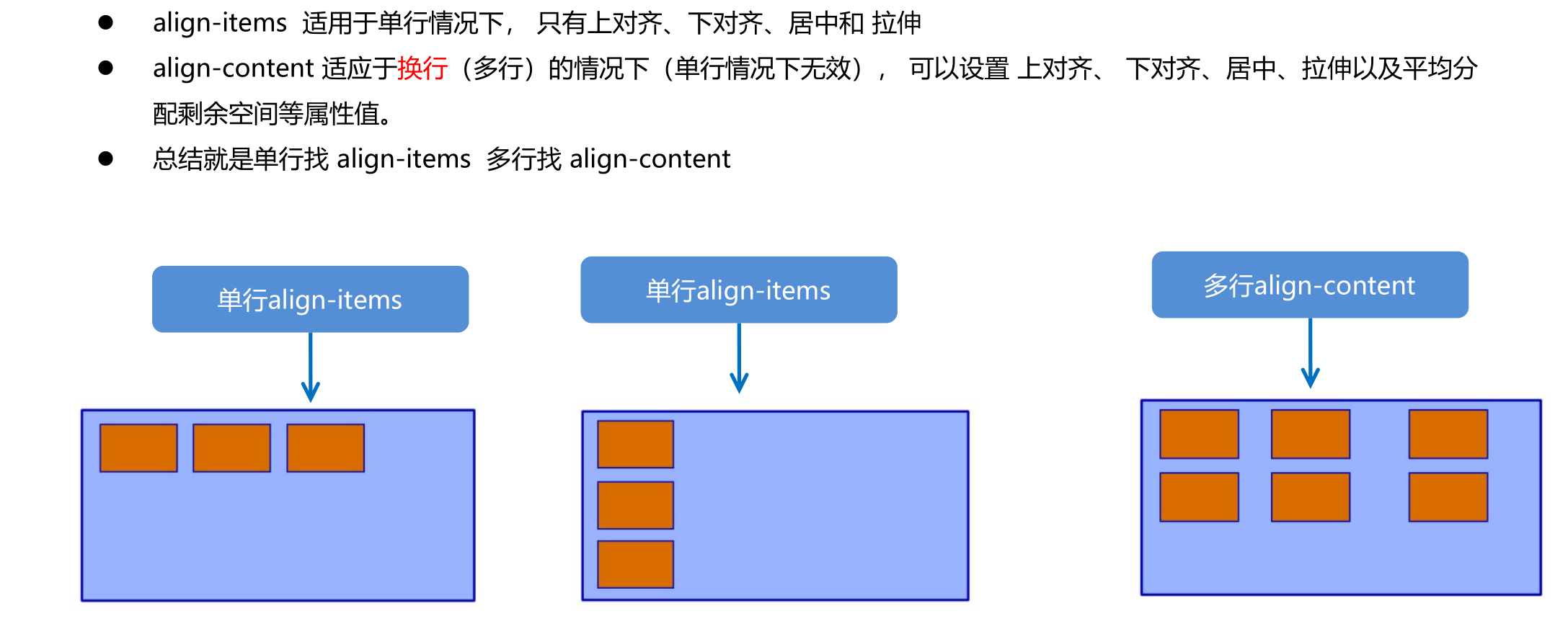
align-content 和 align-items 区别
flex-flow复合属性
lex-flow 属性是 flex-direction 和 flex-wrap 属性的复合属性
flex-flow:row wrap;
<head>
	...
    <style>
        div {
            display: flex;
             600px;
            height: 300px;
            background-color: pink;
            /* flex-direction: column;
            flex-wrap: wrap; */
            /* 把设置主轴方向和是否换行(换列)简写 */
            flex-flow: column wrap;
        }

        div span {
             150px;
            height: 100px;
            background-color: purple;
        }
    </style>
</head>

<body>
    <div>
        <span>1</span>
        <span>2</span>
        <span>3</span>
        <span>4</span>
        <span>5</span>
    </div>
</body>
flex布局子项常见属性
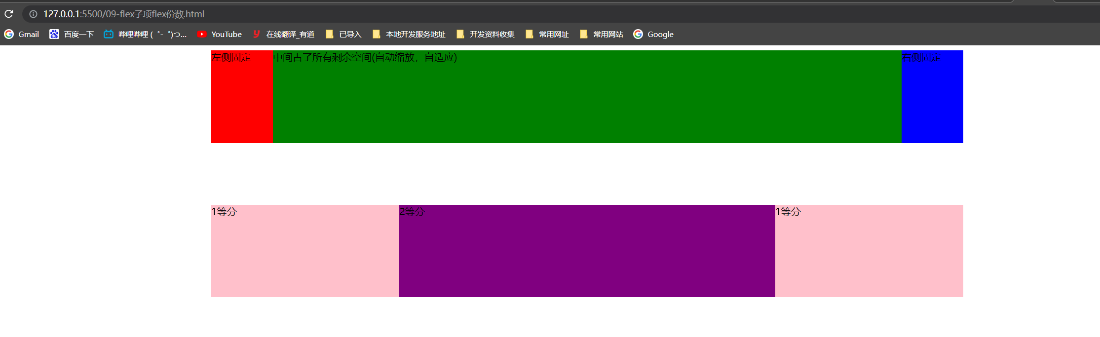
- flex 子项目占的份数
- align-self 控制子项自己在侧轴的排列方式
- order属性定义子项的排列顺序(前后顺序)
flex 属性定义子项目分配剩余空间,用flex来表示占多少份数。
.item {
	flex: <number>; /* default 0 */
}
flex属性
实现左右固定、中间盒子根据屏幕自动伸缩(自适应)
实现子盒子按照等比划分,且第二个盒子占有两份
<head>
    <meta charset="UTF-8">
    <meta name="viewport" content="width=device-width, initial-scale=1.0">
    <meta http-equiv="X-UA-Compatible" content="ie=edge">
    <title>Document</title>
    <style>
        section {
            display: flex;
             60%;
            height: 150px;
            background-color: pink;
            margin: 0 auto;
        }

        section div:nth-child(1) {
             100px;
            height: 150px;
            background-color: red;
        }

        section div:nth-child(2) {
            flex: 1;
            background-color: green;
        }

        section div:nth-child(3) {
             100px;
            height: 150px;
            background-color: blue;
        }

        p {
            display: flex;
             60%;
            height: 150px;
            background-color: pink;
            margin: 100px auto;
        }
        /*子盒子没有自定宽度,会自动按照等分分隔*/
        p span {
            flex: 1;
        }
        /*第二个盒子占两等分*/
        p span:nth-child(2) {
            flex: 2;
            background-color: purple;
        }
    </style>
</head>

<body>
    <section>
        <div>左侧固定</div>
        <div>中间占了所有剩余空间(自动缩放,自适应)</div>
        <div>右侧固定</div>
    </section>
    <p>
        <span>1等分</span>
        <span>2等分</span>
        <span>1等分</span>
    </p>
</body>
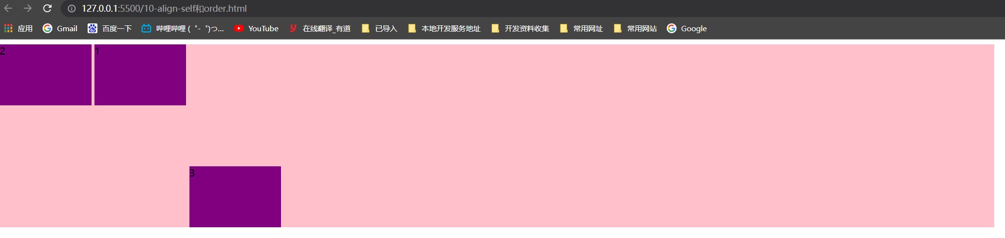
align-self 控制子项自己在侧轴上的排列方式(了解)
align-self 属性允许单个项目有与其他项目不一样的对齐方式,可覆盖 align-items 属性。默认值为 auto,表示继承父元素的 align-items 属性,如果没有父元素,则等同于 stretch。
span:nth-child(2) {
	/* 设置自己在侧轴上的排列方式 */
	align-self: flex-end;
}
order 属性定义项目的排列顺序(了解)
数值越小,排列越靠前,默认为0。注意:和 z-index 不一样。
<head>
    <meta charset="UTF-8">
    <meta name="viewport" content="width=device-width, initial-scale=1.0">
    <meta http-equiv="X-UA-Compatible" content="ie=edge">
    <title>Document</title>
    <style>
        div {
            display: flex;
             80%;
            height: 300px;
            background-color: pink;
            /* 让三个子盒子沿着侧轴底侧对齐 */
            /* align-items: flex-end; */
            /* 我们想只让3号盒子下来底侧 */
        }

        div span {
             150px;
            height: 100px;
            background-color: purple;
            margin-right: 5px;
        }

        div span:nth-child(2) {
            /* 默认是0   -1比0小所以在前面 */
            order: -1;
        }

        div span:nth-child(3) {
            align-self: flex-end;
        }
    </style>
</head>

<body>
    <div>
        <span>1</span>
        <span>2</span>
        <span>3</span>
    </div>
</body>
携程网首页案例
效果
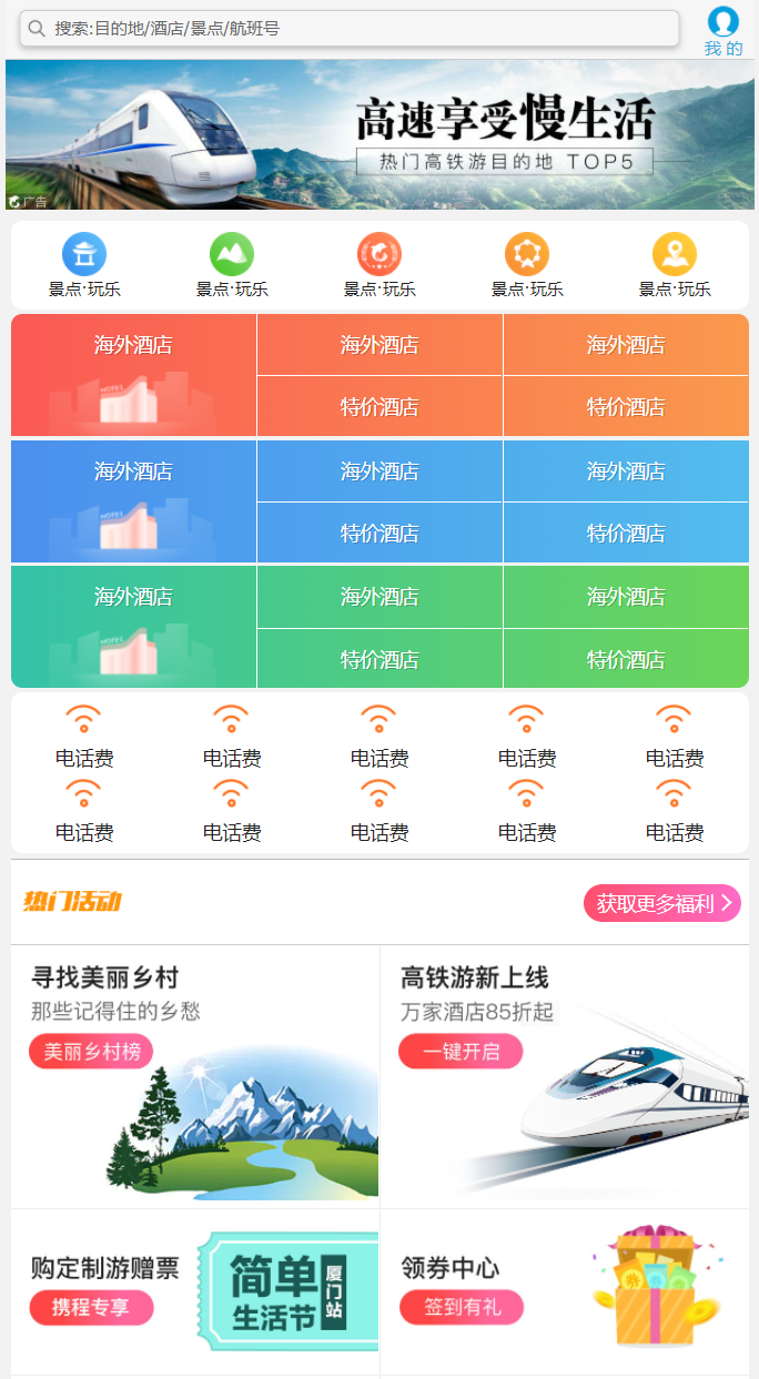
代码
二倍精灵图制作 1、宽度缩小为原来的一般 2、再测量精灵图的x、y轴
css代码
body {
    max- 540px;
    min- 320px;
    margin: 0 auto;
    font: normal 14px/1.5 Tahoma, "Lucida Grande", Verdana, "Microsoft Yahei", STXihei, hei;
    color: #000;
    background: #f2f2f2;
    overflow-x: hidden;
    /*防止某些元素点击之后颜色高亮,设置成透明,就是不高亮*/
    -webkit-tap-highlight-color: transparent;
}

ul {
    list-style: none;
    margin: 0;
    padding: 0;
}

a {
    text-decoration: none;
    color: #222;
}

div {
    box-sizing: border-box;
}


/* 搜索模块 */

.search-index {
    display: flex;
    /* 固定定位跟父级没有关系 它以屏幕为准 */
    position: fixed;
    top: 0;
    left: 50%;
    /* 固定的盒子应该有宽度 */
    -webkit-transform: translateX(-50%);
    transform: translateX(-50%);
     100%;
    min- 320px;
    max- 540px;
    height: 44px;
    /* background-color: pink; */
    background-color: #F6F6F6;
    border-top: 1px solid #ccc;
    border-bottom: 1px solid #ccc;
}

.search {
    position: relative;
    height: 26px;
    line-height: 24px;
    border: 1px solid #ccc;
    flex: 1;
    font-size: 12px;
    color: #666;
    margin: 7px 10px;
    padding-left: 25px;
    border-radius: 5px;
    box-shadow: 0 2px 4px rgba(0, 0, 0, .2);
}

.search::before {
    content: "";
    position: absolute;
    top: 5px;
    left: 5px;
     15px;
    height: 15px;
    /*二倍精灵图制作 1、宽度缩小为原来的一般  2、再测量精灵图的x、y轴*/
    background: url(../images/sprite.png) no-repeat -59px -279px;
    background-size: 104px auto;
}

.user {
     44px;
    height: 44px;
    /* background-color: purple; */
    font-size: 12px;
    text-align: center;
    color: #2eaae0;
}

.user::before {
    content: "";
    display: block;
     23px;
    height: 23px;
    background: url(../images/sprite.png) no-repeat -59px -194px;
    background-size: 104px auto;
    margin: 4px auto -2px;
}


/* focus */

.focus {
    padding-top: 44px;
}

.focus img {
     100%;
}


/* local-nav */

.local-nav {
    display: flex;
    height: 64px;
    margin: 3px 4px;
    background-color: #fff;
    border-radius: 8px;
}

.local-nav li {
    flex: 1;
}

.local-nav a {
    display: flex;
    flex-direction: column;
    /* 侧轴居中对齐 因为是单行 */
    align-items: center;
    font-size: 12px;
}

.local-nav li [class^="local-nav-icon"] {
     32px;
    height: 32px;
    background-color: pink;
    margin-top: 8px;
    background: url(../images/localnav_bg.png) no-repeat 0 0;
    background-size: 32px auto;
}

.local-nav li .local-nav-icon-icon2 {
    background-position: 0 -32px;
}

.local-nav li .local-nav-icon-icon3 {
    background-position: 0 -64px;
}

.local-nav li .local-nav-icon-icon4 {
    background-position: 0 -96px;
}

.local-nav li .local-nav-icon-icon5 {
    background-position: 0 -128px;
}


/* nav */

nav {
    overflow: hidden;
    border-radius: 8px;
    margin: 0 4px 3px;
}

.nav-common {
    display: flex;
    height: 88px;
    background-color: pink;
}

.nav-common:nth-child(2) {
    margin: 3px 0;
}

.nav-items {
    /* 不冲突的 */
    flex: 1;
    display: flex;
    flex-direction: column;
}

.nav-items a {
    flex: 1;
    text-align: center;
    line-height: 44px;
    color: #fff;
    font-size: 14px;
    /* 文字阴影 */
    text-shadow: 1px 1px rgba(0, 0, 0, .2);
}

.nav-items a:nth-child(1) {
    border-bottom: 1px solid #fff;
}

.nav-items:nth-child(1) a {
    border: 0;
    background: url(../images/hotel.png) no-repeat bottom center;
    background-size: 121px auto;
}


/* -n+2就是选择前面两个元素 */

.nav-items:nth-child(-n+2) {
    border-right: 1px solid #fff;
}

.nav-common:nth-child(1) {
    background: -webkit-linear-gradient(left, #FA5A55, #FA994D);
}

.nav-common:nth-child(2) {
    background: -webkit-linear-gradient(left, #4B90ED, #53BCED);
}

.nav-common:nth-child(3) {
    background: -webkit-linear-gradient(left, #34C2A9, #6CD559);
}


/* subnav-entry */

.subnav-entry {
    display: flex;
    border-radius: 8px;
    background-color: #fff;
    margin: 0 4px;
    flex-wrap: wrap;
    padding: 5px 0;
}

.subnav-entry li {
    /* 里面的子盒子可以写 % 相对于父级来说的 */
    flex: 20%;
}

.subnav-entry a {
    display: flex;
    flex-direction: column;
    align-items: center;
}

.subnav-entry-icon {
     28px;
    height: 28px;
    background-color: pink;
    margin-top: 4px;
    background: url(../images/subnav-bg.png) no-repeat;
    background-size: 28px auto;
}


/* sales-box */

.sales-box {
    border-top: 1px solid #bbb;
    background-color: #fff;
    margin: 4px;
}

.sales-hd {
    position: relative;
    height: 44px;
    border-bottom: 1px solid #ccc;
}

.sales-hd h2 {
    position: relative;
    text-indent: -999px;
    overflow: hidden;
}

.sales-hd h2::after {
    position: absolute;
    top: 5px;
    left: 8px;
    content: "";
     79px;
    height: 15px;
    background: url(../images/hot.png) no-repeat 0 -20px;
    background-size: 79px auto;
}

.more {
    position: absolute;
    right: 5px;
    top: 0px;
    background: -webkit-linear-gradient(left, #FF506C, #FF6BC6);
    border-radius: 15px;
    padding: 3px 20px 3px 10px;
    color: #fff;
}

.more::after {
    content: "";
    position: absolute;
    top: 9px;
    right: 9px;
     7px;
    height: 7px;
    border-top: 2px solid #fff;
    border-right: 2px solid #fff;
    transform: rotate(45deg);
}

.row {
    display: flex;
}

.row a {
    flex: 1;
    border-bottom: 1px solid #eee;
}

.row a:nth-child(1) {
    border-right: 1px solid #eee;
}

.row a img {
     100%;
}
html代码
<!DOCTYPE html>
<html lang="en">

<head>
    <meta charset="UTF-8">
    <meta name="viewport" content="width=device-width, initial-scale=1.0">
    <meta http-equiv="X-UA-Compatible" content="ie=edge">
    <link rel="stylesheet" href="css/normalize.css">
    <link rel="stylesheet" href="css/index.css">
    <title>携程在手,说走就走</title>
</head>

<body>
    <!-- 顶部搜索 -->
    <div class="search-index">
        <div class="search">搜索:目的地/酒店/景点/航班号</div>
        <a href="#" class="user">我 的</a>
    </div>
    <!-- 焦点图模块 -->
    <div class="focus">
        <img src="upload/focus.jpg" alt="">
    </div>
    <!-- 局部导航栏 -->
    <ul class="local-nav">
        <li>
            <a href="#" title="景点·玩乐">
                <span class="local-nav-icon-icon1"></span>
                <span>景点·玩乐</span>
            </a>
        </li>
        <li>
            <a href="#" title="景点·玩乐">
                <span class="local-nav-icon-icon2"></span>
                <span>景点·玩乐</span>
            </a>
        </li>
        <li>
            <a href="#" title="景点·玩乐">
                <span class="local-nav-icon-icon3"></span>
                <span>景点·玩乐</span>
            </a>
        </li>
        <li>
            <a href="#" title="景点·玩乐">
                <span class="local-nav-icon-icon4"></span>
                <span>景点·玩乐</span>
            </a>
        </li>
        <li>
            <a href="#" title="景点·玩乐">
                <span class="local-nav-icon-icon5"></span>
                <span>景点·玩乐</span>
            </a>
        </li>

    </ul>

    <!-- 主导航栏 -->
    <nav>
        <div class="nav-common">
            <div class="nav-items">
                <a href="#">海外酒店</a>
            </div>
            <div class="nav-items">
                <a href="#">海外酒店</a>
                <a href="#">特价酒店</a>
            </div>
            <div class="nav-items">
                <a href="#">海外酒店</a>
                <a href="#">特价酒店</a>
            </div>
        </div>

    </nav>
    <!-- 侧导航栏 -->
    <ul class="subnav-entry">
        <li>
            <a href="#">
                <span class="subnav-entry-icon"></span>
                <span>电话费</span>
            </a>
        </li>
        <li>
            <a href="#">
                <span class="subnav-entry-icon"></span>
                <span>电话费</span>
            </a>
        </li>
        <li>
            <a href="#">
                <span class="subnav-entry-icon"></span>
                <span>电话费</span>
            </a>
        </li>
        <li>
            <a href="#">
                <span class="subnav-entry-icon"></span>
                <span>电话费</span>
            </a>
        </li>
        <li>
            <a href="#">
                <span class="subnav-entry-icon"></span>
                <span>电话费</span>
            </a>
        </li>
        <li>
            <a href="#">
                <span class="subnav-entry-icon"></span>
                <span>电话费</span>
            </a>
        </li>
        <li>
            <a href="#">
                <span class="subnav-entry-icon"></span>
                <span>电话费</span>
            </a>
        </li>
        <li>
            <a href="#">
                <span class="subnav-entry-icon"></span>
                <span>电话费</span>
            </a>
        </li>
        <li>
            <a href="#">
                <span class="subnav-entry-icon"></span>
                <span>电话费</span>
            </a>
        </li>
        <li>
            <a href="#">
                <span class="subnav-entry-icon"></span>
                <span>电话费</span>
            </a>
        </li>

    </ul>

    <!-- 销售模块 -->
    <div class="sales-box">
        <div class="sales-hd">
            <h2>热门活动</h2>
            <a href="#" class="more">获取更多福利</a>
        </div>
        <div class="sales-bd">
            <div class="row">
                <a href="#">
                    <img src="upload/pic1.jpg" alt="">
                </a>
                <a href="#">
                    <img src="upload/pic2.jpg" alt="">

                </a>
            </div>
            <div class="row">
                <a href="#">
                    <img src="upload/pic3.jpg" alt="">
                </a>
                <a href="#">
                    <img src="upload/pic4.jpg" alt="">

                </a>
            </div>
            <div class="row">
                <a href="#">
                    <img src="upload/pic5.jpg" alt="">
                </a>
                <a href="#">
                    <img src="upload/pic6.jpg" alt="">

                </a>
            </div>

        </div>
    </div>
</body>

</html>
rem适配布局
思考:
- 页面布局文字能否随着屏幕大小变化而变化?
- 流式布局和flex布局主要针对于宽度布局,那高度如何设置?
- 怎么样让屏幕发生变化的时候元素高度和宽度等比例缩放?
rem单位
rem (root em)是一个相对单位,类似于em,em是父元素字体大小。不同的是rem的基准是相对于html元素的字体大小。
比如,根元素(html)设置font-size=12px; 非根元素设置2rem; 则换成px表示就是24px。
/* 根html 为 12px */
html {
font-size: 12px;
}
/* 此时 div 的字体大小就是 24px */
div {
font-size: 2rem;
}
rem的优势:父元素文字大小可能不一致, 但是整个页面只有一个html,可以很好来控制整个页面的元素大小。
媒体查询语法简介
媒体查询(Media Query)是CSS3新语法。
- 使用 @media 查询,可以针对不同的媒体类型定义不同的样式
- @media 可以针对不同的屏幕尺寸设置不同的样式
- 当你重置浏览器大小的过程中,页面也会根据浏览器的宽度和高度重新渲染页面
- 目前针对很多苹果手机、Android手机,平板等设备都用得到多媒体查询
语法规范
@media mediatype and|not|only (media feature) {
CSS-Code;
}
-
用 @media 开头 注意@符号
-
mediatype 媒体类型
-
关键字 and not only
-
media feature 媒体特性 必须有小括号包含
-
    <style>
        /* 这句话的意思就是: 在我们屏幕上 并且 最大的宽度是 800像素 设置我们想要的样式 */
        /* max-width 小于等于800 */
        /* 媒体查询可以根据不同的屏幕尺寸在改变不同的样式 */

        @media screen and (max- 800px) {
            body {
                background-color: pink;
            }
        }

        @media screen and (max- 500px) {
            body {
                background-color: purple;
            }
        }
    </style>
媒体查询案例背景变色
    <style>
        /* 1. 媒体查询一般按照从大到小或者 从小到大的顺序来 */
        /* 2. 小于540px 页面的背景颜色变为蓝色 */

        @media screen and (max- 539px) {
            body {
                background-color: blue;
            }
        }
        /* 3. 540 ~ 970 我们的页面颜色改为 绿色 */
        /* @media screen and (min- 540px) and (max- 969px) {
            body {
                background-color: green;
            }
        } */

        @media screen and (min- 540px) {
            body {
                background-color: green;
            }
        }
        /* 4. 大于等于970 我们页面的颜色改为 红色 */

        @media screen and (min- 970px) {
            body {
                background-color: red;
            }
        }
        /* 5. screen 还有 and 必须带上不能省略的 */
        /* 6. 我们的数字后面必须跟单位  970px   这个 px 不能省略的 */
    </style>
媒体查询+rem实现元素动态变化
<head>
    <meta charset="UTF-8">
    <meta name="viewport" content="width=device-width, initial-scale=1.0">
    <meta http-equiv="X-UA-Compatible" content="ie=edge">
    <title>Document</title>
    <style>
        * {
            margin: 0;
            padding: 0;
        }
        /* html {
            font-size: 100px;
        } */
        /* 从小到大的顺序 */

        @media screen and (min- 320px) {
            html {
                font-size: 50px;
            }
        }

        @media screen and (min- 640px) {
            html {
                font-size: 100px;
            }
        }

        .top {
            height: 1rem;
            font-size: .5rem;
            background-color: green;
            color: #fff;
            text-align: center;
            line-height: 1rem;
        }
    </style>
</head>

<body>
    <div class="top">购物车</div>
</body>
媒体查询引入资源
style640.css
div {
     100%;
    height: 100px;
}

div:nth-child(1) {
    background-color: pink;
}

div:nth-child(2) {
    background-color: purple;
}
style320.css
div {
    float: left;
     50%;
    height: 100px;
}

div:nth-child(1) {
    background-color: pink;
}

div:nth-child(2) {
    background-color: purple;
}
<head>
    <meta charset="UTF-8">
    <meta name="viewport" content="width=device-width, initial-scale=1.0">
    <meta http-equiv="X-UA-Compatible" content="ie=edge">
    <title>Document</title>
    <style>
        /* 当我们屏幕大于等于 640px以上的,我们让div 一行显示2个 */
        /* 当我们屏幕小于640 我们让div一行显示一个 */
        /* 一个建议: 我们媒体查询最好的方法是从小到大 */
        /* 引入资源就是 针对于不同的屏幕尺寸 调用不同的css文件 */
    </style>
    <link rel="stylesheet" href="style320.css" media="screen and (min- 320px)">
    <link rel="stylesheet" href="style640.css" media="screen and (min- 640px)">
</head>

<body>
    <div>1</div>
    <div>2</div>
</body>
Less基础
Css的弊端
CSS 是一门非程序式语言,没有变量、函数、SCOPE(作用域)等概念。
- CSS 需要书写大量看似没有逻辑的代码,CSS 冗余度是比较高的。
- 不方便维护及扩展,不利于复用。
- CSS 没有很好的计算能力
- 非前端开发工程师来讲,往往会因为缺少 CSS 编写经验而很难写出组织良好且易于维护的 CSS 代码项目。
Less简介以及使用变量
Less (Leaner Style Sheets 的缩写) 是一门 CSS 扩展语言,也成为CSS预处理器。
做为 CSS 的一种形式的扩展,它并没有减少 CSS 的功能,而是在现有的 CSS 语法上,为CSS加入程序式语言的特性。
它在 CSS 的语法基础之上,引入了变量,Mixin(混入),运算以及函数等功能,大大简化了 CSS 的编写,并且降低了 CSS 的维护成本,就像它的名称所说的那样,Less 可以让我们用更少的代码做更多的事情。
Less中文网址: http://lesscss.cn/
常见的CSS预处理器:Sass、Less、Stylus
一句话:Less 是一门 CSS 预处理语言,它扩展了CSS的动态特性。
Less 安装(注意如果使用vscode无需安装less)
① 安装nodejs,可选择版本(8.0),网址:http://nodejs.cn/download/
② 检查是否安装成功,使用cmd命令(win10 是 window +r 打开 运行输入cmd) --- 输入“ node –v ”查看版本即可
③ 基于nodejs在线安装Less,使用cmd命令“ npm install -g less ”即可
④ 检查是否安装成功,使用cmd命令“ lessc -v ”查看版本即可
Less 变量
-
必须有@为前缀
-
不能包含特殊字符
-
不能以数字开头
-
大小写敏感
我们首先新建一个后缀名为less的文件, 在这个less文件里面书写less语句。
// 定义一个粉色的变量
@color: pink;
// 错误的变量名  @1color   @color~@#
// 变量名区分大小写  @color  和  @Color 是两个不同的变量
// 定义了一个 字体为14像素的变量
@font14: 14px;
body {
    background-color: @color;
}
div {
    color: @color;
    font-size: @font14;
}
a {
    font-size: @font14;
}
Less编译easy less插件
vocode Less 插件
Easy LESS 插件用来把less文件编译为css文件
安装完毕插件,重新加载下 vscode。
只要保存一下Less文件,会自动生成CSS文件。
上面的less文件,会自动生成css文件
<head>
    <meta charset="UTF-8">
    <meta name="viewport" content="width=device-width, initial-scale=1.0">
    <meta http-equiv="X-UA-Compatible" content="ie=edge">
    <title>Document</title>
    <link rel="stylesheet" href="my.css">
</head>

<body>
    <div>
        我的颜色也是粉色
    </div>
</body>
Less嵌套
.header {
     200px;
    height: 200px;
    background-color: pink;
    // 1. less嵌套 子元素的样式直接写到父元素里面就好了
    a {
        color: red;
        // 2. 如果有伪类、交集选择器、 伪元素选择器 我们内层选择器的前面需要加&
        &:hover {
            color: blue;
        }
    }
}
.nav {
    .logo {
        color: green;
    }
    &::before {
        content: "";
    }
}
<head>
    <meta charset="UTF-8">
    <meta name="viewport" content="width=device-width, initial-scale=1.0">
    <meta http-equiv="X-UA-Compatible" content="ie=edge">
    <title>Document</title>
    <style>
        /* .header {}
        .header a {} */
    </style>
    <link rel="stylesheet" href="nest.css">
</head>

<body>
    <div class="header">
        <a href="#">文字</a>
    </div>
    <div class="nav">
        <div class="logo">传智播客</div>
    </div>
</body>
Less运算
@baseFont: 50px;
html {
    font-size: @baseFont;
}
@border: 5px + 5;
div {
     200px - 50;
    height: (200px + 50px ) * 2;
    border: @border solid red;
    background-color: #666 - #222;
}
img {
     82rem / @baseFont;
    height: 82rem / @baseFont;
}
// 1. 我们运算符的左右两侧必须敲一个空格隔开
// 2. 两个数参与运算  如果只有一个数有单位,则最后的结果就以这个单位为准
// 3. 两个数参与运算,如果2个数都有单位,而且不一样的单位 最后的结果以第一个单位为准
<head>
    <meta charset="UTF-8">
    <meta name="viewport" content="width=device-width, initial-scale=1.0">
    <meta http-equiv="X-UA-Compatible" content="ie=edge">
    <title>Document</title>
    <link rel="stylesheet" href="count.css">
</head>

<body>
    <div></div>
</body>
rem适配方案
- 我们适配的目标是什么?
- 怎么去达到这个目标的?
- 在实际的开发当中使用?
1. 让一些不能等比自适应的元素,达到当设备尺寸发生改变的时候,等比例适配当前设备。
2. 使用媒体查询根据不同设备按比例设置html的字体大小,然后页面元素使用rem做尺寸单位,当html字体大小变化元素尺寸也会发生变化,从而达到等比缩放的适配。
rem 实际开发适配方案
① 按照设计稿与设备宽度的比例,动态计算并设置 html 根标签的 font-size 大小;(媒体查询)
② CSS 中,设计稿元素的宽、高、相对位置等取值,按照同等比例换算为 rem 为单位的值;
rem 适配方案技术使用(市场主流)
技术方案一
- less
- 媒体查询
- rem
技术方案二(推荐)
- flexible.js
- rem
总结:
- 两种方案现在都存在。
- 方案2 更简单,现阶段大家无需了解里面的js代码。
设计稿常见尺寸宽度
一般情况下,我们以一套或两套效果图适应大部分的屏幕,放弃极端屏或对其优雅降级,牺牲一些效果现在基本以750为准。
动态设置 html 标签 font-size 大小
① 假设设计稿是750px
② 假设我们把整个屏幕划分为15等份(划分标准不一可以是20份也可以是10等份)
③ 每一份作为html字体大小,这里就是50px
④ 那么在320px设备的时候,字体大小为320/15 就是 21.33px
⑤ 用我们页面元素的大小 除以不同的 html 字体大小会发现他们比例还是相同的
⑥ 比如我们以 750为标准设计稿
⑦ 一个100*100像素的页面元素 在 750屏幕下, 就是 100 / 50 转换为rem 是 2rem * 2 rem 比例是 1比1
⑧ 320屏幕下, html 字体大小为 21.33 则 2rem = 42.66px 此时宽和高都是 42.66 但是 宽和高的比例还是 1比1
⑨ 但是已经能实现不同屏幕下 页面元素盒子等比例缩放的效果
等比例缩放效果1:1代码
<head>
    <meta charset="UTF-8">
    <meta name="viewport" content="width=device-width, initial-scale=1.0">
    <meta http-equiv="X-UA-Compatible" content="ie=edge">
    <title>Document</title>
    <style>
        @media screen and (min- 320px) {
            html {
                font-size: 21.33px;
            }
        }

        @media screen and (min- 750px) {
            html {
                font-size: 50px;
            }
        }

        div {
             2rem;
            height: 2rem;
            background-color: pink;
        }
        /* 1. 首先我们选一套标准尺寸 750为准
        2. 我们用屏幕尺寸 除以 我们划分的份数 得到了 html 里面的文字大小 但是我们知道不同屏幕下得到的文字大小是不一样的 */
        /* 3. 页面元素的rem值 =  页面元素在 750像素的下px值 / html 里面的文字大小 */
    </style>
</head>

<body>
    <div></div>
</body>
元素大小取值方法
① 最后的公式: 页面元素的rem值 = 页面元素值(px) / (屏幕宽度 / 划分的份数)
② 屏幕宽度/划分的份数 就是 html font-size 的大小
③ 或者: 页面元素的rem值 = 页面元素值(px) / html font-size 字体大小
苏宁网首页案例制作
效果

技术选型
方案:我们采取单独制作移动页面方案
技术:布局采取rem适配布局(less + rem + 媒体查询)
设计图: 本设计图采用 750px 设计尺寸
搭建相关文件夹结构
设置视口标签以及引入初始化样式
<meta name="viewport" content="width=device-width, user-scalable=no,initial-scale=1.0, maximum-scale=1.0, minimum-scale=1.0">
<link rel="stylesheet" href="css/normalize.css">
设置公共common.less文件
- 新建common.less 设置好最常见的屏幕尺寸,利用媒体查询设置不同的html字体大小,因为除了首页其他页面也需要
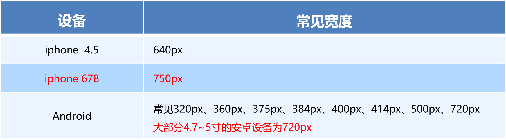
- 我们关心的尺寸有 320px、360px、375px、384px、400px、414px、424px、480px、540px、720px、750px
- 划分的份数我们定为 15等份
- 因为我们pc端也可以打开我们苏宁移动端首页,我们默认html字体大小为 50px,注意这句话写到最上面
// 设置常见的屏幕尺寸 修改里面的html文字大小
a {
    text-decoration: none;
}
// 一定要写到最上面
html {
    font-size: 50px;
}
// 我们此次定义的划分的份数 为 15
@no: 15;
// 320
@media screen and (min- 320px) {
    html {
        font-size: 320px / @no;
    }
}
// 360
@media screen and (min- 360px) {
    html {
        font-size: 360px / @no;
    }
}
// 375 iphone 678
@media screen and (min- 375px) {
    html {
        font-size: 375px / @no;
    }
}

// 384
@media screen and (min- 384px) {
    html {
        font-size: 384px / @no;
    }
}

// 400
@media screen and (min- 400px) {
    html {
        font-size: 400px / @no;
    }
}
// 414
@media screen and (min- 414px) {
    html {
        font-size: 414px / @no;
    }
}
// 424
@media screen and (min- 424px) {
    html {
        font-size: 424px / @no;
    }
}

// 480
@media screen and (min- 480px) {
    html {
        font-size: 480px / @no;
    }
}

// 540
@media screen and (min- 540px) {
    html {
        font-size: 540px / @no;
    }
}
// 720
@media screen and (min- 720px) {
    html {
        font-size: 720px / @no;
    }
}

// 750
@media screen and (min- 750px) {
    html {
        font-size: 750px / @no;
    }
}
新建index.less文件
- 新建index.less 这里面写首页的样式
- 将刚才设置好的 common.less 引入到index.less里面 语法如下:
// 在 index.less 中导入 common.less 文件
@import “common”
- 生成index.css 引入到 index.html 里面
body样式
body {
min- 320px;
15rem;
margin: 0 auto;
line-height: 1.5;
font-family: Arial,Helvetica;
background: #F2F2F2;
}
搜索页面模块布局
效果
主要关注高度的自适应和宽度的自适应
// 页面元素rem计算公式: 页面元素的px / html 字体大小 50
// search-content
@baseFont: 50;
.search-content {
    display: flex;
    position: fixed;
    //定位的盒子,不能使用margin 0 auto 来进行水平居中哦,需要使用top left
    top: 0;
    left: 50%;
    transform: translateX(-50%);
     15rem;
    height: 88rem / @baseFont;
    background-color:#FFC001;
 }
index.html
    <!-- 顶部搜索框 -->
    <div class="search-content">
        <a href="#" class="classify"></a>
        <div class="search">
            <form action="">
                <input type="search" value="厨卫保暖季 哒哒哒">
            </form>
        </div>
        <a href="#" class="login">登录</a>
    </div>
搜索模块制作
注意:这里的input type属性是CSS3新增的属性,所以input是CSS3盒子,padding不会撑大盒子,如果使用的不是CSS3新增的属性,则会撑大
使用了flex进行布局
图片缩放知识
input去掉默认蓝色边框知识
@baseFont: 50;
.search-content {
    display: flex;
    position: fixed;
    //定位的盒子,不能使用margin 0 auto 来进行水平居中哦,需要使用top left
    top: 0;
    left: 50%;
    transform: translateX(-50%);
     15rem;
    height: 88rem / @baseFont;
    background-color:#FFC001;
    .classify {
         44rem / @baseFont;
        height: 70rem / @baseFont;
        margin: 11rem / @baseFont 25rem / @baseFont 7rem / @baseFont 24rem / @baseFont;
        background: url(../images/classify.png) no-repeat;
        // 背景缩放 背景大小跟随父元素的大小
        background-size: 44rem / @baseFont 70rem / @baseFont;
    }
    .search {
        // 剩余空间全部给这个盒子
        flex: 1;
        // 这里的input type属性是CSS3新增的属性,所以input是CSS3盒子,padding不会撑大盒子,如果使用的不是CSS3新增的属性,则会撑大
        input {
            // 去掉默认蓝色边框
            outline: none;
             100%;
            border: 0;
            height: 66rem / @baseFont;
            border-radius: 33rem / @baseFont;
            background-color:#FFF2CC;
            margin-top: 12rem / @baseFont;
            font-size: 25rem / @baseFont;
            padding-left: 55rem / @baseFont;
            color: #757575;
        }
    }
    .login {
         75rem / @baseFont;
        height: 70rem / @baseFont;
        line-height: 70rem / @baseFont;
        margin: 10rem / @baseFont;
        font-size: 25rem / @baseFont;
        text-align: center;
        color: #fff;

    }
}
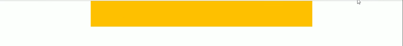
banner和广告模块制作
// banner
.banner {
     750rem / @baseFont;
    height: 368rem / @baseFont;
    img {
         100%;
        height: 100%;
    }
}
// ad
.ad {
    display: flex;
    a {
        flex: 1;
        img {
             100%;
        }
    }
}
    <!-- banner部分 -->
    <div class="banner">
        <img src="upload/banner.gif" alt="">
    </div>
    <!-- 广告部分 -->
    <div class="ad">
        <a href="#"><img src="upload/ad1.gif" alt=""></a>
        <a href="#"><img src="upload/ad2.gif" alt=""></a>
        <a href="#"><img src="upload/ad3.gif" alt=""></a>
    </div>
nav部分制作
nav {
     750rem / @baseFont;
    a {
        float: left;
         150rem / @baseFont;
        height: 140rem / @baseFont;
        text-align: center;
        img {
            display: block;
             82rem / @baseFont;
            height: 82rem / @baseFont;
            margin: 10rem / @baseFont auto 0;
        }
        span {
            font-size: 25rem / @baseFont;
            color: #333;
        }
    }
}
    <!-- nav模块 -->
    <nav>
        <a href="#">
            <img src="upload/nav1.png" alt="">
            <span>爆款手机</span>
        </a>
        <a href="#">
            <img src="upload/nav1.png" alt="">
            <span>爆款手机</span>
        </a>
        <a href="#">
            <img src="upload/nav1.png" alt="">
            <span>爆款手机</span>
        </a>
        <a href="#">
            <img src="upload/nav1.png" alt="">
            <span>爆款手机</span>
        </a>
        <a href="#">
            <img src="upload/nav1.png" alt="">
            <span>爆款手机</span>
        </a>
        <a href="#">
            <img src="upload/nav1.png" alt="">
            <span>爆款手机</span>
        </a>
        <a href="#">
            <img src="upload/nav1.png" alt="">
            <span>爆款手机</span>
        </a>
        <a href="#">
            <img src="upload/nav1.png" alt="">
            <span>爆款手机</span>
        </a>
        <a href="#">
            <img src="upload/nav1.png" alt="">
            <span>爆款手机</span>
        </a>
        <a href="#">
            <img src="upload/nav1.png" alt="">
            <span>爆款手机</span>
        </a>

    </nav>
苏宁首页完整DEMO
本地:F:\谷歌下载\移动web开发-rem布局案例素材\案例\H5
git:https://gitee.com/xiaoqiang001/html_css_material/raw/master/移动web开发-rem布局案例素材.rar
rem制作虽然有些繁琐,但是制作后比较漂亮。有自适应效果
rem适配方案二 flexible.js
简介
1、手机淘宝团队出的简洁高效 移动端适配库
2、我们再也不需要在写不同屏幕的媒体查询,因为里面js做了处理
3、它的原理是把当前设备划分为10等份,但是不同设备下,比例还是一致的。
4、我们要做的,就是确定好我们当前设备的html 文字大小就可以了,比如当前设计稿是 750px, 那么我们只需要把 html 文字大小设置为 75px(750px / 10) 就可以。里面页面元素rem值: 页面元素的px 值 / 75。剩余的,让flexible.js来去算
5、github地址:https://github.com/amfe/lib-flexible
接下来,我们就要使用这种方案来实现苏宁首页。
使用flexible.js制作苏宁首页
设置视口,引入css
<meta name="viewport" content="width=device-width, user-scalable=no,initial-scale=1.0, maximum-scale=1.0, minimum-scale=1.0">
<link rel="stylesheet" href="css/normalize.css">
<link rel="stylesheet" href="css/index.css">
引入JS
在 index.html 中 引入 flexible.js 这个文件
<script src=“js/flexible.js”> </script>
设置body样式
body {
    min- 320px;
    // 这里需要限定最大宽度哦,不然超过这个值,会变大的
    max- 750px;
    /* flexible 给我们划分了 10 等份 */
     10rem;
    margin: 0 auto;
    line-height: 1.5;
    font-family: Arial, Helvetica;
    background: #f2f2f2;
}
VSCode px 转换rem 插件 cssrem
会自动将px 自动转为rem。
安装完成之后需要设置html基准大小,默认是16px对应1rem
我们的设计稿是750px,现在引入了js,分成10等分,所以需要设置成75px:
打开 设置 快捷键是 ctrl + 逗号

设置完成后,重启vs Code。
效果

如果屏幕超过750px,我们就按照设计稿来走,不让屏幕超过750px
/* 如果我们的屏幕超过了 750px  那么我们就按照 750设计稿来走 不会让我们页面超过750px */

@media screen and (min- 750px) {
    html {
        font-size: 75px!important;
    }
}
完整代码
body {
    min- 320px;
    max- 750px;
    /* flexible 给我们划分了 10 等份 */
     10rem;
    margin: 0 auto;
    line-height: 1.5;
    font-family: Arial, Helvetica;
    background: #f2f2f2;
}

a {
    text-decoration: none;
    font-size: .333333rem;
}


/* 这个插件默认的html文字大小 cssroot  16px */


/*
img {
     5.125rem;
    height: 4rem;
     1rem;
     1.093333rem;
    height: 1rem;
} */


/* 如果我们的屏幕超过了 750px  那么我们就按照 750设计稿来走 不会让我们页面超过750px */

@media screen and (min- 750px) {
    html {
        font-size: 75px!important;
    }
}


/* search-content */

.search-content {
    display: flex;
    position: fixed;
    top: 0;
    left: 50%;
    transform: translateX(-50%);
     10rem;
    height: 1.173333rem;
    background-color: #FFC001;
}

.classify {
     .586667rem;
    height: .933333rem;
    margin: .146667rem .333333rem .133333rem;
    background: url(../images/classify.png) no-repeat;
    background-size: .586667rem .933333rem;
}

.search {
    flex: 1;
}

.search input {
    outline: none;
    border: 0;
     100%;
    height: .88rem;
    font-size: .333333rem;
    background-color: #FFF2CC;
    margin-top: .133333rem;
    border-radius: .44rem;
    color: #757575;
    padding-left: .733333rem;
}

.login {
     1rem;
    height: .933333rem;
    margin: .133333rem;
    color: #fff;
    text-align: center;
    line-height: .933333rem;
    font-size: .333333rem;
}
<!DOCTYPE html>
<html lang="en">

<head>
    <meta charset="UTF-8">
    <meta name="viewport" content="width=device-width, user-scalable=no,initial-scale=1.0, maximum-scale=1.0, minimum-scale=1.0">

    <meta http-equiv="X-UA-Compatible" content="ie=edge">
    <link rel="stylesheet" href="css/normalize.css">
    <link rel="stylesheet" href="css/index.css">
    <!-- 引入我们的flexible.js 文件 -->
    <script src="js/flexible.js"></script>
    <title>Document</title>
</head>

<body>
    <div class="search-content">
        <a href="#" class="classify"></a>
        <div class="search">
            <form action="">
                <input type="search" value="rem适配方案2很开心哦">
            </form>
        </div>
        <a href="#" class="login">登录</a>
    </div>
</body>

</html>