最近在了解移动框架的相关知识,在此之中发现了一部分动画需要使用css 3种的动画属性,于是在闲暇时间了解了css3的动画知识。于是写本博客总结。
首先了解一下CSS 3中transition过渡属性:
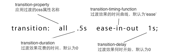
简: transition:<transition-property> <ransition-duration> <transition-timing-function> <transition-delay>;如下图:
通过给相关元素添加transition样式属性就可以为此添加过渡的效果,如下图中的logo图像的:hover状态下logo图片会由透明度为1到0过渡,具体代码如下:
css 样式代码
 1 /************** 圆角边框样式 ******************/
 2         .radius-box {
 3             border-radius: 100px;
 4             -webkit-border-radius: 100px;
 5             -moz-border-radius: 100px;
 6             -o-border-radius: 100px;
 7         }
 8
 9         /************** 容器样式 ******************/
10         .container-box {
11             width: 100px;
12             height: 100px;
13             border: solid 5px #ccc;
14
15         }
16
17         /************** logo样式 ******************/
18
19         .logo {
20             width: 100px;
21             height: 100px;
22             border: solid 5px #ffffff;
23             box-sizing: border-box;
24             opacity: 1;
25             transition: opacity 1s ease .1s;
26             -webkit-transition: opacity 1s ease .1s; /* Safari 和 Chrome */
27             -moz-transition: opacity 1s ease .1s; /* Firefox 4 */
28             -o-transition: opacity 1s ease .1s;/* Opera */
29         }
30
31         /************** logo:hover状态下将opacity改为0 ******************/
32         .logo:hover {
33             opacity: 0;
34         }
HTML代码
1 <!-- 容器 -->
2 <div class="container-box radius-box">
3     <!-- logo -->
4     <img class="logo radius-box" src="images/logo.jpeg" alt="logo图片"/>
5     <!-- logo end -->
6 </div>
7 <!-- 容器 end -->
效果
这个样子还是有点单调,所以现在在进行一下修饰,为logo添加上第二个css属性即 transform ;
transform:转换属性,本属性主要的作用是对元素进行旋转、缩放、移动或倾斜;
translate(x,y):2D 转换 点击查看效果
scale(x,y): 2D 缩放转换 点击查看效果
rotate(angle):2D 旋转,在参数中规定角度 点击查看效果
skew(x-angle,y-angle): 沿着 X 和 Y 轴的 2D 倾斜转换 点击查看效果
以上是简单的属性介绍,接下来我们来修改一下我们的代码:
新css 样式代码
 1 /************** 圆角边框样式 ******************/
 2         .radius-box {
 3             border-radius: 100px;
 4             -webkit-border-radius: 100px;
 5             -moz-border-radius: 100px;
 6             -o-border-radius: 100px;
 7         }
 8
 9         /************** 容器样式 ******************/
10         .container-box {
11             width: 100px;
12             height: 100px;
13             border: solid 5px #ccc;
14
15         }
16
17         /************** logo样式 ******************/
18
19         .logo {
20             width: 100px;
21             height: 100px;
22             border: solid 5px #ffffff;
23             box-sizing: border-box;
24             opacity: 1;
25             transition: opacity 1s ease .1s, width 1s, height 1s,transform 1s;
26             -webkit-transition: opacity 1s ease .1s, width 1s, height 1s,transform 1s; /* Safari 和 Chrome */
27             -moz-transition: opacity 1s ease .1s, width 1s, height 1s,transform 1s; /* Firefox 4 */
28             -o-transition: opacity 1s ease .1s, width 1s, height 1s,transform 1s; /* Opera */
29         }
30
31         /************** logo:hover状态下将opacity改为0 ******************/
32         .logo:hover {
33             opacity: 0;
34             width: 0;
35             height: 0;
36             transform: translate(50px,50px);
37             -moz-transform: translate(50px,50px);
38             -webkit-transform: translate(50px,50px);
39             -o-transform: translate(50px,50px);
40         }
HTML结构不变。这样修改后的效果为:
这样修改以后效果会之前的更有感觉。