前两天封装了一个基于vue和Element的table表格组件,阅读的人还是很多的,看来大家都是很认同组件化、高复用这种开发模式的,毕竟开发效率高,代码优雅,逼格高嘛。虽然这两天我的心情很糟糕,就像“懂王”怼记者:“你是一个糟糕的记者;CNN,Fake news”一样的心情,但我还是忍着难受的心情来工作和分享,毕竟工作是饭碗,分享也能化解我糟糕透顶的心情。
今天,就来分享一下基于vue和Element所封装的form表单组件,其中所用到的技术,在上一篇文章封装Vue Element的table表格组件中已介绍的差不多了,今天再来多讲一个vue的动态组件component。关于动态组件component的介绍,vue官网倒是很吝啬,就只是给了一个例子来告诉我们如何使用而已。我们可以把它理解成一个占位符,其具体展示什么,是由isattribute来实现的,比如官网给的例子:
<component v-bind:is="currentTabComponent"></component>
在上述示例中,currentTabComponent可以包括:
-
已注册组件的名字
-
或一个组件的选项对象
就酱,对它的介绍完了。
如果你还想了解更多,可以去vue官网查看。
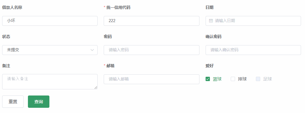
接下来就是封装的具体实现,照例先来张效果图:
1、封装的form表单组件Form.vue:
<template>
  <el-form ref="form" :model="form" :rules="rules" size="small" :label-position="'top'">
    <el-row :gutter="20" v-for="(row, i) in columns" :key="i">
      <el-col :span="24 / rowSize" v-for="(x, idx) in row" :key="idx">
        <el-form-item :label="x.label" :prop="x.prop">
          <component v-model.trim="form[x.prop]" v-bind="componentAttrs(x)" class="width100" />
        </el-form-item>
      </el-col>
    </el-row>
    <div class="searchBtn" v-if="footer">
      <el-button class="filter-item" @click="reset">重置</el-button>
      <el-button class="filter-item" type="primary" @click="submit">查询</el-button>
    </div>
  </el-form>
</template>

<script>
import { fromEntries, chunk } from '@/utils'
export default {
  props: {
    config: Object,
  },
  components: {
    selectBar: {
      functional: true,
      props: {value: String, list: Array, callback: Function},
      render(h, {props: {value = '', list = [], callback}, data: {attrs = {}}, listeners: {input}}){
        return h('el-select', {class: 'width-full', props: {value, ...attrs}, on: {change(v) {input(v); callback(v)}}}, list.map(o => h('el-option', {props: {...o, key: o.value}})))
      }
    },
    checkbox: {
      functional: true,
      props: {value: Boolean, label: String },
      render(h, {props: {value = '', label = ''}, data: {attrs = {}}, listeners: {input}}){
        return h('el-checkbox', {props: {value, ...attrs}, on: {change(v) {input(v)}}}, label)
      }
    },
    checkboxGroup: {
      functional: true,
      props: {value: Array, list: Array},
      render(h, {props: {value = [], list = []}, data: {attrs = {}}, listeners: {input}}){
        return h('el-checkbox-group', {props: {value, ...attrs}, on: {input(v) {input(v)}}}, list.map(o => h('el-checkbox', {props: {...o, label: o.value, key: o.value}}, [o.label])))
      }
    },
    radioGroup: {
      functional: true,
      props: {value: String, list: Array },
      render(h, {props: {value = '', list = []}, data: {attrs = {}}, listeners: {input}}){
        return h('el-radio-group', {props: {value, ...attrs}, on: {input(v) {input(v)}}}, list.map(o => h('el-radio', {props: {...o, key: o.label}}, [o.value])))
      }
    },
  },
  data(){
    const { columns = [], data = {}, rowSize = 3 } =  this.config || {};

    return {
      TYPE: {
        select: {
          is: 'selectBar',
          clearable: true,
        },
        text: {
          is: 'el-input',
          clearable: true,
        },
        switch: {
          is: 'el-switch',
        },
        checkbox: {
          is: 'checkbox',
          clearable: true,
        },
        checkboxGroup: {
          is: 'checkboxGroup',
          clearable: true,
        },
        radioGroup: {
          is: 'radioGroup',
          clearable: true,
        },
        daterange: {
          is: 'el-date-picker',
          type: 'daterange',
          valueFormat: 'yyyy-MM-dd',
          rangeSeparator: '至',
          startPlaceholder: '开始日期',
          endPlaceholder: '结束日期',
          editable: false,
        },
        date: {
          is: 'el-date-picker',
          type: "date",
          valueFormat: 'yyyy-MM-dd',
          editable: false,
        },
        auto: {
          is: 'el-autocomplete'
        }
      },
      form: columns.reduce((r, c) => Object.assign(r, {[c.prop]: data && data[c.prop] ? data[c.prop] : (c.is == 'checkboxGroup' ? [] : '')}), {}),
      rules: columns.reduce((r, c) => ({...r, [c.prop]: c.rules ? c.rules : []}), {}),
      columns: chunk(columns, rowSize),
      rowSize,
    }
  },
  computed: {
    footer(){
      const { footer = true } =  this.config || {};
      return footer
    }
  },
  mounted(){
    this.reset();
  },
  methods: {
    componentAttrs(item) {
      const {is = 'text', label} = item, attrs = fromEntries(Object.entries(item).filter(n => !/^(prop|is|rules)/.test(n[0]))),
      placeholder = (/^(select|el-date-picker)/.test(is) ? '请选择' : '请输入') + label;

      return {...attrs, ...this.TYPE[is], placeholder}
    },
    reset() {
      this.$refs.form.resetFields();
    },
    /*
     * 这里区分了两种情况(footer默认为true,代表默认会展示封装的form组件自带的查询、重置按钮):
     * 1、不使用封装的form组件中自带的查询、重置按钮,则需要使用回调的方式获取form表单的值
     * 2、使用封装的form组件中自带的查询、重置按钮,则需要在使用时通过父组件向封装的form子组件传一个函数submit来获取form表单的值
    */
    submit(cb = () => {}) {
      // 第一种情况
      !this.footer && this.$refs.form.validate(valid => valid && cb(this.form));
      // 第二种情况
      this.footer && this.$refs.form.validate(valid => valid && this.$emit('submit', this.form));
    },
  }
};
</script>

<style scoped>
.width100{ 100%;}
</style>
在封装的时候发现一个问题,就是有时候可能一行展示两列表单,有时候呢可能一行又要展示三列或四列表单,这样的话,也是需要在封装的时候去实现可配置的效果的,那么本次封装就顺便封装了一个类似lodash的_.chunk的工具来实现分段展示。
lodash对_.chunk的定义:将数组array拆分成多个size长度的区块,并将这些区块组成一个新数组。如果array无法被分割成全部等长的区块,那么最后剩余的元素将组成一个区块。
其实lodash这个工具库就像它官网介绍的那样,确实很实用,但需要经常使用才可以掌握它所包含的工具,否则,也是百脸懵逼。不过它的很多工具从字面意思来看,也不难理解其代表的意思。
自己封装的分段chunk.js
export const chunk = (array, size) => {
  if (!array.length || size < 1) return [];
  let result = [];
  array.forEach((item, index) => {
     const rowSize = Math.floor(index / size);
     if(!(result[rowSize] instanceof Array)){
        result[rowSize] = [];
     }
     result[rowSize].push(item);
   })
   return result;
}
另外,在封装时有一个Object.fromEntries的方法不兼容ie,比如这里我本来写的是:
const attrs = Object.fromEntries(Object.entries(item).filter(n => !/^(prop|is|rules)/.test(n[0])))
但我们公司又要求项目可以兼容ie(我们公司的ie基本都是ie11),所以只能自己封装了一个fromEntries方法来代替Object.fromEntries。
export const fromEntries = arr => {
  if (Object.prototype.toString.call(arr) === '[object Map]') {
    let result = {};
    for (const key of arr.keys()) {
      result[key] = arr.get(key);
    }

    return result;
  }

  if(Array.isArray(arr)){
    let result = {}
    arr.map(([key,value]) => {
      result[key] =  value
    })

    return result
  }
  throw 'Uncaught TypeError: argument is not iterable';
}
2、使用已封装的表单组件:
<template>
  <Form :config="config" @submit="getList" ref="form" />
</template>

<script>
import Form from "./Form";

const statusLlist = [
  {label: '未提交', value: "0"},
  {label: '待审批', value: "1"},
  {label: '已通过', value: "2", disabled: true}
]

export default {
  components: {
    Form,
  },
  data() {
    const confimPass = (rule, value, callback) => {
      if (value === '') {
        callback(new Error('请再次输入密码'));
      } else if (value !== this.$refs.form.form.password) {
        callback(new Error('两次输入密码不一致!'));
      } else {
        callback();
      }
    };

    return {
      config: {
        columns: [
          { prop: "name", label: "借款人名称", is: "auto", fetchSuggestions: this.querySearch },
          { prop: "certificateId", label: "统一信用代码", rules: [{required: true, message: '请输入统一信用代码'}] },
          { prop: 'daterange', label: "日期范围", is: 'daterange', },
          { prop: 'date', label: "日期", is: 'date', },
          { prop: 'status', label: "状态", is: 'select', list: statusLlist, callback: r => this.statusChange(r) },
          { prop: "password", label: "密码", type: 'password' },
          { prop: "confimPass", label: "确认密码", type: 'password', rules: [{validator: confimPass}] },
          { prop: 'remark', label: "备注", type: 'textarea' },
          { prop: "email", label: "邮箱", rules: [{ required: true, message: '请输入邮箱地址' }, { type: 'email', message: '请输入正确的邮箱地址' }] },
          { prop: 'remember', label: '记住密码', is: 'checkbox' },
          { prop: 'gender', label: '性别', is: 'radioGroup', list: [{label: 'male', value: "男"}, {label: 'famale', value: "女", disabled: true}] },
          { prop: 'love', label: '爱好', is: 'checkboxGroup', list: [{label: '篮球', value: "0"}, {label: '排球', value: "1"}, {label: '足球', value: "2", disabled: true}] },
          { prop: "delivery", label: "即时配送", is: 'switch' },
        ],
        data: {},
        rowSize: 3,   //一行可以展示几列表单,默认为3列
      },
    }
  },
  created(){
    let data = {
      name: '陈公子',
      certificateId: '222',
      status: '0',
      love: ['0']
    };
    this.config.data = data;
  },
  methods: {
    querySearch(q, cb){
      if (!q) {cb([]);return}
    },
    getList(res){
      console.log(res)
    },
    statusChange(r){
      console.log(r)
    },
  },
}
</script>
本次封装的form表单组件,基本考虑到了在日常开发中会经常使用到的表单组件,如果还有其他的需求,可自行添加。另外,本次封装也对表单的回显(返显)做了实现,比如我们在编辑数据时,需要将被修改的数据显示在表单中,本次封装就充分考虑到了这一点,只要你在传给封装的form组件的参数中加一个data参数,并将需要回显的数据名称一一对应并赋值就可以了。回显的时候有一个问题需要注意:如果需要回显的表单组件是在一个页面中而非嵌套在弹窗组件中,那么需要将回显的方法写在页面的created生命周期函数中,比如:
created(){
  let data = {
    name: '陈公子',
    certificateId: '222',
    status: '0',
    love: ['0']
  };
  this.config.data = data;
},
为什么要这么做呢?为什么不写在mounted生命周期函数中呢?这就涉及到父子组件的生命周期函数的加载顺序的问题了。为什么要考虑父子组件的生命周期函数的加载顺序呢?是因为考虑到所封装的表单组件的通用性原则,我把重置表单组件的方法写在了所封装的表单组件的mounted生命周期函数中了,而由于父子组件的生命周期函数的加载顺序为:
父beforeCreate->父created->父beforeMount->子beforeCreate->子created->子beforeMount->子mounted->父mounted
因此如果把回显的方法放在父组件的mounted周期函数中,那么经过Form子组件的先一步重置会使得无法正常回显出数据。如果form组件是嵌套在了弹窗组件中,那么是把回显的方法写在了弹出弹窗组件的方法中,就没有这个问题。