# 导入第三方包
import pandas as pd
# 读入数据
skin = pd.read_excel(r'F:\python_Data_analysis_and_mining\12\Skin_Segment.xlsx')
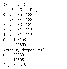
print(skin.shape)
print(skin.head())
# 设置正例和负例
skin.y = skin.y.map({2:0,1:1})
a = skin.y.value_counts()
print(a)
# 导入第三方模块
from sklearn import naive_bayes
from sklearn import model_selection
# 样本拆分
X_train,X_test,y_train,y_test = model_selection.train_test_split(skin.iloc[:,:3], skin.y, test_size = 0.25, random_state=1234)
# 调用高斯朴素贝叶斯分类器的“类”
gnb = naive_bayes.GaussianNB()
# 模型拟合
gnb.fit(X_train, y_train)
# 模型在测试数据集上的预测
gnb_pred = gnb.predict(X_test)
# 各类别的预测数量
b = pd.Series(gnb_pred).value_counts()
print(b)
# 导入第三方包
from sklearn import metrics
import matplotlib.pyplot as plt
import seaborn as sns
# 构建混淆矩阵
cm = pd.crosstab(gnb_pred,y_test)
# 绘制混淆矩阵图
sns.heatmap(cm, annot = True, cmap = 'GnBu', fmt = 'd')
# 去除x轴和y轴标签
plt.xlabel('Real')
plt.ylabel('Predict')
# 显示图形
plt.show()
print('模型的准确率为:
',metrics.accuracy_score(y_test, gnb_pred))
print('模型的评估报告:
',metrics.classification_report(y_test, gnb_pred))
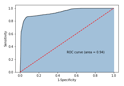
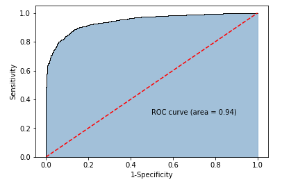
# 计算正例的预测概率,用于生成ROC曲线的数据
y_score = gnb.predict_proba(X_test)[:,1]
fpr,tpr,threshold = metrics.roc_curve(y_test, y_score)
# 计算AUC的值
roc_auc = metrics.auc(fpr,tpr)
# 绘制面积图
plt.stackplot(fpr, tpr, color='steelblue', alpha = 0.5, edgecolor = 'black')
# 添加边际线
plt.plot(fpr, tpr, color='black', lw = 1)
# 添加对角线
plt.plot([0,1],[0,1], color = 'red', linestyle = '--')
# 添加文本信息
plt.text(0.5,0.3,'ROC curve (area = %0.2f)' % roc_auc)
# 添加x轴与y轴标签
plt.xlabel('1-Specificity')
plt.ylabel('Sensitivity')
# 显示图形
plt.show()

# 导入第三方包
import pandas as pd
# 读取数据
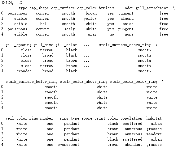
mushrooms = pd.read_csv(r'F:\python_Data_analysis_and_mining\12\mushrooms.csv')
print(mushrooms.shape)
# 数据的前5行
print(mushrooms.head())
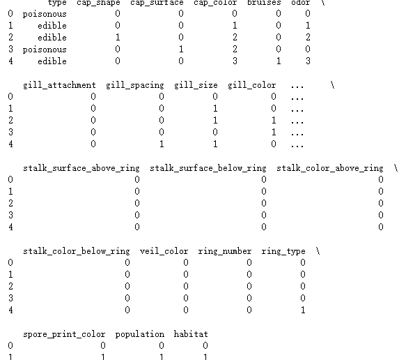
# 将字符型数据作因子化处理,将其转换为整数型数据
columns = mushrooms.columns[1:]
for column in columns:
mushrooms[column] = pd.factorize(mushrooms[column])[0]
print(mushrooms.head())
from sklearn import model_selection
# 将数据集拆分为训练集合测试集
Predictors = mushrooms.columns[1:]
X_train,X_test,y_train,y_test = model_selection.train_test_split(mushrooms[Predictors], mushrooms['type'], test_size = 0.25, random_state = 10)
import seaborn as sns
import matplotlib.pyplot as plt
from sklearn import naive_bayes
from sklearn import metrics
# 构建多项式贝叶斯分类器的“类”
mnb = naive_bayes.MultinomialNB()
# 基于训练数据集的拟合
mnb.fit(X_train, y_train)
# 基于测试数据集的预测
mnb_pred = mnb.predict(X_test)
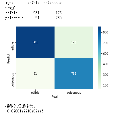
# 构建混淆矩阵
cm = pd.crosstab(mnb_pred,y_test)
print(cm)
# 绘制混淆矩阵图
sns.heatmap(cm, annot = True, cmap = 'GnBu', fmt = 'd')
# 去除x轴和y轴标签
plt.xlabel('Real')
plt.ylabel('Predict')
# 显示图形
plt.show()
# 模型的预测准确率
print('模型的准确率为:
',metrics.accuracy_score(y_test, mnb_pred))
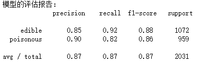
print('模型的评估报告:
',metrics.classification_report(y_test, mnb_pred))
from sklearn import metrics
# 计算正例的预测概率,用于生成ROC曲线的数据
y_score = mnb.predict_proba(X_test)[:,1]
fpr,tpr,threshold = metrics.roc_curve(y_test.map({'edible':0,'poisonous':1}), y_score)
# 计算AUC的值
roc_auc = metrics.auc(fpr,tpr)
# 绘制面积图
plt.stackplot(fpr, tpr, color='steelblue', alpha = 0.5, edgecolor = 'black')
# 添加边际线
plt.plot(fpr, tpr, color='black', lw = 1)
# 添加对角线
plt.plot([0,1],[0,1], color = 'red', linestyle = '--')
# 添加文本信息
plt.text(0.5,0.3,'ROC curve (area = %0.2f)' % roc_auc)
# 添加x轴与y轴标签
plt.xlabel('1-Specificity')
plt.ylabel('Sensitivity')
# 显示图形
plt.show()
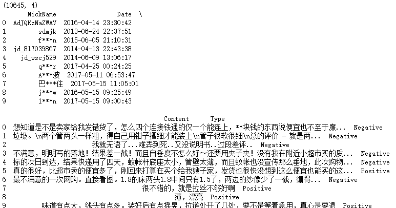
import pandas as pd
# 读入评论数据
evaluation = pd.read_excel(r'F:\python_Data_analysis_and_mining\12\Contents.xlsx',sheetname=0)
print(evaluation.shape)
# 查看数据前10行
print(evaluation.head(10))
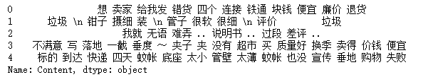
# 运用正则表达式,将评论中的数字和英文去除
evaluation.Content = evaluation.Content.str.replace('[0-9a-zA-Z]','')
print(evaluation.head())

# 导入第三方包
import jieba
# 加载自定义词库
jieba.load_userdict(r'F:\python_Data_analysis_and_mining\12\all_words.txt')
# 读入停止词
with open(r'F:\python_Data_analysis_and_mining\12\mystopwords.txt', encoding='UTF-8') as words:
stop_words = [i.strip() for i in words.readlines()]
# 构造切词的自定义函数,并在切词过程中删除停止词
def cut_word(sentence):
words = [i for i in jieba.lcut(sentence) if i not in stop_words]
# 切完的词用空格隔开
result = ' '.join(words)
return(result)
# 对评论内容进行批量切词
words = evaluation.Content.apply(cut_word)
# 前5行内容的切词效果
print(words[:5])
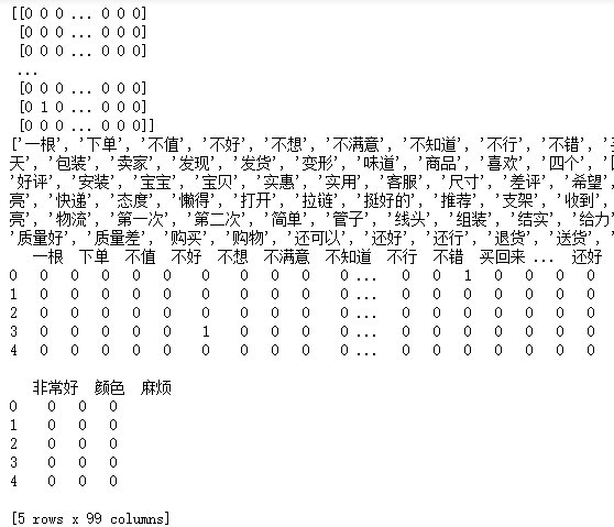
# 导入第三方包
from sklearn.feature_extraction.text import CountVectorizer
# 计算每个词在各评论内容中的次数,并将稀疏度为99%以上的词删除
counts = CountVectorizer(min_df = 0.01)
# 文档词条矩阵
dtm_counts = counts.fit_transform(words).toarray()
print(dtm_counts)
# 矩阵的列名称
columns = counts.get_feature_names()
print(columns)
# 将矩阵转换为数据框--即X变量
X = pd.DataFrame(dtm_counts, columns=columns)
# 情感标签变量
y = evaluation.Type
print(X.head())
import matplotlib.pyplot as plt
import seaborn as sns
from sklearn import model_selection
from sklearn import naive_bayes
from sklearn import metrics
# 将数据集拆分为训练集和测试集
X_train,X_test,y_train,y_test = model_selection.train_test_split(X,y,test_size = 0.25, random_state=1)
# 构建伯努利贝叶斯分类器
bnb = naive_bayes.BernoulliNB()
# 模型在训练数据集上的拟合
bnb.fit(X_train,y_train)
# 模型在测试数据集上的预测
bnb_pred = bnb.predict(X_test)
# 构建混淆矩阵
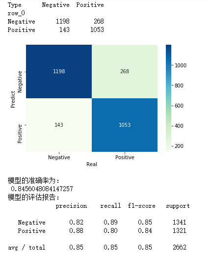
cm = pd.crosstab(bnb_pred,y_test)
print(cm)
# 绘制混淆矩阵图
sns.heatmap(cm, annot = True, cmap = 'GnBu', fmt = 'd')
# 去除x轴和y轴标签
plt.xlabel('Real')
plt.ylabel('Predict')
# 显示图形
plt.show()
# 模型的预测准确率
print('模型的准确率为:
',metrics.accuracy_score(y_test, bnb_pred))
print('模型的评估报告:
',metrics.classification_report(y_test, bnb_pred))
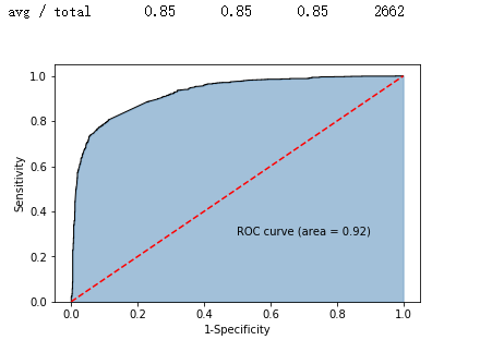
# 计算正例Positive所对应的概率,用于生成ROC曲线的数据
y_score = bnb.predict_proba(X_test)[:,1]
fpr,tpr,threshold = metrics.roc_curve(y_test.map({'Negative':0,'Positive':1}), y_score)
# 计算AUC的值
roc_auc = metrics.auc(fpr,tpr)
# 绘制面积图
plt.stackplot(fpr, tpr, color='steelblue', alpha = 0.5, edgecolor = 'black')
# 添加边际线
plt.plot(fpr, tpr, color='black', lw = 1)
# 添加对角线
plt.plot([0,1],[0,1], color = 'red', linestyle = '--')
# 添加文本信息
plt.text(0.5,0.3,'ROC curve (area = %0.2f)' % roc_auc)
# 添加x轴与y轴标签
plt.xlabel('1-Specificity')
plt.ylabel('Sensitivity')
# 显示图形
plt.show()