使用 Matplotlib 组件绘图时,经常要与 Numpy 组件搭配使用 。
使用 Matplotlib 绘图首先要导入 Matplotlib 组件 , 由于大部分绘图功能是在
matplotlib . pyplot 中 ,所 以通常会在导入 matplotlib . pyplot 时设置一个简短的别名 , 以
方便输入。 例如,我们可把别名取为 pit:

Matplotlib 给图的主要功能是给制 x 、 y 坐标图 。绘 图时,我们需要把 x 、 y 坐标
保存在列表变量中并传给 Matplotlib 。 例如,我们要给制 6 个点 :

x 坐标的列表及 y 坐标的列表的元素数目必须相同,否则执行时会产生“x and y
must have same first dimen s ion ,, 的错误 。
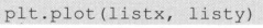
matplotlib . pyplot 绘制线图的方法为 plot ,语法为 :

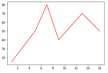
例如,我们要用 li stx 及 Ii sty 的列表进行绘图 :
绘图后如果不会自动显示,可用 s how 方法显示,例如:

import matplotlib.pyplot as plt

listx = [1,5,7,9,13,16]
listy = [15,50,80,40,70,50]
plt.plot(listx, listy, color ="red")
plt.show()
plot 方法的参数及图形设置
matplotlib.pyplot 的 plot 方法,除了 x 坐标列表及 y 坐标列表为必需的参数外,
还有数十个可选参数可用于设置绘图特性,下面是 4 个常用可选参数:
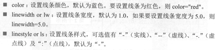

例如,给制红色、虚线、线宽为 5 、图形名称为 food 的线形图:

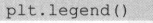
设置好属性后 ,执行 legend 方法进行显示 :
同时绘制多个图形
在同一个坐标系中可以绘制多个图形,我们通常会将所有图形都绘制完成后再
显示。例如我们要给制两个图形 :
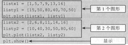
如果没有设置线条颜色,系统会自动设置不同颜色 。
圄形设置
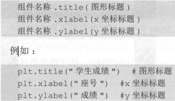
图形绘制完成后 , 可对图形做一些设置,如图标题、 x 及 y 坐标轴标题等,这样
可以让图形看起来更直观。
设置图形的标题、 x 坐标轴标题、 y 坐标轴标题的语法分别为 :
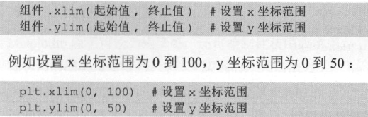
如果没有指定 x 坐标及 y 坐标范围,系统会根据数据判断最适合的 x 坐标及 y
坐标范围。我们也可以自行设置 x 、 y 的坐标范围,语法为 :
绘制两个线形图并设置其各个图形属性。
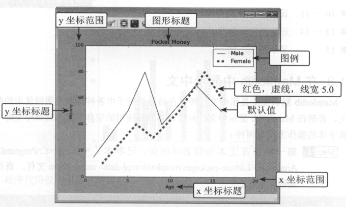
import matplotlib.pyplot as plt

listx1 = [1,5,7,9,13,16]
listy1 = [15,50,80,40,70,50]
plt.plot(listx1, listy1, label="Male")
listx2 = [2,6,8,11,14,16]
listy2 = [10,40,30,50,80,60]
plt.plot(listx2, listy2, color="red", linewidth=5.0, linestyle="--", label="Female")
plt.legend()
plt.xlim(0, 20)
plt.ylim(0, 100)
plt.title("Pocket Money")
plt.xlabel("Age")
plt.ylabel("Money")
plt.show()

在 Matplotlib 中显示中文
Matplotlib 默认无法显示中文,所以在前面的例子中各种标题及图例使用的都是
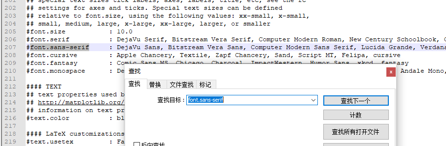
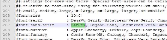
英文。若想在 Matplotlib 显示中文,只需将其默认使用的字体更改为简体中文即可。
更换字体的操作方法有两种:
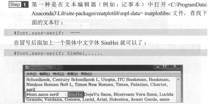

在自己python的安装路径中找到:

这种设置是永久性的。修改后建议把集成开发工具重启加载一下。
以上操作可能还存在一些问题,更为详细的的做法请参考这个链接:https://www.cnblogs.com/tszr/p/11228013.html
绘制柱状图及饼图
Matplotlib 除了可绘制线图外,还可绘制柱状图或饼图。
柱状图的绘制是通过 bar 方法来实现的,其语法为 :

绘制柱状图的参数与绘制线形图类似,除了一些线 的 属性参数(如线宽、线样
式等〉不能使用外,其余参数在绘制柱状图时都可以使用。
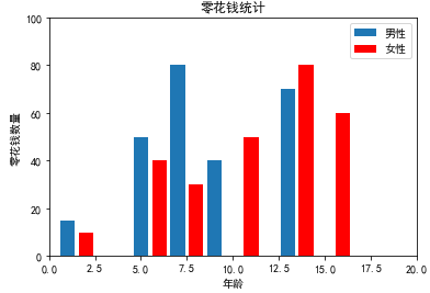
下例与前面的例子相同 , 只是现在我们用柱状图来呈现, 并用中文显示各项文字。
import matplotlib.pyplot as plt

from pylab import rcParams

rcParams["font.sans-serif"]=["SimHei"]

listx1 = [1,5,7,9,13,16]
listy1 = [15,50,80,40,70,50]
plt.bar(listx1, listy1, label="男性")
listx2 = [2,6,8,11,14,16]
listy2 = [10,40,30,50,80,60]
plt.bar(listx2, listy2, color="red", label="女性")
plt.legend()
plt.xlim(0, 20)
plt.ylim(0, 100)
plt.title("零花钱统计")
plt.xlabel("年龄")
plt.ylabel("零花钱数量")
plt.show()
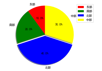
饼图是用 pi e 方法来绘制的,其语法为 :


饼图的展示效果虽然不错,但仅适合少量数据的呈现,若将圆饼图分块太多,
那么比例太小的数据就会看不清楚 。
import matplotlib.pyplot as plt

labels = ["东部", "南部", "北部", "中部"]
sizes = [5, 10, 20, 15]
colors = ["red", "green", "blue", "yellow"]
explode = (0, 0, 0.05, 0)
plt.pie(sizes,explode = explode,labels = labels,colors = colors,labeldistance = 1.1,autopct = "%3.1f%%",shadow = True,startangle = 90,pctdistance = 0.6)
plt.axis("equal")
plt.legend()
plt.show()