前面的话
在网页设计中,Sticky footers设计是最古老和最常见的效果之一,大多数人都曾经经历过。它可以概括如下:如果页面内容不够长的时候,页脚块粘贴在视窗底部;如果内容足够长时,页脚块会被内容向下推送。本文将详细介绍sticky footer的4种实现方式
绝对定位
常见的实现方法是对(.sticky)footer进行绝对定位,假设高度为50px。对父级(.box)进行相对定位,将html、body的高度设置为100%,父级(.box)的最小高度设置为100%,将(.content)内容部分设置padding-bottom为footer的高度,即50px,这里不用margin-bottom是因为会出现margin-bottom传递的情况
[注意]关于margin传递的详细情况移步至此
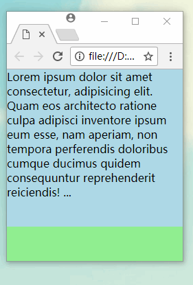
<style>
html,body{height:100%}
body{margin:0}
.box{position:relative;background-color:lightblue;min-height:100%;}
.content{padding-bottom:50px;}
.sticky{position:absolute;background-color:lightgreen;100%;height:50px;bottom:0;}
</style>
<div class="box">
  <main class="content">
    Lorem ipsum dolor sit amet consectetur, adipisicing elit. Quam eos architecto ratione culpa adipisci inventore ipsum eum esse, nam aperiam, non tempora perferendis doloribus cumque ducimus quidem consequuntur reprehenderit reiciendis!
    ...
  </main>
  <footer class="sticky"></footer>
</div>
效果如下
calc
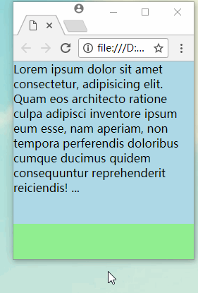
上面的代码中,因为要实现最小高度100%的效果,给html、body都设置为高度100%,不利于代码扩展。下面使用100vh来代替100%,代码会简洁很多。内容部分(.content)设置最小高度为calc(100vh - 50px)即可
[注意]关于视口单位vh的详细信息移步至此,关于calc的详细信息移步至此
<style>
body{margin:0}
.content{background-color:lightblue;min-height: calc(100vh - 50px)}
.sticky{background-color:lightgreen;height:50px;}
</style>
<div class="box">
  <main class="content">
    Lorem ipsum dolor sit amet consectetur, adipisicing elit. Quam eos architecto ratione culpa adipisci inventore ipsum eum esse, nam aperiam, non tempora perferendis doloribus cumque ducimus quidem consequuntur reprehenderit reiciendis!
    ...
  </main>
  <footer class="sticky"></footer>
</div>
效果如下
flex
上面的代码中,如果sticky的底部高度发生了变化,则内容部分的代码也需要进行相应地调整。如果使用flex,则可以更加灵活。为父级(.box)设置flex、上下排列及最小高度为100vh,为内容部分(.content)设置flex:1即可
[注意]关于flex的详细信息移步至此
<style>
body{margin:0}
.box{display:flex;flex-flow:column;min-height:100vh;background-color:lightblue;}
.content{flex:1;}
.sticky{background-color:lightgreen;height:50px;}
</style>
grid
作为最新布局方式的grid当然也可以实现,而且代码更加简洁
[注意]关于grid的详细信息移步至此
<style>
body{margin:0}
.box{display:grid;grid-template-rows:1fr 50px;min-height:100vh;}
.content{background-color:lightblue;}
.sticky{background-color:lightgreen;}
</style>
转载于:https://www.cnblogs.com/xiaohuochai/p/8391288.html