zoukankan      html  css  js  c++  java
  • 每天CSS学习之transform-origin

    上一篇中,我们学习了如何使用transform来进行2D变形。今天要讲述的transform-origin与这个变形有关。

    origin翻译过来的意思是原点、开端。transform-origin寓意即变形的起点。没错,它的作用就是设置变形的起点。

    transform-orgin:x-axis  y-axis  z-axis;

    翻译过来就是:

    transform-origin:X轴  Y轴  Z轴;

    X轴:left 、center 、right 、百分比、长度

    Y轴:top、center、bottom、百分比、长度

    Z轴:长度

    一般2D变形没有用到Z轴这个参数。

    接下来让我们实践一下,更容易明白。

    以顺时针旋转20度为例:

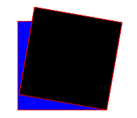
    1、没有设置transform-orgin时,变形起点默认为中心点:

                .trans1{        
                    z-index:-1;
                    position:absolute;
                    top:100px;
                    left:100px;
                    100px;
                    height:100px;
                    border:1px solid red;    
                    background-color:blue;
                    color:yellow;            
                }
                
                .trans2{                
                    z-index:1;
                    position:absolute;
                    top:100px;
                    left:100px;
                    100px;
                    height:100px;
                    border:1px solid red;    
                    background-color:black;
                    color:red;            
                    
                    transform:rotate(10deg);    
                }

    结果:

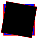
    2、设置变形的起点为盒子的右下角,即transform-origin:right bottom;

                .trans1{        
                    z-index:-1;
                    position:absolute;
                    top:100px;
                    left:100px;
                    100px;
                    height:100px;
                    border:1px solid red;    
                    background-color:blue;
                    color:yellow;            
                }
                
                .trans2{                
                    z-index:1;
                    position:absolute;
                    top:100px;
                    left:100px;
                    100px;
                    height:100px;
                    border:1px solid red;    
                    background-color:black;
                    color:red;            
                    
                    transform:rotate(10deg);        
                    transform-origin:right bottom;                
                }

    结果:


  • 相关阅读:
    list和set的区别
    tcp与udp协议的区别
    c3p0的数据库连接池
    mysql的连接
    HAVING 的使用 及笛卡尔积
    break-跳出内循环
    求素数(范围自改)
    1-100累加
    1-100累乘
    类实例:飞机大战
  • 原文地址:https://www.cnblogs.com/williamwsj/p/7401695.html
Copyright © 2011-2022 走看看