在移动网页,尤其是webapp中
常需要用到大量的css3动画,来获得良好交互体验
我之前帮朋友做了一个,可惜没帮上忙
现在和大家分享一下
目标是要做一个《炉石传说》游戏的介绍宣传页面,文字内容不多,主要是要和用户有互动
脑海中闪过很多见过的css3效果,决定总体采用一个3d翻转效果,每页再堆砌一些小动画
效果/演示
(在支持css3的浏览器中才能显示,ie11目前都不支持3d转换)
标题标题标题标题标题
文字文字文字文字
www.cnblogs.com/wingkun
文字文字文字文字
www.cnblogs.com/wingkun
title
内容内容内容内容内容内容内容内容内容内容内容内容内容内容内容素材
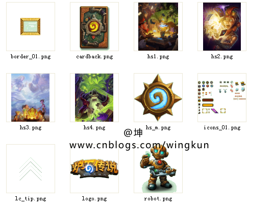
首先去网易炉石官网找到了这些素材:
HTML/JS
那么开始编码第一步,先建好上下前后左右六个面,这里左右两面不需要展示,可以不写
<div id="divOuter" class="ts">
        <!-- 前 -->
        <div class="o1">
            <div class="logo"></div>
            <div class="up"></div>
            <div class="o1_ct">
                <span>标题标题标题标题标题</span><br/>
                <span>文字文字文字文字</span><br/>
                <span style="font-size:20px;">www.cnblogs.com/wingkun</span>
            </div>
            <div class="up down"></div>
            <div class="o1_menu">
                <div class="d1">文字111</div>
                <div class="d2">文字222</div>
            </div>
        </div>
        <!-- 下 -->
        <div class="o2">
            <div class="o2_ct">
                <ul>
                    <li class="o2_1"></li>
                    <li class="o2_2"></li>
                    <li class="o2_3"></li>
                    <li class="o2_4"></li>
                </ul>
            </div>
        </div>
        <!-- 后 -->
        <div class="o3">
            <div class="o3_tx">
                <h1>title</h1>
                内容内容内容内容内容内容内容内容内容内容内容内容内容内容内容
            </div>
        </div>
        <!-- 上 -->
        <div class="o4">
            <div class="o4_r"></div>
            <br/>
            <div class="o4_ct">
                <div class="o4_p"></div>
                <div class="o4_p"></div>
                <div class="o4_p"></div>
            </div>
        </div>


        <!-- 左 -->
        <div class="o5">左</div>
        <!-- 右 -->
        <div class="o6">右</div>


    </div>
由于没有js权限,上面的例子是纯css的效果,固定的大小和翻转透视,
实际应用中应该用js根据设备分辨率来初始化大小,并且控制手指滑动来翻转,
使用了zepto,只是习惯了,这里不用也可以,改成原生js一样
如下:
    $(function(){

        var m={m:$("#divOuter"),startY:0,rx:0,$("body").width(),height:$("body").height() ,init:function(){

            this.m.parent().css("-webkit-perspective",this.height/2);
            this.m.css("-webkit-transform","translateZ(-"+ this.height/2+"px)");
            this.m.children().eq(0).css({"-webkit-transform":"translateZ("+this.height/2+"px)",this.width,height:this.height })
            this.m.children().eq(1).css({"-webkit-transform":"rotateX(-90deg)  translateZ("+this.height/2+"px)",this.width,height:this.height })
            this.m.children().eq(2).css({"-webkit-transform":"rotateX(180deg)  translateZ("+this.height/2+"px)",this.width,height:this.height })
            this.m.children().eq(3).css({"-webkit-transform":"rotateX(90deg)  translateZ("+this.height/2+"px)",this.width,height:this.height })
            this.m.children().eq(4).css({"-webkit-transform":"rotateY(-90deg)  translateZ("+this.width/2+"px)",this.width,height:this.height })
            this.m.children().eq(5).css({"-webkit-transform":"rotateY(90deg)  translateZ("+this.width/2+"px)",this.width,height:this.height })

            var _this = this;
            $("body").on("touchstart",function(e){
                var et = e.touches[0];
                _this.startY =  et.pageY;
            }).on("touchmove",function(e){

            }).on("touchend",function(e){
                var et = e.changedTouches[0];
                if(Math.abs(et.pageY-_this.startY)<10) return;
                var t = et.pageY-_this.startY >0?1:-1;
                _this.m.css( { "-webkit-transform":"translateZ(-"+_this.height/2+"px) rotateX("+ -( _this.rx += t*90)+"deg)"});

            });
        }};

        m.init();

    });
CSS/动画
然后,开始分别写每一页的动画效果,这里我只是堆了一些简单的动画,
效果有点拙计。。。具体的动画按需都可以再修改
动画比较多,请展开,这里只加了-webkit前缀,下面源代码下载里面写了两个前缀
如下:


body{text-align:center;margin:0px;padding:0px;font-size:12px;}

    .ts{-webkit-transition:1s ease-in-out;}
    #divOuter{width:100%;height:100%;position:relative;-webkit-transform-style:preserve-3d;}
    #divOuter>div{position:absolute;top:0px;left:0px; overflow:hidden;}

    .o1{background:url(images/hs1.png) 50% 50% no-repeat;background-size:100% 100%;}
    .o1_menu{position:absolute;bottom:0px;margin-bottom:20px;width:100%;}
    .o1_menu>div{;width:120px;height:32px;margin:0 auto 10px auto;line-height:32px;color:#fff;}
    .o1_menu .d1{background:url(images/icons_01.png) -44px -180px no-repeat;}
    .o1_menu .d2{background:url(images/icons_01.png) -44px -232px no-repeat;color:#000;}

    .o1_ct{margin:30px auto;}
    .o1_ct span{font-size:25px;/*background-image:-webkit-gradient(linear,0 0,0 bottom,from(#FFE20D),to(#EE9800));
     -webkit-background-clip: text;-webkit-text-fill-color: transparent;*/color:#E7BD19;font-weight:bold;text-shadow:1px 1px 3px #C8AE5E;}

     .o1 .up{opacity:0.5;display:block;width:30px;height:30px;background:url(images/lc_tip.png) 50% 50% no-repeat;background-size:100% 100%;margin:10px auto;-webkit-animation:kl2 5s linear infinite;}
      .o1 .down{opacity:0.5;display:block;width:30px;height:30px;background:url(images/lc_tip.png) 50% 50% no-repeat;background-size:100% 100%;margin:10px auto;-webkit-animation:kl3 5s linear infinite;-webkit-transform:rotateZ(180deg);}

    .logo{width:210px;height:80px;margin:0 auto;background:url(images/logo.png) 50% 50% no-repeat;
    background-size:100% 100%;margin-top:20px;-webkit-animation:kl 2s linear infinite alternate;}


    .o2{background:url(images/hs2.png) 50% 50% no-repeat;background-size:100% 100%;position:relative;}
    .o2_ct{width:137px;height:134px;background:url(images/hs_m.png);position:absolute;left:0px;top:0px;right:0px;bottom:0px;margin:auto;}
    .o2 ul{position:relative;}
    .o2 li{position:absolute;list-style:none;top:0;left:0;background:url(images/icons_01.png) no-repeat;width:30px;height:30px;}


    .o2_ct .o2_1{background-position:-3px -5px;top:-30px;left:50px;-webkit-animation:kl4_1 4s linear infinite alternate; }
    .o2_ct .o2_2{background-position:-3px -43px;top:56px; left:138px;-webkit-animation:kl4_2 4s infinite alternate;}
    .o2_ct .o2_3{background-position:-3px -81px;top:56px;left:-30px;-webkit-animation:kl4_3 4s ease-in infinite alternate;}
    .o2_ct .o2_4{background-position:-3px -119px;top:134px;left:53px;-webkit-animation:kl4_4 4s ease-out infinite alternate; }

    .o3{background:url(images/hs3.png) 50% 50% no-repeat;background-size:100% 100%;}
    .o3_tx{border-width: 7px;-webkit-border-image: url(images/border_01.png) 7 repeat;margin: 20 auto;width: 200px;
    height: 300px;background-image: -webkit-gradient(radial,10% 20%,0,50% 20%,200,from(rgb(253, 239, 194)),to(rgb(234, 220, 185)));
    box-shadow: inset 0px 0px 65px -16px #000;padding: 10px;line-height: 20px;color: rgb(103, 79, 1);
    }
    .o3_tx h1{font-height:20px; padding:10px 0px 10px 0px;    }

    .o4{background:url(images/hs4.png) 50% 50% no-repeat;background-size:100% 100%;text-align:center;}
    .o4_r{width:200px;height:250px;background:url(images/robot.png) no-repeat;background-size:100% 100%;-webkit-transform:translate(0,-250px);-webkit-animation:kl5 4s infinite;display:inline-block; }


    .o4_ct{display:inline-block; margin-top:50px;}
    .o4_p{width:100px;height:150px;background:url(images/cardback.png) no-repeat;background-size:100% 100%;float:left;}

    .o4_ct>div:nth-child(1){-webkit-transform: rotateZ(-30deg) translate(20px,0px);opacity:0;-webkit-animation:kl5_1 4s infinite;}
    .o4_ct>div:nth-child(2){-webkit-transform: rotateZ(30deg) translate(20px,0px);opacity:0;-webkit-animation:kl5_2 4s infinite;}
    .o4_ct>div:nth-child(3){-webkit-transform: rotateZ(-18deg);opacity:0;-webkit-animation:kl5_3 4s infinite;}


    /*animation*/
    @-webkit-keyframes kout
    {
        0%,20%{-webkit-transform:translateZ(-240px) rotateX(0deg) ;}
        25%,45%{-webkit-transform:translateZ(-240px) rotateX(90deg) ;}
        50%,70%{-webkit-transform:translateZ(-240px) rotateX(180deg) ;}
        75%,95%{-webkit-transform:translateZ(-240px) rotateX(270deg) ;}
        100%{-webkit-transform:translateZ(-240px) rotateX(360deg) ;}
    }


    @-webkit-keyframes kl
    {
        from{-webkit-transform:scale(1.0) translate(0px,0px);}
        to{-webkit-transform:scale(1.1) translate(2px,4px);}
    }

    @-webkit-keyframes kl2
    {
        from{-webkit-transform:translate(0px,20px);}
        to{-webkit-transform:translate(0px,0px);}
    }

    @-webkit-keyframes kl3
    {
        from{-webkit-transform:translate(0px,0px) rotateZ(180deg);}
        to{-webkit-transform:translate(0px,20px) rotateZ(180deg);}
    }

    @-webkit-keyframes kl4_1
    {
        from{-webkit-transform:translate(0px,-10px) ;}
        to{-webkit-transform:translate(-15px,-20px);}
    }

    @-webkit-keyframes kl4_2
    {
        from{-webkit-transform:translate(0px,-5px) ;}
        to{-webkit-transform:translate(20px,-20px);}
    }

    @-webkit-keyframes kl4_3
    {
        from{-webkit-transform:translate(-10px,10px) ;}
        to{-webkit-transform:translate(-20px,20px);}
    }

    @-webkit-keyframes kl4_4
    {
        from{-webkit-transform:translate(0px,0px) ;}
        to{-webkit-transform:translate(20px,20px);}
    }

    @-webkit-keyframes kl5
    {
        0%{-webkit-transform:translate(0px,-250px) ;}
        50%,99%{-webkit-transform:translate(0px,50px);}
    }


    @-webkit-keyframes kl5_1
    {
        0%,50%{-webkit-transform:rotateZ(-50deg) translate(-200px,0px);opacity:0;}
        100%{-webkit-transform:rotateZ(-30deg) translate(20px,0px);opacity:1;}
    }

    @-webkit-keyframes kl5_2
    {
        0%,50%{-webkit-transform:rotateZ(0deg) translate(0px,200px);opacity:0;}
        100%{-webkit-transform:rotateZ(30deg) translate(20px,0px);opacity:1;}
    }

    @-webkit-keyframes kl5_3
    {
        0%,50%{-webkit-transform:rotateZ(-18deg) translate(200px,0px) ;opacity:0;}
        100%{-webkit-transform:rotateZ(-18deg) translate(0px,0px) ;opacity:1;}
    }
结语/下载
最终没有帮上朋友的忙,所以代码也没有继续完善了
但还是希望能给大家一个思路吧。
如有纰漏还请见谅哟~
有问题也可以在下面讨论,感谢大家[推荐]一下!
纯css版和js的都在压缩文件里面,js的里面只带了-webkit前缀,注意啦。
源代码下载在 这里