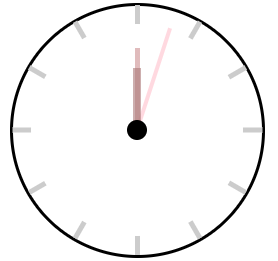
1、秒钟转360度需要60s分60步
2、分针转360度需要3600s分60步
3、秒钟转360度需要43200s分60步
<!DOCTYPE html>
<html lang="en">
<head>
    <meta charset="UTF-8">
    <title>Title</title>
    <style>
        .watch {
            width: 200px;
            height: 200px;
            border: 2px solid #000;
            margin: 150px auto;
            position: relative;
            border-radius: 50%;
        }

        .watch .line {
            width: 4px;
            height: 200px;
            position: absolute;
            top: 0;
            left: 50%;
            margin-left: -2px;
            background-color: #ccc;
        }

        .line2 {
            transform: rotate(30deg);
        }

        .line3 {
            transform: rotate(60deg);
        }

        .line4 {
            transform: rotateZ(90deg);
        }

        .line5 {
            transform: rotateZ(120deg);
        }

        .line6 {
            transform: rotateZ(150deg);
        }

        .cover {
            position: absolute;
            top: 50%;
            left: 50%;
            margin-top: -85px;
            margin-left: -85px;
            width: 170px;
            height: 170px;
            background-color: #fff;
            border-radius: 50%;
        }

        .second, .minute, .hours {
            position: absolute;
            left: 50%;
            background-color: pink;
            opacity: 0.6;
            transform-origin: bottom center;
        }

        .second {
            width: 3px;
            margin-left: -1.5px;
            height: 86px;
            top: 50%;
            margin-top: -86px;
            animation: gun 60s infinite steps(60);
        }

        .minute {
            width: 4px;
            margin-left: -2px;
            height: 66px;
            top: 50%;
            margin-top: -66px;
            background-color: #CC8E8F;
            animation: gun 3600s infinite steps(60);
        }

        .hours {
            width: 7px;
            margin-left: -3.5px;
            height: 50px;
            top: 50%;
            margin-top: -50px;
            background-color: #AB7878;
            animation: gun 43200s infinite steps(60);
        }

        .button {
            width: 16px;
            height: 16px;
            position: absolute;
            border-radius: 50%;
            top: 50%;
            left: 50%;
            margin-left: -8px;
            margin-top: -8px;
            background-color: #000000;
        }

        @keyframes gun {
            0% {
                transform: rotateZ(0deg);
            }
            100% {
                transform: rotateZ(360deg);
            }
        }
    </style>
</head>
<body>
<div class="watch">
    <div class="line line1"></div>
    <div class="line line2"></div>
    <div class="line line3"></div>
    <div class="line line4"></div>
    <div class="line line5"></div>
    <div class="line line6"></div>
    <div class="cover"></div>
    <div class="second"></div>
    <div class="minute"></div>
    <div class="hours"></div>
    <div class="button"></div>
</div>
</body>
</html>