transform-style:flat | preserve-3d;
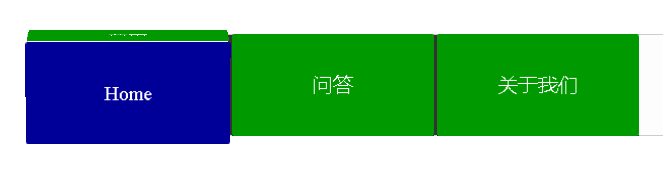
3d透视属性。针对子元素如何在3d空间相对其父元素渲染,这个属性声明在父元素上,并且他的子元素使用了transform才会有效。有两个属性值,一个是flat平面,这也是默认值;一个是preserve-3d当子元素使用transform时,保留其3d的位置也就是3d透视。本示例3d菜单翻转动画中,使用了transform的3d变形属性,包括旋转和移动。当鼠标移入该菜单,该元素做3d翻转动画;鼠标离开后,还原至初始状态
<!DOCTYPE html> <html lang="en"> <head> <meta charset="UTF-8"> <title>CSS3实现3d菜单翻转</title> <style type="text/css"> .nav{ width: 980px; margin: 50px auto; background-color: #fdfdfd; border: 1px #cccccc solid; } .nav:after{ /*本段css主要是解决header标签中的子元素因为浮动而未将header高度撑起来的问题*/ clear: both; display: block; overflow: hidden; content: ""; } .nav .item{ width: 200px; height: 100px; float: left; border-right: 5px #333333 solid; /*3d元素距离视图的距离,当元素设置perspective时,它的子元素会获得一个透视的效果,而不是元素的本身 其实就是z轴的距离,从屏幕到屏幕里面的距离*/ -webkit-perspective: 4000px; -moz-perspective: 4000px; perspective: 4000px; } .nav .item:last-child{ border-right: none; } .nav .item a{ display: block; height: 100px; /*去掉超链接默认的下边线*/ text-decoration: none; -webkit-transition: all .5s; -moz-transition: all .5s; -ms-transition: all .5s; -o-transition: all .5s; transition: all .5s; -webkit-transform-style: preserve-3d; -moz-transform-style: preserve-3d; -ms-transform-style: preserve-3d; transform-style: preserve-3d; } .nav .item a p{ height: 100px; margin: 0; /*设置行高,设置文字距上距下的高,包括文字的高度。这里与height同高,即垂直方向居中*/ line-height: 100px; color: #ffffff; text-align: center; font-size: 20px; font-famiy: "Microsoft Yahei"; -webkit-border-radius: 2px; -moz-border-radius: 2px; border-radius: 2px; -webkit-transition: all .5s; -moz-transition: all .5s; -ms-transition: all .5s; -o-transition: all .5s; transition: all .5s; } .nav .item a p:first-child{ background-color: #009900; -webkit-transform: translateZ(50px); -moz-transform: translateZ(50px); -ms-transform: translateZ(50px); -o-transform: translateZ(50px); transform: translateZ(50px); } .nav .item a p:last-child{ background-color: #000099; -webkit-transform: translateZ(50px) rotateX(-90deg); -moz-transform: translateZ(50px) rotateX(-90deg); -ms-transform: translateZ(50px) rotateX(-90deg); -o-transform: translateZ(50px) rotateX(-90deg); transform: translateZ(50px) rotateX(-90deg); margin-top: -50px; } .nav .item a:hover{ -webkit-transform: rotateX(90deg); -moz-transform: rotateX(90deg); -ms-transform: rotateX(90deg); -o-transform: rotateX(90deg); transform: rotateX(90deg); } .nav .item a:hover p:last-child{ margin-top: 0; -webkit-transform: translateZ(0) rotateX(-90deg); -moz-transform: translateZ(0) rotateX(-90deg); -ms-transform: translateZ(0) rotateX(-90deg); -o-transform: translateZ(0) rotateX(-90deg); transform: translateZ(0) rotateX(-90deg); } </style> </head> <body> <header class="nav"> <div class="item"> <a href="#"> <p>首页</p> <p>Home</p> </a> </div> <div class="item"> <a href="#"> <p>问答</p> <p>Q & A</p> </a> </div> <div class="item"> <a href="#"> <p>关于我们</p> <p>About us</p> </a> </div> </header> </body> </html>