原来是设置自己要居中对齐,不是设置外面容器属性
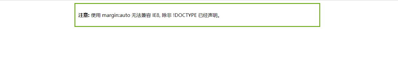
<!DOCTYPE html>
<html>
    <head>
        <title>
            居中对齐
        </title>
        <style>
        .center {
            margin: auto;
            width: 60%;
            border: 3px solid #73AD21;
            padding: 10px;
       }
        </style>
    </head>
    <body>
        <div>
            <div class="center">
                <p><b>注意: </b>使用 margin:auto 无法兼容 IE8, 除非 !DOCTYPE 已经声明。</p>
              </div>
        </div>
    </body>
</html>
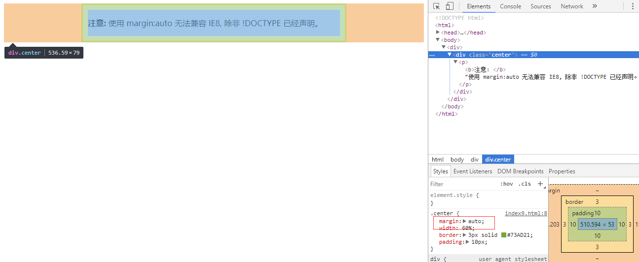
注意: 如果没有设置 width 属性(或者设置 100%),居中对齐将不起作用。
左右对齐 - 使用 float 方式
我们也可以使用 float 属性来对齐元素:
<!DOCTYPE html>
<html>
<head>
<meta charset="utf-8">
<title>菜鸟教程(runoob.com)</title>
<style>
.right {
    float: right;
    width: 300px;
    border: 3px solid #73AD21;
    padding: 10px;
}
</style>
</head>
<body>

<h2>右对齐</h2>
<p>以下实例演示了使用 float 属性来实现右对齐:</p>

<div class="right">
  <p>我老爹在小时候给我的一些人生建议,我现在还记忆深刻。</p>
</div>

</body>
</html>
当像这样对齐元素时,对 <body> 元素的外边距和内边距进行预定义是一个好主意。这样可以避免在不同的浏览器中出现可见的差异。
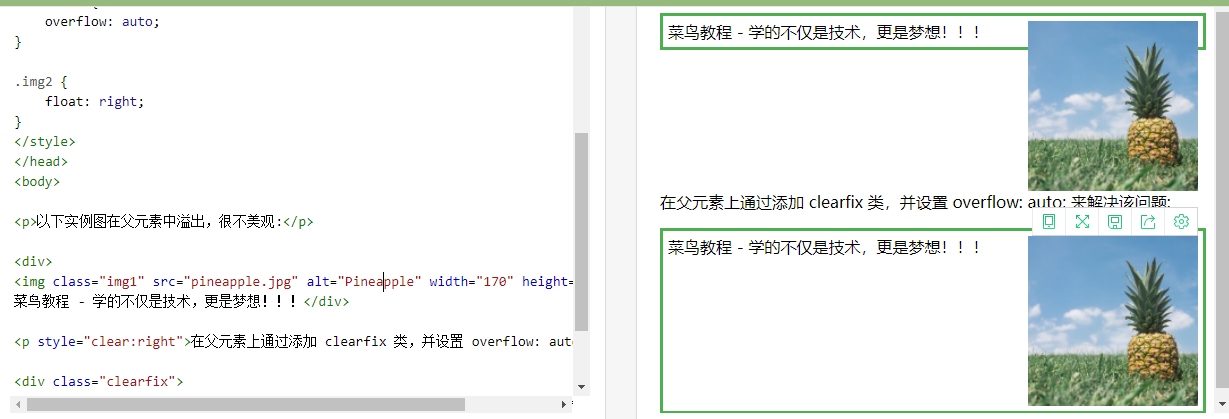
注意:如果子元素的高度大于父元素,且子元素设置了浮动,那么子元素将溢出,这时候你可以使用 "clearfix(清除浮动)" 来解决该问题。
我们可以在父元素上添加 overflow: auto; 来解决子元素溢出的问题:
.clearfix {
    overflow: auto;
}
<!DOCTYPE html>
<html>
<head>
<meta charset="utf-8">
<title>菜鸟教程(runoob.com)</title>
<style>
div {
    border: 3px solid #4CAF50;
    padding: 5px;
}

.img1 {
    float: right;
}

.clearfix {
    overflow: auto;
}

.img2 {
    float: right;
}
</style>
</head>
<body>

<p>以下实例图在父元素中溢出,很不美观:</p>

<div>
<img class="img1" src="pineapple.jpg" alt="Pineapple" width="170" height="170">
菜鸟教程 - 学的不仅是技术,更是梦想!!!</div>

<p style="clear:right">在父元素上通过添加 clearfix 类,并设置 overflow: auto; 来解决该问题:</p>

<div class="clearfix">
<img class="img2" src="pineapple.jpg" alt="Pineapple" width="170" height="170">
菜鸟教程 - 学的不仅是技术,更是梦想!!!</div>

</body>
</html>
参考:https://www.runoob.com/try/try.php?filename=trycss_layout_clearfix
垂直居中对齐 - 使用 padding
CSS 中有很多方式可以实现垂直居中对齐。 一个简单的方式就是头部顶部使用 padding:
垂直居中 - 使用 line-height
.center {
    line-height: 200px;
    height: 200px;
    border: 3px solid green;
    text-align: center;
}

/* 如果文本有多行,添加以下代码: */
.center p {
    line-height: 1.5;
    display: inline-block;
    vertical-align: middle;
}
垂直居中 - 使用 position 和 transform
除了使用 padding 和 line-height 属性外,我们还可以使用 transform 属性来设置垂直居中:
<!DOCTYPE html>
<html>
<head>
<meta charset="utf-8">
<title>菜鸟教程(runoob.com)</title>
<style>
.center {
    height: 200px;
    position: relative;
    border: 3px solid green;
}

.center p {
    margin: 0;
    position: absolute;
    top: 50%;
    left: 50%;
    -ms-transform: translate(-50%, -50%);
    transform: translate(-50%, -50%);
}
</style>
</head>
<body>

<h2>居中</h2>
<p>以下实例中,我们使用了 positioning 和 transform 属性来设置水平和垂直居中:</p>

<div class="center">
  <p>我是水平和垂直居中的。</p>
</div>

<p>注意: IE8 及更早版本不支持 transform 属性。</p>

</body>
</html>
如何让子元素居于父元素底部
如何让子元素居于父元素底部?其实这是个很简单的问题,只是父元素和子元素的css都需要修改一下:
.parent{
    position: relative;
    width:200px;
    height: 100px;
    background: dodgerblue;
}
.content{
    position: absolute;
    width: 200px;
    height: 30px;
    background: orange;
    bottom: 0;

}
<div class="parent">
        <div class="content"></div>
    </div>
上面的代码我解释一下,只要父元素的posiiton设置为relative,子元素的位置就是相对于父元素的,这样设置子元素的bottom为0,即可将子元素置于父元素底部。
参考:https://www.runoob.com/css/css-align.html
https://www.cnblogs.com/chen-cong/p/8076442.html
https://blog.csdn.net/woshizhushiqiu/article/details/75269791