大家好,我是小强老师。 今天我们看下CSS3最为简单的两个属性。
css3给我们带来了很多视觉的感受和变化,以前的图片做的事情,很多代码都能实现。 下面小强老师给大家简单介绍两种最为常见的圆角边框和盒子阴影,同时附上一个iphone 手机效果,提供大家练习。
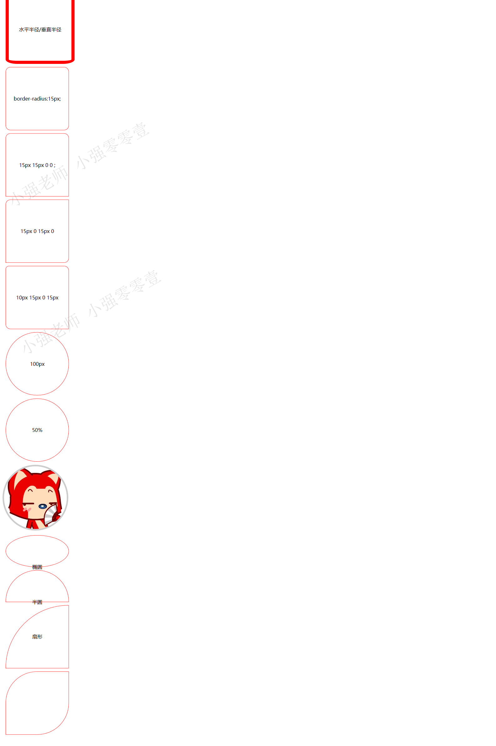
1.border-radius 圆角矩形
语法格式: border-radius: 水平半径/垂直半径
只不过我们平时都把后面的这个垂直半径给省略了。
圆角也有连写的方法
border-radius: 左上角 右上角 右下角 左下角; 采取的是 顺时针
如下图:
代码如下:
 1 <!DOCTYPE html>
 2 <html>
 3 <head lang="en">
 4     <meta charset="UTF-8">
 5     <title></title>
 6     <style>
 7         div{
 8             width: 200px;
 9             height: 200px;
10             border:1px solid red;
11             margin:10px;
12             text-align: center;
13             line-height: 200px;
14         }
15         div:nth-of-type(1)
16         {
17             border:10px solid red;
18             border-radius: 38px/14px;
19         }
20         div:nth-of-type(2)
21         {
22             border-radius:15px;
23         }
24         div:nth-of-type(3)
25         {
26             border-radius:15px 15px 0 0 ;
27         }
28         div:nth-of-type(4)
29         {
30             border-radius:15px 0 15px 0  ;
31         }
32         div:nth-of-type(5)
33         {
34             border-radius:10px 15px 0 15px  ;
35         }
36         div:nth-of-type(6)
37         {
38             border-radius:100px;
39         }
40         div:nth-of-type(7)
41         {
42             border-radius:50%;
43         }
44         img{
45             border:5px solid #ccc;
46             border-radius:50%;
47         }
48         div:nth-of-type(8)
49         {
50             border-radius:50%;
51             height: 100px;
52         }
53         div:nth-of-type(9)
54         {
55             border-radius:100px 100px 0 0 ;
56             height: 100px;
57         }
58         div:nth-of-type(10)
59         {
60             border-radius:200px 0 0 0 ;
61
62         }
63         div:nth-of-type(11)
64         {
65             border-radius:100px 0 100px 0 ;
66
67         }
68
69     </style>
70 </head>
71 <body>
72 <div>水平半径/垂直半径</div>
73 <div>border-radius:15px;</div>
74 <div>15px 15px 0 0 ;</div>
75 <div>15px 0 15px 0</div>
76 <div>10px 15px 0 15px  </div>
77 <div>100px</div>
78 <div>50%</div>
79 <img src="1.jpg" alt=""/>
80 <div>椭圆</div>
81 <div>半圆</div>
82 <div>扇形</div>
83 <div></div>
84 </body>
85 </html>
1.2 阴影(box-shadow)
Box-shadow: 水平阴影 垂直阴影 模糊距离 阴影尺寸 阴影颜色 内外阴影;
里面只有水平阴影和垂直阴影是必须的。其他的可以省略有默认值。
默认的外阴影 outset 不能写,写上就看不到效果
1.3 CSS3iphone 手机的写法
先看效果图吧:
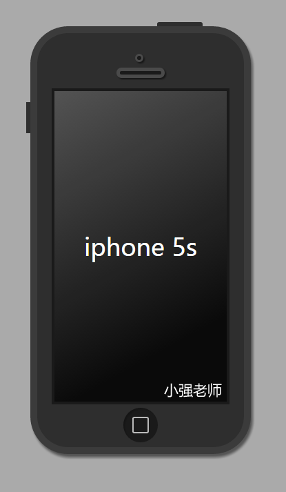
完整代码如下:
<!DOCTYPE html>
<html lang="en">
<head>
    <meta charset="UTF-8">
    <title>Document</title>
    <style type="text/css">
    body{
        background-color: #aaa;
    }
    .iphone5s{
        width: 300px;
        height:600px;
        margin:50px auto;
        background-color: #2e2e2e;
        border:10px solid #3b3b3b;
        border-radius: 55px;
        position: relative;
        box-shadow: 3px 5px 5px  rgba(0,0,0,0.5);
    }
    .iphone5s:before
    {   content: "";
        position: absolute;
        width: 66px;
        height: 6px;
        background-color: #2e2e2e;
        right:60px;
        top:-16px;
        border-radius: 3px 3px 0 0;
    }
    .iphone5s:after{
        content: "";
        position: absolute;
        height: 45px;
        width: 6px;
        background-color: #2e2e2e;
        left:-16px;
        top:100px;
    }
    .listen{
        width: 6px;
        height:6px;
        background-color: #1a1a1a;
        border:3px solid #4a4a4a;
        position: absolute;
        top:30px;
        left:50%;
        margin-left:-8px;
        border-radius: 50%;
        box-shadow: 2px 2px 2px  rgba(0,0,0,0.5);

    }
    .speaker{
        width: 60px;
        height:5px;
        border:5px solid #4a4a4a;
        background-color: #1a1a1a;
        position: absolute;
        left:50%;
        margin-left:-35px;
        top:50px;
        border-radius: 10px;
        box-shadow: 2px 2px 2px  rgba(0,0,0,0.5);

    }
    .content{
        width: 250px;
        height: 450px;
        background-color: #0a0a0a;
        margin:80px auto 0;
        font:35px/450px "微软雅黑";
        text-align: center;
        color:white;
        border:4px solid #1a1a1a;
        position: relative;

    }
    .content:before{
        content: "";
        width: 250px;
        height: 450px;
        position: absolute;
        top:0;
        left:0;
        background: -webkit-linear-gradient(top left,rgba(255,255,255,0.3),rgba(255,255,255,0) 80%)
    }
    .home{
        width: 50px;
        height: 50px;
        background-color: #1a1a1a;
        border-radius: 50%;
        margin:5px auto 0;
        position: relative;
        box-shadow: 2px 2px 2px  rgba(0,0,0,0.2) inset;
    }
    .home:before{
        content: "";
        width: 20px;
        height: 20px;
        border:2px solid rgba(255,255,255,0.7);
        position:absolute;
        top:13px;
        left:13px;
        border-radius: 3px;

    }
    </style>
</head>
<body>
    <div class="iphone5s">
        <div class="listen"></div>
        <div class="speaker"></div>
        <div class="content">
            iphone 5s
        </div>
        <div class="home"></div>
    </div>
</body>
</html>
嘻嘻,怎么样,很简单吧,喜欢,就赶紧自己动手写一下吧! 感谢CSS3给我们带来的好处。 我是小强老师