IE浏览器下的渐变背景
IE浏览器下渐变背景的使用需要使用IE的渐变滤镜。如下代码:
filter: progid:DXImageTransform.Microsoft.gradient(startcolorstr=red,endcolorstr=blue,gradientType=1);
相关说明:
上面的滤镜代码主要有三个参数,依次是:startcolorstr, endcolorstr, 以及gradientType。
其中gradientType=1代表横向渐变,gradientType=0代表纵向淅变。startcolorstr=”色彩” 代表渐变渐变起始的色彩,endcolorstr=”色彩” 代表渐变结尾的色彩。
上面代码实现的是红色至蓝色的渐变,但是不含透明度变化,这是由于IE目前尚未支持opacity属性以及RGBA颜色,要实现IE下的透明度变化,还是需要使用IE滤镜,IE的透明度滤镜功能比较强大,这种强大反而与Firefox或是Safari浏览器下的css-gradient背景渐变的用法类似。例如下面的使用:
filter:alpha(opacity=100 finishopacity=0 style=1 startx=0,starty=5,finishx=90,finishy=60)
其中各个参数的含义如下:
opacity表示透明度,默认的范围是从0 到 100,他们其实是百分比的形式。也就是说,0代表完全透明,100代表完全不透明。
finishopacity 是一个可选参数,如果想要设置渐变的透明效果,就可以使用他们来指定结束时的透明度。范围也是0 到 100。
style用来指定透明区域的形状特征:
0 代表统一形状
1 代表线形
2 代表放射状
3 代表矩形。
startx 渐变透明效果开始处的 X坐标。
starty 渐变透明效果开始处的 Y坐标。
finishx 渐变透明效果结束处的 X坐标。
finishy 渐变透明效果结束处的 Y坐标。
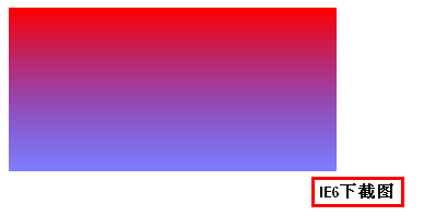
综合上述,实现IE下含透明度变化红蓝垂直渐变的代码如下:
.gradient{
  300px; height:150px;
  filter:alpha(opacity=100 finishopacity=50 style=1 startx=0,starty=0,finishx=0,finishy=150) progid:DXImageTransform.Microsoft.gradient(startcolorstr=red,endcolorstr=blue,gradientType=1);
  -ms-filter:alpha(opacity=100 finishopacity=50 style=1 startx=0,starty=0,finishx=0,finishy=150) progid:DXImageTransform.Microsoft.gradient(startcolorstr=red,endcolorstr=blue,gradientType=1);
}

<div class="gradient"></div>
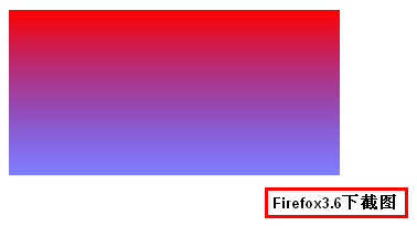
Firefox浏览器下的渐变背景
对于Firefox浏览器下(Firefox 3.6+)渐变背景的实现需使用CSS3渐变属性,-moz-linear-gradient属性,对于本文开头提到的要实现的效果的实现可以参见下面的代码:
.gradient{
    300px;
    height:150px;
    background:-moz-linear-gradient(top, red, rgba(0, 0, 255, 0.5));
}

<div class="gradient"></div>
此段代码在Firefox3.6浏览器下的效果是:
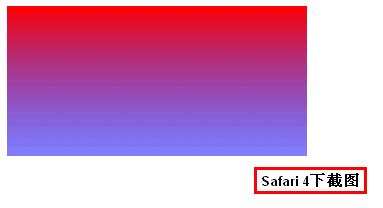
chrome/Safari浏览器下的渐变背景实现
对于webkit核心的浏览器,如Chrome/Safari浏览器下渐变背景的实现也是使用CSS3 渐变方法,css-gradient,具体为-webkit-gradient,使用语Firefox浏览器是有一些差异的。具体使用就不详述了,参见下面的代码:
.gradient{
    300px;
    height:150px;
    background:-webkit-gradient(linear, 0 0, 0 bottom, from(#ff0000), to(rgba(0, 0, 255, 0.5)));
}

<div class="gradient"></div>
此段代码在Safari 4浏览器下的效果是:
综合 – 兼容性的渐变背景效果
.gradient{
    300px;
    height:150px;
    filter:alpha(opacity=100 finishopacity=50 style=1 startx=0,starty=0,finishx=0,finishy=150) progid:DXImageTransform.Microsoft.gradient(startcolorstr=red,endcolorstr=blue,gradientType=0);
    -ms-filter:alpha(opacity=100 finishopacity=50 style=1 startx=0,starty=0,finishx=0,finishy=150) progid:DXImageTransform.Microsoft.gradient(startcolorstr=red,endcolorstr=blue,gradientType=0);/*IE8*/
    background:red; /* 一些不支持背景渐变的浏览器 */
    background:-moz-linear-gradient(top, red, rgba(0, 0, 255, 0.5));
    background:-webkit-gradient(linear, 0 0, 0 bottom, from(#ff0000), to(rgba(0, 0, 255, 0.5)));
    background:-o-linear-gradient(top, red, rgba(0, 0, 255, 0.5));
}

<div class="gradient"></div>