本篇文章由:http://xinpure.com/css3-animation-steps-properties-for-analogue-effects/
animation默认以ease方式过渡,它会在每个关键帧之间插入补间动画,所以动画效果是连贯性的。除了ease,linear、cubic-bezier之类的过渡函数都会为其插入补间。但有些效果不需要补间,只需要关键帧之间的跳跃,这时应该使用steps过渡方式,而时钟的指针嘀嗒旋转,就应该使用这种方式。
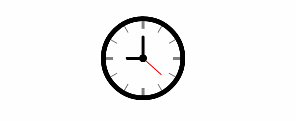
时钟动画分析
时钟的动画效果其实就只有一种,就是指针旋转了。
圆为360deg,秒针每秒旋转6deg,分针每60秒旋转6deg, 时针每3600秒旋转6deg
因此,我们所需要实现的动画效果就是:
-
秒针旋转360deg,60秒一个周期,无限循环动画
-
分针旋转360deg,3600秒一个周期,无限循环动画
-
时针旋转360deg: 216000秒一个周期,无限循环动画
时钟旋转的嘀嗒效果,不需要补间动画,应该使用 steps 来过渡(将旋转360deg的动画分步执行)
由于秒针、分针和时针的步长均为6deg,因此,可以将360deg分成60步完成 steps(60, end)
指针旋转360deg动画定义
@keyframes tick-tock {
    to {
        transform: rotate(360deg);
    }
}
@-webkit-keyframes tick-tock {
    to {
        transform: rotate(360deg) translate3d(0, 0, 0);
    }
}
为动画DOM元素添加
CSS3样式-webkit-transform: transition3d(0,0,0)或-webkit-transform: translateZ(0),这两个属性都会开启GPU硬件加速模式,从而让浏览器在渲染动画时从CPU转向GPU,其实说白了这是一个小伎俩,也可以算是一个Hack,-webkit-transform: transition3d和-webkit-transform: translateZ其实是为了渲染3D样式,但我们设置值为0后,并没有真正使用3D效果,但浏览器却因此开启了GPU硬件加速模式。
绑定指针旋转动画
/* 秒针 */
-webkit-animation: tick-tock 60s steps(60, end) infinite;
        animation: tick-tock 60s steps(60, end) infinite;

/* 分针 */
-webkit-animation: tick-tock 3600s steps(60, end) infinite;
        animation: tick-tock 3600s steps(60, end) infinite;

/* 时针 */
-webkit-animation: tick-tock 216000s steps(60, end) infinite;
        animation: tick-tock 216000s steps(60, end) infinite;
综合示例
HTML Code
<div class="clock">
    <!-- 时钟刻度线条 -->
    <div class="line"></div>
    <div class="line line1"></div>
    <div class="line line2"></div>
    <div class="line line3"></div>
    <div class="line line4"></div>
    <div class="line line5"></div>
    <div class="line line6"></div>

    <!-- 内部白圆与线条配合形成刻度 -->
    <div class="white_circle"></div>
    <!-- 时钟中心圆点 -->
    <div class="black_circle"></div>

    <div class="hour"></div>
    <div class="minute"></div>
    <div class="second"></div>
</div>
CSS Code
.clock {
    position: relative;
     150px;
    height: 150px;
    margin: 50px auto;
    border: 10px solid black;
    border-radius: 50%;
}
.line {
    position: absolute;
    left: 50%;
    margin-left: -3px;
     6px;
    height: 150px;
    background-color: gray;
}
.line1 {
    -webkit-transform: rotate(30deg);
            transform: rotate(30deg);
}
.line2 {
    -webkit-transform: rotate(-30deg);
            transform: rotate(-30deg);
}
.line3 {
    -webkit-transform: rotate(60deg);
            transform: rotate(60deg);
}
.line4 {
    -webkit-transform: rotate(-60deg);
            transform: rotate(-60deg);
}
.line5 {
    -webkit-transform: rotate(30deg);
            transform: rotate(30deg);
}
.line6 {
    -webkit-transform: rotate(90deg);
            transform: rotate(90deg);
}
.line1, .line2, .line3, .line4, .line5 {
     2px;
    margin-left: -1px;
}
.white_circle {
    position: absolute;
    left: 50%;
    top: 50%;
    margin: -60px 0 0 -60px;
     120px;
    height: 120px;
    border-radius: 50%;
    background-color: #fff;
}
.black_circle {
    position: absolute;
    left: 50%;
    top: 50%;
    margin: -8px 0 0 -8px;
     16px;
    height: 16px;
    border-radius: 50%;
    background-color: #000;
    z-index: 1;
}

.hour {
    position: absolute;
    top: 50%;
    right: 50%;
     35px;
    height: 6px;
    margin-top: -3px;
    background-color: #000;
    border-radius: 5px;
    -webkit-transform-origin: right;
            transform-origin: right;
    -webkit-animation: tick-tock 216000s steps(60, end) infinite;
            animation: tick-tock 216000s steps(60, end) infinite;
}
.minute {
    position: absolute;
    top: 50%;
    left: 50%;
     6px;
    height: 46px;
    margin: -46px 0 0 -3px;
    background-color: #000;
    border-radius: 5px;
    -webkit-transform-origin: bottom;
            transform-origin: bottom;
    -webkit-animation: tick-tock 3600s steps(60, end) infinite;
            animation: tick-tock 3600s steps(60, end) infinite;
}
.second {
    position: absolute;
    left: 50%;
    top: 50%;
     2px;
    height: 50px;
    margin: -50px 0 0 -1px;
    background-color: red;
    border-radius: 5px;
    -webkit-transform-origin: bottom;
            transform-origin: bottom;
    -webkit-animation: tick-tock 60s steps(60, end) infinite;
            animation: tick-tock 60s steps(60, end) infinite;
}

@keyframes tick-tock {
    to {
        transform: rotate(360deg);
    }
}
@-webkit-keyframes tick-tock {
    to {
        transform: rotate(360deg) translate3d(0, 0, 0);
    }
}
结果示图