BFC即 Block Fomatting Context = block-level box + Formatting Context。
block-level box即块级元素:display属性为block, list-item, table的元素,会生成block-level box。并且参与 block fomatting context;
inline-level box即行内元素:display 属性为 inline, inline-block, inline-table的元素,会生成inline-level box。并且参与 inline formatting context;
Formatting context
Formatting context是W3C CSS2.1规范中的一个概念。它是页面中的一块渲染区域,并且有一套渲染规则,它决定了其子元素将如何定位,以及和其他元素的关系、相互作用。最常见的 Formatting context 有 Block fomatting context (简称BFC)和 Inline formatting context(简称IFC)。
CSS2.1 中只有BFC和IFC, CSS3中还增加了G(grid)FC和F(flex)FC。
BFC 定义
BFC(Block formatting context)直译为"块级格式化上下文"。它是一个独立的渲染区域,只有Block-level box参与, 它规定了内部的Block-level Box如何布局,并且与这个区域外部毫不相干。
BFC的生成
上边提到BFC是一块渲染区域,那这块渲染区域在哪?它有多大?这些由生成BFC的元素决定,CSS2.1中规定满足下列CSS声明之一的元素便会生成BFC。
1 根元素
2 float的值不为none
3 overflow的值不为visible
4 display的值为inline-block、table-cell、table-caption
5 position的值为absolute或fixed
BFC的约束规则
1 内部的Box会在垂直方向上一个接一个的放置
2 垂直方向上的距离由margin决定。(完整的说法是:属于同一个BFC的两个相邻Box的margin会发生重叠(塌陷),与方向无关。)
3 每个元素的左外边距与包含块的左边界相接触(从左向右),即使浮动元素也是如此。(这说明BFC中子元素不会超出他的包含块,而position为absolute的元素可以超出他的包含块边界)
4 BFC的区域不会与float的元素区域重叠
5 计算BFC的高度时,浮动子元素也参与计算
6 BFC就是页面上的一个隔离的独立容器,容器里面的子元素不会影响到外面元素,反之亦然
margin重叠
两个元素之间发生了margin重叠(塌陷),以最大的值为准。
<style>

    p {

        color: #f55;

        background: #fcc;

        width: 200px;

        line-height: 100px;

        text-align:center;

        margin: 100px;

    }

</style>

<body>

    <p>Haha</p>

    <p>Hehe</p>

</body>
以上代码margin会发生重叠。我们可以在p外面包裹一层容器,并触发该容器生成一个新BFC。那么两个P便不属于同一个BFC,就不会发生margin重叠了。
<style>

    .wrap {

        overflow: hidden;// 新的BFC

    }

    p {

        color: #f55;

        background: #fcc;

        width: 200px;

        line-height: 100px;

        text-align:center;

        margin: 100px;

    }

</style>

<body>

    <p>Haha</p>

    <div class="wrap">

        <p>Hehe</p>

    </div>

</body>
以下代码相邻Box水平方向margin重叠。
<!doctype HTML>

<html>

<head>

<style type="text/css">


    #green {

        margin:10px 10px 10px 10px

    }

    #blue {

        margin:10px 10px 10px 10px

    }

    #red {

        margin:10px 10px 10px 10px

    }

    body {

        writing-mode:tb-rl;

    }

</style>

</head>

<body>

<div id="green" style="background:lightgreen;height:100px;100px;"></div>

<div id="blue" style="background:lightblue;height:100px;100px;"></div>

<div id="red" style="background:pink;height:100px;100px;"></div>

</body>

</html>
我们可以给div加个display:inline-block,触每个div容器生成一个BFC。那么三个DIV便不属于同一个BFC(这里是body根元素形成的BFC),就不会发生margin重叠了。
清除内部浮动
<style>

    .par {

        border: 5px solid #fcc;

        width: 300px;

    }


    .child {

        border: 5px solid #f66;

        width:100px;

        height: 100px;

        float: left;

    }

</style>

<body>

    <div class="par">

        <div class="child"></div>

        <div class="child"></div>

    </div>

</body>
根据BFC布局规则第六条:计算BFC的高度时,浮动元素也参与计算。
以下代码为达到清除内部浮动,我们可以触发par生成BFC,那么par在计算高度时,par内部的浮动元素child也会参与计算。
.par {
    overflow: hidden;
}
之前看圣杯布局,双飞翼布局一直不理解原理。。。今天看了下面的有一些懂了。还有浮动元素如何撑开父元素的高度。其实用的就是BFC原理!
自适应两栏布局
<!DOCTYPE html>
<html lang="en">
    <head>
        <meta charset="UTF-8">
        <style>
                .aside {
                    width: 100px;
                    height: 150px;
                    float: left;
                    background: #f66;
                }
                .main {
                    height: 200px;
                    background: #fcc;
                    /* 变成BFC元素 */
                    overflow: hidden;

                }
        </style>
    </head>
    <body>
        <div class="aside"></div>
        <div class="main"></div>
    </body>
</html>
效果:

根据BFC布局规则第3条:
每个元素的margin box的左边, 与包含块border box的左边相接触(对于从左往右的格式化,否则相反)。即使存在浮动也是如此。因此,虽然存在浮动的元素aslide,但main的左边依然会与包含块的左边相接触。
根据BFC布局规则第四条:
BFC的区域不会与float box重叠。因此我们可以通过通过触发main生成BFC, 来实现main的左边不与包含块的左边相接触,与aslide右边接触。来实现自适应两栏布局。
当触发main生成BFC后,这个新的BFC不会与浮动的aside重叠。因此会根据包含块的宽度,和aside的宽度,自动调整宽窄。
自适应三栏布局
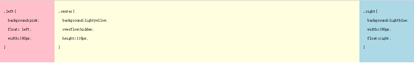
以下布局左右两栏宽度固定,中间栏可以根据浏览器宽度自适应。
<!DOCTYPE html>

<html>

<head>

  <meta http-equiv="Content-Type" content="text/html; charset=utf-8">

  <!--The viewport meta tag is used to improve the presentation and behavior of the samples

    on iOS devices-->

  <meta name="viewport" content="initial-scale=1, maximum-scale=1,user-scalable=no"/>

  <title></title>

  <style>

    html, body { height: 100%; width: 100%; margin: 0; padding: 0; }

    .left{

      background:pink;

      float: left;

      width:180px;

    }

    .center{

      background:lightyellow;

      overflow:hidden;

    }

    .right{

      background: lightblue;

      width:180px;

      float:right;

    }

  </style>

</head>

<body class="claro">

  <div class="container">

    <div class="left">

      <pre>

  .left{

    background:pink;

    float: left;

    180px;

  }

      </pre>

    </div>

    <div class="right">

       <pre>

  .right{

    background:lightblue;

    180px;

    float:right;

  }

      </pre>

    </div>

    <div class="center">

    <pre>

  .center{

    background:lightyellow;

    overflow:hidden;

    height:116px;

  }

      </pre>

    </div>

  </div>

</html>
效果图:
当BFC外部存在浮动时,它不应该影响BFC内部Box的布局,BFC会通过变窄,而不与浮动有重叠。 ----- 多栏布局
当BFC内部有浮动时,为了不影响外部元素的布局,BFC计算高度时会包括浮动的高度。 ----- 浮动元素撑开父元素的高度
原理: