实现居中的方式分为水平和垂直,接下来对两种方式进行整体的整合
水平居中
水平居中需要满足两个条件:父级元素为块级元素且设置宽度
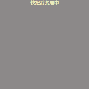
1.子元素为任意元素,但未设置宽度
<body>
    <div class="wrap">
          <p class="center">快把我变居中<p/>
    </div>
</body>
.wrap{
     300px;
     height:300px;
     background:gray;
}

.center{
      text-align:center;
}
效果如下图:
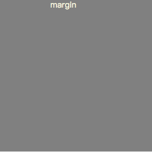
2.子元素为任意元素,并设定了宽度
- margin
<body>
    <div class="wrap">
          <p class="center">margin<p/>
    </div>
</body>
.wrap{
     width:300px;
     height:300px;
     background:gray;
}

.center{
     margin:0 auto;
   100px;

}
效果图如下:
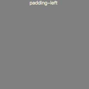
- padding-left和padding-right
我们还可以通过计算父元素和子元素宽度之差,(父宽-子宽)/2,得出父元素的padding-left或者padding-right
<div class="wrap">
    <div class="center">快把我变居中</div>
</div>
</body>
.wrap{
    width:300px;
    height:300px;
    background: gray;
    box-sizing: border-box;
    padding-left: 100px;
}

.center{
    color: beige;
    box-sizing: border-box;
    width: 100px;
}
效果如图:
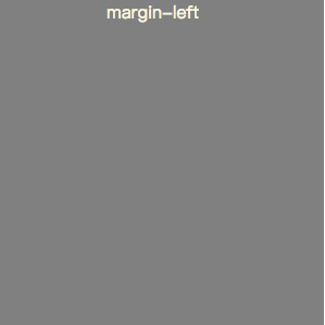
- 计算子元素的margin-left或margin-right
计算子元素的方式和计算父元素的方式相同
<div class="wrap">
    <div class="center">margin-left</div>
</div>
.wrap{
    width:300px;
    height:300px;
    background: gray;
    box-sizing: border-box;
}

.center{
    color: beige;
    box-sizing: border-box;
    width: 100px;
    margin-left: 100px;
}
效果如图:
- 使用定位
<div class="wrap">
    <div class="center">margin-left</div>
</div>
.wrap{
    width:300px;
    height:300px;
    background: gray;
    box-sizing: border-box;
    position: relative;
}

.center{
    color: beige;
    box-sizing: border-box;
    position: absolute;
    left: 50%;
    margin-left: -50px;
    width: 100px;
}
效果如图:
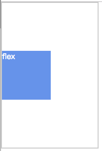
- flex
<body>
<div class="wrap">
    <div class="center">flex</div>
</div>
</body>
.wrap{
    width:200px ;
    height: 300px;
    border: 2px solid #ccc;
    box-sizing: border-box;
    display: flex;
    justify-content: center;
    flex-direction: row;
}

.center{
    width:100px ;
    height: 100px;
    box-sizing: border-box;
    background: #6495ed;
    color: #fff;

}
垂直居中
1.子元素为块级元素,宽高设定了
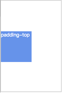
- 计算父元素的padding-top或padding-bottom
<body>
<div class="wrap">
    <div class="center">margin-top</div>
</div>
</body>
.wrap{
    width:200px ;
    height: 300px;
    border: 2px solid #ccc;
    box-sizing: border-box;
    padding-top: 100px;
}

.center{
    width:100px ;
    height: 100px;
    box-sizing: border-box;
    background: #6495ed;
    color: #fff;
}
效果如图:
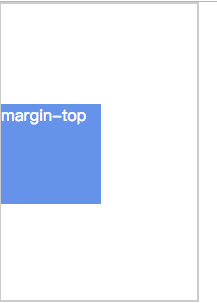
- 计算子元素的margin-top或margin-bottom
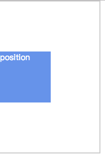
<body>
<div class="wrap">
    <div class="center">position</div>
</div>
</body>
.wrap{
    width:200px ;
    height: 300px;
    border: 2px solid #ccc;
    box-sizing: border-box;
}

.center{
    width:100px ;
    height: 100px;
    box-sizing: border-box;
    background: #6495ed;
    margin-top: 100px;
    color: #fff;
}
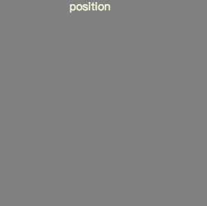
- 定位
<body>
<div class="wrap">
    <div class="center">padding-top</div>
</div>
</body>
.wrap{
    width:200px ;
    height: 300px;
    border: 2px solid #ccc;
    box-sizing: border-box;
    position: relative;
}

.center{
    position: absolute;
    width:100px ;
    height: 100px;
    box-sizing: border-box;
    background: #6495ed;
    color: #fff;
    top: 50%;
    margin-top: -50px;
}
效果如图:
- flex
<body>
<div class="wrap">
    <div class="center">position</div>
</div>
</body>
.wrap{
    width:200px ;
    height: 300px;
    border: 2px solid #ccc;
    box-sizing: border-box;
    display: flex;
    justify-content: center;
    flex-direction: column;
}

.center{
    width:100px ;
    height: 100px;
    box-sizing: border-box;
    background: #6495ed;
    color: #fff;

}
效果如图: