需求:
项目需要在3D场景增加动画按钮,直接添加到场景时 当场景过大的时候 、加载比较麻烦
因在找资料时发现这玩意居然要付费。故做此记录,
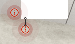
效果:
参考:
1、https://www.jiangweishan.com/article/css3htmlsdf20210208a1.html
2、https://www.cnblogs.com/lalalagq/p/9988347.html
实现:
没啥可思考的 就是将上面两个内容结合了一下。
大概的意思就是:
1、创建一个元素
2、创建两个伪类元素
3、动画延迟加载(before 元素更新之前会加载一次,after 元素更新之后加载一次、这个时候去加一个延时。)
<template>
         <!-- 样式1 -->
    <div class="circle">
            <svg  class="circle" viewBox="0 0 1024 1024" version="1.1" xmlns="http://www.w3.org/2000/svg" p-id="9798" width="32" height="32">
            <path d="M509.979 959.316c-247.308 0-447.794-200.486-447.794-447.794S262.671 63.728 509.979 63.728s447.794 200.486 447.794 447.794-200.485 447.794-447.794 447.794z m0-814.171c-202.346 0-366.377 164.031-366.377 366.377s164.031 366.377 366.377 366.377c202.342 0 366.377-164.031 366.377-366.377S712.321 145.145 509.979 145.145z m-40.708 610.628c-40.709 0-40.709-40.708-40.709-40.708l40.709-203.543s0-40.709-40.709-40.709c0 0-40.709 0-40.709-40.709h122.126s40.709 0 40.709 40.709-40.709 162.834-40.709 203.543 40.709 40.709 40.709 40.709h40.709c-0.001 0-0.001 40.708-122.126 40.708z m81.417-407.085c-22.483 0-40.709-18.225-40.709-40.709s18.225-40.709 40.709-40.709 40.709 18.225 40.709 40.709-18.226 40.709-40.709 40.709z" p-id="9799" fill="#d81e06"></path></svg>

    </div>


</template>


<style lang="less">

.circle {
    // --inner-radius: 15px;
    display: flex;
    align-items: center;
    justify-content: center;
}


.circle::before,
.circle::after {
    content: '';
    position: absolute;
    width: 32px;
    height: 32px;
    // border: 2px solid white;
    box-shadow: 0 0 0 0 rgba(168, 63, 57, 0.4);
    border-radius: 50%;
    animation: pulse 2s ease-out infinite;
}

.circle::after {
    animation-delay: 1s;
}

@keyframes pulse {
    from {
        box-shadow: 0 0 0 0 rgba(168, 63, 57, 0.4);
    }

    to {
        box-shadow: 0 0 0 35px rgba(168, 63, 57, 0);
    }
}


</style>
当然 ,这个是比较简单的, 想要更多的层数,那还是参考别的吧。