原文位置:http://docs.oracle.com/javafx/2/api/javafx/scene/doc-files/cssref.html
Release: JavaFX 2.2
JavaFX CSS Reference Guide
Contents
- Introduction
- Types
- Nodes
- javafx.scene.image
- javafx.scene.layout
- javafx.scene.shape
- javafx.scene.text
- javafx.scene.web
- Controls
- javafx.scene.control
- Accordion
- Button
- ButtonBase
- Cell
- CheckBox
- CheckMenuItem
- ChoiceBox
- ColorPicker
- ComboBox
- Control
- Hyperlink
- IndexedCell
- Label
- Labeled
- ListCell
- ListView
- Menu
- MenuBar
- MenuButton
- MenuItem
- MenuItemBase
- Pagination
- PasswordField
- ProgressBar
- ProgressIndicator
- RadioButton
- RadioMenuItem
- ScrollBar
- ScrollPane
- Separator
- Slider
- SplitMenuButton
- SplitPane
- TabPane
- TableView
- TextArea
- TextInputControl
- TextField
- TitledPane
- ToggleButton
- ToolBar
- Tooltip
- TreeCell
- TreeView
- javafx.scene.control
- Charts
- javafx.scene.chart
- References
Introduction
JavaFX Cascading Style Sheets (CSS) is based on the W3C CSS version 2.1 [1] with some additions from current work on version 3 [2]. JavaFX CSS also has some extensions to CSS in support of specific JavaFX features. The goal for JavaFX CSS is to allow web developers already familiar with CSS for HTML to use CSS to customize and develop themes for JavaFX controls and scene graph objects in a natural way. The JavaFX CSS support and extensions have been designed to allow JavaFX CSS style sheets to be parsed cleanly by any compliant CSS parser, even though it might not support JavaFX extensions. This enables the mixing of CSS styles for JavaFX and for other purposes (such as for HTML pages) into a single style sheet. To this end, all JavaFX property names have been prefixed with a vendor extension of "-fx-". Even properties that might seem to be compatible with standard HTML CSS have been prefixed, because JavaFX has somewhat different semantics for their values.
JavaFX层叠样式表 (CSS) 基于 W3C CSS 2.1 [1] 并增加了一些CSS3 [2] 的内容. 为支持JavaFX特性,对CSS作了一些增强. JavaFX的目的是为了提供一种更自然的方式让熟悉HTML CSS的web开发者使用CSS去定制JavaFX控件和场景图形(scene graph) 。 JavaFX CSS被设计成可以被标准的CSS解析器顺利的解析,即使它们可能不支持JavaFX扩展的内容.这样可以使JavaFX的CSS和其它目的CSS(如针对HTML页面的)可以放在同一个样式表中. 为此, 所有JavaFX的样式属性名都添加了厂商扩展前缀"-fx-"。尽管属性名除了前缀外跟标准的HTML CSS相似, 但他们的值在JavaFX中有却一些不同的语义.
JavaFX CSS does not support CSS layout properties such as float, position, overflow, and width. However, the CSS padding and margins properties are supported on some JavaFX scene graph objects. All other aspects of layout are handled programmatically in JavaFX code. In addition, CSS support for HTML-specific elements such as Tables are not supported since there is no equivalent construct in JavaFX.
JavaFX CSS不支持标准CSS中的布局(layout)属性,如:float,position,overflow,width.但是,padding和margins属性在某些场景图形对象中是支持的。其他的布局都是需要在代码中编写的。此外,Table等HTML的控件并没有在JavaFX中等价的实现,所以并不支持相应的属性。
JavaFX has a rich set of extensions to CSS in support of features such as color derivation, property lookup, and multiple background colors and borders for a single node. These features add significant new power for developers and designers and are described in detail in this document.
The structure of this document is as follows. First, there is a description of all value types for JavaFX CSS properties.Where appropriate, this includes a grammar for the syntax of values of that type. Then, for each scene graph node that supports CSS styles, a table is given that lists the properties that are supported, along with type and semantic information. The pseudo-classes for each class are also given. The description of CSS properties continues for the controls. For each control, the substructure of that control's skin is given, along with the style class names for the Region objects that implement that substructure.
CSS and the JavaFX Scene Graph
CSS styles are applied to nodes in the JavaFX scene graph in a way similar to the way CSS styles are applied to elements in the HTML DOM. Styles are first applied to the parent, then to its children. The code is written such that only those branches of the scene graph that might need CSS reapplied are visited. A node is styled after it is added to the scene graph. Styles are reapplied when there is a change to the node's pseudo-class state, style class, id, inline style, or parent.
CSS styles are applied asynchronously. That is, CSS styles are loaded and values are converted and assigned some time after a scene graph object has been created and added to the scene graph, but before the scene graph is first laid out and painted. In addition, if the styles that apply to an object have changed (for example, because its pseudo-class has changed), values from the newly applied styles will not be applied immediately. Instead, they will be applied sometime after the object's state has changed but before the scene is next painted. It is possible that a style might apply to a variable in a JavaFX object that had been assigned a value by a JavaFX program. Since CSS styles are applied asynchronously, it's possible that values might be assigned by a program and used for some time before being overwritten by CSS at an arbitrary time later.
Each node in the scene graph has a styleClass variable, a List<String>. This is analogous to the class="..." attribute that can appear on HTML elements. Supplying a string for a node's styleClass variable causes style properties for that style class to applied to this node. Styles for style classes can be specified using the ".styleclass" selector syntax in a style sheet. Note that a node may have more than one style class.
Each node in the scene graph has an id variable, a string. This is analogous to the id="..." attribute that can appear HTML elements. Supplying a string for a node's id variable causes style properties for this node to be looked up using that id. Styles for specific ids can be specified using the "#nodeid" selector syntax in a style sheet.
Each node honors a set of properties that depends on the node's JavaFX class (as distinct from its styleClass). The properties honored by each node class are shown in detail in tables later in this document. The property value that is actually applied depends on the precedence of the origin of the rule, as described above, as well as the specificity of the rule's selector as described in CSS 2 [1] . Ultimately, a property value string is converted into a JavaFX value of the appropriate type and is then assigned to an instance variable of the JavaFX object.
CSS styles can come from style sheets or inline styles. Style sheets are loaded from the URLs specified in the stylesheets variable of the Scene object. If the scene graph contains a Control, a default user agent style sheet is loaded. Inline styles are specified via the Node setStyle API. Inline styles are analogous to the style="..." attribute of an HTML element. Styles loaded from a Scene's style sheets take precedence over rules from the user agent style sheet. Inline styles take precedence over styles originating elsewhere. The precedence order of style rules can be modified using "!important" in a style declaration.
Beginning with JavaFX 2.1, the Parent class has a stylesheets property, allowing style sheets to be set on a container. This allows for one branch of of the scene graph to have a distinct set of styles. Any instance of Parent can have a style sheets. A child will take its styles from its own inline styles, the style sheets of all its ancestors, and any style sheets from the Scene.
A style sheet URL may be an absolute URL or a relative URL. If a relative URL is given, it is resolved against the base URL of the ClassLoader of the concrete Application class. If, for example, there is a main classcom.wicked.cool.ui.Main that extends Application, the relative URL "com/wicked/cool/resources/styles.css" would resolve correctly. The relative URL "../resources/styles.css" would not since the path ".." relative to the root is not a valid path. It is often easier to use the ClassLoader of some class to find the resource. For example, if the "styles.css" file resides in the same package as Main, the following code will give the correct URL:com.wicked.cool.ui.Main.class.getResource("styles.css").toExternalForm()
Note that, beginning with JavaFX 2.1, a URL consisting of only an absolute path (having no scheme or authority) is resolved relative to the base URL of ClassLoader of the class that extends Application. In other words, "/com/wicked/cool/resources/styles.css" is treated as "com/wicked/cool/resources/styles.css". This is consistent with FXML.
The implementation allows designers to style an application by using style sheets to override property values set from code. This has implications for the cascade; particularly, when does a style from a style sheet override a value set from code? The JavaFX CSS implementation applies the following order of precedence; a style from a user agent style sheet has lower priority than a value set from code, which has lower priority than a Scene or Parent style sheet. Inline styles have highest precedence. Style sheets from a Parent instance are considered to be more specific than those styles from Scene style sheets.
Naming conventions have been established for deriving CSS style class names from JavaFX class names, and for deriving CSS property names from JavaFX variable names. Note that this is only a naming convention; there is no automatic name conversion. Most JavaFX names use "camel case," that is, mixed case names formed from compound words, where the initial letter of each sub-word is capitalized. Most CSS names in the HTML world are all lower case, with compound words separated by hyphens. The convention is therefore to take JavaFX class names and form their corresponding CSS style class name by separating the compound words with hyphens and convering the letters to all lower case. For example, the JavaFX ToggleButton class would have a style class of "toggle-button". The convention for mapping JavaFX variable names to CSS property names is similar, with the addition of the "-fx-" prefix. For example, the blendMode variable would have a corresponding CSS property name of "-fx-blend-mode".
Limitations
While the JavaFX CSS parser will parse valid CSS syntax, it is not a fully compliant CSS parser. One should not expect the parser to handle syntax not specified in this document.
@-keyword statements are ignored.
The ":first-child" and ":lang" pseudo-classes are not supported. The ":first-line", ":first-letter", ":after", and ":before" pseudo-elements are not supported.
The ":active" and ":focus" dynamic pseudo-classes are not supported. However, Nodes do support the ":pressed" and ":focused" pseudo-classes, which are similar.
The ":link" and ":visited" pseudo-classes are not supported in general. However, Hyperlink objects can be styled, and they support the ":visited" pseudo-class.
JavaFX CSS does not support comma-separated series of font family names in the -fx-font-family property. The optional line height parameter when specifying fonts is not supported. There is no equivalent for the font-variant property.
JavaFX CSS uses the HSB color model instead of the HSL color model.
It is possible to use the JavaFX class name as a type selector, however, such use is not recommended. For example, it is possible to specify styles for a ToggleButton using the syntax "ToggleButton { ... }". Such usage is not recommended because the name used to match the type selector is the actual concrete class name used in the JavaFX program. This class name can change in the case of subclassing. If the application were to subclass the ToggleButton class, these styles would no longer apply.
At this time, the programming interfaces necessary for a class to declare support for CSS properties, to convert and load these values from CSS style sheets into object variables, and to declare and notify changes to an object's pseudo-classes, are considered internal interfaces and are not accessible directly to applications.
If a property of a node is initialized by calling the set method of the property, the CSS implementation will see this as a user set value and the value will not be overwritten by a style from a user agent style sheet.
Inheritance
CSS also provides for certain properties to be inherited by default, or to be inherited if the property value is 'inherit'. If a value is inherited, it is inherited from the computed value of the element's parent in the document tree. In JavaFX, inheritance is similar, except that instead of elements in the document tree, inheritance occurs from parent nodes in the scene graph.
The following properties inherit by default. Any property can be made to inherit by giving it the value "inherit".
| Class | Property | CSS Property | Initial Value |
|---|---|---|---|
| javafx.scene.Node | cursor | -fx-cursor | javafx.scene.Cursor.DEFAULT |
| javafx.scene.text.Text | textAlignment | -fx-text-alignment | javafx.scene.text.TextAlignment.LEFT |
| javafx.scene.text.Font | font | -fx-font | Font.DEFAULT (12px system) |
Within the hierarchy of JavaFX classes (for example, Rectangle is a subclass of Shape, which in turn is a subclass of Node), the CSS properties of an ancestor are also CSS properties of the descendant. This means that a subclass will respond to the same set of properties as its ancestor classes, and to additional properties it defines itself. So, a Shape supports all the properties of Node plus several more, and Rectangle supports all the properties of Shape plus a couple more. However, because using a JavaFX class name as a type selector is an exact match, providing style declarations for a Shape will not cause a Rectangle to use those values (unless the .css value for the Rectangle's property is "inherit").
Examples
Consider the following simple JavaFX application:
Scene scene = new Scene(new Group());
scene.getStylesheets().add(“test.css”);
Rectangle rect = new Rectangle(100,100);
rect.setLayoutX(50);
rect.setLayoutY(50);
rect.getStyleClass().add("my-rect");
((Group)scene.getRoot()).getChildren().add(rect);
Without any styles, this will display a plain black rectangle. If test.css contains the following:
.my-rect { -fx-fill: red; }
the rectangle will be red instead of black:

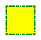
If test.css contains the following:
.my-rect {
-fx-fill: yellow;
-fx-stroke: green;
-fx-stroke- 5;
-fx-stroke-dash-array: 12 2 4 2;
-fx-stroke-dash-offset: 6;
-fx-stroke-line-cap: butt;
}
the result will be a yellow rectangle with a nicely dashed green border:
Understanding Parser Warnings
When the JavaFX CSS parser encounters a syntax error, a warning message is emitted which conveys as much information as is available to help resolve the error. For example
WARNING: com.sun.javafx.css.parser.CSSParser declaration Expected '<percent>' while parsing '-fx-background-color' at ?[1,49]
The cryptic '?[1,49]' pertains to the location of the error. The format of the location string is
<url>[line, position]
If the error is found while parsing a file, the file URL will be given. If the error is from an inline style (as in the example above), the URL is given as a question mark. The line and position give an offset into the file or string where the token begins. Please note that the line and position may not be accurate in releases prior to JavaFX 2.2.
Applications needing to detect errors from the parser can add a listener to the errors property of com.sun.javafx.css.StyleManager. This is not public API and is subject to change.
Types
inherit
Each property has a type, which determines what kind of value and the syntax for specifying those values. In addition, each property may have a specified value of 'inherit', which means that, for a given node, the property takes the same computed value as the property for the node's parent. The 'inherit' value can be used on properties that are not normally inherited.
If the 'inherit' value is set on the root element, the property is assigned its initial value.
<boolean>
Boolean values can either have the string value of "true" or "false", the values are case insensitive as all CSS is case insensitive.
<string>
Strings can either be written with double quotes or with single quotes. Double quotes cannot occur inside double quotes, unless escaped (e.g., as '\"' or as '\22'). Analogously for single quotes (e.g., "\'" or "\27").
"this is a 'string'"
"this is a \"string\""
'this is a "string"'
'this is a \'string\''
A string cannot directly contain a newline. To include a newline in a string, use an escape representing the line feed character in ISO-10646 (U+000A), such as "\A" or "\00000a". This character represents the generic notion of "newline" in CSS. See the 'content' property for an example.
<number> & <integer>
Some value types may have integer values (denoted by <integer>) or real number values (denoted by <number>). Real numbers and integers are specified in decimal notation only. An <integer> consists of one or more digits "0" to "9". A <number> can either be an <integer>, or it can be zero or more digits followed by a dot (.) followed by one or more digits. Both integers and real numbers may be preceded by a "-" or "+" to indicate the sign. -0 is equivalent to 0 and is not a negative number.
[+|-]? [[0-9]+|[0-9]*"."[0-9]+]
Note that many properties that allow an integer or real number as a value actually restrict the value to some range, often to a non-negative value.
<size>
A size is a <number> with units of <length> or <percentage>If units are not specified then specified the 'px' is assumed.
<length>
<number>[ px | mm | cm | in | pt | pc | em | ex ]?
No whitespace is allowed between the number and units if provided. Some units are relative and others absolute.
Relative
- px: pixels, relative to the viewing device
- em: the 'font-size' of the relevant font
- ex: the 'x-height' of the relevant font
Absolute
- in: inches — 1 inch is equal to 2.54 centimeters.
- cm: centimeters
- mm: millimeters
- pt: points — the points used by CSS 2.1 are equal to 1/72nd of an inch.
- pc: picas — 1 pica is equal to 12 points.
<percentage>
These are a percentage of some length, typically to the width or height of a node.
<number>[ % ]
<angle>
An angle is a <number> with one of the following units.
<number>[ deg | rad | grad | turn ]
- deg: angle in degrees - all other angle units are converted to degrees.
- rad: angle in radians
- grad: angle in gradians
- turn: angle in turns
<point>
A point is an {x,y} coordinate.
[ [ <length> <length> ] | [ <percentage> | <percentage> ] ]
<color-stop>
Stops are per W3C color-stop syntax.
[ <color> [ <percentage> | <length>]? ]
In a series of <color-stop>, stop distance values must all be <percentage> or <length>. Furthermore, if <length> values are used, then the distance value for first and last stop in the series must be specified. This restriction may be removed in a future release.
"red, white 70%, blue" is valid since the distance for red and blue is assumed to be 0% and 100%, respectively.
"red 10, white, blue 90" is valid. Because distance for red and blue is 10 and 90, respectively, the distance for white can be calculated.
"red, white 70, blue" is not valid since distance units do not agree.
"red, white, blue" is valid. The stops are distributed evenly between 0% and 100%.
<uri>
url ( [\"\']? <address> [\"\']? )
<address> can be an absolute URI, for example:
url(http://example.com)
url('http://example.com')
url("http://example.com")
or it can be relative to the location of the CSS file.
<effect>
JavaFX CSS currently supports the DropShadow and InnerShadow effects from the JavaFX platform. See the class documentation in javafx.scene.effect for further details about the semantics of the various effect parameters.
Drop Shadow
A high-level effect that renders a shadow of the given content behind the content.
dropshadow( <blur-type> , <color> , <number> , <number> , <number> , <number> )
<blur-type> = [ gaussian | one-pass-box | three-pass-box | two-pass-box ]
<color> The shadow Color.
<number> The radius of the shadow blur kernel. In the range [0.0 ... 127.0], typical value 10.
<number> The spread of the shadow. The spread is the portion of the radius where the contribution of the source material will be 100%. The remaining portion of the radius will have a contribution controlled by the blur kernel. A spread of 0.0 will result in a distribution of the shadow determined entirely by the blur algorithm. A spread of 1.0 will result in a solid growth outward of the source material opacity to the limit of the radius with a very sharp cutoff to transparency at the radius. Values should be in the range [0.0 ... 1.0].
<number> The shadow offset in the x direction, in pixels.
<number> The shadow offset in the y direction, in pixels.
Inner Shadow
A high-level effect that renders a shadow inside the edges of the given content.
innershadow( <blur-type> , <color> , <number> , <number> , <number> , <number> )
<blur-type> = [ gaussian | one-pass-box | three-pass-box | two-pass-box ]
<color> The shadow Color.
<number> The radius of the shadow blur kernel. In the range [0.0 ... 127.0], typical value 10.
<number> The choke of the shadow. The choke is the portion of the radius where the contribution of the source material will be 100%. The remaining portion of the radius will have a contribution controlled by the blur kernel. A choke of 0.0 will result in a distribution of the shadow determined entirely by the blur algorithm. A choke of 1.0 will result in a solid growth inward of the shadow from the edges to the limit of the radius with a very sharp cutoff to transparency inside the radius. Values should be in the range [0.0 ... 1.0].
<number> The shadow offset in the x direction, in pixels.
<number> The shadow offset in the y direction, in pixels.
<font>
JavaFX CSS supports the ability to specify fonts using separate family, size, style, and weight properties, as well as the ability to specify a font using a single shorthand property. There are four value types related to fonts plus a shorthand property that encompasses all four properties. The font-related types are as follows.
<font-family>The string name of the font family. An actual font family name available on the system can be used, or one of the following generic family names can be used:
- 'serif' (e.g., Times)
- 'sans-serif' (e.g., Helvetica)
- 'cursive' (e.g., Zapf-Chancery)
- 'fantasy' (e.g., Western)
- 'monospace' (e.g., Courier)
<font-size> The size of the font, using the <size> syntax.
<font-style> The font's style, using the following syntax:
[ normal | italic | oblique ]
<font-weight> The font's weight, using the following syntax:
[ normal | bold | bolder | lighter | 100 | 200 | 300 | 400 | 500 | 600 | 700 | 800 | 900 ]
<font> This font shorthand property can be used in place of the above properties. It uses the following syntax:
[[ <font-style> || <font-weight> ]? <font-size> <font-family> ]
Font Properties
Most classes that use text will support the following font properties. In some cases a similar set of properties will be supported but with a different prefix instead of "-fx-font".
| CSS Property | Values | Default | Comments |
|---|---|---|---|
| -fx-font | <font> | inherit | shorthand property for font-size, font-family, font-weight and font-style |
| -fx-font-family | <font-family> | inherit | |
| -fx-font-size | <font-size> | inherit | |
| -fx-font-style | <font-style> | inherit | |
| -fx-font-weight | <font-weight> | inherit |
<paint>
Paint values can either be a solid color specified in one of the color syntaxes or they can be a linear or radial gradient.
<color> | <linear-gradient> | <radial-gradient>
Linear Gradients <linear-gradient>
linear-gradient( [ [from <point> to <point>] | [ to <side-or-corner>], ]? [ [ repeat | reflect ], ]? <color-stop>[, <color-stop>]+)
where <side-or-corner> = [left | right] || [top | bottom]
Linear gradient creates a gradient going though all the stop colors along the line between the "from" <point> and the "to" <point>. If the points are percentages, then they are relative to the size of the area being filled. Percentage and length sizes can not be mixed in a single gradient function.
If neither repeat nor reflect are given, then the CycleMethod defaults "NO_CYCLE".
If neither [from <point> to <point>] nor [ to <side-or-corner> ] are given, then the gradient direction defaults to 'to bottom'.
Stops are per W3C color-stop syntax and are normalized accordingly.
This example will create a gradient from top left to bottom right of the filled area with red at the top left corner and black at the bottom right.
linear-gradient(to bottom right, red, black)
This is equivalent to:
linear-gradient(from 0% 0% to 100% 100%, red 0%, black 100%)
This more complex example will create a 50px high bar at the top with a 3 color gradient with white underneath for the rest of the filled area.
linear-gradient(from 0px 0px to 0px 50px, gray, darkgray 50%, dimgray 99%, white)
The following syntax for linear gradient does not conform to the CSS grammar and is deprecated in JavaFX 2.0. The JavaFX 2.0 CSS parser supports the syntax but this support may be removed in later releases.
linear (<size>, <size>) to (<size>, <size>) stops [ (<number>,<color>) ]+ [ repeat | reflect ]?
Radial Gradients <radial-gradient>
radial-gradient([ focus-angle <angle>, ]? [ focus-distance <percentage>, ]? [ center <point>, ]? radius [ <length> | <percentage> ] [ [ repeat | reflect ], ]? <color-stop>[,<color-stop>]+)
If neither repeat nor reflect are given, then the CycleMethod defaults "NO_CYCLE".
Stops are per W3C color-stop syntax and are normalized accordingly.
Following are examples of the use of radial-gradient:
radial-gradient(radius 100%, red, darkgray, black)
radial-gradient(focus-angle 45deg, focus-distance 20%, center 25% 25%, radius 50%, reflect, gray, darkgray 75%, dimgray)
The following syntax for radial gradient does not conform to the CSS grammar and is deprecated in JavaFX 2.0. The JavaFX 2.0 CSS parser supports the syntax but this support may be removed in later releases.
radial [focus-angle <number> | <number> ] ]? [ focus-distance <size> ]? [ center <size,size> ]? <size> stops [ ( <number>, <color> ) ]+ [ repeat | reflect ]?
<color>
<named-color> | <looked-up-color> | <rgb-color> | <hsb-color> | <color-function>
Named Colors <named-color>
CSS supports a bunch of named constant colors. Named colors can be specified with just their unquoted name for example:
.button {
-fx-background-color: red;
}
The named colors that are available in CSS are:
| aliceblue = #f0f8ff | antiquewhite = #faebd7 | aqua = #00ffff | aquamarine = #7fffd4 | ||||
| azure = #f0ffff | beige = #f5f5dc | bisque = #ffe4c4 | black = #000000 | ||||
| blanchedalmond = #ffebcd | blue = #0000ff | blueviolet = #8a2be2 | brown = #a52a2a | ||||
| burlywood = #deb887 | cadetblue = #5f9ea0 | chartreuse = #7fff00 | chocolate = #d2691e | ||||
| coral = #ff7f50 | cornflowerblue = #6495ed | cornsilk = #fff8dc | crimson = #dc143c | ||||
| cyan = #00ffff | darkblue = #00008b | darkcyan = #008b8b | darkgoldenrod = #b8860b | ||||
| darkgray = #a9a9a9 | darkgreen = #006400 | darkgrey = #a9a9a9 | darkkhaki = #bdb76b | ||||
| darkmagenta = #8b008b | darkolivegreen = #556b2f | darkorange = #ff8c00 | darkorchid = #9932cc | ||||
| darkred = #8b0000 | darksalmon = #e9967a | darkseagreen = #8fbc8f | darkslateblue = #483d8b | ||||
| darkslategray = #2f4f4f | darkslategrey = #2f4f4f | darkturquoise = #00ced1 | darkviolet = #9400d3 | ||||
| deeppink = #ff1493 | deepskyblue = #00bfff | dimgray = #696969 | dimgrey = #696969 | ||||
| dodgerblue = #1e90ff | firebrick = #b22222 | floralwhite = #fffaf0 | forestgreen = #228b22 | ||||
| fuchsia = #ff00ff | gainsboro = #dcdcdc | ghostwhite = #f8f8ff | gold = #ffd700 | ||||
| goldenrod = #daa520 | gray = #808080 | green = #008000 | greenyellow = #adff2f | ||||
| grey = #808080 | honeydew = #f0fff0 | hotpink = #ff69b4 | indianred = #cd5c5c | ||||
| indigo = #4b0082 | ivory = #fffff0 | khaki = #f0e68c | lavender = #e6e6fa | ||||
| lavenderblush = #fff0f5 | lawngreen = #7cfc00 | lemonchiffon = #fffacd | lightblue = #add8e6 | ||||
| lightcoral = #f08080 | lightcyan = #e0ffff | lightgoldenrodyellow = #fafad2 | lightgray = #d3d3d3 | ||||
| lightgreen = #90ee90 | lightgrey = #d3d3d3 | lightpink = #ffb6c1 | lightsalmon = #ffa07a | ||||
| lightseagreen = #20b2aa | lightskyblue = #87cefa | lightslategray = #778899 | lightslategrey = #778899 | ||||
| lightsteelblue = #b0c4de | lightyellow = #ffffe0 | lime = #00ff00 | limegreen = #32cd32 | ||||
| linen = #faf0e6 | magenta = #ff00ff | maroon = #800000 | mediumaquamarine = #66cdaa | ||||
| mediumblue = #0000cd | mediumorchid = #ba55d3 | mediumpurple = #9370db | mediumseagreen = #3cb371 | ||||
| mediumslateblue = #7b68ee | mediumspringgreen = #00fa9a | mediumturquoise = #48d1cc | mediumvioletred = #c71585 | ||||
| midnightblue = #191970 | mintcream = #f5fffa | mistyrose = #ffe4e1 | moccasin = #ffe4b5 | ||||
| navajowhite = #ffdead | navy = #000080 | oldlace = #fdf5e6 | olive = #808000 | ||||
| olivedrab = #6b8e23 | orange = #ffa500 | orangered = #ff4500 | orchid = #da70d6 | ||||
| palegoldenrod = #eee8aa | palegreen = #98fb98 | paleturquoise = #afeeee | palevioletred = #db7093 | ||||
| papayawhip = #ffefd5 | peachpuff = #ffdab9 | peru = #cd853f | pink = #ffc0cb | ||||
| plum = #dda0dd | powderblue = #b0e0e6 | purple = #800080 | red = #ff0000 | ||||
| rosybrown = #bc8f8f | royalblue = #4169e1 | saddlebrown = #8b4513 | salmon = #fa8072 | ||||
| sandybrown = #f4a460 | seagreen = #2e8b57 | seashell = #fff5ee | sienna = #a0522d | ||||
| silver = #c0c0c0 | skyblue = #87ceeb | slateblue = #6a5acd | slategray = #708090 | ||||
| slategrey = #708090 | snow = #fffafa | springgreen = #00ff7f | steelblue = #4682b4 | ||||
| tan = #d2b48c | teal = #008080 | thistle = #d8bfd8 | tomato = #ff6347 | ||||
| turquoise = #40e0d0 | violet = #ee82ee | wheat = #f5deb3 | white = #ffffff | ||||
| whitesmoke = #f5f5f5 | yellow = #ffff00 | yellowgreen = #9acd32 | transparent = rgba(0,0,0,0) |
Looked-up Colors <looked-up-color>
With looked-up colors you can refer to any other color property that is set on the current node or any of its parents. This is a very powerful feature, as it allows a generic palette of colors to be specified on the scene then used thoughout the application. If you want to change one of those palette colors you can do so at any level in the scene tree and it will affect that node and all its decendents. Looked-up colors are not looked up until they are applied, so they are live and react to any style changes that might occur, such as replacing a palette color at runtime with the "style" property on a node.
In the following example, all background color of all buttons uses the looked up color "abc".
.root { abc: #f00 }
.button { -fx-background-color: abc }
RGB Colors <rgb-color>
The RGB color model is used in numerical color specifications. It has a number of different supported forms.
#<digit><digit><digit>
| #<digit><digit><digit><digit><digit><digit>
| rgb( <integer> , <integer> , <integer> )
| rgb( <integer> %, <integer>% , <integer>% )
| rgba( <integer> , <integer> , <integer> , <number> )
| rgba( <integer>% , <integer>% , <integer> %, <number> )
These examples all specify the same color for the text fill of a Label:
- .label { -fx-text-fill: #f00 } /* #rgb */
- .label { -fx-text-fill: #ff0000 } /* #rrggbb */
- .label { -fx-text-fill: rgb(255,0,0) }
- .label { -fx-text-fill: rgb(100%, 0%, 0%) }
- .label { -fx-text-fill: rgba(255,0,0,1) }
RGB Hex: The format of an RGB value in hexadecimal notation is a ‘#’ immediately followed by either three or six hexadecimal characters. The three-digit RGB notation (#rgb) is converted into six-digit form (#rrggbb) by replicating digits, not by adding zeros. For example, #fb0 expands to #ffbb00. This ensures that white (#ffffff) can be specified with the short notation (#fff) and removes any dependencies on the color depth of the display.
RGB Decimal or Percent: The format of an RGB value in the functional notation is ‘rgb(’ followed by a comma-separated list of three numerical values (either three decimal integer values or three percentage values) followed by ‘)’. The integer value 255 corresponds to 100%, and to F or FF in the hexadecimal notation: rgb(255,255,255) = rgb(100%,100%,100%) = #FFF. White space characters are allowed around the numerical values.
RGB + Alpha: This is an extension of the RGB color model to include an ‘alpha’ value that specifies the opacity of a color. This is accomplished via a functional syntax of the form rgba(...) form that takes a fourth parameter which is the alpha value. The alpha value must be a number in the range 0.0 (representing completely transparent) and 1.0 (completely opaque). As with the rgb() function, the red, green, and blue values may be decimal integers or percentages. The following examples all specify the same color:
- .label { -fx-text-fill: rgb(255,0,0) } /* integer range 0 - 255*/
- .label { -fx-text-fill: rgba(255,0,0,1) /* the same, with explicit opacity of 1 */
- .label { -fx-text-fill: rgb(100%,0%,0%) } /* float range 0.0% - 100.0% */
- .label { -fx-text-fill: rgba(100%,0%,0%,1) } /* the same, with explicit opacity of 1 */
HSB Colors <hsb-color>
Colors can be specified using the HSB (sometimes called HSV) color model, as follows:
hsb( <number> , <number>% , <number>% ) | hsba( <number> , <number>% , <number>% , <number> )
The first number is hue, a number in the range 0 to 360 degrees. The second number is saturation, a percentage in the range 0% to 100%. The third number is brightness, also a percentage in the range 0% to 100%. The hsba(...) form takes a fourth parameter at the end which is a alpha value in the range 0.0 to 1.0, specifying completely transparent and completely opaque, respectively.
Color Functions <color-function>
JavaFX supports some color computation functions. These compute new colors from input colors at the time the color style is applied. This enables a color theme to be specified using a single base color and to have variant colors computed from that base color. There are two color functions: derive() and ladder().
<derive> | <ladder>
Derive <derive>
The derive function takes a color and computes a brighter or darker version of that color. The second parameter is the brightness offset, ranging from -100% to 100%. Positive percentages indicate brighter colors and negative percentages indicate darker colors. A value of -100% means completely black, 0% means no change in brightness, and 100% means completely white.
Ladder<ladder>
ladder(<color> , <color-stop> [, <color-stop>]+)
The ladder function interpolates between colors. The effect is as if a gradient is created using the stops provided, and then the brightness of the provided <color> is used to index a color value within that gradient. At 0% brightness, the color at the 0.0 end of the gradient is used; at 100% brightness, the color at the 1.0 end of the gradient is used; and at 50% brightness, the color at 0.5, the midway point of the gradient, is used. Note that no gradient is actually rendered. This is merely an interpolation function that results in a single color.
Stops are per W3C color-stop syntax and are normalized accordingly.
For example, you could use the following if you want the text color to be black or white depending upon the brightness of the background.
background: white;
-fx-text-fill: ladder(background, white 49%, black 50%);
The resulting -fx-text-fill value will be black, because the background (white) has a brightness of 100%, and the color at 1.0 on the gradient is black. If we were to change the background color to black or dark grey, the brightness would be less than 50%, giving an -fx-text-fill value of white.
The following syntax for radial gradient does not conform to the CSS grammar and is deprecated in JavaFX 2.0. The JavaFX 2.0 CSS parser supports the syntax but this support may be removed in later releases.
ladder(<color>) stops [ ( <number> , <color> ) ]+
Nodes
| javafx.scene |
Group
Style class: empty by default
| CSS Property | Values | Default | Comments |
|---|---|---|---|
| Group extends Parent. Group does not add any addtional CSS properties. | |||
| Also has all properties of Parent | |||
Node
Style class: empty by default
| CSS Property | Values | Default | Range | Comments |
|---|---|---|---|---|
| -fx-blend-mode | [ add | blue | color-burn | color-dodge | darken | difference | exclusion | green | hard-light | lighten | multiply | overlay | red | screen | soft-light | src-atop | src-in | src-out | src-over ] | null | ||
| -fx-cursor | [ null | crosshair | default | hand | move | e-resize | h-resize | ne-resize | nw-resize | n-resize | se-resize | sw-resize | s-resize | w-resize | v-resize | text | wait ] | <url> | null | inherits | |
| -fx-effect | <effect> | null | ||
| -fx-focus-traversable | <boolean> | false | ||
| -fx-opacity | <number> | 1 | [0.0 ... 1.0] | Opacity can be thought of conceptually as a postprocessing operation. Conceptually, after the node (including its descendants) is rendered into an RGBA offscreen image, the opacity setting specifies how to blend the offscreen rendering into the current composite rendering. |
| -fx-rotate | <number> | 0 | This is the angle of the rotation in degrees. Zero degrees is at 3 o'clock (directly to the right). Angle values are positive clockwise. Rotation is about the center. | |
| -fx-scale-x | <number> | 1 | scale about the center | |
| -fx-scale-y | <number> | 1 | scale about the center | |
| -fx-scale-z | <number> | 1 | scale about the center | |
| -fx-translate-x | <number> | 0 | ||
| -fx-translate-y | <number> | 0 | ||
| -fx-translate-z | <number> | 0 | ||
| visibility | [ visible | hidden | collapse | inherit ] | visible | See W3C visibility property |
Pseudo-classes
| CSS Pseudo-class | Comments |
|---|---|
| disabled | applies when the disabled variable is true |
| focused | applies when the focused variable is true |
| hover | applies when the hover variable is true |
| pressed | applies when the pressed variable is true |
| show-mnemonic | apples when the mnemonic affordance (typically an underscore) should be shown. |
Parent
Style class: empty by default
| CSS Property | Values | Default | Comments |
|---|---|---|---|
| Parent extends Node. Parent does not add any addtional CSS properties. | |||
| Also has all properties of Node | |||
Scene
Style class: not applicable
The Scene object has no settable CSS properties, nor does it have any pseudo-classes. However, the root node of the scene is assigned the style class "root" (in addition to style classes already assigned to the node). This is useful because the root node of Scene is the root container for all active scene graph nodes. Thus, it can serve as a container for properties that are inherited or looked up.
| javafx.scene.image |
ImageView
Style class: empty by default
| CSS Property | Values | Default | Comments |
|---|---|---|---|
| -fx-image | <uri> | null | Relative URLs are resolved against the URL of the stylesheet. |
| Also has all properties of Node | |||
| javafx.scene.layout |
AnchorPane
Style class: empty by default
| CSS Property | Values | Default | Comments |
|---|---|---|---|
| AnchorPane extends Pane and does not add any additional CSS properties. | |||
| Also has all properties of Pane | |||
BorderPane
Style class: empty by default
| CSS Property | Values | Default | Comments |
|---|---|---|---|
| BorderPane extends Pane and does not add any additional CSS properties. | |||
| Also has all properties of Pane | |||
FlowPane
Style class: empty by default
| CSS Property | Values | Default | Comments |
|---|---|---|---|
| -fx-hgap | <size> | 0 | |
| -fx-vgap | <size> | 0 | |
| -fx-alignment | [ top-left | top-center | top-right | center-left | center | center-right bottom-left | bottom-center | bottom-right | baseline-left | baseline-center | baseline-right ] | top-left | |
| -fx-column-halignment | [ left | center | right ] | center | |
| -fx-row-valignment | [ top | center | baseline | bottom ] | center | |
| -fx-orientation | [ horizontal | vertical ] | horizontal | |
| Also has all properties of Pane | |||
GridPane
Style class: empty by default
| CSS Property | Values | Default | Comments | |
|---|---|---|---|---|
| -fx-hgap | <size> | 0 | ||
| -fx-vgap | <size> | 0 | ||
| -fx-alignment | [ top-left | top-center | top-right | center-left | center | center-right bottom-left | bottom-center | bottom-right | baseline-left | baseline-center | baseline-right ] | top-left | ||
| -fx-grid-lines-visible | <boolean> | false | ||
| Also has all properties of Pane | ||||
HBox
Style class: empty by default
| CSS Property | Values | Default | Comments |
|---|---|---|---|
| -fx-spacing | <size> | 0 | |
| -fx-alignment | [ top-left | top-center | top-right | center-left | center | center-right bottom-left | bottom-center | bottom-right | baseline-left | baseline-center | baseline-right ] | top-left | |
| -fx-fill-height | <boolean> | false | |
| Also has all properties of Pane | |||
Pane
Style class: empty by default
| CSS Property | Values | Default | Comments |
|---|---|---|---|
| Pane extends Region to expose Region's children. Pane does not add any addtional CSS properties. | |||
| Also has all properties of Region | |||
Region
Style class: empty by default
A Region is a Node (extending from Parent) with backgrounds and borders that are styleable via CSS. A Region is typically a rounded rectangle, though this can be modified through CSS to be an arbitrary shape. Regions can contain other Region objects (sub-regions) or they can contain sub-controls. All Regions have the same set of CSS properties as described below.
Each Region consists of several layers, painted from bottom to top, in this order:
- background fills
- background images
- contents
- border strokes
- border images
The background and border mechanisms are patterned after the CSS 3 draft backgrounds and borders module. See [4] for a detailed description.
Background fills are specified with the properties -fx-background-color, -fx-background-radius and -fx-background-insets. The -fx-background-color property is a series of one or more comma-separated <paint> values. The number of values in the series determines the number of background rectangles that are painted. Background rectangles are painted in the order specified using the given <paint> value. Each background rectangle can have different radii and insets. The -fx-background-radius and -fx-background-insets properties are series of comma-separated values (or sets of values). The radius and insets values used for a particular background are the found in the corresponding position in the -fx-background-radius and -fx-background-insets series. For example, suppose a series of three values is given for the -fx-background-color property. A series of three values should also be specified for the -fx-background-radius and -fx-background-insets properties. The first background will be painted using the first radius value and first insets value, the second background will be painted with the second radius value and second insets value, and so forth.
Note also that properties such as -fx-background-radius and -fx-background-insets can contain a series of values or sets of four values. A set of values is separated by whitespace, whereas the values or sets-of-values in a series are separated by commas. For -fx-background-radius, a single value indicates that the value should be used for the radius of all four corners of the background rectangle. A set of four values indicates that different radius values are to be used for the top-left, top-right, bottom-right, and bottom-left corners, in that order. Similarly, the -fx-background-insets property can also contain a series of values or sets of values. A set of four values for -fx-background-insets indicates that different insets are to be used for the top, right, bottom, and left edges of the rectangle, in that order.
Background images are specified with the properties -fx-background-image, -fx-background-repeat, -fx-background-position and -fx-background-size. The number of images in the series of -fx-background-image values determines the number of background images that are painted. The -fx-background-repeat, -fx-background-position, and -fx-background-size properties each can contain a series of values. For each item in the -fx-background-image series, the corresponding items in the -fx-background-repeat, -fx-background-position, and -fx-background-size properties are applied to that background image.
Stroked borders are specified with the properties -fx-border-color, -fx-border-style, -fx-border-width, -fx-border-radius and -fx-border-insets. Each property contains a series of items. The number of items in the-fx- border-color property determines the number of borders that are painted. Each border in the series is painted using information from the corresponding series item of the -fx-border-style, -fx-border-width, -fx-border-radius, and -fx-border-insets properties.
Image borders are specified with the properties -fx-border-image-source, -fx-border-image-repeat, -fx-border-image-slice, -fx-border-image-width and -fx-border-image-insets. Each property contains a series of items. The number of items in the -fx-border-image-source property determines the number of images that are painted. Each image in the series is painted using information from the corresponding series items of the -fx-border-image-repeat, -fx-border-image-slice, -fx-border-image-width, and -fx-border-image-insets properties.
The region's contents are a sequence of nodes, like any other container. The contents are set programmatically and cannot be set via CSS.
| CSS Property | Values | Default | Comments |
|---|---|---|---|
| BACKGROUND FILLS (see CSS Backgrounds and Borders Module Level 3: Backgrounds) | |||
| -fx-background-color | <paint> [ , <paint> ]* | null | A series of paint values separated by commas. |
| -fx-background-insets | <size> | <size> <size> <size> <size> [ , [ <size> | <size> <size> <size><size>] ]* | null |
A series of size values or sets of four size values, separated by commas. A single size value means all insets are the same. Otherwise, the four values for each inset are given in the order top, right, bottom, left. Each comma-separated value or set of values in the series applies to the corresponding background color. |
| -fx-background-radius | <size> | <size> <size> <size> <size> [ , [ <size> | <size> <size> <size><size>] ]* | null |
A series of radius values or sets of four radius values, separated by commas. A single radius value means the radius of all four corners is the same. Otherwise, the four values in the set determine the radii of the top-left, top-right, bottom-right, and bottom-left corners, in that order. Each comma-separated value or set of values in the series applies to the corresponding background color. |
| BACKGROUND IMAGES (see CSS Backgrounds and Borders Module Level 3: Background Image) | |||
| -fx-background-image | <uri> [ , <uri> ]* | null | A series of image URIs separated by commas. |
| -fx-background-position |
<bg-position> [ , <bg-position> ]* |
null |
A series of <bg-position> values separated by commas. Each bg-position item in the series applies to the corresponding image in the background-image series. |
| -fx-background-repeat | <repeat-style> [ , <repeat-style> ]* where <repeat-style> = repeat-x | repeat-y | [repeat | space | round | stretch | no-repeat]{1,2} |
null |
A series of <repeat-style> values separated by commas. Each repeat-style item in the series applies to the corresponding image in the background-image series. |
| -fx-background-size | <bg-size> [ , <bg-size> ]* <bg-size> = [ <size> | auto ]{1,2} | cover | contain | stretch |
null |
A series of <bg-size> values separated by commas. Each bg-size item in the series applies to the corresponding image in the background-image series. |
| STROKED BORDERS (see CSS Backgrounds and Borders Module Level 3: Borders) | |||
| -fx-border-color | <paint> | <paint> <paint> <paint><paint> [ , [<paint> | <paint> <paint><paint> <paint>] ]* | null |
A series of paint values or sets of four paint values, separated by commas. For each item in the series, if a single paint value is specified, then that paint is used as the border for all sides of the region; and if a set of four paints is specified, they are used for the top, right, bottom, and left borders of the region, in that order. If the border is not rectangular, only the first paint value in the set is used. |
| -fx-border-insets | <size> | <size> <size> <size> <size> [ , [ <size> | <size> <size> <size><size>] ]* | null |
A series of inset or sets of four inset values, separated by commas. For each item in the series, a single inset value means that all insets are the same; and if a set of four inset values is specified, they are used for the top, right, bottom, and left edges of the region, in that order. Each item in the series of insets applies to the corresponding item in the series of border colors. |
| -fx-border-radius | <size> | <size> <size> <size> <size> [ , [ <size> | <size> <size> <size><size>] ]* | null |
A series of radius or sets of four radius values, separated by commas. For each item in the series, a single radius value means that all corner radii are the same; and if a set of four radius values is specified, they are used as the radii of the top-left, top-right, bottom-right, and bottom-left corners, in that order. Each item in the series of radii applies to the corresponding item in the series of border colors. |
| -fx-border-style |
<border-style> [ , <border-style> ]* |
null |
A series of border style values, separated by commas. Each item in the series applies to the corresponding item in the series of border colors. The segments dash-style defines a sequence representing the lengths of the dash segments. Alternate entries in the sequence represent the lengths of the opaque and transparent segments of the dashes. This corresponds to the strokeDashArray variable of Shape. The optional phase parameter defines the point in the dashing pattern that will correspond to the beginning of the stroke. This corresponds to the strokeDashOffsetvariable of Shape. |
| -fx-border-width | <size> | <size> <size> <size> <size> [ , [ <size> | <size> <size> <size><size>] ]* | null |
A series of width or sets of four width values, separated by commas. For each item in the series, a single width value means that all border widths are the same; and if a set of four width values is specified, they are used for the top, right, bottom, and left border widths, in that order. If the border is not rectangular, only the first width value is used. Each item in the series of widths applies to the corresponding item in the series of border colors. |
| BORDER IMAGES (see CSS Backgrounds and Borders Module Level 3: Border Images) | |||
| -fx-border-image-source | <uri> [ , <uri> ]* | null |
A series of image URIs, separated by commas. 使用逗号分隔的一系列图像URI |
| -fx-border-image-insets | <size> | <size> <size> <size> <size> [ , [ <size> | <size> <size> <size><size>] ]* | null |
A series of inset or sets of four inset values, separated by commas. For each item in the series, a single inset value means that all insets are the same; and if a set of four inset values is specified, they are used for the top, right, bottom, and left edges of the region, in that order. Each item in the series of insets applies to the corresponding image in the series of border images. 使用逗号分隔的单值或四值的插入量(inset)序列。对于序列中的每一项,单值表示所有的插入量(inset)都相同;而四值则分别表示上、右、下、左四个区域。每一项对应到边框图像序列中的每一个图像。 |
| -fx-border-image-repeat | <repeat-style> [ , <repeat-style> ]* where <repeat-style> = repeat-x | repeat-y | [repeat | space | round | no-repeat]{1,2} |
null |
A series of repeat-style values, separated by commas. Each item in the series applies to the corresponding image in the series of border images. 使用逗号分隔的repeat-style值。每一项对应到边框图像序列中的每一个图像。 |
| -fx-border-image-slice |
[<size> | <size> <size> <size> <size> ] fill? [ , [ <size> | <size><size><size> <size> <size> ] fill? ]* |
null |
A series of image slice values or sets of four values, separated by commas. Each item in the series applies to the corresponding image in the series of border images. For each item in the series, if four values are given, they specify the size of the top, right, bottom, and left slices. This effectively divides the image into nine regions: an upper left corner, a top edge, an upper right corner, a right edge, a lower right corner, a bottom edge, a lower left corner, a left edge and a middle. If one value is specified, this value is used for the slice values for all four edges. If 'fill' is present, the middle slice is preserved, otherwise it is discarded. Percentage values may be used here, in which case the values are considered proportional to the source image. 使用逗号分隔的单值或者四值的图像切片值序列。序列中的每一项应用于边框图像系列中的每一个图像(貌似是指后面九格中的每一个格子图像?)。对于(使用逗号分隔的)每一项,如果给了四值,则分别对应上,右,下,左的切片大小。实际上图像被划分为九个区域:左上角,上边,右上角,右边,右下角,下边,左上角,左边,中间区域。如果只给了一个值,则四边的使用相同的大小。如果包含'fill',则中间的切片保留,否则被忽略。可以使用百分值来表示值,如果使用百分值则对应到源图像的百分比。 |
| -fx-border-image-width | <size> | <size> <size> <size> <size> [ , [ <size> | <size> <size> <size><size>] ]* | null |
A series of width or sets of four width values, separated by commas. For each item in the series, a single width value means that all border widths are the same; and if a set of four width values is specified, they are used for the top, right, bottom, and left border widths, in that order. If the border is not rectangular, only the first width value is used. Each item in the series of widths applies to the corresponding item in the series of border images. Percentage values may be used here, in which case the values are considered proportional to the border image area. 使用逗号分隔的单值或者四值的宽度序列。序列中的每一项,如果只有一个值,则表示所有的边框使用相同的宽度;如果给了四值,则分别对应上,右,下,左的宽度。如果边框是非矩形的,只有第一个值被使用。序列中的每一项宽度对应到边框图像序列中的每一个图像。可以使用百分值来表示值,如果使用百分值则对应到源图像的百分比。 |
| OTHER | |||
| -fx-padding | <size> | <size> <size> <size> <size> | null |
A sets of four padding values, separated by commas. For each item in the series, a single padding value means that all padding are the same; and if a set of four padding values is specified, they are used for the top, right, bottom, and left edges of the region, in that order. |
| -fx-position-shape | <boolean> | true | If true means the shape centered within the region's width and height, otherwise the shape is positioned at its source position. Has no effect if a shape string is not specified. |
| -fx-scale-shape | <boolean> | true | If true means the shape is scaled to fit the size of the region, otherwise the shape is at its source size, and its position depends on the value of the position-shape property. Has no effect if a shape string is not specified. |
| -fx-shape | "<string>" | null | An SVG path string. By specifying a shape here the region takes on that shape instead of a rectangle or rounded rectangle. The syntax of this path string is specified in [3]. |
| -fx-snap-to-pixel | <boolean> | true | Defines whether this region rounds position/spacing and ceils size values to pixel boundaries when laying out its children. |
| -fx-background-fills | null | This property is set by specifying -fx-background-color, optionally -fx-background-insets, and optionally -fx-background-radius. In order to set the background fill to null, specify the style "-fx-background-color: null;". There is no shorthand notation for -fx-background-fills at this time. | |
| -fx-background-images | null | This property is set by specifying -fx-background-image, optionally -fx-background-position, optionally -fx-background-repeat, and optionally -fx-background-size. There is no shorthand notation for -fx-background-images at this time. | |
| -fx-stroke-borders | null | This property is set by specifying -fx-border-color with the optional -fx-border-insets, -fx-border-radius, -fx-border-style and -fx-border-width. There is no shorthand notation for -fx-stroke-borders at this time. | |
| -fx-image-borders | null | This property set by specifying -fx-border-image-source with the optional -fx-border-image-insets, -fx-border-image-repeat, -fx-border-image-slice and -fx-border-image-width. There is no shorthand notation for -fx-image-borders at this time. | |
| Also has all properties of Parent | |||
StackPane
Style class: empty by default
| CSS Property | Values | Default | Comments |
|---|---|---|---|
| -fx-alignment | [ top-left | top-center | top-right | center-left | center | center-right bottom-left | bottom-center | bottom-right | baseline-left | baseline-center | baseline-right ] | top-left | |
| Also has all properties of Pane | |||
TilePane
Style class: empty by default
| CSS Property | Values | Default | Comments |
|---|---|---|---|
| -fx-orientation | [ horizontal | vertical ] | horizontal | |
| -fx-pref-rows | <integer> | 5 | |
| -fx-pref-columns | <integer> | 5 | |
| -fx-pref-tile-width | <size> | -1 | |
| -fx-pref-tile-height | <size> | -1 | |
| -fx-hgap | <size> | 0 | |
| -fx-vgap | <size> | 0 | |
| -fx-alignment | [ top-left | top-center | top-right | center-left | center | center-right bottom-left | bottom-center | bottom-right | baseline-left | baseline-center | baseline-right ] | top-left | |
| -fx-tile-alignment | [ top-left | top-center | top-right | center-left | center | center-right bottom-left | bottom-center | bottom-right | baseline-left | baseline-center | baseline-right ] | center | |
| Also has all properties of Pane | |||
VBox
Style class: empty by default
| CSS Property | Values | Default | Comments |
|---|---|---|---|
| -fx-spacing | <size> | 0 | |
| -fx-alignment | [ top-left | top-center | top-right | center-left | center | center-right bottom-left | bottom-center | bottom-right | baseline-left | baseline-center | baseline-right ] | top-left | |
| -fx-fill-width | <boolean> | true | |
| Also has all properties of Pane | |||
| javafx.scene.shape |
Shape
Style class: empty by default
| CSS Property | Values | Default | Comments |
|---|---|---|---|
| -fx-fill | <paint> | BLACK | |
| -fx-smooth | <boolean> | true | |
| -fx-stroke | <paint> | null | |
| -fx-stroke-type | [ inside | outside | centered ] | centered | |
| -fx-stroke-dash-array | <size>[ <size>]+ | null | |
| -fx-stroke-dash-offset | <number> | 0 | |
| -fx-stroke-line-cap | [ square | butt | round ] | square | |
| -fx-stroke-line-join | [ miter | bevel | round ] | miter | |
| -fx-stroke-miter-limit | <number> | 10 | |
| -fx-stroke-width | <size> | 1 | |
| Also has all properties of Node | |||
Arc
Style class: empty by default
The Arc node has all the properties of Shape and Node.
Circle
Style class: empty by default
The Circle node has all the properties of Shape and Node.
CubicCurve
Style class: empty by default
The CubicCurve node has all the properties of Shape and Node.
Ellipse
Style class: empty by default
The Ellipse node has all the properties of Shape and Node.
Line
Style class: empty by default
The Line node has all the properties of Shape and Node.
Path
Style class: empty by default
The Path node has all the properties of Shape and Node.
Polygon
Style class: empty by default
The Polygon node has all the properties of Shape and Node.
QuadCurve
Style class: empty by default
The QuadCurve node has all the properties of Shape and Node.
Rectangle
Style class: empty by default
| CSS Property | Values | Default | Comments |
|---|---|---|---|
| -fx-arc-height | <size> | 0 | |
| -fx-arc-width | <size> | 0 | |
| Also has all properties of Shape | |||
SVGPath
Style class: empty by default
The SVGPath node has all the properties of Shape and Node.
| javafx.scene.text |
Text
Style class: empty by default
| CSS Property | Values | Default | Comments |
|---|---|---|---|
| -fx-font | <font> | Font.DEFAULT | inherits |
| -fx-font-smoothing-type | [ gray | lcd ] | gray | |
| -fx-strikethrough | <boolean> | false | |
| -fx-text-alignment | [ left | center | right | justify ] | left | inherits |
| -fx-text-origin | [ baseline | top | bottom ] | baseline | |
| -fx-underline | <boolean> | false | |
| Also has font properties and all properties of Shape | |||
| javafx.scene.web |
WebView
Style class: web-view
| CSS Property | Values | Default | Comments |
|---|---|---|---|
| -fx-context-menu-enabled | <boolean> | true | |
| -fx-font-smoothing-type | [ gray | lcd ] | lcd | |
| -fx-font-scale | <number> | 1 | |
| -fx-min-width | <size> | 0 | |
| -fx-min-height | <size> | 0 | |
| -fx-pref-width | <size> | 800 | |
| -fx-pref-height | <size> | 600 | |
| -fx-max-width | <size> | Double.MAX_VALUE | |
| -fx-max-height | <size> | Double.MAX_VALUE | |
| Also has all properties of Parent | |||
| javafx.scene.control |
In JavaFX 2.0 the default skins for all controls support styling from CSS. This is accomplished by building the skins from layout objects called Regions. Most of the style properties for a control are provided by the Region objects that comprise the control's skin. Each Region object of the skin's substructure has its own style class so that it can be styled specifically. The control itself will sometimes provide CSS properties in addition to those provided by its Regions. Finally, controls may also define pseudo-classes such as "vertical" and "horizontal" in addition to those defined by Node.
Accordion
Style class: accordion
The Accordion control has all the properties and pseudo-classes of Control
Substructure
- first-titled-pane - the first TitledPane
Button
Style class: button
The Button control has all the properties of ButtonBase
Pseudo-classes
| CSS Pseudo-class | Comments |
|---|---|
| cancel | applies if this Button receives VK_ESC if the event is not otherwise consumed |
| default | applies if this Button receives VK_ENTER if the event is not otherwise consumed |
| Also has all pseudo-classes of ButtonBase | |
ButtonBase
The ButtonBase control has all the properties of Labeled
Pseudo-classes
| CSS Pseudo-class | Comments |
|---|---|
| armed | applies when the armed variable is true |
| Also has all pseudo-classes of Labeled | |
Cell
Style class: cell
| CSS Property | Values | Default | Comments |
|---|---|---|---|
| -fx-cell-size | <size> | 15 | The cell size. For vertical ListView or a TreeView or TableView this is the height, for a horizontal ListView this is the width. |
| The Cell control has all the properties of Labeled | |||
Pseudo-classes
| CSS Pseudo-class | Comments |
|---|---|
| empty | applies when the empty variable is true |
| filled | applies when the empty variable is false |
| selected | applies when the selected variable is true |
| Also has all pseudo-classes of Labeled | |
Substructure
- text - a Labeled
CheckBox
Style class: check-box
The CheckBox control has all the properties of ButtonBase
Pseudo-classes
| CSS Pseudo-class | Comments |
|---|---|
| selected | applies when the selected variable is true |
| determinate | applies when the indeterminate variable is false |
| indeterminate | applies when the indeterminate variable is true |
| Also has all pseudo-classes of ButtonBase | |
Substructure
- box — a StackPane
- mark — a StackPane
CheckMenuItem
Pseudo-classes
| CSS Pseudo-class | Comments |
|---|---|
| selected | applies if this item is selected |
ChoiceBox
Style class: choice-box
The ChoiceBox control has all the properties and pseudo-classes of Control
Substructure
- open-button — Region
- arrow — Region
ColorPicker
Style class: color-picker
The ColorPicker control has all the properties and pseudo-classes of ComboBoxBase
| CSS Property | Values | Default | Comments |
|---|---|---|---|
| -fx-color-label-visible | <boolean> | true | |
| Also has all properties of Control | |||
Substructure
- color display node — Label
- arrow-button - StackPane
- arrow — StackPane
ComboBox
Style class: combo-box
The ComboBox control has all the properties and pseudo-classes of ComboBoxBase
Substructure
- list-cell - a ListCell instance used to show the selection in the button area of a non-editable ComboBox
- text-input — a TextField instance used to show the selection and allow input in the button area of an editable ComboBox
- combo-box-popup - a PopupControl that is displayed when the button is pressed
- list-view - a ListView
- list-cell - a ListCell
ComboBoxBase
Style class: combo-box-base
The ComboBoxBase control has all the properties of Control
Substructure
- arrow-button — a StackPane
- arrow — a StackPane
| CSS Pseudo-class | Comments |
|---|---|
| editable | applies when the editable variable is true |
| showing | applies when the showing variable is true |
| armed | applies when the armed variable is true |
Control
The Control class has all the properties of Parent
| CSS Property | Values | Default | Comments |
|---|---|---|---|
| -fx-skin | <string> | null | The class name of the Control's Skin. |
Hyperlink
Style class: hyperlink
The Hyperlink control has all the properties of ButtonBase.
Pseudo-classes
| CSS Pseudo-class | Comments |
|---|---|
| visited | applies when the visited variable is true |
| Also has all pseudo-classes of ButtonBase | |
Substructure
- label — Label
IndexedCell
Style class: indexed-cell
The IndexedCell control has all the properties of Cell.
Pseudo-classes
| CSS Pseudo-class | Comments | ||
|---|---|---|---|
| even | applies if this cell's index is even | ||
| odd | applies if this cell's index is odd | ||
| Also has all pseudo-classes of Cell | |||
Label
Style class: label
Label has all the properties and pseudo-class state of Labeled
Labeled
| CSS Property | Values | Default | Comments |
|---|---|---|---|
| -fx-alignment | [ top-left | top-center | top-right | center-left | center | center-right bottom-left | bottom-center | bottom-right | baseline-left | baseline-center | baseline-right ] | top-left | |
| -fx-text-alignment | [ left | center | right | justify ] | left | text-align from CSS spec maps to textAlignment in JavaFX |
| -fx-text-overrun | [ center-ellipsis | center-word-ellipsis | clip | ellipsis | leading-ellipsis | leading-word-ellipsis | word-ellipsis ] | ellipsis | |
| -fx-wrap-text | <boolean> | false | |
| -fx-font | <font> | inherits | |
| -fx-underline | <boolean> | false | |
| -fx-graphic | <uri> | null | |
| -fx-content-display | [ top | right | bottom | left | center | right | graphic-only | text-only ] | left | |
| -fx-graphic-text-gap | <size> | 4 | |
| -fx-label-padding | <size> | <size> <size> <size> <size> | [0,0,0,0] | |
| -fx-text-fill | <paint> | black | |
| -fx-ellipsis-string | <string> | ... | |
| Also has properties of Control | |||
ListCell
Style class: list-cell
The ListCell control has all the settable properties and pseudo-classes of IndexedCell.
ListView
Style class: list-view
| CSS Property | Values | Default | Comments |
|---|---|---|---|
| -fx-orientation | [ horizontal | vertical ] | horizontal |
Pseudo-classes
| CSS Pseudo-class | Comments |
|---|---|
| horizontal | applies if this ListView is horizontal |
| vertical | applies if this ListView is vertical |
Menu
Style class: menu
Pseudo-classes
| CSS Pseudo-class | Comments |
|---|---|
| showing | applies if this Menu is showing |
| Also has all pseudo-classes of Control | |
MenuBar
Style class: menu-bar
| CSS Property | Values | Default | Comments |
|---|---|---|---|
| -fx-use-system-menu-bar | <boolean> | false | |
| Also has all properties of Control | |||
MenuBar has all the pseudo-class states of Control
Substructure
- menu
MenuButton
Style class: menu-button
The MenuButton control has all the properties of ButtonBase
Pseudo-classes
| CSS Pseudo-class | Comments |
|---|---|
| openvertically | applies if the openVertically variable is true |
| showing | applies if the showing variable is true |
| Also has all pseudo-classes of Node | |
MenuItem
Style class: menu-item
Pagination
Style class: pagination
Pagination has all the pseudo-class states of Control
| CSS Property | Values | Default | Comments |
|---|---|---|---|
| -fx-max-page-indicator-count | <number> | 10 | |
| -fx-arrows-visible | <boolean> | true | |
| -fx-tooltip-visible | <boolean> | true | |
| -fx-page-information-visible: | <boolean> | true | |
| -fx-page-information-alignment | [ top | bottom | left | right ] | bottom | |
| Also has all properties of Control | |||
Substructure
- page — StackPane
- pagination-control — StackPane
- leftArrowButton - Button
- leftArrow — StackPane
- rightArrowButton - Button
- rightArrow — StackPane
- bullet-button - ToggleButton
- number-button - ToogleButton
- page-information - Label
PasswordField
Style class: password-field
The PasswordField control has all the properties of TextField
PopupControl
ProgressBar
Style class: progress-bar
| CSS Property | Values | Default | Comments |
|---|---|---|---|
| -fx-indeterminate-bar-length | <number> | 60 | |
| -fx-indeterminate-bar-escape | <boolean> | true | |
| -fx-indeterminate-bar-flip | <boolean> | true | |
| -fx-indeterminate-bar-animation-time | <number> | 2.0 |
The ProgressBar control has all the properties of and pseudo-class state of ProgressIndicator
Substructure
- track - StackPane
- bar — Region
ProgressIndicator
Style class: progress-indicator
| CSS Property | Values | Default | Comments |
|---|---|---|---|
| -fx-skin | <the fully qualified class name of the Skin> | null | |
| The PopupControl is a PopupWindow and does not have any other CSS properties |
| CSS Property | Values | Default | Comments |
|---|---|---|---|
| -fx-progress-color | <paint> | dodgerblue | |
| The ProgressIndicator control has all the properties of Control |
Pseudo-classes
| CSS Pseudo-class | Comments |
|---|---|
| determinate | applies if the indeterminate variable is false |
| indetermindate | applies if the indeterminate variable is true |
| Also has all pseudo-classes of Control | |
Substructure
- indicator — StackPane
- progress - StackPane
- percentage - Text
- tick - StackPane
RadioButton
Style class: radio-button
The RadioButton control has all the properties of ToggleButton
Substructure
- radio — Region
- dot — Region
- label — Label
RadioMenuItem
Pseudo-classes
| CSS Pseudo-class | Comments |
|---|---|
| selected | applies if this item is selected |
ScrollBar
Style class: scroll-bar
| CSS Property | Values | Default | Comments |
|---|---|---|---|
| -fx-orientation | [ horizontal | vertical ] | horizontal | |
| -fx-block-increment | <number> | 10 | |
| -fx-unit-increment | <number> | 1 |
Pseudo-classes
| CSS Pseudo-class | Comments |
|---|---|
| vertical | applies if this ScrollBar is vertical |
| horizontal | applies if this ScrollBar is horizontal |
| Also has all pseudo-classes of Control | |
Substructure
- decrement-button — StackPane
- decrement-arrow — StackPane
- track — StackPane
- thumb — StackPane
- increment-button — StackPane
- increment-arrow — StackPane
ScrollPane
Style class: scroll-pane
| CSS Property | Values | Default | Comments |
|---|---|---|---|
| -fx-fit-to-width | <boolean> | false | |
| -fx-fit-to-height | <boolean> | false | |
| -fx-pannable | <boolean> | false | |
| -fx-hbar-policy | [ never | always | as-needed ] | 1 | |
| -fx-vbar-policy | [ never | always | as-needed ] | 1 | |
| Also has all properties of Control | |||
Pseudo-classes
| CSS Pseudo-class | Comments |
|---|---|
| pannable | applies if this ScrollPane is pannable |
| fitToWidth | applies if this ScrollPane is fitToWidth |
| fitToHeight | applies if this ScrollPane is fitToHeight |
| Also has all pseudo-classes of Control | |
Substructure
- scroll-bar:vertical — ScrollBar
- scroll-bar:horizontall — ScrollBar
- corner - StackPane
Separator
Style class: separator
| CSS Property | Values | Default | Comments |
|---|---|---|---|
| -fx-orientation | [ horizontal | vertical ] | horizontal | |
| -fx-halignment | [ left | center | right ] | center | |
| -fx-valignment | [ top | center | baseline | bottom ] | center | |
| Also has all properties of Control | |||
Pseudo-classes
| CSS Pseudo-class | Comments |
|---|---|
| horizontal | applies if this Separator is horizontal |
| vertical | applies if this Separator is vertical |
| Also has all pseudo-classes of Control | |
Substructure
- line — Region
Slider
Style class: slider
| CSS Property | Values | Default | Comments |
|---|---|---|---|
| -fx-orientation | [ horizontal | vertical ] | horizontal | |
| -fx-show-tick-labels | <boolean> | false | |
| -fx-show-tick-marks | <boolean> | false | |
| -fx-major-tick-unit | <number> | 25 | |
| -fx-minor-tick-count | <integer> | 3 | |
| -fx-show-tick-labels | <boolean> | false | |
| -fx-snap-to-ticks | <boolean> | false | |
| -fx-block-increment | <integer> | 10 | |
| Also has all properties of Control | |||
Pseudo-classes
| CSS Pseudo-class | Comments |
|---|---|
| horizontal | applies if this Slider is horizontal |
| vertical | applies if this Slider is vertical |
| Also has all pseudo-classes of Control | |
Substructure
- axis — NumberAxis
- track — Region
- thumb — Region
SplitMenuButton
Style class: split-menu-button
SplitPane
Style class: split-pane
| CSS Property | Values | Default | Comments |
|---|---|---|---|
| -fx-orientation | [ horizontal | vertical ] | horizontal | |
| Also has all properties of Control | |||
Pseudo-classes
| CSS Pseudo-class | Comments |
|---|---|
| horizontal | applies if this Slider is horizontal |
| vertical | applies if this Slider is vertical |
| Also has all pseudo-classes of Control | |
Substructure
- split-pane-divider — StackPane
- vertical-grabber — StackPane
- horizontal-grabber — StackPane
TabPane
Style class: tab-pane
Note: The styleclass is "tab-pane floating" if the TabPane is floating.
| CSS Property | Values | Default | Comments |
|---|---|---|---|
| -fx-tab-min-width | <integer> | 0 | |
| -fx-tab-max-width | <integer> | Double.MAX_VALUE | |
| -fx-tab-min-height | <integer> | 0 | |
| -fx-tab-max-height | <integer> | Double.MAX_VALUE | |
| Also has all properties of Control | |||
Pseudo-classes
| CSS Pseudo-class | Comments |
|---|---|
| top | applies if the side is top |
| right | applies if the side is rght |
| bottom | applies if the side is bottom |
| left | applies if the side is left |
| Also has all pseudo-classes of Control | |
Substructure
- tab-header-area — StackPane
- headers-region - StackPane
- tab-header-background - StackPane
- control-buttons-tab - StackPane
- tab-down-button - Pane
- arrow - StackPane
- tab - Tab
- tab-label - Label
- tab-close-button - StackPane
- tab-content-area — StackPane
TableView
Style class: table-view
| CSS Property | Values | Default | Comments |
|---|---|---|---|
| -fx-size | <size> | 20 | The table column header size. |
| Also has all properties of Control | |||
Pseudo-classes
| CSS Pseudo-class | Comments |
|---|---|
| cell-selection | applies if this TableView's selection model is cell selection |
| row-selection | applies if this TableView's selection model is row selection |
| Also has all pseudo-classes of Node | |
Substructure
- column-resize-line - Region
- column-overlay - Region
- placeholder - StackPane
- column-header-background - StackPane
- nested-column-header
- column-header
- filler - Region
- show-hide-columns-button - StackPane
- show-hide-column-image - StackPane
- column-drag-header - StackPane
- label - Label
TextArea
Style class: text-area
TextArea has all the properties and pseudo-class state of TextInputControl
Substructure
- scroll-pane - ScrollPane
- content - Region
TextInputControl
| CSS Property | Values | Default | Comments |
|---|---|---|---|
| -fx-font | <font> | null | inherits |
| -fx-text-fill | <paint> | black | |
| -fx-prompt-text-fill | <paint> | gray | |
| -fx-highlight-fill | <paint> | dodgerblue | |
| -fx-highlight-text-fill | <paint> | white | |
| -fx-display-caret | <boolean> | true | |
| Also has Font Properties and all properties of Control | |||
Pseudo-classes
| CSS Pseudo-class | Comments |
|---|---|
| readonly | applies if this TextInputControl is not editable |
| Also has all pseudo-classes of Control | |
TextField
Style class: text-field
| CSS Property | Values | Default | Comments |
|---|---|---|---|
| -fx-alignment | [ top-left | top-center | top-right | center-left | center | center-right bottom-left | bottom-center | bottom-right | baseline-left | baseline-center | baseline-right ] | center-left | |
| Also has all properties of TextInputControl | |||
TextField has all the pseudo-class states of TextInputControl
TitledPane
| CSS Property | Values | Default | Comments |
|---|---|---|---|
| -fx-animated | <boolean> | true | |
| -fx-collapsible | <boolean> | true | |
| Also has Font Properties and all properties of Labeled | |||
Pseudo-classes
| CSS Pseudo-class | Comments |
|---|---|
| expanded | applies if this TitledPane is expanded |
| collapsed | applies if this TitledPane is collapsed |
| Also has all pseudo-classes of Labeled | |
Substructure
- title — HBox
- text — Label/li>
- arrow-button — StackPane/li>
- arrow — StackPane
- content — StackPane/li>
ToggleButton
Style class: toggle-button
The ToggleButton control has all the properties of ButtonBase.
Pseudo-classes
| CSS Pseudo-class | Comments |
|---|---|
| selected | applies if this ToggleButton is selected |
| Also has all pseudo-classes of ButtonBase | |
ToolBar
Style class: tool-bar
| CSS Property | Values | Default | Comments |
|---|---|---|---|
| -fx-orientation | [ horizontal | vertical ] | horizontal | |
| Also has all properties of Control | |||
Pseudo-classes
| CSS Pseudo-class | Comments |
|---|---|
| horizontal | applies if this ToolBar is horizontal |
| vertical | applies if this ToolBar is vertical |
| Also has all pseudo-classes of Control | |
Substructure
- tool-bar-overflow-button - StackPane
- arrow - StackPane
Tooltip
Style class: tooltip
| CSS Property | Values | Default | Comments |
|---|---|---|---|
| -fx-text-alignment | [ left | center | right | justify ] | left | |
| -fx-text-overrun | [ center-ellipsis | center-word-ellipsis | clip | ellipsis | leading-ellipsis | leading-word-ellipsis | word-ellipsis ] | ellipsis | |
| -fx-wrap-text | <boolean> | false | |
| -fx-graphic | <uri> | null | |
| -fx-content-display | [ top | right | bottom | left | center | right | graphic-only | text-only ] | left | |
| -fx-graphic-text-gap | <size> | 4 | |
| -fx-font | <font> | Font.DEFAULT | inherits |
Substructure
- label — Label
- page-corner — StackPane
TreeCell
Style class: tree-cell
| CSS Property | Values | Default | Comments |
|---|---|---|---|
| -fx-indent | <size> | 10 | The amout of space to multiply by the treeItem.level to get the left margin |
| Also has all properties of IndexedCell | |||
Pseudo-classes
| CSS Pseudo-class | Comments |
|---|---|
| expanded | applies if this cell is expanded |
| collapsed | applies if this cell is not expanded |
| Also has all pseudo-classes of IndexedCell | |
TreeView
Style class: tree-view
TreeView has all the properites and pseudo-class state of Control
Charts
| javafx.scene.chart |
AreaChart
| Style class | Comments | Properties |
|---|---|---|
| "chart-series-area-line series<i> default-color<j>" | Where <i> is the index of the series and <j> is the series’ color index | Node |
| "chart-series-area-fill series<i> default-color<j>" | Where <i> is the index of the series and <j> is the series’ color index | Path |
| "chart-area-symbol series<i> data<j> default-color<k>" | Where <i> is the index of the series, <j> is the index of the data within the series, and <k> is the series’ color index | Path |
| "chart-area-symbol series<i> area-legend-symbol default-color<j>" | Where <i> is the index of the series and <j> is the series’ color index | LegendItem |
| CSS Property | Values | Default | Comments |
|---|---|---|---|
| Has all properties of XYChart | |||
BarChart
| Style class | Comments | Properties |
|---|---|---|
| "bar-chart" | ||
| "chart-bar series<i> data<j> default-color<k>" | Where <i> is the index of the series, <j> is the index of the data within the series, and <k> is the series’ color index. If the data value is negative, the "negative" style class is added. | Node |
| "chart-bar series<i> bar-legend-symbol default-color<j>" | Where <i> is the index of the series and <j> is the series’ color index | LegendItem |
| CSS Property | Values | Default | Comments |
|---|---|---|---|
| -fx-bar-gap | <number> | 4 | |
| -fx-category-gap | <number> | 10 | |
| Has all properties of XYChart | |||
BubbleChart
| Style class | Comments | Properties |
|---|---|---|
| "chart-bubble series<i> data<j> default-color<k>" | Where <i> is the index of the series, <j> is the index of the data within the series, and <k> is the series’ color index | Node |
| "chart-bubble series<i> bubble-legend-symbol default-color<j>" | Where <i> is the index of the series and <j> is the series’ color index | LegendItem |
| CSS Property | Values | Default | Comments |
|---|---|---|---|
| Has all properties of XYChart | |||
Chart
Style class: chart
| CSS Property | Values | Default | Comments |
|---|---|---|---|
| -fx-legend-side | Side | bottom | |
| -fx-legend-visible | <boolean> | true | |
| -fx-title-side | Side | top | |
| Has all properties of Region | |||
Substructure
- chart-title — Label
- chart-content — Pane
LineChart
| Style class | Comments | Properties |
|---|---|---|
| "chart-series-line series<i> default-color<j>" | Where <i> is the index of the series and <j> is the series’ color index | Node |
| "chart-line-symbol series<i> data<j> default-color<k>" | Where <i> is the index of the series, <j> is the index of the data within the series, and <k> is the series’ color index | Node |
| "chart-line-symblol series<i> default-color<j>" | Where <i> is the index of the series and <j> is the series’ color index | LegendItem |
| CSS Property | Values | Default | Comments |
|---|---|---|---|
| -fx-create-symbols | <boolean> | true | |
| Has all properties of XYChart | |||
ScatterChart
| Style class | Comments | Properties |
|---|---|---|
| "chart-symbol series<i> data<j> default-color<k>" | Where <i> is the index of the series, <j> is the index of the data within the series, and <k> is the series’ color index | Node |
| The LegendItem symbols are assigned the style class of the first symbol of the series. | LegendItem |
| CSS Property | Values | Default | Comments |
|---|---|---|---|
| Has all properties of XYChart | |||
PieChart
| Style class | Comments | Properties |
|---|---|---|
| "chart-pie data<i> default-color<j>" | Where <i> is the index of the data and <j> is the series’ color index. If the data value is negative, the "negative" style class is added. | Node |
| "chart-pie-label-line;" | Path | |
| "chart-pie-label;" | Text | |
| "pie-legend-symbol <ith data item’s style class>" | Each item in the legend has the style class "pie-legend-symbol" plus the style class of the corresponding data item | LegendItem |
| CSS Property | Values | Default | Comments |
|---|---|---|---|
| -fx-clockwise | <boolean> | true | |
| -fx-pie-label-visible | <boolean> | true | |
| -fx-label-line-length | <size> | 20 | |
| -fx-start-angle | <number> | 0 | |
| Has all properties of Chart | |||
XYChart
Style class: set by sub-type
| CSS Property | Values | Default | Comments |
|---|---|---|---|
| -fx-alternative-column-fill-visible | <boolean> | true | |
| -fx-alternative-row-fill-visible | <boolean> | true | |
| -fx-horizontal-grid-lines-visible | <boolean> | true | |
| -fx-horizontal-zero-line-visible | <boolean> | true | |
| -fx-vertical-grid-lines-visible | <boolean> | true | |
| -fx-vertical-zero-line-visible | <boolean> | true | |
| Has all properties of chart | |||
Substructure
- plot-content — Group
- chart-plot-background — Region
- chart-alternative-column-fill — Path
- chart-alternative-row-fill — Path
- chart-vertical-grid-lines — Path
- chart-horizontal-grid-lines — Path
- chart-vertical-zero-line — Line
- chart-horizontal-zero-line — Line
Axis
Style class: axis
| CSS Property | Values | Default | Comments |
|---|---|---|---|
| -fx-side | Side | null | |
| -fx-tick-length | <size> | 8 | |
| -fx-tick-label-font | <font> | 8 system | |
| -fx-tick-label-fill | <paint> | 8 system | |
| -fx-tick-label-gap | <size> | 8 system | |
| -fx-tick-mark-visible | <boolean> | true | |
| -fx-tick-labels-visible | <boolean> | true | |
| Has all properties of Region | |||
Substructure
- axis-label — Text
- axis-tick-mark — Path
ValueAxis
Style class: axis
| CSS Property | Values | Default | Comments |
|---|---|---|---|
| -fx-minor-tick-length | <size> | 5 | |
| -fx-minor-tick-count | <size> | 5 | |
| -fx-minor-tick-visible | <boolean> | true | |
| Has all properties of Axis | |||
Substructure
- axis-minor-tick-mark — Path
NumberAxis
Style class: axis
| CSS Property | Values | Default | Comments |
|---|---|---|---|
| -fx-tick-unit | <number> | 5 | The value between each major tick mark in data units. |
| Has all properties of ValueAxis | |||
CategoryAxis
Style class: axis
| CSS Property | Values | Default | Comments |
|---|---|---|---|
| -fx-start-margin | <number> | 5 | The margin between the axis start and the first tick-mark |
| -fx-end-margin | <number> | 5 | The margin between the axis start and the first tick-mark |
| -fx-gap-start-and-end | <boolean> | true | If this is true then half the space between ticks is left at the start and end |
| Has all properties of Axis | |||
Legend
Style class: chart-legend
| CSS Property | Values | Default | Comments |
|---|---|---|---|
| Has all properties of Region | |||
Substructure
- chart-legend-item - Label
- chart-legend-item-symbol - Node
References
[1] CSS 2.1: http://www.w3.org/TR/CSS21/
[2] CSS 3 work in progress http://www.w3.org/Style/CSS/current-work (May 2010).
[3] SVG Paths: http://www.w3.org/TR/SVG/paths.html
[4] CSS Backgrounds and Borders Module Level 3: http://www.w3.org/TR/css3-background/
Copyright (c) 2008, 2012 Oracle and/or its affiliates. All rights reserved. Use is subject to license terms.