[翻译]使用React+Typescript2.8的终极开发方式
最近在使用React+Typescript开发项目,刚好找到这篇好文章,翻译到自己博客记录一下,方便以后查找。
原文章:https://levelup.gitconnected.com/ultimate-react-component-patterns-with-typescript-2-8-82990c516935
这篇博文的灵感来自React Component Patterns的帖子
如果你认识我,你肯定知道我不喜欢写无类型的JavaScript,所以从0.9版本之后,我选择了Typescript。除了Typescript,我还喜欢React,当我同时使用React+Typescript的时候,这种感觉非常的棒。
那么这篇文章到底讲了些什么?在网上有许多的文章讲关于React组件的模式,但是没有一篇描述如何将这些模式应用于Typescript。此外,即将推出的TS 2.8的版本更新中,带来了许多令人心奋的功能,如有条件类型,预定义的有条件类型,改进对映射类型修饰符的控制....,这能够让我们更容易在Typescript使用各种React组件模式。
所有代码和示例都基于typescript 2.8的严格模式
开始
首先,我们需要安装typescript和tslib模块,帮助我们生成更精简的代码
yarn add -D typescript@next
# tslib仅作用于编译后的代码,本身不导出任何功能
yarn add tslib
接下来可以初始化我们的typescript配置:
# 这将在我们的项目目录中创建一个tsconfig.json配置文件
yarn tsc --init
现在让我们安装react,react-dom及其类型定义。
yarn add react react-dom
yarn add -D @types/react @types/react-dom
好了,现在让我们开始学习如何在Typescript中使用组件模式。
无状态组件(Stateless Component)
无状态组件是什么?它大多数的时候,只是一个纯函数。现在让我们用typescript来创建一个无状态的Button组件
就像使用JS一样,首先我们需要导入react,它让我们可以使用JSX
import React from 'react'
const Button = ({ onClick: handleClick, children }) => (
  <button onClick={handleClick}>{children}</button>
)
然而tsc编译器将会报错!我们需要明确的告诉component/function我们的props的类型是什么。让我们来定义props:
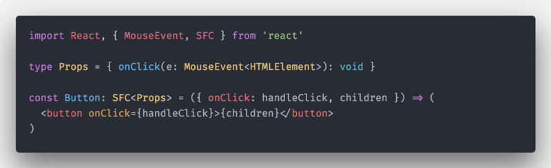
import React, { MouseEvent, ReactNode } from 'react'
type Props = {
 onClick(e: MouseEvent<HTMLElement>): void
 children?: ReactNode
}
const Button = ({ onClick: handleClick, children }: Props) => (
  <button onClick={handleClick}>{children}</button>
)
现在错误解决了,但是我们可以做的更好!
在@types/react中有一个预定义的类型type SFC<P>,它是interface StatelessComponent<P>的一个别名,它有预定义children和一些其他属性(defaultProps,displayName ...),使用它我们不必每次都自己写这些属性!
最终我们的无状态组件看起来像这样:
有状态组件(Stateful Component)
让我们创建有状态的计数器组件,它将使用我们的的Button组件
首先,我们需要定义initialState
const initialState = { clicksCount: 0 }
现在我们将使用Typescript从我们的实现中推断出State类型。
通过这样,我们不必单独维护类型和实现
type State = Readonly<typeof initialState>
另外需要注意,虽然显式定义了类型为只读的。但是在我们在使用的时候,还是需要显示定义state为只读的。
readonly state: State = initialState
为什么要这么做,有什么用?
我们知道我们无法在React中直接更新state,如下所示:
this.state.clicksCount = 2
this.state = { clicksCount: 2 }
这将会在运行的时候抛出错误,但不会再编译期间跑出。通过显式的定义我们的
type State为Readonly,然后在组件中再设置state为readonly,这样TS将知道state是只读的,当出现上面的情况的时候,TS将会抛出错误。
Example
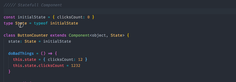
整个有状态组件的实现:
我们的组件没有使用Props API,所以我们需要设置Component的第一个泛型参数为object(因为props在React中被定义为{} ),然后将State作为第二个泛型参数。

你可能已经注意到我将状态更新函数提取到类外的纯函数。这是一种常见的模式,因为我们可以容易的对这些函数进行测试。另外因为我们正在使用typescript并且我们将State显式设置为只读,它将阻止我们在这些函数中做任何修改
const decrementClicksCount = (prevState: State)
                      => ({ clicksCount: prevState.clicksCount-- })

// 将抛出一个编译错误
//
// [ts]
// Cannot assign to 'clicksCount' because it is a constant or a read-only property.
默认Props(Default Props)
让我们给Button组件做一个扩展,添加一个类型为string的color属性
type Props = {
  onClick(e: MouseEvent<HTMLElement>): void
  color: string
}
如果我们需要定义defaultProps,那么我们可以通过Button.defaultProps = {...}来添加。
然后我们需要修改我们的Props的定义,将有默认值的属性标记为可选的
如下(注意?操作符)
type Props = {
  onClick(e: MouseEvent<HTMLElement>): void
  color?: string
}
我们的Component看起来像这样:
const Button: SFC<Props> = ({ onClick: handleClick, color, children }) => (
  <button style={{ color }} onClick={handleClick}>
    {children}
  </button>
)
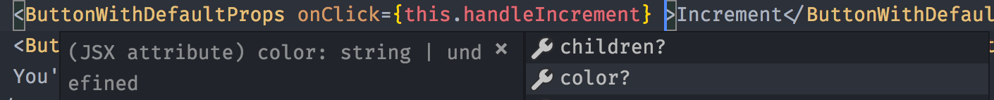
虽然这个方法适用于这个简单的例子,但存在一个问题。因为我们处于严格模式下,所以可选属性color的类型实际为undefined | string的联合类型
假设我们想对那个特殊的属性color做一些操作,TS将会抛出一个错误,因为它不确定color的类型。

为了符合TS编译器,我们有3种方法:
- 使用 非空断言操作符 虽然它是可选的,但可以明确告诉编译器在我们的渲染中这个值不会是
undefined,如下所示:<button onClick={handleClick!}>{children}</button> - 使用 条件语句/三元运算符 使编译器可以推断出prop不是未定义的:
<button onClick={handleClick ? handleClick: undefined}>{children}</button> - 创建可重用的
withDefaultProps高阶函数,使用它更新我们的props类型定义,并设置默认值。我认为这是最干净的解决方案
我们可以非常轻松地实现高阶函数:

现在我们可以使用我们的withDefaultProps高阶函数来定义我们的默认props,这也将解决我们之前的问题:
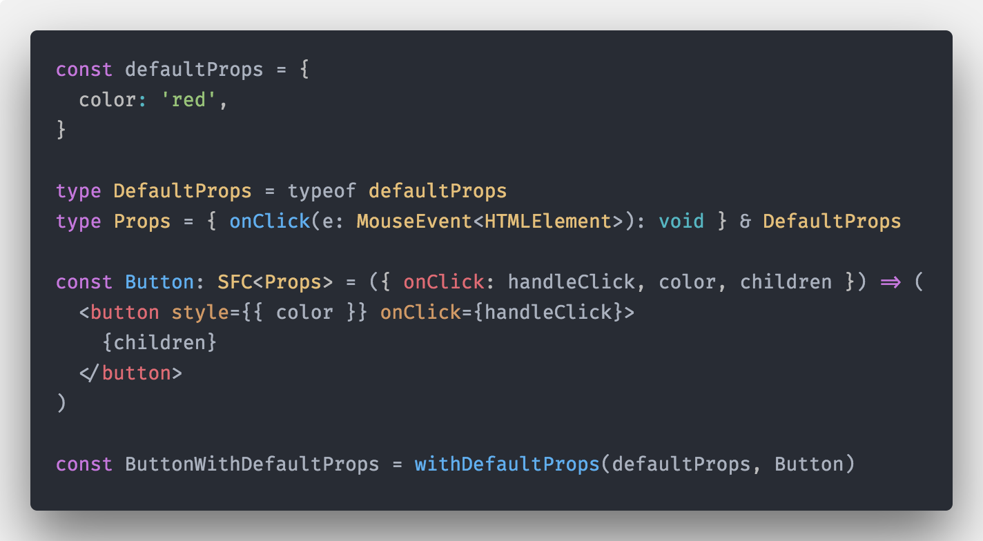
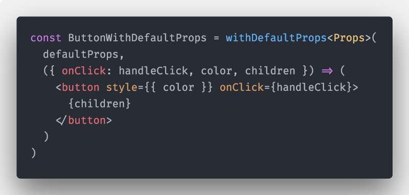
或者直接内联(注意,我们需要显式提供Button Props的类型,因为TS无法从函数中推断出参数类型):
现在Button的Props被正确定义了,但是对于默认的props,在定义的时候,仍然需要设置为可选的。
{
  onClick(e: MouseEvent<HTMLElement>): void
  color?: string
}
用法保持不变:
render(){
  return (
    <ButtonWithDefaultProps
      onClick={this.handleIncrement}
    >
      Increment
    </ButtonWithDefaultProps>
  )
}
并且,也能通过withDefaultProps定义class组件
它看起来像这样:
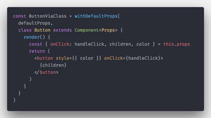
用法依然保持不变:
render(){
  return (
    <ButtonViaClass
      onClick={this.handleIncrement}
    >
      Increment
    </ButtonViaClass>
  )
}
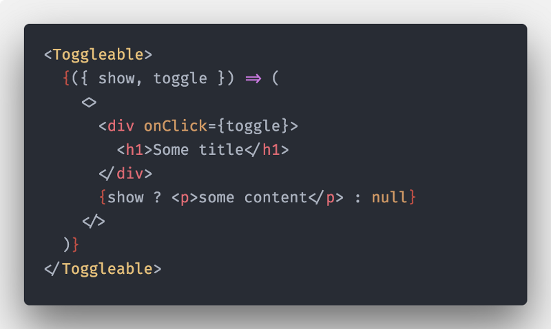
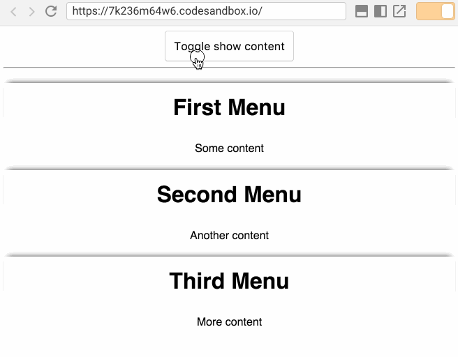
假如你需要构建一个可扩展的菜单组件,当用户点击它时,会显示一些字内容。接下来我们通过使用React的组件模式来实现。
渲染回调/渲染Props模式(Render Callbacks/Render Props pattern)
让组件逻辑可重用的最佳方法是将组件的子组件转换为函数或利用render prop API。
让我们来实现一个含有render props的Toggleable的组件:

让我们仔细看看我们实现的每个功能:
const initialState = { show: false }
type State = Readonly<typeof initialState>
在这里,我们像前面的例子一样定义我们的状态,没有什么新的东西
现在我们需要定义我们组件的props(注意我们使用的是Partial映射类型,因为我们知道所有props都是可选的,而不是给每个属性手动添加?操作符):
type Props = Partial<{
  children: RenderCallback
  render: RenderCallback
}>
type RenderCallback = (args: ToggleableComponentProps) => JSX.Element
type ToggleableComponentProps = {
  show: State['show']
  toggle: Toggleable['toggle']
}
因为我们想要支持两个渲染函数属性,所以这两个属性应该都是可选的。为了DRY,我们可以定义一个RenderCallback渲染函数类型:
type RenderCallback = (args: ToggleableComponentProps) => JSX.Element
对我们来说最后一个别名可能看起来很奇怪,
type ToggleableComponentProps!
type ToggleableComponentProps = {
  show: State['show']
  toggle: Toggleable['toggle']
}
我们再次使用typescript强大的类型查找功能,因此在定义类型时我们不必重复定义:
-
show: State['show']我们通过show来查找State的类型 -
toggle: Toggleable['toggle']我们通过从类中获取toggle的类型,然后利用TS中的类型推断功能,定义类型
其余的实现都很简单,标准render props/children作为函数模式:
export class Toggleable extends Component<Props, State> {
  // ...
  render() {
    const { children, render } = this.props
    const renderProps = { show: this.state.show, toggle: this.toggle }
    if (render) {
      return render(renderProps)
    }
    return isFunction(children) ? children(renderProps) : null
  }
  // ...
}
现在我们可以将一个函数作为子组件传递给Toggleable组件:
或者我们可以传递一个函数给render prop:
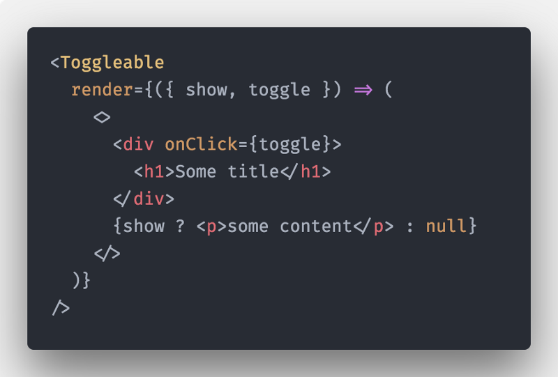
感谢Typescript,我们还可以使用intellisense来对render prop的参数进行正确的类型检查:

如果我们想重用它(对于菜单之类的组件),我们可以快速的创建一个使用Toggleable逻辑的新组件:
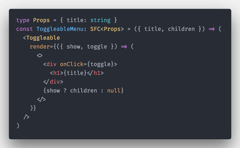
我们全新的ToggleableMenu组件可以直接放入Menu中使用:

它将按预期工作:

当我们只想改变渲染内容而不管状态时,这种方法非常有用:正如你所看到的,我们已经将渲染逻辑放到我们的ToggleableMenu子函数中,将状态逻辑放到我们的Toggleable组件中!
组件注入(Component Injection)
为了使我们的组件更加灵活,我们可以使用组件注入模式。
什么是组件注入模式?如果你熟悉React-Router,则可以使用以下方式定义路由:
<Route path="/foo" component={MyView} />
所以我们可以通过往组件中“注入”component属性来代替,render props/children作为函数模式,因此,可以将内联的渲染函数,重构为一个可重用的无状态组件:
import { ToggleableComponentProps } from './toggleable'
type MenuItemProps = { title: string }
const MenuItem: SFC<MenuItemProps & ToggleableComponentProps> = ({
  title,
  toggle,
  show,
  children,
}) => (
  <>
    <div onClick={toggle}>
      <h1>{title}</h1>
    </div>
    {show ? children : null}
  </>
)
有了它,我们可以在ToggleableMenu中使用,render props重构:
type Props = { title: string }
const ToggleableMenu: SFC<Props> = ({ title, children }) => (
  <Toggleable
    render={({ show, toggle }) => (
      <MenuItem show={show} toggle={toggle} title={title}>
        {children}
      </MenuItem>
    )}
  />
)
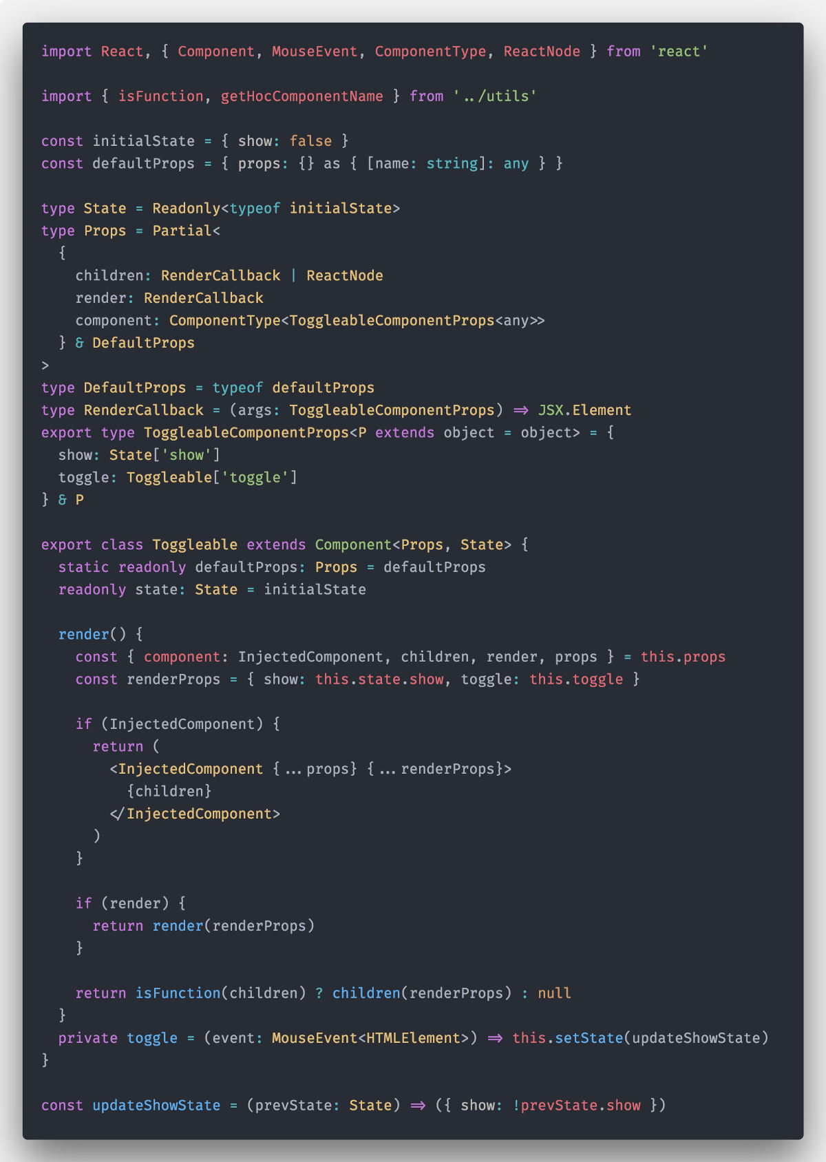
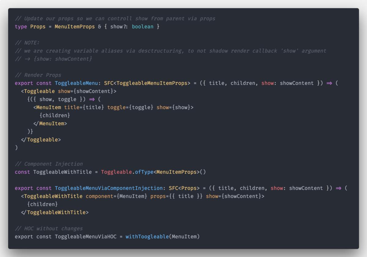
现在完成了,让我们定义我们新的API - component属性。
我们需要更新我们的props API。
children可以是函数或者是ReactNodecomponent是我们新的API,它接受一个实现了ToggleableComponentProps并将泛型设置为any的组件,因此,只要实现了ToggleableComponentProps的组件都可以通过TS校验器props因为需要使用它来传递任意的属性,因此我们需要放弃严格的类型安全,将它定义为any类型的可索引类型,这是一种很常见的模式
const defaultProps = { props: {} as { [name: string]: any } }
type Props = Partial<
  {
    children: RenderCallback | ReactNode
    render: RenderCallback
    component: ComponentType<ToggleableComponentProps<any>>
  } & DefaultProps
>
type DefaultProps = typeof defaultProps
接下来,我们需要给我们的ToggleableComponentProps组件添加新的API,让组件可以被这样使用<Toggleable props={...}/>:
export type ToggleableComponentProps<P extends object = object> = {
  show: State['show']
  toggle: Toggleable['toggle']
} & P
现在我们需要更新我们的render方法
render() {
    const {
     component: InjectedComponent,
     children,
     render,
     props
    } = this.props
    const renderProps = {
     show: this.state.show, toggle: this.toggle
    }
    // 组件注入
    if (InjectedComponent) {
      return (
        <InjectedComponent {...props} {...renderProps}>
          {children}
        </InjectedComponent>
      )
    }
    if (render) {
      return render(renderProps)
    }

    // children函数渲染
    return isFunction(children) ? children(renderProps) : null
  }
接下来我们使用render渲染属性,children作为函数渲染,还有组件注入三种方式实现Toggleable组件:
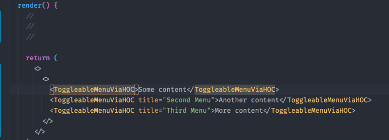
最后我们看下ToggleableMenuViaComponentInjection怎么使用component的:

但是要注意,我们对props属性没有做类型检查,因为它被定义为可索引对象{ [name: string]: any }

现在我们可以像ToggleableMenu一样使用ToggleableMenuViaComponentInjection
export class Menu extends Component {
  render() {
    return (
      <>
        <ToggleableMenuViaComponentInjection title="First Menu">
          Some content
        </ToggleableMenuViaComponentInjection>
        <ToggleableMenuViaComponentInjection title="Second Menu">
          Another content
        </ToggleableMenuViaComponentInjection>
        <ToggleableMenuViaComponentInjection title="Third Menu">
          More content
        </ToggleableMenuViaComponentInjection>
      </>
    )
  }
}
泛型组件(Generic Components)
当我们在实现“组件注入模式”的时候,我们放弃了对组件的props中的props属性的类型检查。现在也想对它进行类型检查,那么我们可以将Toggleable改写为泛型组件!
首先,我们需要定义我们的props的泛型,并添加默认的泛型参数,这样我们就可以不需要显式的提供泛型参数(用于render props/children作为函数)
type Props<P extends object = object> = Partial<
  {
    children: RenderCallback | ReactNode
    render: RenderCallback
    component: ComponentType<ToggleableComponentProps<P>>
  } & DefaultProps<P>
>
我们还需要将ToggleableComponentProps改为泛型的。但是,它好像已经是了,所以不需要做任何修改。
需要改变的定义是type DefaultProps,修改如下:
type DefaultProps<P extends object = object> = { props: P }
const defaultProps: DefaultProps = { props: {} }
几乎完成了!
现在让我们定义我们的class泛型组件。我们再次使用默认参数,这样我们在使用组件的时候,不必指定泛型参数!
export class Toggleable<T = {}> extends Component<Props<T>, State> {}
定义好了,那么我们如何在JSX中使用呢?
一个坏消息,我们没法直接使用...
我们需要引入ofType泛型组件工厂模式
export class Toggleable<T extends object = object> extends Component<Props<T>, State> {
  static ofType<T extends object>() {
    return Toggleable as Constructor<Toggleable<T>>
  }
}
Toggleable组件支持,render函数、children作为函数、组件注入、泛型props的实现如下:

现在使用static ofType工厂方法,我们可以创建类型正确的泛型组件
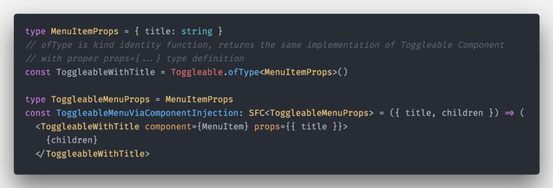
不需要做任何改变,但是这次我们的props属性就可以正确的做类型检查了。

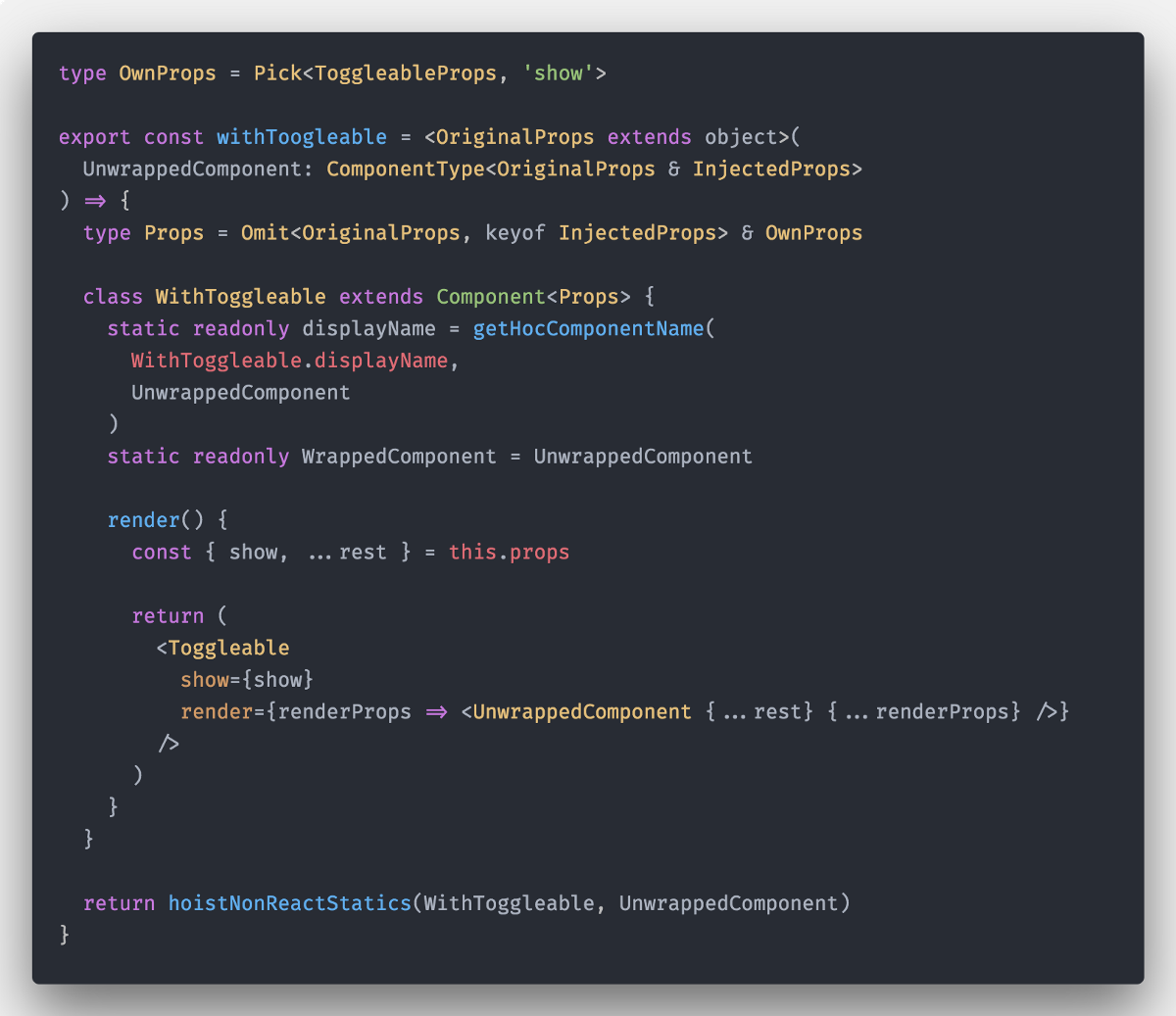
高阶组件(High Order Components)
因为我们已经使用了render callback模式创建Toggleable组件,所以很容易实现HOC。(这也是render callback模式的一大优势,我们可以利用它来实现HOC)
让我们来实现我们的HOC:
我们需要创建:
- displayName(为了方便在devtools中调试)
- WrappedComponent(为了我们能够知道原始组件 - 对测试很有用)
- 从
hoist-non-react-staticsnpm包中,引入hoistNonReactStatics方法

现在我们也可以通过HOC创建Toggleable菜单项,并且props也是类型安全的!

所有代码都正常工作,并且都能够做类型校验!
受控组件(Controlled Components)
在文章的最后!我们希望父组件能够控制Toggleable中的内容显示。这是一种非常强大的模式。
我们需要修改我们的ToggleableMenu组件的实现,如下所示:
修改完成之后,接下来需要在Menu中添加状态,并将它传递给ToggleableMenu

让我们最后一次更新我们的Toggleable
开发我们的Toggleable受控组件,我们需要执行以下操作:
- 添加
show到我们的PropsAPI - 更新默认props(因为
show是可选参数) - 将初始化的Component.state设置为Props.show的值,因为真实的数据来自于父级组件
- 在componentWillReceiveProps生命周期函数中,从props中正确更新state
1&2:
const initialState = { show: false }
const defaultProps: DefaultProps = { ...initialState, props: {} }
type State = Readonly<typeof initialState>
type DefaultProps<P extends object = object> = { props: P } & Pick<State, 'show'>
3&4:
export class Toggleable<T = {}> extends Component<Props<T>, State> {
  static readonly defaultProps: Props = defaultProps
  // Bang operator used, I know I know ...
  state: State = { show: this.props.show! }
  componentWillReceiveProps(nextProps: Props<T>) {
    const currentProps = this.props
    if (nextProps.show !== currentProps.show) {
      this.setState({ show: Boolean(nextProps.show) })
    }
  }
}
最后,我们的Toggleable组件支持所有的模式(render Props/Children作为函数/组件注入/泛型组件/受控组件)

最后的最后,通过withToggleable生成高阶组件Toggleable
只需要简单修改一下,我们只需要将show属性的值传递给我们的高阶组件,并且更新OwnPropsAPI就可以了。
总结
在React中使用Typescript编写类型安全的组件可能很棘手。但是因为Typescript 2.8添加的新功能,我们几乎可以遵循常见的React组件模式来编写类型安全的组件。
在这篇超级长的文章中,我们学习了在Typescript严格模式中,实现了类型安全的具有各种模式的组件。
在所有模式中,最强大的模式确实是Render Props,它允许我们实现其他的常见模式,如组件注入或HOC。
这篇文章中的所有的demos都可以在我的Github中找到
同样重要的是,我们可以意识到,只有使用VDOM/JSX的库中,才能在模板中实现类型安全,如本文所示。
- Angular在模板中提供了类型的检查,但是在诸如ngFor等指令内部的检查却失败了...
- Vue还没有实现和Angular一样的模板类型检查,所以他们的模板和数据绑定只是魔术字符串
如果你有任何问题,可以在这里或者是我的twitter中问我。