此实验来自于part1中的具体要求:
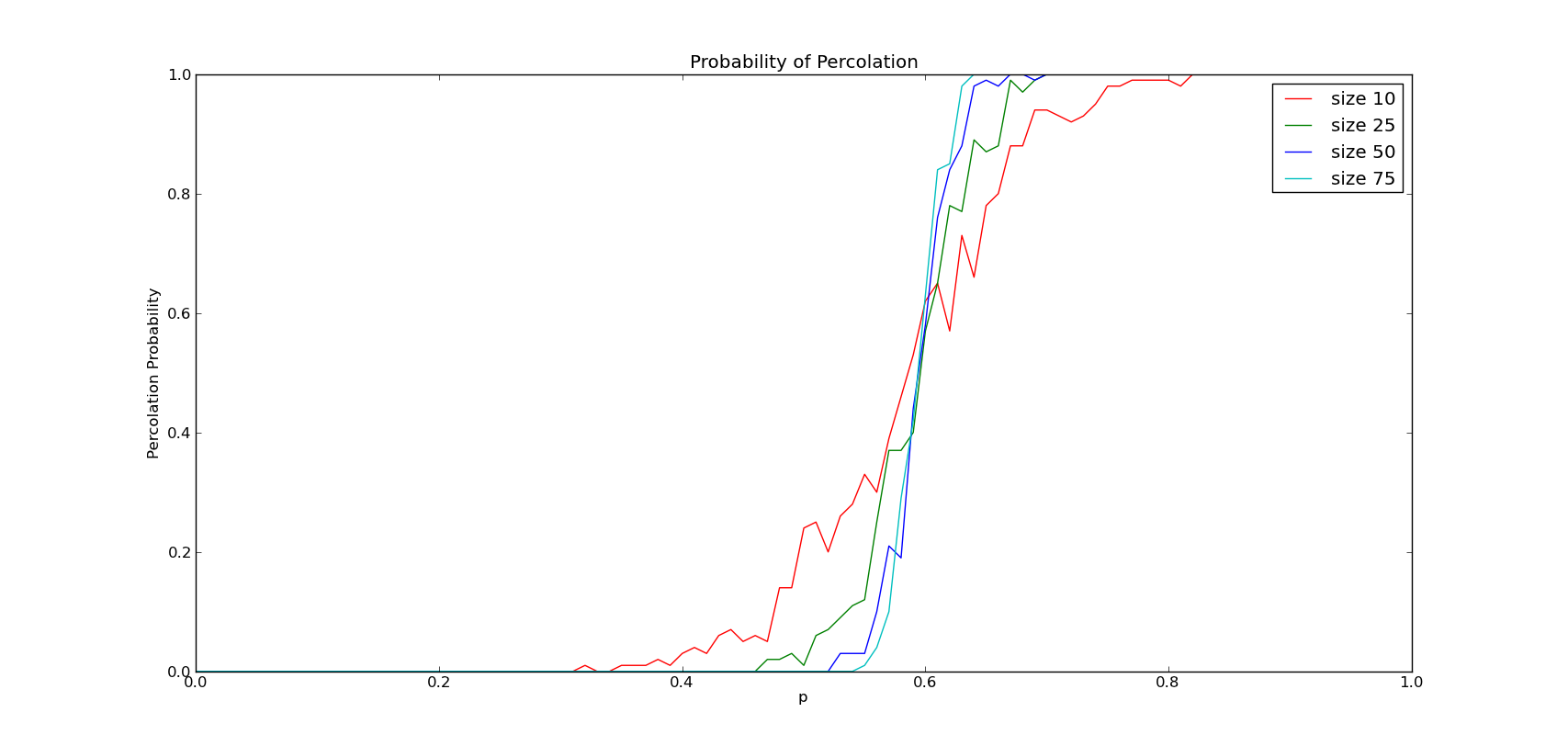
Next, consider grid sizes n = 10, 25, 50, and 75 and determine the percolation probabilities (you already know it for n=25). One way to visualize the performance for the different values of n is to make the same curve as above and show all three in one plot. Discuss how the size of the grid seems to impact the percolation probability and the shape of the curves. Place all code generating the curves into file experiment_n_varies.py.
下一步,分别对n=10,25,50,75的网格进行实验,并确定其渗透率(n=25的已经得出)。可视化不同n值的结果的方法之一是同上面所述的一样,画出同样的曲线,并把三条曲线画在同一幅图中。讨论网格的大小是如何影响渗透率的,以及曲线的形状。把产生曲线的所有代码放在experiment_n_varies.py文件中。
要求很简单,就是测试不同大小的网格对于渗透率的影响,对于结果咱倒是挺好奇的,我无责任猜测,网格的size越大,发生渗透的概率也会越高。测试脚本如下:
 Test Code

"""
Created on Wed Aug 10 12:46:25 2011
@author: Nupta
"""
from percolation_wave import *
from my_percolation_recursive import *
from pylab import *
step = 0.01
trial_count = 100
sizes = [10, 25, 50, 75]
if __name__ == '__main__':
TotalResults=[]
for size in sizes:
p = 0
results = []
while p < 1:
print 'Running for p =', p, '...'
perc_count = 0
for k in range(trial_count):
g = random_grid(size, p)
flow,perc = percolation_wave(g,trace=False)
if perc:
perc_count += 1
prob = float(perc_count)/trial_count
print 'percolation q=',prob
results.append(prob)
p += step
TotalResults.append(results)
#print len(results)
#b = bar(arange(0,1,step), results, width=step, color='r')
xaxis = arange(0,1,step)
plot(xaxis, TotalResults[0], 'r', label='size 10')
plot(xaxis, TotalResults[1], 'g', label='size 25')
plot(xaxis, TotalResults[2], 'b', label='size 50')
plot(xaxis, TotalResults[3], 'c', label='size 75')
legend()
xlabel('p')
ylabel('Percolation Probability')
title('Probability of Percolation')
show()
结果还是和猜想有点不同的,存在一个临界范围,粗略看做为一个临界值p,使得低于此p值下,n越大,渗透率越低;高于此p值后,渗透率与n成正比。