Nine Great Books about Information Visualization
Maybe it’s anachronistic to celebrate static, printed books when so many of us love and create interactive data displays. I don’t care. I love books.
Edward Tufte, the patron saint of information visualization, haspublished four legendary books. Here are nine more indispensable favorites about visualizing information. I’ve limited myself to books I’ve actually read; if you find a favorite missing, leave a response! Let’s start with:
Now You See It
by Steven Few
Steven Few is an unsung hero of information visualization. Steadily he toils in the shadow of The Great and Wonderful Tufte as the vanguard of business intelligence dashboards. Few writes practical, clear, no-nonsense advice about information-dense dashboards. He focuses on execution, not theory, and for that, his most popular title, Now You See It, is great foundational reading.
Few highlights the power of visualizations to help us “think with our eyes” and overcome the limits of human memory (see The Magical Number Seven). From small multiples to brushing data on dashboards, he emphasizes externalizing information processing to help the brain do what it does best — recognize patterns.
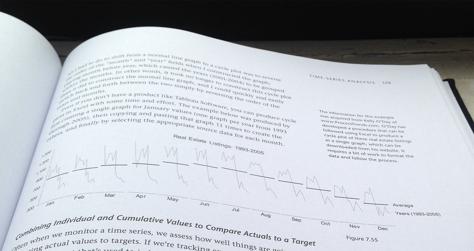
Few also covers a surprising amount of data analysis in Now You See It. The book provides an approachable introduction to data science, from navigating data to common patterns in time-series, deviation, distribution, correlation, and multivariate data. The below graphic is a great example of Few’s approach: here, Few regroups data by month to correct for periodicity and adds an average to help the reader see the patterns in the data.
Semiology of Graphics
by Jacques Bertin
Make no mistake: this is the ur-book of information visualization. Bertin’s masterpiece, published in 1967, outlines an systemic approach to the creation of information graphics as no other book has, before or since. In fact, Bertin provides a simple table that ties together math, music, and graphics, right on the second page of Semiology of Graphics:
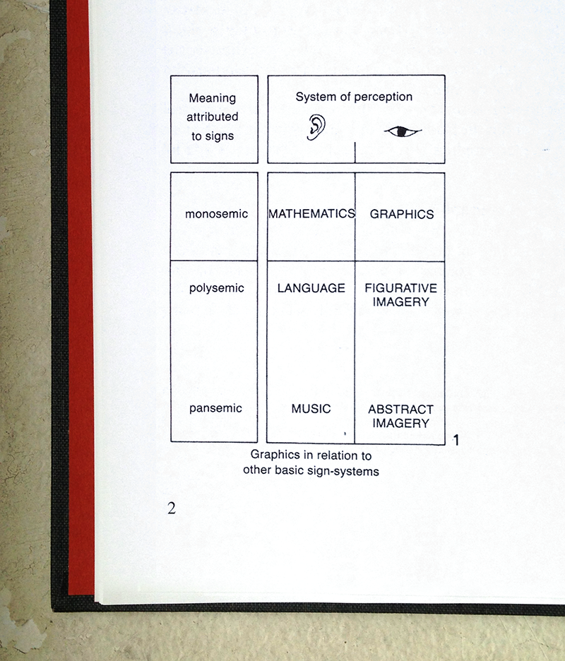
This table exemplifies Bertin’s approach to visualizing information: break a problem into its constituent elements, cross them, then examine and define each intersection. Bertin presents a whole system in Semiology of Graphics: he begins with retinal variables, such as size and color, which express planar dimensions, such as association, order, and quantity. Watch Bertin demonstrate the distinct graphic opportunities that the retinal variables provide for solving the same visual problem:

After addressing fundamentals, Bertin dives into theory. He covers the three questions every visualization should answer, as well as the three functions of visualization: recording, communicating, and processing information — here, by using his infamous “contingency table” and “reorderable matrix.” Bertin covers maps, graphics, and so much more in Semiology — though dense, a read pays dividends.
WSJ Guide to Information Graphics
by Dona M. Wong
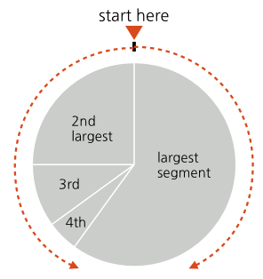
Wong’s reference book, Guide to Information Graphics, is rarely far from my desk. Even after years of designing visualizations, I still turn to page 75 for a quick check on her guidelines for ordering wedges in a pie chart — on the rare occasion I’m designing a pie chart, that is.
If you think that’s a simple and useful diagram, Wong’s book offers many more: 140 pages of ready reference for the working visualization designer. Guide to Information Graphics goes beyond chart fundamentals, too — the book also provides tips for math and copy writing, as well as a fun (and helpful) chapter titled “Tricky Situations”.
Visualize This
by Nathan Yau
Nathan Yau’s Visualize This is a fantastic book for beginners ready to move beyond out-of-the-box visualization tools and to create their own work.
Yau breaks down easy processes to create essential visualizations like bar graphs and U.S. maps. Using R to create visualizations, or taking rough graphs from Excel into Illustrator, are methods I use often, even today. For example, in a few clearly explained pages, Yau teaches how to transform a table of information into an excellent small-multiples visualization like this:

Information Visualization
by Colin Ware
Fair warning: I felt mislead by the title of this book. Though I expected another book about colors, shapes, bar graphs, line charts and the like, I found instead hardware specification for your eyes and brain.Information Visualization explains how our minds process visual information. It’s all there, from an in-depth explanation of how eyes seek edges and patterns, to color theory, to space perception, and even a chapter on the limits of memory.
By way of example, a nugget of knowledge I learned from Information Visualization: extend your arm and hold up your thumb — your thumbnail represents the extent of your focus, or more specifically, your fovea, where the vast majority of the cones that provide color vision cluster. Beyond your thumbnail, your brain is far more responsive to motion than to detail, which helps explain why animation can be incredibly powerful for visualizations and pre-attentive processing.
Designing Interfaces
by Jenifer Tidwell
Though Tidwell’s Designing Interfaces is hardly the only book on its subject, it is perhaps the best book I’ve read about common web design patterns. Anyone interested in designing interactive information visualizations would do well to familiarize herself with these common patterns. Though some forms, such as bar graphs and line graphs, may have matured, interaction with these forms still provides many opportunities for every designer.
In the book, Tidwell provides a practical overview of fundamental interface patterns, from site architecture to forms and controls. Tidwell also describes when to use specifc patterns, framed by the problems these patterns solve and their benefits for users. I was delighted to discover that Chapter 7 specifically addresses “Showing Complex Data” — she’s writing for us! Designing Interfaces is an excellent resource for new designers and great reference for those with experience.
The Visual Miscellaneum
by David McCandless
I picked up the first edition of David McCandless’s book, The Visual Miscellaneum, after a trip to an exhibit at the Cooper Hewitt Design Museum. Bar none, this is the book that convinced me to make information visualization my professional focus.
I fell in love with McCandless’s playful and unpretentious approach to visualizing data and information about the world around us, from budgets to to beards. The enthusiasm that welcomed his work made me believe that I could find a place in the world visualizing information. I turn to his book for inspiration, usually to see this frequently consulted graphic:
World Geographic Atlas
by Herbert Bayer
My favorite book of inspirational data graphics is, naturally, out of print and in demand. I watched eBay for months until I found a slightly damaged copy of World Geographic Atlas for less than four figures. It was worth it.
In 1953, the Container Corporation of America commissioned Bauhaus designer Herbert Bayer to create an atlas to commemorate the company’s 25th year of business. Alongside three other accomplished designers, Bayer worked for five years on an oversize (11.5" x 15.5") book of 368 pages, featuring over 2,200 diagrams. The results are stunning and, to my eye, yet unmatched. Just take a look at this rich spread on the United Kingdom and the Scandinavian countries:

From color choice to icon design, to illustrations, to topographic choropleth maps, this book literally has it all. Find a copy if you can, or, take a few minutes to watch this video.
Metropolitan World Atlas
by Joost Grootens
Joost Grootens is a Dutch graphic designer. Although theMetropolitan World Atlas is not his only covetable book, it is certainly my favorite. Grooten’s style is spare — he designs with only a few colors, one or two typefaces, and repeats, repeats, and repeats structure. This restraint lets his data — geographic or otherwise — take center stage.
Metropolitan World Atlas maps 50 major global cities at the same scale with consistent visualizations of data about those cities, including economic and population factors. It is strangely difficult to find any examples of a scaled comparison of major cities, let alone examples this beautiful and useful. Grootens takes advantage of the physical affordances of the book — comparing two cities is as easy as flipping pages back and forth:
Sadly, Metropolitan World Atlas is another out-of-print treasure. If you can find one, be sure to scoop it up!