shape 可以绘制简单的图形,颜色等。它主要就是应用于selector 的一些状态。
本文内容参考自http://www.cnblogs.com/cyanfei/archive/2012/07/27/2612023.html
自己验证了下,学习记录
它主要有以下几个部分,分别是
填充(solid):设置填充的颜色
间隔(padding):设置四个方向上的间隔
大小(size):设置大小
圆角(corners):设置图形圆角,默认是正方形的
渐变(gradient):当设置填充颜色后,无渐变效果。angle的值必须是45的倍数(包括0),仅在type="linear"有效,不然会报错。android:useLevel 这个属性不知道有什么用。
接下来针对上面的内容,自己写下demo进行验证学习。
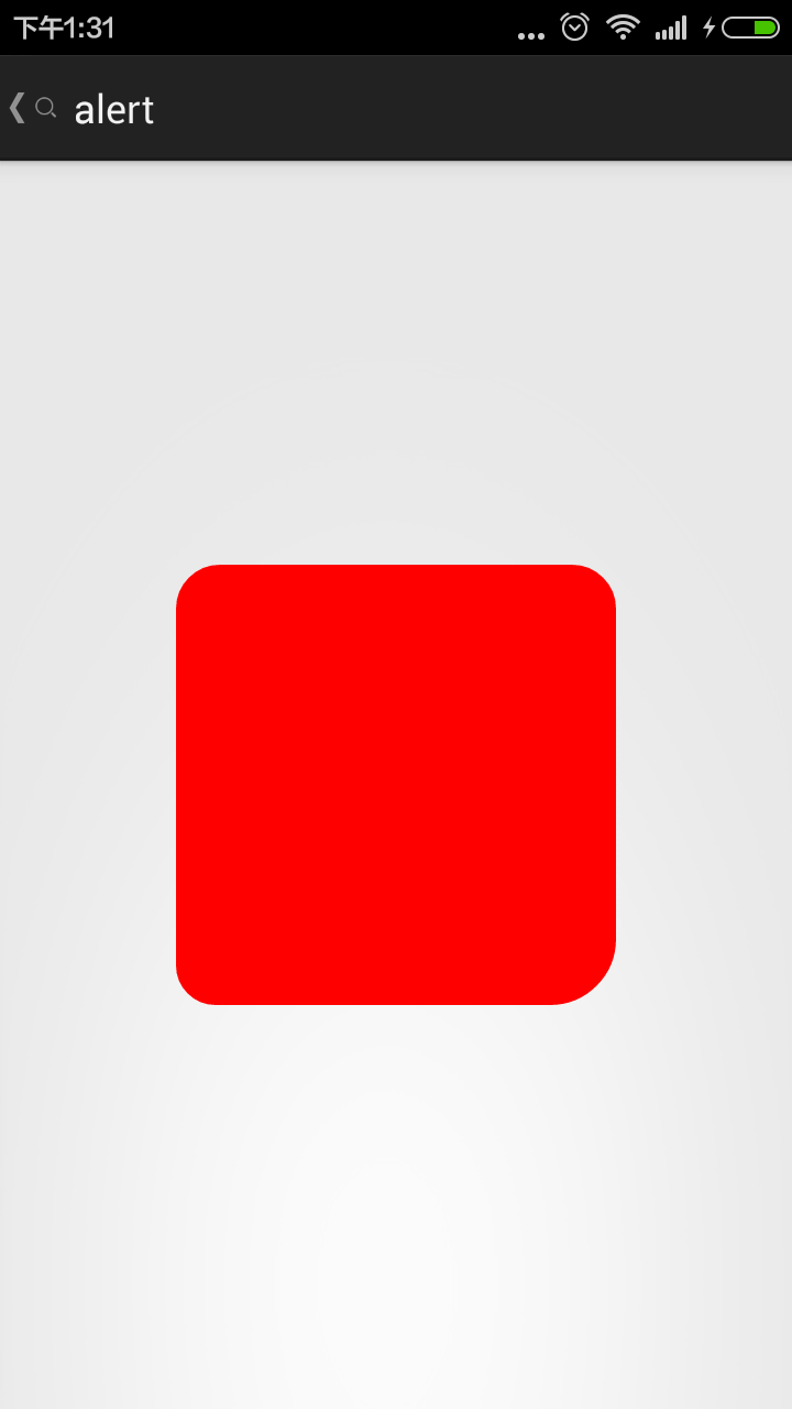
1.验证corners 效果
代码
<?xml version="1.0" encoding="utf-8"?>
<shape xmlns:android="http://schemas.android.com/apk/res/android" >
    <corners
        android:radius="20dp"
        android:topLeftRadius="12dp"
        android:bottomLeftRadius="18dp"
        android:topRightRadius="24dp"
        android:bottomRightRadius="30dp"/>
    <solid
        android:color="#ff0000"
        />

</shape>
效果

可以发现,当五个关于圆角半径的属性全部设置的时候,这时候radius 不起作用。
然后我们少了个属性试下
<corners
        android:bottomLeftRadius="18dp"
        android:bottomRightRadius="30dp"
        android:radius="20dp" />
效果
我们可以得出结论
android:Radius="20dp" 设置四个角的半径
android:topLeftRadius="20dp" 设置左上角的半径
android:topRightRadius="20dp" 设置右上角的半径
android:bottomLeftRadius="20dp" 设置右下角的半径
android:bottomRightRadius="20dp" 设置左下角的半径
radius是设置的四个角圆弧半径,一但这个角单独进行了设定,优先选择单角数值
另外,填充色solid必须有,否则看不到
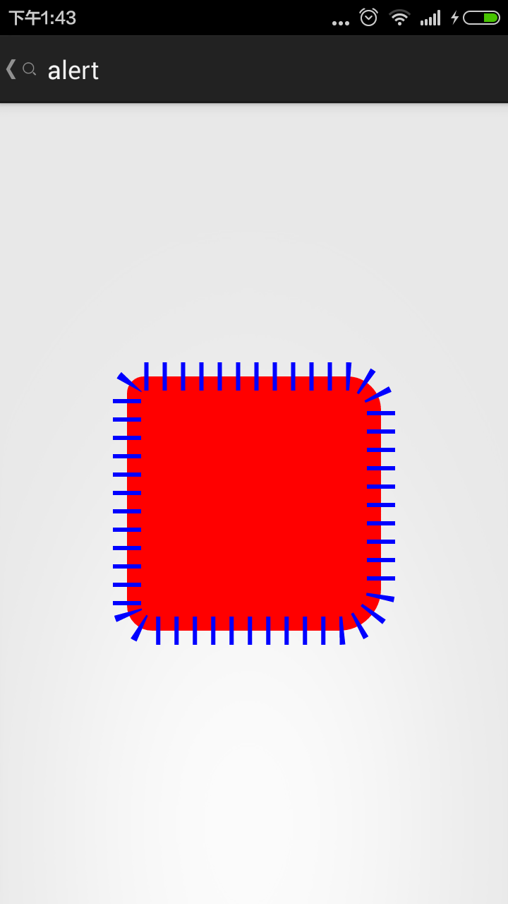
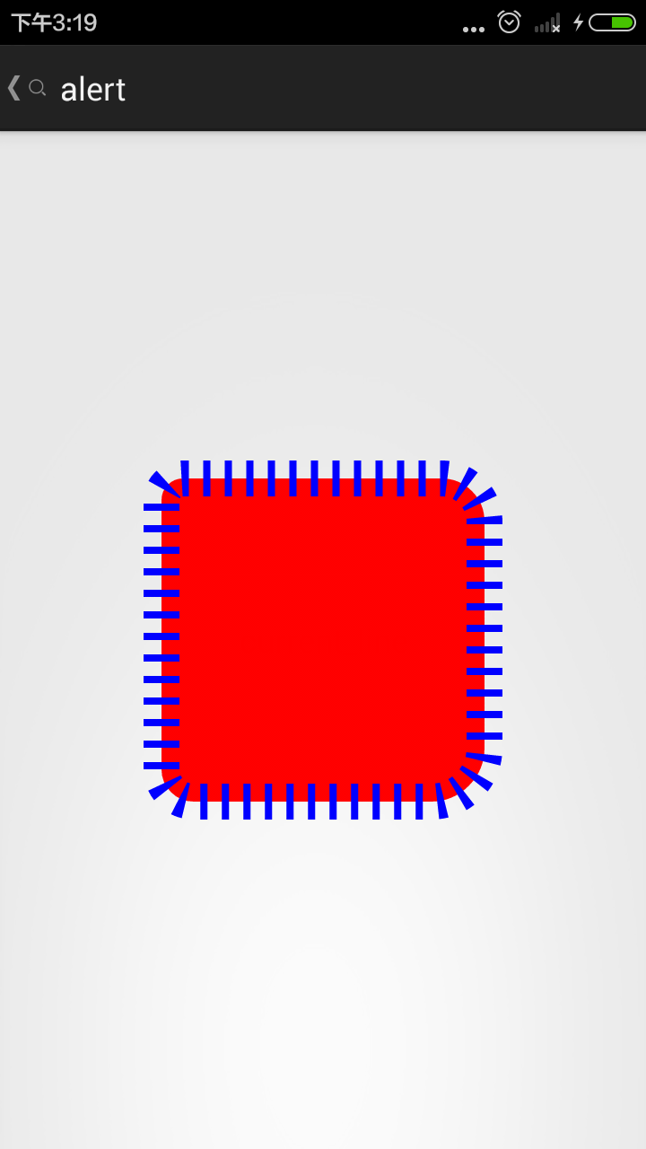
2.我们给上面的图形加个边框stroke
<?xml version="1.0" encoding="utf-8"?>
<shape xmlns:android="http://schemas.android.com/apk/res/android" >

    <corners
        android:bottomLeftRadius="18dp"
        android:bottomRightRadius="30dp"
        android:radius="20dp"
        android:topLeftRadius="12dp"
        android:topRightRadius="24dp" />

    <stroke
        android:dashGap="3dp"
        android:dashWidth="10dp"
        android:width="10dp"
        android:color="#0000ff" />

    <solid android:color="#ff0000" />

</shape>
看下效果

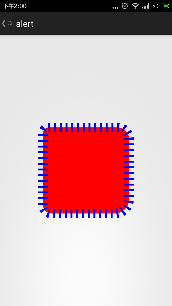
然后我们更改属性
<stroke
        android:dashGap="10dp"
        android:dashWidth="3dp"
        android:width="20dp"
        android:color="#0000ff" />
结果
如果dash属性有一个值为0,或不加这个属性
结果就是

结论
描边(stroke):dashWidth和dashGap属性,只要其中一个设置为0dp,则边框为实线边框
android:width="20dp" 设置边边的宽度
android:color="@android:color/black" 设置边边的颜色
android:dashWidth="2dp" 设置虚线的宽度
android:dashGap="20dp" 设置虚线的间隔宽度
而且加的边宽度并不是从原来的图形最外圈算起,而是里外各占一半
3.我们增加个渐变效果 gradient
<?xml version="1.0" encoding="utf-8"?>
<shape xmlns:android="http://schemas.android.com/apk/res/android" >

    <corners
        android:bottomLeftRadius="18dp"
        android:bottomRightRadius="30dp"
        android:radius="20dp"
        android:topLeftRadius="12dp"
        android:topRightRadius="24dp" />

    <stroke
        android:dashGap="8dp"
        android:dashWidth="4dp"
        android:width="20dp"
        android:color="#0000ff" />
    <gradient
        android:startColor="#00ff00"
        android:centerColor="#ffff00"
        android:endColor="#00ffff"
        android:useLevel="true"
        android:angle="30"
        android:type="linear"
        android:gradientRadius="30"
        />

    <solid android:color="#ff0000" />

</shape>
运行上述代码报错
原因
angle = "30" 不是45倍数
修改以后
原因
里面有solid填充属性,导致渐变效果无效
去掉填充item项。然后我们研究 angle
angle的值必须是45的倍数(包括0),仅在type="linear"有效
看下面angle不同取值时候的效果


0 45 90 135


180 225 270 315
从上面的结果看,似乎没什么规律啊
导致以上原因是我们对属性android:useLevel="true" 进行了设定
如果我们把这个值设为false,就会发现它的线性规律是
0VFC5ZT8DT8B")
例如,当我们设置useLevel = "false", angle = 225
其中,决定中间色位置的属性是
 android:centerX="50%"
 android:centerY="50%"
对于其他属性
看如下实例
<gradient
        android:angle="225"
        android:centerColor="#00ff00"
        android:endColor="#0000ff"
        android:centerX="50%"
        android:centerY="50%"
        android:startColor="#ff0000"
        android:type="radial"
        android:gradientRadius="40"
        android:useLevel="false" />
结果

修改其中的属性,如下
<gradient
        android:angle="225"
        android:centerColor="#00ff00"
        android:endColor="#0000ff"
        android:centerX="100%"
        android:centerY="50%"
        android:startColor="#ff0000"
        android:type="radial"
        android:gradientRadius="200"
        android:useLevel="false" />
结果

我们可以得出结论
android:centerX="100%"
android:centerY="50%"
这两个属性是渐变的起点
radial 这个是径向渐变
我们在看下
<gradient
        android:angle="225"
        android:centerColor="#00ff00"
        android:endColor="#0000ff"
        android:centerX="50%"
        android:centerY="50%"
        android:gradientRadius="200"
        android:startColor="#ff0000"
        android:type="sweep"
        android:useLevel="false" />
结果
我们可以发现,这时候的
android:gradientRadius="200"
已经不起作用了,但是
 android:centerX="50%"
 android:centerY="50%"
作用还是一样的
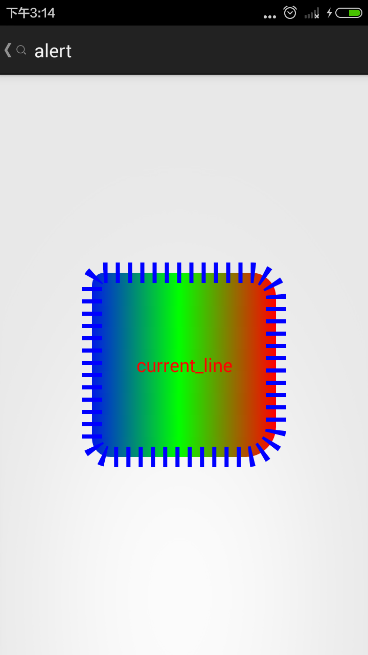
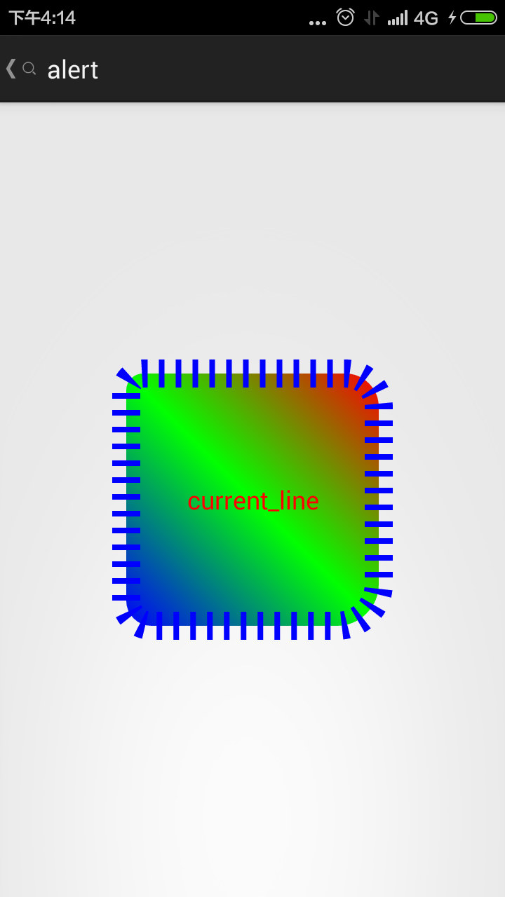
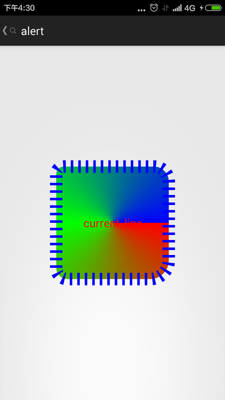
4.我们尝试更改下shape的大小size
上面我们的大小没有设置,都是自适应控件大小的,现在我们修改如下
测试控件
<ImageButton
            android:id="@+id/bt"
            android:layout_width="200dp"
            android:layout_height="200dp"
           android:layout_centerInParent="true"
            android:background="#000000"
            android:src="@drawable/shape_test"
            android:text="current_line"
            android:textColor="#ff0000" />
size大小设置
<size
        android:height="100dp"
        android:width="100dp" />
结果

我们继续更改
<size
        android:height="300dp"
        android:width="300dp" />
当我们把控件设置为自适应的时候

也就是说,这个属性相当于你做了一张图片,设置了这张图片的大小。
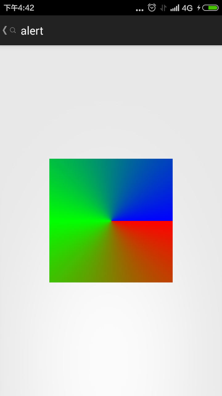
5.我们现在看下padding的性质
看对比
<padding

        android:left="100dp"
        android:top="20dp"
        android:bottom="20dp"
        android:right="20dp"
        />

    <size
        android:height="100dp"
        android:width="100dp" />
结果

但我们去掉padding的时候

其实是没有什么区别的。网上有人说
padding单独使用是没有效果的,必须是shape作为一个item的时候,使用才有效果。具体等以后用到再做调查吧