一、阴影
1.1、文字阴影
text-shadow
<length>①: 第1个长度值用来设置对象的阴影水平偏移值。可以为负值
<length>②: 第2个长度值用来设置对象的阴影垂直偏移值。可以为负值
<length>③: 如果提供了第3个长度值则用来设置对象的阴影模糊值。不允许负值
<color>: 设置对象的阴影的颜色。
示例代码:
<!DOCTYPE html>
<html>
    <head>
        <meta charset="UTF-8">
        <title></title>
        <style>
            .text{
                font: bold 100px/1.5 georgia, sans-serif;
                color: dodgerblue;
                text-shadow: 10px 10px 50px #000;
                /*text-shadow: 20px 30px 50px #000,-20px -30px 50px #f00;*/
            }
        </style>
    </head>
    <body>
        <div class="text">
            Shadow Text
        </div>
    </body>
</html>
运行效果:

1.2、盒子阴影
box-shadow
<length>①: 第1个长度值用来设置对象的阴影水平偏移值。可以为负值
<length>②: 第2个长度值用来设置对象的阴影垂直偏移值。可以为负值
<length>③: 如果提供了第3个长度值则用来设置对象的阴影模糊值。不允许负值
<length>④: 如果提供了第4个长度值则用来设置对象的阴影外延值。可以为负值
<color>: 设置对象的阴影的颜色。
inset: 设置对象的阴影类型为内阴影。该值为空时,则对象的阴影类型为外阴影

示例代码:
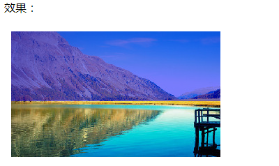
<!DOCTYPE html>
<html>
<head>
    <meta charset="UTF-8">
    <title></title>
    <style>
        .shadow1{
            margin: 30px;
            border: 10px solid #fff;
            box-shadow: 10px 10px 30px 0 #1E90FF,-10px -10px 30px 0 #1E90FF;
        }
        .shadow2{
            margin: 30px;
            border: 10px solid #fff;
            box-shadow: 0 0 40px 0 #1E90FF;
        }
        img{
            width: 600px;
            height: 80%;
        }
    </style>
</head>
<body>
<p>
    <img src="img/1.jpg" class="shadow2"/>
</p>
</body>
</html>
运行效果:

<!DOCTYPE html>
<html>
    <head>
        <meta charset="UTF-8">
        <title></title>
        <style>
            #div1{
                width: 400px;
                height: 200px;
                border: 20px solid rgba(0,0,255,.2);
                margin: 100px;
                padding: 20px;

                background: url(img/7.jpg) no-repeat;
                background-size:100% 100%;
                background-origin:padding-box;
            }
        </style>
    </head>
    <body>
        <div id="div1">

        </div>
    </body>
</html>
运行效果:


三、伪元素
伪元素不是真的元素是通过CSS虚拟出的一个元素,CSS3的语法为了区分伪元素与伪类,使用“::”表示,但是前期为了兼容“:”仍然可以使用。
3.1、before
在应用样式的元素内的前部虚拟一个元素可以指定元素的内容与样式。
示例:
<!DOCTYPE html>
<html>

<head>
    <meta charset="UTF-8">
    <title></title>
    <style type="text/css">
        #div1 {

            width: 300px;
            height: 140px;
            border: 5px solid lightcoral;
        }
        a{
            color:#2e6da4;
            text-decoration: none;
        }

        #div1:before {
            content: '这是before伪元素的内容';
            display: block;
            color: white;
            background: lightgreen;
        }

        #link1:before {
            content: attr(href);
        }

        #link2:before {
            content: url(img/4.jpg);
        }
    </style>
</head>

<body>
<div id="div1">
    <hr />
</div>

<p>
    <a href="http://www.cnblogs.com" id="link1">博客园</a>
</p>

<p>
    <a href="http://www.cnblogs.com/zhangyongl/" id="link2">张永林 - 博客园</a>
</p>
</body>

</html>
效果:

注意:
a)、本质上并不支持伪元素的双冒号(::)写法,而是忽略掉了其中的一个冒号,仍以单冒号来解析,所以等同变相支持了E::after。
b)、不支持设置属性position, float, list-style-*和一些display值,Firefox3.5开始取消这些限制。
c)、IE10在使用伪元素动画有一个问题:
.test:hover {}
.test:hover::after { /* 这时animation和transition才生效 */ }需要使用一个空的:hover来激活
3.3、清除浮动
方法一:
.clearfix:before, .clearfix:after {
    content:"";
    display:table;
}
.clearfix:after{
    clear:both;
    overflow:hidden;
}
.clearfix{
    *zoom:1;
}
方法二:
.clearfix {
                *zoom: 1;
                /*在旧版本的IE浏览器缩放大小,触发haslayout(类似BFC)*/
            }

            .clearfix:after {
                /*伪元素,在应用该元素后添加一个伪元素*/
                content: "";
                /*内容为空*/
                display: table;
                /*BFC,清除内部浮动*/
                clear: both;
                /*清除外部浮动*/
            }
4.1、border-radius 圆角
示例代码:
<!DOCTYPE html>
<html>
<head>
    <meta charset="UTF-8">
    <title>border-radius</title>
    <style type="text/css">
        #div1 {
            width: 300px;
            height: 180px;
            margin: 100px;
            padding: 10px;
            border: 5px solid lightgreen;

            /*border-radius: 20px;  /*4个角水平与垂直都为10px*/

            /*  border-radius: 30px 0 30px 0;  上右下左4个角*/

            /*border-radius: 190px; 4个角圆角是高宽一半*/

            border-radius: 165px 105px;
        }
    </style>
</head>
<body>
<div id="div1">
    border-radius: 165px 105px;
</div>
</body>
</html>
运行效果:
五、变形 transform
5.1、rotate()2D旋转
transform:rotate(<angle>)
angle是角度的意思,单位可以是:
deg 度(Degrees)
<!DOCTYPE html>
<html>

    <head>
        <meta charset="utf-8">
        <title></title>
        <style>
            .box-wrapper {
                width: 200px;
                height: 200px;
                border: 5px dashed lightgreen;
                padding: 5px;
                margin: 50px;
            }

            .box {
                width: 200px;
                height: 200px;
                background: lightblue;
                transform: rotate(45deg);
            }
        </style>
    </head>

    <body>
        <div class="box-wrapper">
            <div class="box">
            </div>
        </div>
        transform: rotate(45deg);
    </body>

</html>
效果:
5.2、设置原点 transform-origin
transform-origin用于设置变形时的原点,从5.1可以看出转动时默认的原点在中心,这里使用该属性修改原点位置。


<!DOCTYPE html>
<html>

    <head>
        <meta charset="utf-8">
        <title></title>
        <style>
            .box-wrapper {
                width: 200px;
                height: 200px;
                border: 5px dashed lightgreen;
                padding: 5px;
                margin: 50px 0 0 150px;
            }

            .box {
                width: 200px;
                height: 200px;
                background: lightblue;
                transform: rotate(30deg);
                transform-origin: left top;
                /*旋转的原点为左上角*/
            }
        </style>
    </head>

    <body>
        <div class="box-wrapper">
            <div class="box">
            </div>
        </div>
    </body>

</html>

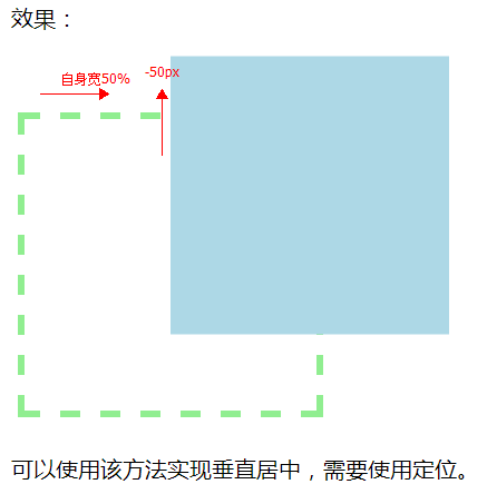
5.3、平移 translate()
transform:translate(x,y) = translate(<translation-value>[,<translation-value>]?),指定对象的2D translation(2D平移)。第一个参数对应X轴,第二个参数对应Y轴。如果第二个参数未提供,则默认值为0 。
示例:
<!DOCTYPE html>
<html>

    <head>
        <meta charset="utf-8">
        <title></title>
        <style>
            .box-wrapper {
                width: 200px;
                height: 200px;
                border: 5px dashed lightgreen;
                padding: 5px;
                margin: 50px 0 0 150px;
            }

            .box {
                width: 200px;
                height: 200px;
                background: lightblue;
                transform: translate(50%,-50px);
            }
        </style>
    </head>

    <body>
        <div class="box-wrapper">
            <div class="box">
            </div>
        </div>
    </body>

</html>
5.4、缩放 scale
transform:scale(x,y)
scale(): 指定对象的2D scale(2D缩放)。第一个参数对应X轴,第二个参数对应Y轴。如果第二个参数未提供,则默认取第一个参数的值
示例:
<!DOCTYPE html>
<html>

    <head>
        <meta charset="utf-8">
        <title></title>
        <style>
            .box-wrapper {
                width: 200px;
                height: 200px;
                border: 5px dashed lightgreen;
                padding: 5px;
                margin: 50px 0 0 150px;
            }

            .box {
                width: 200px;
                height: 200px;
                background: lightblue;
                transform: scale(0.5,1.5);  /*宽度缩小到1半,高度放大到1.5倍*/
            }
        </style>
    </head>

    <body>
        <div class="box-wrapper">
            <div class="box">
            </div>
        </div>
    </body>

</html>


示例代码:
<!DOCTYPE html>
<html>
<head>
    <meta charset="UTF-8">
    <title></title>
    <style type="text/css">
        #demo{
            margin:200px auto;
            background-color: #FFFFFF;
            border-width:2px;
            border:2px solid #000;
            height: 110px;
            width: 90px;
            position: relative;
        }


        #demo:after {
            content: '';
            display: block;
            position: absolute; /*在这里要使用绝对定位*/
            top: 20px;
            width: 20px;
            height: 20px;
            border: 1px solid;
            right: -12px;
            border-bottom-color: white;
            border-left-color: white;
            transform: rotate(45deg);
            background-color: #FFFFFF;
        }

    </style>
</head>
<body>

<div id="demo">

</div>
</body>
</html>

示例代码:
<!DOCTYPE html>
<html>

    <head>
        <meta charset="utf-8">
        <title></title>
        <style>
            .box {
                width: 500px;
                height: 200px;
                background: lightblue;
                font: 43px/200px "microsoft yahei";
                color: darkblue;
                text-align: center;
                margin: 0 auto;
                text-shadow: 0 1px 1px #fff;
                position: relative;
            }

            .box:before,
            .box:after {
                content: ' ';
                position: absolute;
                bottom: 10px;
                left: 5px;
                width: 50%;
                height: 20%;
                box-shadow: 0 10px 20px #ccc;
                transform: rotate(-3deg);
                z-index: -1;
            }

            .box:after {
                left: auto;
                right: 5px;
                transform: rotate(3deg);
            }
        </style>
    </head>

    <body>
        <div class="box">
            Hello World By CSS3
        </div>
    </body>

</html>
运行效果:

六、渐变
示例代码:
<!DOCTYPE html>
<html>
    <head>
        <meta charset="utf-8">
        <title>linear-gradient</title>
        <style>
            .box {
                height: 200px;
                width: 200px;
                float: left;
                margin: 20px;
            }
            #div1{
                background: linear-gradient(orange,navy);
                /*从上到下橙色到蓝色渐变*/
            }
            #div2{
                background: linear-gradient(lightgreen,lightcoral 40%,lightblue);
                /*绿红蓝从上到下渐变,中间的40%表示红出现的位置,如果不指定则均匀分配*/
            }

            #div3{
                background: linear-gradient(0deg,red 20%,yellow 50%,green 80%);
                /*0度角方向(从下向上)*/
            }

            #div4{
                background: linear-gradient(45deg,blue,pink);
                /*目标方向45度角方向*/
            }

            #div5{
                background: linear-gradient(to top left,#000,#fff);
                /*从右下到左上的渐变*/
            }
            span{
                font: 50px/50px "microsoft yahei";
                color: linear-gradient(to left,red,blue);
                /*前景色无效,背景有效*/
            }
        </style>
    </head>

    <body>
        <div class="box" id="div1">
        </div>
        <div class="box" id="div2">
        </div>
        <div class="box" id="div3">
        </div>
        <div class="box" id="div4">
        </div>
        <div class="box" id="div5">
        </div>
        <span>
            Hello Linear-Gradient
        </span>
    </body>
</html
运行效果:

如果要考虑兼容IE浏览器,可以使用IE中特有的滤镜。
filter: progid:DXImageTransform.Microsoft.Gradient(GradientType=0, StartColorStr="orange", EndColorStr="navy");
                /*老IE中的渐变*/
七、透明
7.1、opacity
设置对象的不透明度。
opacity:<number>
<number>: 使用浮点数指定对象的不透明度。值被约束在[0.0-1.0]范围内,如果超过了这个范围,其计算结果将截取到与之最相近的值。 0表示完全透明,1表示完全不透明。
示例:
.box {
                height: 180px;
                 300px;
                float: left;
                margin: 20px;
                background: url(img/7.jpg);
            }
            #div1{
                opacity: 0.5;  /*设置半透明*/
                filter:alpha(opacity=50); /*兼容IE,使用滤镜,0-100 */
                background: blue;
                height: 100px;
            }

        <div class="box">
            <div id="div1">
            </div>
        </div>
作业:

示例代码:
<!DOCTYPE html>
<html lang="en">
<head>
    <meta charset="UTF-8">
    <title>Title</title>
    <link rel="stylesheet" href="css/bootstrap.min.css" />
    <script type="text/javascript" src="js/jquery-1.10.2.min.js" ></script>
    <script type="text/javascript" src="js/bootstrap.min.js" ></script>
    <style>
        #div1{
            position:fixed;
            z-index:-1;
        }
        #div1 > img {
            height:100%;
            width:100%;
            border:0;
        }
        body{ font-family: 'Heiti SC', 'Microsoft YaHei';
            width: 1350px;
            height: 560px;
            position: relative;
            text-align: center;
        }

        #alert{
            display: none;
            position: absolute;
            width: 80%;
            height: 50%;
            background: white;
           margin-top: 10%;
            margin-left: 10%;
        }
        #harder{
            height: 30%;
            line-height: 80px;
            font-size: 30px;
            color: white;
            width: 100%;
            background: #ff5f19;
        }
        #harder span{
            float: right;
            margin-top: 10px;
            margin-right: 10px;
            cursor: pointer;
        }
        #center{
            height: 40%;
            line-height: 80px;
            font-size: 25px;
            width: 100%;
        }
        button,input{
            background: #ff5f19;
            border: 0;
            border-radius: 38px;
            color: white;
            font-size: 20px;
            width: 170px;
            height: 60px;
        }
        button:hover{
            opacity: 0.8;
        }
        input{
            height: 40px;
            width: 160px;
        }
    </style>
</head>
<body>
<div id="div1"><img src="img/14.jpg" id="img"/></div>
    <input type="button" value="登陆" id="Login" />

<div class="alert">
    <div id="alert">
        <div id="harder">
            提示
            <span class="glyphicon glyphicon-remove-circle" id="span"></span>
        </div>
        <div id="center">
            账户或密码输入错误
        </div>
        <div id="bottom">
            <button type="button" id="btn" >确定</button>
        </div>
    </div>
</div>
<script>
    var Login =document.getElementById("Login");
    var span =document.getElementById("span");
    var alert =document.getElementById("alert");
    var img =document.getElementById("img");
    var btn =document.getElementById("btn");
    Login.onclick=function () {

        img.style.opacity='0.8';
        alert.style.display='block';
    }
    span.onclick=function btn() {
        img.style.opacity='1';
        alert.style.display='none';
    }
    btn.onclick=function btn() {
        img.style.opacity='1';
        alert.style.display='none';
    }
</script>
</body>
</html>
运行效果:

八、动画
8.1、过渡动画
<!DOCTYPE html>
<html>

    <head>
        <meta charset="utf-8">
        <title>动画</title>
        <style>
            body {
                padding: 100px;
            }

            #img1 {
                /*所有过渡动画的时间都为1秒*/
                transition: all 1s;
            }

            #img1:hover {
                transform: rotate(360deg);
            }

            #img2 {
                /*当动画针对width时时间为0.5秒,高度为2秒*/
                transition: width 0.5s, height 2s ease-in;
            }

            #img2:hover {
                width: 100px;
                height: 50px;
            }
        </style>
    </head>

    <body>
        <img src="img/7.jpg" id="img1" />
        <img src="img/7.jpg" id="img2" width="300" height="200" />
    </body>

</html>
运行效果:

8.2、帧动画
<!DOCTYPE html>
<html>

    <head>
        <meta charset="utf-8">
        <title>动画</title>
        <style>
            /*定义动画 名称为animate1*/
            @keyframes animate1 {
                /*第一帧样式*/
                from {
                    margin-left: 100%;
                    background: orangered;
                }
                /*动画执行到30%时样式*/
                30% {
                    background: lightblue;
                    width: 200px;
                    height: 200px;
                    border-radius: 100px;
                }
                /*动画执行到60%时样式*/
                60% {
                    background: lightgreen;
                    width: 300px;
                    height: 300px;
                    border-radius: 150px;
                }
                /*结束时样式*/
                to {
                    margin-left: 0;
                }
            }
            #div1 {
                width: 100px;
                height: 100px;
                border-radius: 50px;
                background: lightcoral;
                /*调用定义的动画,infinite无限制执行,linear动画函数线性动画*/
                animation: animate1 2s infinite linear;
            }
        </style>
    </head>
    <body>
        <div id="div1">
        </div>
    </body>
</html>
运行效果:

infinite表示动画一直执行,如果只想执行一次,可以删除该关键字。虽然多数动画使用CSS3可以完成,但是动画非常耗资源,特别是在移动端,不建议多用。更加复杂的动画可以使用Canvas。