zoukankan      html  css  js  c++  java
  • CSS3动画第二式--组合动画

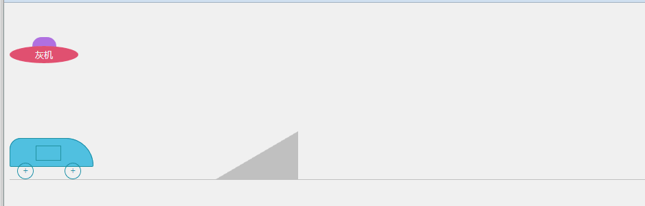
    接第一式之后的进阶招式,加入一些组合动画,剧情、动画啥的都是随意瞎想的,纯粹是为了熟悉2D、3D和过渡等css3代码写法。效果见下图:

    代码如下(有点长,折叠一下):

    <!DOCTYPE html>
    <html lang="zh-cn">
    <head>
        <meta charset="UTF-8">
        <title>test</title>
        <style>
            ul,ol,li {
                list-style: none;
                margin: 0;
                padding: 0;
            }
            .box {
                position: relative;
                margin-top: 50px;
                height: 135px;
            }
            .talkBox {
                position: absolute;
                overflow: hidden;
            }
            .talkBox ul {
                position: absolute;
                left: 0;
                width: 100%;
            }
            .talkBox ul li{
                margin: 0;
                padding: 0;
                font:12px/22px Microsoft YaHei;
                text-align: left;
            }
            .ufoBox {
                position: absolute;
                top: 0;
                left: 0;
                width: 100px;
                height: 40px;
                text-align: center;
                color: #fff;
                -webkit-animation-name: gogogo;
                -webkit-animation-duration: 6s;
                -webkit-animation-delay: 9.5s;
                -webkit-animation-timing-function: ease;
                -webkit-animation-iteration-count: 2;
                animation-name: gogogo;
                animation-duration: 6s;
                animation-delay: 9.5s;
                animation-timing-function:ease;
                animation-iteration-count: 2;
            }
            .talkBox01 {
                position: absolute;
                top: 0;
                left: 115px;
                width: 150px;
                height: 22px;
            }
            .talkBox01 ul {
                top: 22px;
                -webkit-animation-name: talk01;
                -webkit-animation-duration: 9.5s;
                -webkit-animation-delay: 0.5s;
                -webkit-animation-timing-function: ease;
                -webkit-animation-fill-mode: forwards;
                animation-name: talk01;
                animation-duration: 9.5s;
                animation-delay: 0.5s;
                animation-timing-function: ease;
                animation-fill-mode: forwards;
            }
            .talkBox01 ul li{
                color: #6978e6;
            }
            .ufoBox .ufoTop {
                margin: 0 auto;
                width: 35px;
                height: 15px;
                border-radius: 13px 13px 0 0;
                background-color: #b37de6;
            }
            .ufoBox .ufoBody {
                width: 100px;
                height: 25px;
                margin-top: -2px;
                font:13px/25px Microsoft YaHei;
                border-radius: 50%;
                background-color: #eb5C7e;
            }
            @-webkit-keyframes talk01
            {
                0% {
                    top: 22px;
                }
                15% {
                    top: 0;
                }
                30% {
                    top: -22px;
                }
                45% {
                    top: -44px;
                }
                60%,85% {
                    top: -66px;
                }
                95% {
                    top: -88px;
                }
                100% {
                    top: -110px;
                }
            }
            @keyframes talk01
            {
                0% {
                    top: 22px;
                }
                15% {
                    top: 0;
                }
                30% {
                    top: -22px;
                }
                45% {
                    top: -44px;
                }
                60% {
                    top: -66px;
                }
                90%, 95% {
                    top: -88px;
                }
                100% {
                    top: -110px;
                }
            }
            @-webkit-keyframes gogogo
            {
                0%,10% { 
                    -webkit-transform: rotate(0);
                }
                30%{
                    left: 0;
                    top: 0; 
                    -webkit-transform: rotate(30deg);        
                }
                50%{
                    left: 400px;
                    top: 55px;
                    -webkit-transform: rotate(0);
                }
                70%{
                    left: 400px;
                    -webkit-transform: rotate(0);
                }    
                100%{ 
                    left:0;
                    -webkit-transform: rotate(-360deg);
                }
            }
            @keyframes gogogo
            {
                0%,10 { 
                    transform: rotate(0);
                }
                30%{
                    left: 0;
                    top: 0; 
                    transform: rotate(30deg);        
                }
                50%{
                    left: 400px;
                    top: 55px;
                    transform: rotate(0);
                }
                70%{
                    left: 400px;
                    transform: rotate(0);
                }    
                100%{ 
                    left:0;
                    transform: rotate(-360deg);
                }
            }
            .box02 {
                position: relative;
                height: 72px;
                border-bottom: 1px solid #ccc;
            }
            .box02 .hill {
                position: absolute;
                left: 300px;
                bottom: 0;
                width: 0;
                height: 0;
                border-style: solid;
                border-color: transparent #ccc #ccc transparent;
                border-width: 35px 60px;
            }
            .carBox {
                position: absolute;
                left: 0;
                bottom: 0;
                width: 122px;
                height: 60px;
                -webkit-animation-name: boxGo;
                -webkit-animation-duration: 5s;
                -webkit-animation-delay: 8.5s;
                -webkit-animation-timing-function: ease-in;
                -webkit-animation-fill-mode: forwards;
                animation-name: boxGo;
                animation-duration: 5s;
                animation-delay: 8.5s;
                animation-timing-function: ease-in;
                animation-fill-mode: forwards;
            }
            .carBox .carBody {
                position: relative;
                width: 120px;
                height: 40px;
                background-color: #59c4e6;
                border: 1px solid #2094aa;
                border-radius: 16px 40px 2px 2px;
            }
            .carBody .carDoorBox {
                position: absolute;
                top: 10px;
                left: 37px;
                width: 37px;
                height: 22px;
                background-color: #000;
            }
            .carBody .carDoor {
                position: absolute;
                left: 0;
                top: 0;
                display: inline-block;
                width: 35px;
                height: 20px;
                border: 1px solid #2094aa;
                background-color: #59c4e6;
                -webkit-animation-name: doorGo;
                -webkit-animation-duration: 0.5s;
                -webkit-animation-delay: 12.5s;
                -webkit-animation-timing-function: ease-in;
                -webkit-animation-fill-mode: forwards;
                animation-name: doorGo;
                animation-duration: 0.5s;
                animation-delay: 12.5s;
                animation-timing-function: ease-in;
                animation-fill-mode: forwards;
            }
            .carBox .carWheel {
                position: absolute;
                bottom: 0;
                display: inline-block;
                width: 22px;
                height: 22px;
                font: 14px/22px Simsun;
                color: #2094aa;
                text-align: center;
                border: 1px solid #2094aa;
                border-radius: 50%;
                -webkit-animation-name: wheelGo;
                -webkit-animation-duration: 2.5s;
                -webkit-animation-delay: 8.5s; 
                -webkit-animation-timing-function: ease-in;
                -webkit-animation-iteration-count: 3;
                animation-name: wheelGo;
                animation-duration: 2.5s;
                animation-delay: 8.5s; 
                animation-timing-function: ease-in;
                animation-iteration-count: 3;
            }
            .carBox .front { left: 11px; }
            .carBox .back {    right: 18px; }
            .talkBox02 {
                top: -10px;
                left: 115px;
                width: 240px;
                height: 22px;
                color: #1f9fbe;
            }
            .talkBox02 ul {
                left: 240px;
                height: 22px;
                width: 9999px;
                -webkit-animation-name: talk02;
                -webkit-animation-duration: 8s;
                -webkit-animation-delay: 2s; 
                -webkit-animation-timing-function: ease-in;
                -webkit-animation-fill-mode: forwards;
                animation-name: talk02;
                animation-duration: 8s;
                animation-delay: 2s; 
                animation-timing-function: ease-in;
                animation-fill-mode: forwards;
            }
            .talkBox02 ul li {
                float: left;
                width: 220px;
                margin-right: 20px;
            }
            .talkBox03 {
                top: -10px;
                width: 150px;
                height: 44px;
                left: 785px;
                overflow: visible;
                opacity: 0;
                -webkit-animation-name: talk03;
                -webkit-animation-duration: 4s;
                -webkit-animation-delay: 14s; 
                -webkit-animation-timing-function: ease-in;
                -webkit-animation-fill-mode: forwards;
                animation-name: talk03;
                animation-duration: 4s;
                animation-delay: 14s; 
                animation-timing-function: ease-in;
                animation-fill-mode: forwards;
            }
            .talkBox03 ul li {
                color: #f30;
                font-weight: 800;
                white-space: nowrap;
            }
            .talkBox03 ul li:first-child {
                -webkit-transform: rotate(-17deg);
                -webkit-transform-origin: 10% 50%;
                transform: rotate(-17deg);
                transform-origin: 10% 50%;
            }
            .talkBox03 ul li:last-child {
                -webkit-transform: rotate(17deg);
                -webkit-transform-origin: 10% 50%;
                transform-origin: 10% 50%;
                transform: rotate(17deg);
            }
            @-webkit-keyframes talk02 {
                0% {
                    left: 240px;
                }
                5%, 25% {
                    left: 0;
                }
                30%, 50% {
                    left: -240px;
                }
                55%, 75% {
                    left: -480px;
                }
                80%,100% {
                    left: -720px;
                }
            }
            @keyframes talk02 {
                0% {
                    left: 240px;
                }
                5%, 25% {
                    left: 0;
                }
                30%, 50% {
                    left: -240px;
                }
                55%, 75% {
                    left: -480px;
                }
                80%,100% {
                    left: -720px;
                }
            }
            @-webkit-keyframes talk03 {
                0% {
                    opacity: 0;
                }
                30%,70% {
                    opacity: 1;
                }
                100% {
                    opacity: 0;
                }
            }
            @keyframes talk03 {
                0% {
                    opacity: 0;
                }
                30%,70% {
                    opacity: 1;
                }
                100% {
                    opacity: 0;
                }
            }
            @-webkit-keyframes boxGo {
                0% {
                    -webkit-transform: rotate(0);
                }
                30% {
                    left: 205px;
                    bottom: 0;
                    -webkit-transform: rotate(0);
                }
                40% {
                    left: 240px;
                    bottom: 12px;
                    -webkit-transform: rotate(-20deg);
                }
                45% {
                    -webkit-transform: rotate(-28deg);
                    -webkit-transform-origin: 55% 20%;
                }
                52% {
                    -webkit-transform: rotate(-28deg);
                }
                60% {
                    bottom: 68px;
                    left: 350px;
                    -webkit-transform: rotate(-28deg);
                    -webkit-transform-origin: 52% 50%;
                }
                70% {
                    left: 450px;
                    -webkit-transform: rotate(90deg);
                }
                78% {
                    left: 520px;
                    bottom: 0;
                    -webkit-transform: rotate(180deg);
                }
                82% {
                    bottom: 18px;
                    -webkit-transform: rotate(200deg);
                }
                100% {
                    left: 650px;
                    bottom: 0;
                    -webkit-transform: rotate(180deg);
                }    
            }
            @keyframes boxGo {
                0% {
                    transform: rotate(0);
                }
                30% {
                    left: 205px;
                    bottom: 0;
                    transform: rotate(0);
                }
                40% {
                    left: 240px;
                    bottom: 12px;
                    transform: rotate(-20deg);
                }
                45% {
                    transform: rotate(-28deg);
                    transform-origin: 55% 20%;
                }
                52% {
                    transform: rotate(-28deg);
                }
                60% {
                    bottom: 68px;
                    left: 350px;
                    transform: rotate(-28deg);
                    transform-origin: 52% 50%;
                }
                70% {
                    left: 450px;
                    transform: rotate(90deg);
                }
                78% {
                    left: 520px;
                    bottom: 0;
                    transform: rotate(180deg);
                }
                82% {
                    bottom: 18px;
                    transform: rotate(200deg);
                }
                100% {
                    left: 650px;
                    bottom: 0;
                    transform: rotate(180deg);
                }    
            }
            @-webkit-keyframes wheelGo {
                0% {
                    -webkit-transform: rotate(0deg);    
                }
                100% {
                    -webkit-transform: rotate(360deg);
                }    
            }
            @keyframes wheelGo {
                0% {
                    transform: rotate(0deg);    
                }
                100% {
                    transform: rotate(360deg);
                }    
            }
            @-webkit-keyframes doorGo {
                0% {
                    top: 0;
                    -webkit-transform: rotate(0deg);    
                }
                80% {
                    top:3px;
                }
                100% {
                    top: 3px;
                    left: 18px;
                    width: 17px;
                    height: 20px;
                    -webkit-transform: skew(0,-20deg);
                }    
            }
            @keyframes doorGo {
                0% {
                    top: 0;
                    transform: rotate(0deg);    
                }
                80% {
                    top:3px;
                }
                100% {
                    top: 3px;
                    left: 18px;
                    width: 17px;
                    height: 20px;
                    transform: skew(0,-20deg);
                }    
            }
        </style>
    </head>
    <body>
        <div class="box">
            <div class="talkBox talkBox01">
                <ul>
                    <li>马:看见下面那辆车了吗?</li>
                    <li>黄:看见了,老大。</li>
                    <li>马:等会飞过去,撞他!</li>
                    <li>黄:遵命,老大!</li>
                    <li>黄.马:go!</li>
                </ul>
            </div>
            <div class="ufoBox">
                <div class="ufoTop"></div>
                <div class="ufoBody">灰机</div>
            </div>
        </div>
        <div class="box02">
            <div class="hill">
            </div>
            <div class="talkBox talkBox02">
                <ul>
                    <li>董:今天我们学习如何飞跃凤凰山哈!</li>
                    <li>陈:嗯好哒!</li>
                    <li>陈.董:油门飚起来~~~</li>
                </ul>
            </div>
            <div class="talkBox talkBox03">
                <ul>
                    <li>董:啊!!!雅蠛蝶~~~</li>
                    <li>陈:救命!救命!</li>
                </ul>
            </div>
            <div class="carBox">
                <div class="carBody">
                    <div class="carDoorBox"><span class="carDoor"></span></div>
                </div>
                <span class="carWheel front">+</span>
                <span class="carWheel back">+</span>
            </div>
        </div>
    </body>
    </html>
    View Code

    只支持主流浏览器哈,让低版本IE见鬼去吧~~~

  • 相关阅读:
    小程序上传多张图片
    小程序倒计时遇到的问题
    taro小程序展示富文本
    taro小程序地址选择组件
    构建基于Suricata+Splunk的IDS入侵检测系统
    SQL注入学习资料总结
    常见WAF绕过思路
    业务安全漏洞挖掘归纳总结
    细说验证码安全 —— 测试思路大梳理
    验证码安全那些事
  • 原文地址:https://www.cnblogs.com/zichun/p/4981071.html
Copyright © 2011-2022 走看看