第七部分——news
简要介绍:
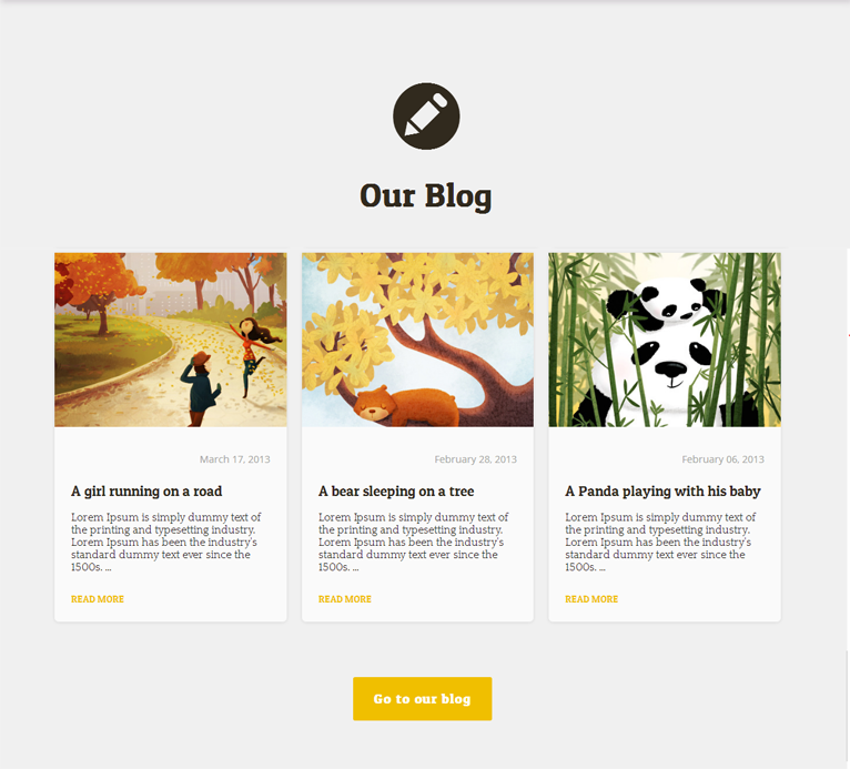
本部分利用<article>标签实现了一种卡片式效果。
页面效果:
HTML代码:
<section id="news">
<div class="container">
<div class="align"><i class="icon-pencil-circled"></i></div>
<h1>Our Blog</h1>
<div class="row">
<div class="post">
<img class="img-news" src="img/blog_img-01.jpg" alt=""/>
<div class="inside">
<div class="timer">
<p class="post-date"><i class="icon-calendar"></i>March 17, 2013</p>
</div>
<h2>A girl running on a road</h2>
<div class="entry-content">
<p>Lorem Ipsum is simply dummy text of the printing and typesetting industry. Lorem Ipsum has been the industry's standard dummy text ever since the 1500s. …</p>
<a href="#" class="more-link">read more</a>
</div>
</div>
</div>
<article class="post">
<img class="img-news" src="img/blog_img-02.jpg" alt=""/>
<div class="inside">
<div class="timer">
<p class="post-date"><i class="icon-calendar"></i>February 28, 2013</p>
</div>
<h2>A bear sleeping on a tree</h2>
<div class="entry-content">
<p>Lorem Ipsum is simply dummy text of the printing and typesetting industry. Lorem Ipsum has been the industry's standard dummy text ever since the 1500s. …</p>
<a href="#" class="more-link">read more</a>
</div>
</div>
</article>
<article class="post">
<img class="img-news" src="img/blog_img-03.jpg" alt=""/>
<div class="inside">
<div class="timer">
<p class="post-date"><i class="icon-calendar"></i>February 06, 2013</p>
</div>
<h2>A Panda playing with his baby</h2>
<div class="entry-content">
<p>Lorem Ipsum is simply dummy text of the printing and typesetting industry. Lorem Ipsum has been the industry's standard dummy text ever since the 1500s. …</p>
<a href="#" class="more-link">read more</a>
</div>
</div>
</article>
</div>
<div id="a">
<a href="#" class="btn btn-large">Go to our blog</a>
</div>
</div>
</div>
</section>
CSS代码:
       #news{
            background: url("img/grey-cardboard-bg.png") repeat 0 0;
            padding: 0 70px;
            margin-top: 120px;
            margin-bottom: 100px;
        }
        #news .align{
            font-size: 6em;
            text-align: center;
        }
        #news h1{
            font-size: 3em;
            margin: 0.5em 0 1em 0;
            text-align: center;
            font-family: 'Patua One',cursive;
        }
        #news h2{
            font-size: 21px;
            margin-top: 24px;
            font-family: 'Patua One',cursive;
            font-weight: lighter;
        }
        #news .post{
            background: none repeat scroll 0 0 rgba(255,255,255,0.7);
            border-bottom-left-radius: 6px;
            border-bottom-right-radius:6px;
            display: inline-block;
             31%;
            margin: 0 9px;
            box-shadow: 0 1px 6px rgba(0,0,0,0.1);
            -moz-box-shadow: 0 1px 6px rgba(0, 0, 0, 0.1);
            -webkit-box-shadow: 0 1px 6px rgba(0, 0, 0, 0.1);
        }
        #news img{
            margin: 0 auto;
             100%;  /*宽度为父元素的100%*/
        }
        #news .inside{
            margin: 5px 24px 50px;
            padding-top: 0.3em;
            background: url("img/dot-row-2.png") repeat-x scroll 0 0 transparent !important;
        }
        #news .timer{
            margin-bottom: 5px;
            margin-top: 5px;
            float: right;
             100%;
        }
        #news .post-date{
            color: #a5a5a2;
            float: right;
            font-family: 'Open Sans';
            font-size: 14px;
            font-style: normal;
            line-height: 2;
       }
        #news .more-link{
            float: left;            /*内容在父元素中从右往左排列*/
            text-decoration: none;  /*去除链接的下划线*/
            text-transform: uppercase;
            /*控制文本大小写,uppercase表示文本中每个单词都是大写字母*/
            font-family: 'Patua One', cursive;
            font-size: 0.9em;
            color:#f0bf00;
            margin: 12px 0 25px 0;
        }
        #news .more-link:hover{
            text-decoration: underline;
        }
        #news .btn-large{
            padding: 20px 30px;
            background:#f0bf00;
            color: #fff;
            font-size: 19px;
            font-family: 'Patua One',cursive;
            letter-spacing: 0.05em;  /*字母间距*/
            font-weight: bold;
            text-decoration: none;
            border-radius: 3px;
        }
        #news .btn-large:hover{
            background: #43413e !important;
        }
        #news #a{
            text-align: center;
            margin-top: 100px;
        }
总结:
本部分遇到两个问题:
1、图片的宽度会超过其父元素的宽度。
2、时间戳会和h2在同一行,使得h2不够宽度放置会变成两行。
解决:
1、设置图片的宽度为100%,表示它会铺满父元素的区域,根据父元素的大小调整自己的大小。
2、给实践戳添加一个<div>父元素,设置div的样式为100%;float:right;