写在前面的话:
在 w3cplus 上可以看到相关学习资料,本文就是参考了这篇,写下的笔记~,原文 链接
五、css sticky footers布局
一般来说,常会遇到这样的布局:在一个页面的内容不确定的情况下,始终得实现 footer 部分位于页面的底部~
实现这种布局的方式有很多,据说css sticky footers 是一种兼容性最好的一种布局方式~
然而最好的方式是:flex 布局~~~
好用的写在前面,参考原文


 1 <!DOCTYPE html>
 2 <head>
 3     <title>底部不固定时</title>
 4 </head>
 5 <style>
 6     body {margin: 0; padding: 0;}
 7     body { display: flex; flex-flow: column; min-height: 100vh;}
 8     main { flex: 1; }
 9
10     /* 加入以下样式以示区分 */
11     header{background: red;}
12     main{background: yellow;}
13     footer{background: red;}
14 </style>
15 <body>
16     <header>
17         <h1>Site name</h1>
18     </header>
19     <main>
20         <p>Bacon Ipsum dolor sit amet... <!-- Filler text from baconipsum.com --></p>
21         <br>
22         <br>
23         <br>
24     </main>
25     <footer>
26         <p>© 2015 No rights reserved.</p> <p>Made with ♥ by an anonymous pastafarian.</p>
27     </footer>
28 </body>
29 </html>
效果图:
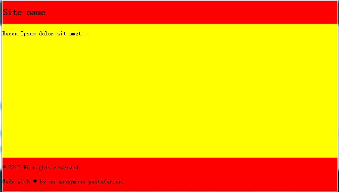
好简洁~~~
除此之外还有一种 2列的 flex 布局
sticky footers 方案,通常都有其固定的“格式”,一般来说,套路是这样的:
情况一:当底部是固定高度,可参考如下方法(来自于视频当中的方法):
 1 <!DOCTYPE html>
 2 <head>
 3     <title>底部固定时</title>
 4 </head>
 5 <style>
 6     html, body, .wrap, .content-box, .content{
 7         margin: 0;
 8         padding: 0;
 9     }
10     .wrap {
11         position: fixed;    /* 这一属性非常重要 */
12         top: 0;
13         left: 0;
14         width: 100%;
15         height: 100%;
16         overflow: auto;
17     }
18     .content-box {
19         min-height: 100%;
20         clear: both;     /* 通常是加 clearfix 类的,但貌似删掉这句也不影响 */
21     }
22     .content{
23         padding-bottom: 100px; /* bottom = -footer height */
24     }
25     footer {
26         position: relative;
27         left: 0;
28         bottom: 0;
29         height: 100px;    /* footer height 为100px ,宽度随意 */
30         margin-top: -100px;  /* 若是想要水平居中的话可以使用 margin: -100px auto 0; */
31         clear: both;    /* 貌似删掉这句也不影响 */
32     }
33     /* 为了方便观察,加入以下背景颜色以示区分*/
34     .wrap{background: gray;}
35     header{background: red;}
36     article{background: yellow;}
37     footer{background: red;}
38 </style>
39 <body>
40     <div class="wrap">
41         <div class="content-box">
42             <div class="content">
43                 <!-- 这是内容 -->
44                 <header>顶部</header>
45                 <article>
46                     主体部分
47                     <br>
48                     <br>
49                     <br>
50                     <br>
51                     <br>
52                     <br>
53                     <br>
54                     <br>
55                     <br>
56                     <br>
57                     <br>
58                 </article>
59             </div>
60         </div>
61
62         <footer>底部</footer>
63     </div>
64 </body>
65 </html>
实现图:

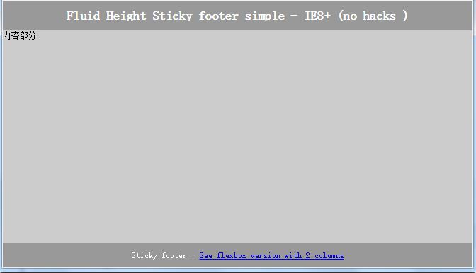
情况二:当底部是不定高度时,可参考如下方法(使用 display:table)布局:
说明:参考原文:原文链接 ,原作者还提供了一种2列的 flex 布局
 1 <!DOCTYPE html>
 2 <head>
 3     <title>底部不固定时</title>
 4 </head>
 5 <style>
 6     html, body, #wrap {margin:0;    padding:0;    height:100%;}
 7     #wrap {display:table;width:100%}
 8     /* if ie7 support is needed then set height of #wrap and header and footer to auto in CC's and just let it have a normal layout (or: *+html #wrap{height:auto})*/
 9     .content { background:#ccc; }
10     header {    background:#999;    color:#fff;    text-align:center;    padding:10px 0}
11     header, .footer, main { display:block}/* ie7 and under*/
12     header, .footer, main { display:table-row }
13     /* height 1px on the header and footer is the sticky footer technique */
14     header, .footer{height:1px}
15     h1{padding:10px;margin:0;}
16     .footer {background:#999;    color:#fff;    text-align:center;}
17     .footer p {    margin:0;    padding:10px}
18 </style>
19 <body>
20     <!-- html5 shiv for IE8 and under -->
21     <!--[if lt IE 9]>
22       <script src="http://html5shiv.googlecode.com/svn/trunk/html5.js"></script>
23     <![endif]-->
24     <!-- If you aren't using jquery you can use the body element instead (body{100%;display:table;height:100%})of the #wrap div as jquery has a bug (
25     http://bugs.jquery.com/ticket/7261) in webkit when the body is display:table. -->
26
27     <div id="wrap">
28         <header>
29             <h1>Fluid Height Sticky footer simple - IE8+ (no hacks )</h1>
30         </header>
31         <main class="content">内容部分
32         <br>
33         <br>
34         <br>
35         <br>
36         <br>
37         <br>
38         <br>
39         <br>
40         <br>
41         </main>
42           <footer class="footer">
43               <p>
44                   Sticky footer - <a target="blank" href="http://codepen.io/paulobrien/full/rxyEMN/">See flexbox version with 2 columns</a>
45               </p>
46           </footer>
47     </div>
48 </body>
49 </html>
 1 <!DOCTYPE html>
 2 <head>
 3     <title>底部不固定时</title>
 4 </head>
 5 <style>
 6     html, body, #wrap { margin: 0; padding: 0; }
 7
 8     /* 必需的样式 */
 9     html, body, #wrap { width: 100%; height: 100%; display: table; }
10     /* if ie7 support is needed then set height of #wrap and header and footer to auto in CC's and just let it have a normal layout (or: *+html #wrap{height:auto})*/
11
12     header, .footer, main { display:block; }/* ie7 and under*/
13     header, .footer, main { display:table-row; }
14     /* height 1px on the header and footer is the sticky footer technique */
15     header, .footer{height: 1px;}
16
17     /* 加入以下样式以示区分 */
18     header { background: #999; color: #fff; text-align: center; padding:10px 0; }
19     header h1{padding: 10px;margin: 0; }
20     .content { background: #ccc; }
21     .footer {background: #999; color: #fff; text-align: center; }
22     .footer p {    margin: 0; padding: 10px; }
23 </style>
24 <body>
25     <!-- html5 shiv for IE8 and under -->
26     <!--[if lt IE 9]>
27       <script src="http://html5shiv.googlecode.com/svn/trunk/html5.js"></script>
28     <![endif]-->
29     <!-- If you aren't using jquery you can use the body element instead (body{100%;display:table;height:100%})of the #wrap div as jquery has a bug (
30     http://bugs.jquery.com/ticket/7261) in webkit when the body is display:table. -->
31
32     <div id="wrap">
33         <header>
34             <h1>Fluid Height Sticky footer simple - IE8+ (no hacks )</h1>
35         </header>
36         <main class="content">内容部分
37         <br>
38         <br>
39         <br>
40         <br>
41         <br>
42         </main>
43           <footer class="footer">
44               <p>
45                   Sticky footer - <a target="blank" href="http://codepen.io/paulobrien/full/rxyEMN/">See flexbox version with 2 columns</a>
46               </p>
47           </footer>
48     </div>
49 </body>
50 </html>
效果如图: