一, Flex布局是什么
布局的传统解决方案,基于盒状模型,依赖 display属性 + position属性 + float属性。它对于那些特殊布局非常不方便,比如,垂直居中就不容易实现。Flex布局是W3C组织于2009年提出的一种布局方案,可以简便、完整、响应式地实现各种页面布局。目前,它已经得到了所有浏览器的支持。Flex布局将会成为未来布局的首选方案。
二,如何指定一个容器为Flex布局
只需要在容器中添加值为flex的display属性。
.box{
  display: flex;
}
三,Flex的基本语法
display
语法: display:flex;
指定Flex。
flex-direction
语法: flex-direction: row | row-reverse | column | column-reverse
指定弹性子元素在父容器中的排列顺序。这个也可以通过设置 direction:rtl; 或是 direction:ltr; 来等效实现,其中的rtl、ltr是right to left、left to right的简写。
justify content
语法: justify-content: flex-start | flex-end | center | space-between | space-around
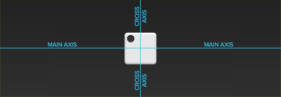
内容对齐(justify-content)属性应用在弹性容器上,把弹性项沿着弹性容器的主轴线(main axis)对齐。
概念理解图:

其中space-around,笔者总结了一个简单的公式:
x=(W2-N*W1)/(2N)
x:最两边留下的宽度。
W2:就是模块的width。
W1:一个子模块的宽度(每个均匀)。
N:
align-items
语法: align-items: flex-start | flex-end | center | baseline | stretch
设置弹性盒子元素在侧轴(纵轴)方向上的对齐方式。
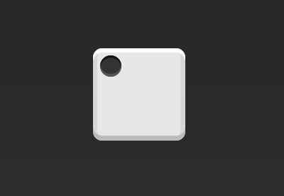
下面这张图片可以帮助读者理解baseline:

flex-wrap
语法: flex-flow: nowrap | warp | warp-reverse
align-content
语法: align-content: flex-start | flex-end | center | space-between | space-around | stretch
设置各个行的对齐方式。
align-self
语法: align-self: auto | flex-start | flex-end | center | baseline | stretch
设置弹性元素自身在侧轴方向的对齐。这个属性要区别与align-content,align-content的范围是每一行,然而align-self只是某一行里面的某个弹性元素。
flex-flow
语法:flex-direction和flex-wrap的简写。
flex
语法: flex: flex-grow flex-shrink flex-basis|auto|initial|inherit;
指定元素分配空间。需要注意,如果flex-basis为100%,那么该弹性模块就会单独占一行。
oder
语法: order: number|initial|inherit;
指定弹性模块的排列顺序,其中值越小,越优先,可以为负值。
四,示例
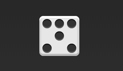
1,骰子的布局
骰子的一面,最多可以放置9个点。

下面,就来看看Flex如何实现,从1个点到9个点的布局。你可以到codepen查看Demo。
如果不加说明,本节的HTML模板一律如下。
<div class="box">
  <span class="item"></span>
</div>
上面代码中,div元素(代表骰子的一个面)是Flex容器,span元素(代表一个点)是Flex项目。如果有多个项目,就要添加多个span元素,以此类推。
1.1 单项目
首先,只有左上角1个点的情况。Flex布局默认就是首行左对齐,所以一行代码就够了。
.box {
  display: flex;
}
设置项目的对齐方式,就能实现居中对齐和右对齐。
.box {
  display: flex;
  justify-content: center;
}
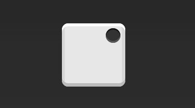
.box {
  display: flex;
  justify-content: flex-end;
}
设置交叉轴对齐方式,可以垂直移动主轴。
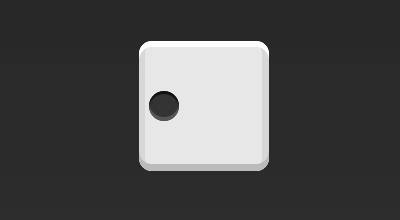
.box {
  display: flex;
  align-items: center;
}
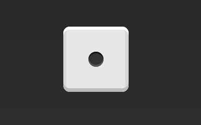
.box {
  display: flex;
  justify-content: center;
  align-items: center;
}
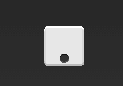
.box {
  display: flex;
  justify-content: center;
  align-items: flex-end;
}
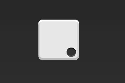
.box {
  display: flex;
  justify-content: flex-end;
  align-items: flex-end;
}
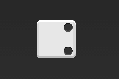
1.2 双项目
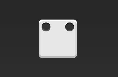
.box {
  display: flex;
  justify-content: space-between;
}
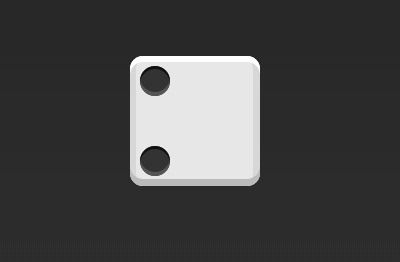
.box {
  display: flex;
  flex-direction: column;
  justify-content: space-between;
}
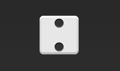
.box {
  display: flex;
  flex-direction: column;
  justify-content: space-between;
  align-items: center;
}
.box {
  display: flex;
  flex-direction: column;
  justify-content: space-between;
  align-items: flex-end;
}
.box {
  display: flex;
}

.item:nth-child(2) {
  align-self: center;
}
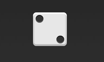
.box {
  display: flex;
  justify-content: space-between;
}

.item:nth-child(2) {
  align-self: flex-end;
}
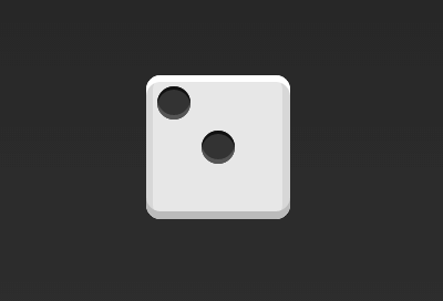
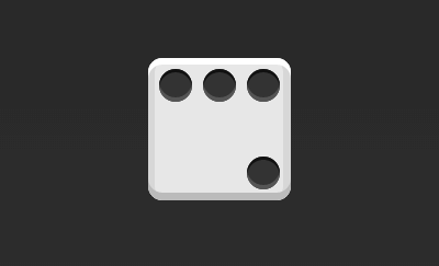
1.3 三项目
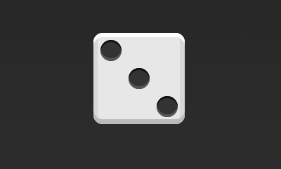
.box {
  display: flex;
}

.item:nth-child(2) {
  align-self: center;
}

.item:nth-child(3) {
  align-self: flex-end;
}
1.4 四项目
.box {
  display: flex;
  flex-wrap: wrap;
  justify-content: flex-end;
  align-content: space-between;
}
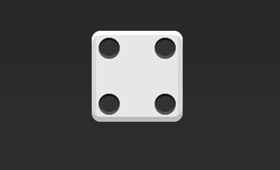
HTML代码如下。
<div class="box">
  <div class="column">
    <span class="item"></span>
    <span class="item"></span>
  </div>
  <div class="column">
    <span class="item"></span>
    <span class="item"></span>
  </div>
</div>
CSS代码如下。
.box {
  display: flex;
  flex-wrap: wrap;
  align-content: space-between;
}

.column {
  flex-basis: 100%;
  display: flex;
  justify-content: space-between;
}
1.5 六项目
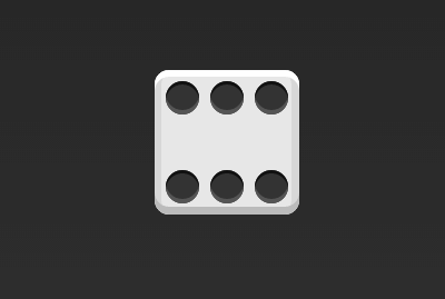
.box {
  display: flex;
  flex-wrap: wrap;
  align-content: space-between;
}
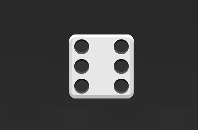
.box {
  display: flex;
  flex-direction: column;
  flex-wrap: wrap;
  align-content: space-between;
}
HTML代码如下。
<div class="box">
  <div class="row">
    <span class="item"></span>
    <span class="item"></span>
    <span class="item"></span>
  </div>
  <div class="row">
    <span class="item"></span>
  </div>
  <div class="row">
     <span class="item"></span>
     <span class="item"></span>
  </div>
</div>
CSS代码如下。
.box {
  display: flex;
  flex-wrap: wrap;
}

.row{
  flex-basis: 100%;
  display:flex;
}

.row:nth-child(2){
  justify-content: center;
}

.row:nth-child(3){
  justify-content: space-between;
}
1.6 九项目
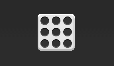
.box {
  display: flex;
  flex-wrap: wrap;
}
2,圣杯布局
圣杯布局(Holy Grail Layout)指的是一种最常见的网站布局。页面从上到下,分成三个部分:头部(header),躯干(body),尾部(footer)。其中躯干又水平分成三栏,从左到右为:导航、主栏、副栏。

HTML代码如下:
<div class="flex-container">
  <header class="header">头部</header>
  <article class="main">
    <p>主体</p>
  </article>
  <aside class="aside aside1">边栏 1</aside>
  <aside class="aside aside2">边栏 2</aside>
  <footer class="footer">底部</footer>
</div>
CSS代码入下:
.flex-container {
    display: -webkit-flex;
    display: flex;
    -webkit-flex-flow: row wrap;
    flex-flow: row wrap;
    font-weight: bold;
    text-align: center;
}

.flex-container > * {
    padding: 10px;
    flex: 1 100%;
}

.main {
    text-align: left;
    background: cornflowerblue;
}

.header {background: coral;}
.footer {background: lightgreen;}
.aside1 {background: moccasin;}
.aside2 {background: violet;}

@media all and (min- 600px) {
    .aside { flex: 1 auto; }
}

@media all and (min- 800px) {
    .main    { flex: 3 0px; }
    .aside1 { order: 1; }
    .main    { order: 2; }
    .aside2 { order: 3; }
    .footer  { order: 4; }
}
五,参考文章
https://davidwalsh.name/flexbox-dice
http://www.ruanyifeng.com/blog/2015/07/flex-grammar.html?utm_source=tuicool
http://www.runoob.com/css3/css3-flexbox.html
本文章为博主原创作品,若需转载请注明出处。