CSS函数贝塞尔曲线(cubic-bezier)
一、总结
一句话总结:
cubic-bezier可以放在css中实现更多动画:transition:all 2s cubic-bezier(.17, .86, .73, .14);
二、CSS函数贝塞尔曲线(cubic-bezier)
转自或参考:实用的 CSS — 贝塞尔曲线(cubic-bezier) - 简书
https://www.jianshu.com/p/d999f090d333
前言
在了解 cubic-bezier 之前,你需要对 CSS3 中的动画效果有所认识,它是 animation-timing-function 和 transition-timing-function 中一个重要的内容。
本体
简介
cubic-bezier 又称三次贝塞尔,主要是为 animation 生成速度曲线的函数,规定是 cubic-bezier(<x1>, <y1>, <x2>, <y2>)。
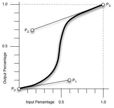
我们可以从下图中简要理解一下 cubic-bezier:
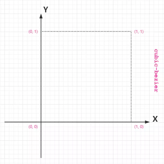
从上图我们需要知道的是 cubic-bezier 的取值范围:
- P0:默认值 (0, 0)
- P1:动态取值 (x1, y1)
- P2:动态取值 (x2, y2)
- P3:默认值 (1, 1)
我们需要关注的是 P1 和 P2 两点的取值,而其中 X 轴的取值范围是 0 到 1,当取值超出范围时 cubic-bezier 将失效;Y 轴的取值没有规定,当然也毋须过大。
最直接的理解是,将以一条直线放在范围只有 1 的坐标轴中,并从中间拿出两个点来拉扯(X 轴的取值区间是 [0, 1],Y 轴任意),最后形成的曲线就是动画的速度曲线。
使用
在测试例子中:
<!DOCTYPE html>
<html lang="zh-cn">
<head>
  <meta charset="UTF-8">
  <title>Document</title>

  <style>
    .animation {
      width: 50px;
      height: 50px;
      background-color: #ed3;
      -webkit-transition:  all 2s;
           -o-transition:  all 2s;
              transition:  all 2s;
    }
    .animation:hover {
      -webkit-transform:  translateX(100px);
          -ms-transform:  translateX(100px);
           -o-transform:  translateX(100px);
              transform:  translateX(100px);
    }
  </style>
</head>
<body>
  <div class="animation"></div>
</body>
</html>
我们可以在浏览器中看到,当鼠标移到元素上时,元素开始向右移动,开始比较慢,之后则比较快,移开时按原曲线回到原点。
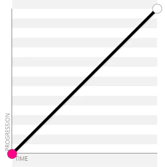
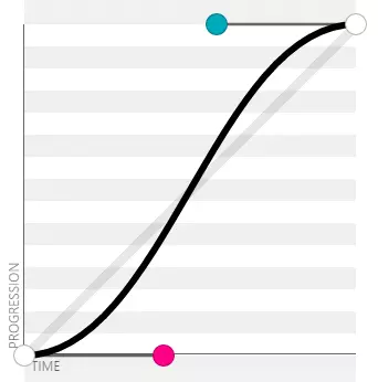
在例子中,当我们不为 transition 添加 cubic-bezier 或是其他 timing-function 时,默认的速度曲线是 ease,此时的速度曲线是:
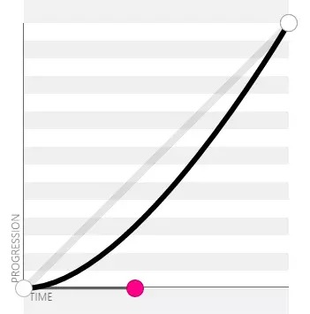
那么让我们在代码中加入 cubic-bezier(.17, .86, .73, .14):
...
.animation {
  ...
  -webkit-transition:  all 2s cubic-bezier(.17, .86, .73, .14);
       -o-transition:  all 2s cubic-bezier(.17, .86, .73, .14);
          transition:  all 2s cubic-bezier(.17, .86, .73, .14);
}
...
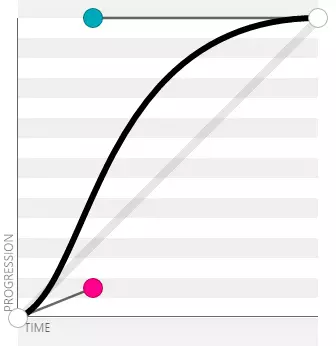
再刷新页面观察效果,会看到动画在执行过程中有一段很缓慢的移动,前后的速度相似,此时的运动曲线是:

几个常用的固定值对应的 cubic-bezier 值以及速度曲线
-
ease:cubic-bezier(.25, .1, .25, 1)

-
liner:cubic-bezier(0, 0, 1, 1) / cubic-bezier(1, 1, 0, 0)
-
ease-in:cubic-bezier(.42, 0, 1, 1)
-
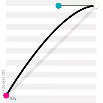
ease-out:cubic-bezier(0, 0, .58, 1)
-
ease-in-out:cubic-bezier(.42, 0, .58, 1)
-
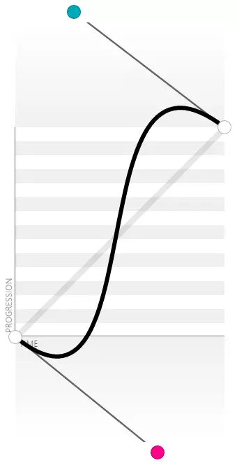
In Out . Back(来回的缓冲效果):cubic-bezier(0.68, -0.55, 0.27, 1.55)
效果参考
文章所提到的动画效果可以在下面站点中看到,当然你也可以大胆尝试: