基础知识
在了解CSS过渡时间之前,你应该先了解一下CSS的变形动画,可以参考之前的一篇博客。
故我们要学习CSS过渡时间,来让它的变化过程更加平滑。
动画属性
不是所有css属性都有过渡效果,
可以看一下下面这个例子,比如边框的样式就不支持过渡效果,而其他的诸如背景颜色,高度宽度等等都是支持过渡效果的。
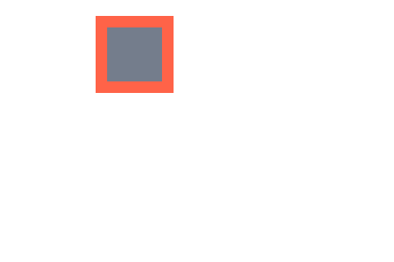
可以看到,在鼠标放上去的瞬间,边框的样式就发生变化了,而不是再跟随过渡时间进行渐变。
而其他的属性,诸如背景颜色,圆角等都是跟随过渡时间进行渐变的。


<!DOCTYPE html>
<html lang="en">
<head>
        <meta charset="UTF-8">
        <meta name="viewport" content="width=device-width, initial-scale=1.0">
        <title>Document</title>
        <style>
                *{
                        margin: 0;
                        padding: 0;
                }
                body{
                        display: flex;
                        justify-content: center;
                        align-items: center;
                        height: 100vh;
                        width: 100vw;
                }

                div{
                        height: 50px;
                        width: 50px;
                        background: #747d8c;
                        border: 10px solid #ff6348;
                        /* 添加过渡时间 1s */
                        transition: 1s;
                }
                body:hover div{
                        background: #5352ed;
                        border: 10px dotted #ffa502;
                        width: 100px;
                        height: 100px;
                        border-radius: 50%;
                        transform: translate(100px,100px);
                }
        </style>
</head>
<body>
        <div></div>
</body>
</html>
元素状态
初始形态
指当页面加载后的样式状态,下面是表单设置的初始样式。

变化形态
指元素由初始状态变化后的状态,比如鼠标放上、表单获得焦点后的形态。

<!DOCTYPE html>
<html lang="en">
<head>
        <meta charset="UTF-8">
        <meta name="viewport" content="width=device-width, initial-scale=1.0">
        <title>Document</title>
        <style>
                * {
                    padding: 0;
                    margin: 0;
                }

                body {
                    background: #2c3e50;
                    display: flex;
                    flex-direction: column;
                    justify-content: center;
                    align-items: center;
                    box-sizing: border-box;
                    width: 100vw;
                    height: 100vh;
                    • padding: 20px;
                }

                input {
                    border: solid 5px #e67e22;
                    height: 60px;
                    width: 400px;
                    margin-bottom: 20px;
                    transition: 2s;
                }

                input:hover {
                    border: solid 5px #000 !important;
                }

                input:focus {
                    background: #e67e22;
                }

                input:checked {
                    position: relative;
                    width: 60px;
                    height: 60;
                    border: none;
                }

                input:checked::before {
                    content: '⩗';
                    color: white;
                    display: flex;
                    justify-content: center;
                    align-items: center;
                    font-size: 3em;
                    position: absolute;
                    left: 0;
                    top: 0;
                    right: 0;
                    bottom: 0;
                    box-sizing: border-box;
                    background: #3498db;
                }
        </style>
</head>
<body>

    <input type="text">
    <input type="checkbox" checked>

</body>
</html>
transition-property
用于设置哪些属性应用过渡效果。
默认值为
all即所有属性都发生过渡效果多个属性使用逗号分隔
当我们使用该选项时,注意要和transition-duration搭配使用才能生效,这个才是非简写的过渡时间。
transition只是一种简写形式,如果使用transition-duration与transition进行搭配使用,则不会生效transition-duration。
属性设置
注意看,下面的这张图片里transition-duration只设置了圆角与透明度,其他的诸如宽度高度背景颜色等均未设置,所以在鼠标放上去的一瞬间未设置的属性立刻产生了变化,而圆角和透明度是随着过渡时间渐渐变化的。

<!DOCTYPE html>
<html lang="en">

<head>
        <meta charset="UTF-8">
        <meta name="viewport" content="width=device-width, initial-scale=1.0">
        <title>Document</title>
        <style>
                * {
                        margin: 0;
                        padding: 0;
                        box-sizing: border-box;
                }

                body {
                        display: flex;
                        justify-content: center;
                        align-items: center;
                        width: 100vw;
                        height: 100vh;
                }
                main{
                        width: 400px;
                        height: 400px;

                        display: flex;
                        justify-content: center;
                        align-items: center;

                }

                div{
                        width: 100px;
                        height: 100px;
                        background: #f39c12;
                        transition-property:border-radius,opacity;
                        /* 这个才是真正的设置过渡时间,
                        transition只是简写形式 */
                        transition-duration: 1s;
                        opacity: .5;

                }
                main:hover div{
                        border-radius: 50%;
                        width: 150px;
                        height: 150px;
                        background: #2ecc71;
                        opacity: 1;
                }
        </style>
</head>

<body>
        <main>
                <div></div>
        </main>
</body>

</html>
禁用属性
当设置transition-property:none;后,所有的变化形态均不会跟随过渡时间发生变化。
也就是说全部都是瞬发完成。

<!DOCTYPE html>
<html lang="en">

<head>
        <meta charset="UTF-8">
        <meta name="viewport" content="width=device-width, initial-scale=1.0">
        <title>Document</title>
        <style>
                * {
                        margin: 0;
                        padding: 0;
                        box-sizing: border-box;
                }

                body {
                        display: flex;
                        justify-content: center;
                        align-items: center;
                        width: 100vw;
                        height: 100vh;
                }
                main{
                        width: 400px;
                        height: 400px;

                        display: flex;
                        justify-content: center;
                        align-items: center;

                }

                div{
                        width: 100px;
                        height: 100px;
                        background: #f39c12;
                        transition-property:none;
                        /* 这个才是真正的设置过渡时间,
                        transition只是简写形式 */
                        transition-duration: 1s;
                        opacity: .5;

                }
                main:hover div{
                        border-radius: 50%;
                        width: 150px;
                        height: 150px;
                        background: #2ecc71;
                        opacity: 1;
                }
        </style>
</head>

<body>
        <main>
                <div></div>
        </main>
</body>

</html>
transitionend
用于控制过渡结束后执行的JS事件,简写属性会触发多次如 border-radius 会触发四次事件,不难理解因为可以为border-bottom-left-radius 等四个属性独立设置过渡,所以就会有四次事件。
| 属性 | 说明 |
|---|---|
| propertyName | 结束过渡样式 |
| elapsedTime | 过渡需要的时间 |
| pseudoElement | 过渡的伪元素 |
| isTrusted | true:用户触发,false:脚本触发 |
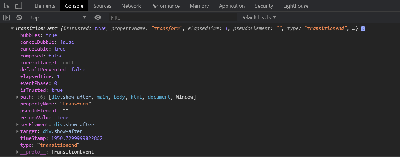
我们只需要有JS来监听该事件即可,如下图。
当我们检测的<div>标签过渡时间结束后触发了transitionend事件,然后才显示出了恭候多时的字样。

<!DOCTYPE html>
<html lang="en">

<head>
        <meta charset="UTF-8">
        <meta name="viewport" content="width=device-width, initial-scale=1.0">
        <title>Document</title>
        <style>
                * {
                        margin: 0;
                        padding: 0;
                        box-sizing: border-box;
                }

                body {
                        display: flex;
                        justify-content: center;
                        align-items: center;
                        width: 100vw;
                        height: 100vh;
                        background-color: #57606f;
                }

                main {
                        width: 400px;
                        height: 400px;

                        display: flex;
                        justify-content: center;
                        align-items: center;

                }

                div {
                        width: 100px;
                        height: 100px;
                        background: #f39c12;

                        transition-duration: 1s;

                        position: relative;


                }

                div:after {
                        content: "恭候多时";
                        color: #fff;
                        width: 100%;
                        font-size: 1.4em;

                        display: flex;
                        justify-content: center;
                        align-items: center;

                        position: absolute;
                        bottom: -50px;
                        transform: scale(0);
                        transition-duration: 1s;

                }

                main:hover div {
                        transform: rotate(360deg);
                }

                main:hover div.show-after::after {
                        transform: scale(1) skew(360deg);
                }
        </style>
</head>

<body>
        <main>
                <div></div>
        </main>
</body>

<script>
        // 检测div的 transitionend 事件
        document.querySelector('div').addEventListener('transitionend', function (e) {
                console.log(e);
                // 给div添加class为show-after
                document.querySelector('div').className = 'show-after';
        })
</script>

</html>
此时查看一下浏览器控制台,正好对应上表中的属性。
transition-duration
用于设置过渡时间,需要注意以下几点
可使用单位为 ms毫秒、s秒
默认值为0s不产生过渡效果
一个值时,所有属性使用同样的时间
二个值时,奇数属性使用第一个,偶数属性使用第二个
变化属性数量大于时间数量时,后面的属性再从第一个时间开始重复使用
统一时间

<!DOCTYPE html>
<html lang="en">
<head>
        <meta charset="UTF-8">
        <meta name="viewport" content="width=device-width, initial-scale=1.0">
        <title>Document</title>
        <style>
                * {
                    padding: 0;
                    margin: 0;
                }

                body {
                    background: #2c3e50;
                    display: flex;
                    flex-direction: column;
                    justify-content: center;
                    align-items: center;
                    box-sizing: border-box;
                    width: 100vw;
                    height: 100vh;
                    padding: 80px;
                }

                main {
                    width: 400px;
                    height: 400px;
                }

                div {
                    width: 150px;
                    height: 150px;
                    background-color: #34495e;
                    border-radius: 50%;
                    opacity: 0.2;
                    transition-property: background-color, transform, opacity, border-radius;
                    transition-duration: 3s;
                }

                div:hover {
                    opacity: 1;
                    border-radius: 0;
                    transform: scale(2) rotate(180deg);
                    background-color: #e67e22;
                }
        </style>
</head>
<body>
        <main>
                <div></div>
        </main>
</body>
</html>
两个时间
下面共有四个属性并设置了两个时间值,1,3属性使用第一个值,2,4属性使用第二个值。
...
div {
   150px;
  height: 150px;

  border-radius: 50%;
  opacity: 0.2;
  transition-property: background-color, transform, opacity, border-radius;
  transition-duration: 200ms, 5s;
}
...
多个时间
下面共有四个属性并设置了三个时间值,1,2,3属性使用1,2,3时间值,第四个属性再从新使用第一个时间值。
...
div {
   150px;
  height: 150px;

  border-radius: 50%;
  opacity: 0.2;
  transition-property: background-color, transform, opacity, border-radius;
  transition-duration: 200ms, 5s, 2s;
}
...
不同时间
可以为初始与变化状态设置不同的时间。
下面是将hover 设置为3s,当鼠标放上时变化时间为3s。为初始设置为1s即表示变化到初始状态需要1s。

<!DOCTYPE html>
<html lang="en">
<head>
        <meta charset="UTF-8">
        <meta name="viewport" content="width=device-width, initial-scale=1.0">
        <title>Document</title>
        <style>
                * {
                    padding: 0;
                    margin: 0;
                }

                body {
                    background: #2c3e50;
                    display: flex;
                    flex-direction: column;
                    justify-content: center;
                    align-items: center;
                    box-sizing: border-box;
                    width: 100vw;
                    height: 100vh;
                    padding: 80px;
                }

                main {
                    width: 400px;
                    height: 400px;
                }

                div {
                    width: 150px;
                    height: 150px;
                    background-color: #e67e22;
                    border-radius: 50%;
                    transition-property: background-color, transform, opacity, border-radius;
                    /* 结束时间,变回初始状态  如果只有该时间,则过渡时间也采用它 */
                    transition-duration: 1s;
                }

                div:hover {
                    border-radius: 0;
                    transform: scale(2) rotate(180deg);
                    background-color: #e67e22;
                    /* 过渡时间 */
                    transition-duration: 3s;
                }
        </style>
</head>
<body>
        <main>
                <div></div>
        </main>
</body>
</html>
transition-timing-function
用于设置整体过渡效果的速度,可在
默认参数
| 值 | 描述 |
|---|---|
| linear | 规定以相同速度开始至结束的过渡效果(等于 cubic-bezier(0,0,1,1)) |
| ease | 开始慢,然后快,慢下来,结束时非常慢(cubic-bezier(0.25,0.1,0.25,1))。默认值 |
| ease-in | 开始慢,结束快(等于 cubic-bezier(0.42,0,1,1)) |
| ease-out | 开始快,结束慢(等于 cubic-bezier(0,0,0.58,1)) |
| ease-in-out | 中间快,两边慢(等于 cubic-bezier(0.42,0,0.58,1)) |
| cubic-bezier(n,n,n,n) | 在 cubic-bezier 函数中定义自己的值 |
差异对比
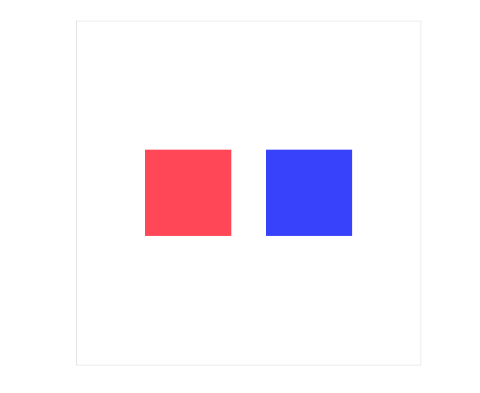
我们用linear和ease来做一个对比,左边是linear,右边是ease。
其实他们的过渡时间都是一模一样的,只是视觉上有所差异。

<!DOCTYPE html>
<html lang="en">
<head>
        <meta charset="UTF-8">
        <meta name="viewport" content="width=device-width, initial-scale=1.0">
        <title>Document</title>
        <style>
                *{
                        margin: 0;
                        padding: 0;
                        box-sizing: border-box;
                }
                body{
                        height: 100vh;
                        width: 100vw;

                        display: flex;
                        justify-content: center;
                        align-items: center;
                }

                main{
                        height: 400px;
                        width: 400px;

                        display: flex;
                        justify-content: center;
                        align-items: center;

                        border:1px solid #ddd;
                }
                main div{
                        height: 100px;
                        width: 100px;
                        margin: 20px;
                        transition-duration: 3s;
                }
                main div:nth-child(1){
                        background-color: #ff4757;
                        transition-timing-function:linear;
                }

                main div:nth-child(2){
                        background-color: #3742fa;
                        transition-timing-function:ease;
                }

                main:hover div{
                        width: 150px;
                        height: 150px;
                        border-radius: 50%;
                }

        </style>

</head>
<body>
        <main>
                <div></div>
                <div></div>
        </main>
</body>
</html>
贝塞尔曲线
其实不管是linear或者是ease都是由贝塞尔曲线来完成的。
我们需要设置四个值 cubic-bezier(<x1>, <y1>, <x2>, <y2>)来控制曲线速度,可在
如以下是我自己调的一个数值,右边的那个,对比的是linear。
<!DOCTYPE html>
<html lang="en">
<head>
        <meta charset="UTF-8">
        <meta name="viewport" content="width=device-width, initial-scale=1.0">
        <title>Document</title>
        <style>
                *{
                        margin: 0;
                        padding: 0;
                        box-sizing: border-box;
                }
                body{
                        height: 100vh;
                        width: 100vw;

                        display: flex;
                        justify-content: center;
                        align-items: center;
                }

                main{
                        height: 400px;
                        width: 400px;

                        display: flex;
                        justify-content: center;
                        align-items: center;

                        border:1px solid #ddd;
                }
                main div{
                        height: 100px;
                        width: 100px;
                        margin: 20px;
                        transition-duration: 3s;
                }
                main div:nth-child(1){
                        background-color: #ff4757;
                        transition-timing-function:linear;
                }

                main div:nth-child(2){
                        background-color: #3742fa;
                        transition-timing-function:cubic-bezier(.17,.67,.88,-0.47);
                }

                main:hover div{
                        width: 150px;
                        height: 150px;
                        border-radius: 50%;
                }

        </style>

</head>
<body>
        <main>
                <div></div>
                <div></div>
        </main>
</body>
</html>
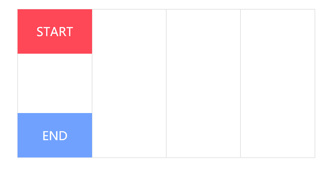
步进速度
过渡使用阶梯化呈现,有点像现实生活中的机械舞,下面是把过渡分3步完成。
| 选项 | 说明 |
|---|---|
| steps(n,start) | 设置n个时间点,第一时间点变化状态 |
| steps(n,end) | 设置n个时间点,第一时间点初始状态 |
| step-start | 等于steps(1,start),可以理解为从下一步开始 |
| step-end | 等于steps(1,end),可以理解为从当前步开始 |
start总是先走,end总是后走。
<!DOCTYPE html>
<html lang="en">
<head>
        <meta charset="UTF-8">
        <meta name="viewport" content="width=device-width, initial-scale=1.0">
        <title>Document</title>
        <style>
                *{
                        margin: 0;
                        padding: 0;
                        box-sizing: border-box;
                }
                body{
                        height: 100vh;
                        width: 100vw;

                        display: flex;
                        justify-content: center;
                        align-items: center;
                }

                main{
                        height: 400px;
                        width: 800px;

                        display: flex;
                        border:1px solid #ddd;

                        position: relative;
                }
                main div{
                        width: 200px;
                        height: 100%;
                        border: 1px solid #ddd;
                }
                main::after{
                        content: "START";
                        height: 30%;
                        width: 25%;
                        background: #ff4757;
                        color: #fff;
                        font-size: 2em;
                        /* 过渡时间2s */
                        transition: 2s;
                        /* 相当于把2s分成三步走 */
                        transition-timing-function: steps(3, start);

                        position: absolute;
                        top: 0;

                        display: flex;
                        justify-content: center;
                        align-items: center;


                }

                main::before{
                        content: "END";
                        height: 30%;
                        width: 25%;
                        background: #70a1ff;
                        color: #fff;
                        font-size: 2em;
                        /* 过渡时间2s */
                        transition: 2s;
                        /* 相当于把2s分成三步走 */
                        transition-timing-function: steps(3, end);

                        position: absolute;
                        bottom: 0;

                        display: flex;
                        justify-content: center;
                        align-items: center;
                }

                main:hover::before{
                        transform: translateX(600px);
                }

                main:hover::after{
                        transform: translateX(600px);
                }

        </style>

</head>
<body>
        <main>
                <div></div>
                <div></div>
                <div></div>
                <div></div>
        </main>
</body>
</html>
时钟效果
其实步进这样一帧一帧的来走非常时候做时钟,那么这里就做一个非常简chou陋的时钟吧。
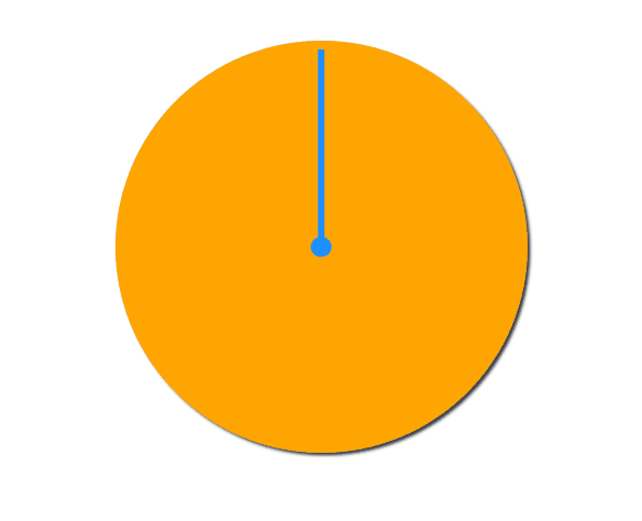
<!DOCTYPE html>
<html lang="en">
<head>
        <meta charset="UTF-8">
        <meta name="viewport" content="width=device-width, initial-scale=1.0">
        <title>Document</title>
        <style>
                *{
                        margin: 0;
                        padding: 0;
                        box-sizing: border-box;
                }
                body{
                        height: 100vh;
                        width: 100vw;

                        display: flex;
                        justify-content: center;
                        align-items: center;
                }

                main{
                        height: 400px;
                        width: 400px;
                        display: flex;
                        position: relative;
                        background:#ffa502;
                        box-shadow: 3px 3px 3px #2f3542;
                        border-radius: 50%;
                }
                main::after{
                        content: "";
                        height: 20px;
                        width: 20px;
                        border-radius: 50%;
                        position: absolute;
                        left: 50%;
                        top: 50%;
                        transform:translate(-50%,-50%);
                        background: #1e90ff;
                }
                main::before{
                        content: "";
                        height: 48%;
                        width: 6px;
                        position: absolute;
                        left: 50%;
                        bottom: 50%;
                        transform:translate(-50%,0);
                        background:  #1e90ff;
                        transition-duration: 60s;
                        transition-timing-function:steps(60,start);
                        transform-origin: bottom;
                }

                main:hover::before{

                        transform:translateX(-50%)  rotate(360deg);

                }


        </style>

</head>
<body>
<main></main>
</body>
</html>
transition-delay
用于设置延迟过渡的时间。
默认为0s即立刻开始过渡
值可以为负数
变化属性数量大于时间数量时,后面的属性再从第一个时间开始重复使用
基本使用
下面设置了延迟时间为1s,当鼠标放上时产生变化。

<!DOCTYPE html>
<html lang="en">
<head>
        <meta charset="UTF-8">
        <meta name="viewport" content="width=device-width, initial-scale=1.0">
        <title>Document</title>
        <style>
                * {
                    padding: 0;
                    margin: 0;
                }

                body {
                    background: #2c3e50;
                    display: flex;
                    flex-direction: column;
                    justify-content: center;
                    align-items: center;
                    box-sizing: border-box;
                    width: 100vw;
                    height: 100vh;
                    padding: 80px;
                }

                main {
                    width: 400px;
                    height: 400px;
                }

                div {
                    width: 150px;
                    height: 150px;
                    background-color: #e67e22;
                    border-radius: 50%;
                    transition-property: background-color, transform, opacity, border-radius;
                    transition-duration: 1s;
                    transition-delay: 1s;
                }

                div:hover {
                    border-radius: 0;
                    transform: scale(2) rotate(180deg);
                    background-color: #e67e22;
                }
        </style>
</head>
<body>
        <main>
                <div></div>
        </main>
</body>
</html>
多值延迟
可以设置不同属性的延迟时间。

<!DOCTYPE html>
<html lang="en">
<head>
        <meta charset="UTF-8">
        <meta name="viewport" content="width=device-width, initial-scale=1.0">
        <title>Document</title>
        <style>
                * {
                    padding: 0;
                    margin: 0;
                }

                body {
                    background: #2c3e50;
                    display: flex;
                    flex-direction: column;
                    justify-content: center;
                    align-items: center;
                    box-sizing: border-box;
                    width: 100vw;
                    height: 100vh;
                    padding: 80px;
                }

                main {
                    width: 400px;
                    height: 400px;
                }

                div {
                    width: 150px;
                    height: 150px;
                    background-color: #fff;
                    /* 一一对应 */
                    transition-property: background-color, transform, border-radius;
                    transition-duration: 1s, 2s, 3s;
                    transition-delay: 1s, 3s, 5s;
                }

                div:hover {
                    border-radius: 50%;
                    transform: scale(2) rotate(180deg);
                    background-color: #e67e22;
                }
        </style>
</head>
<body>
        <main>
                <div></div>
        </main>
</body>
</html>
使用负值
下例圆角属性的过渡时间为4s,设置延迟为 -4s,表示鼠标放上时直接显示在4s上的效果。如果设置为-2s显示圆角变形一半的效果。
即对圆角来说不产生过渡,是瞬发的。

<!DOCTYPE html>
<html lang="en">
<head>
        <meta charset="UTF-8">
        <meta name="viewport" content="width=device-width, initial-scale=1.0">
        <title>Document</title>
        <style>
                * {
                    padding: 0;
                    margin: 0;
                }

                body {
                    background: #2c3e50;
                    display: flex;
                    flex-direction: column;
                    justify-content: center;
                    align-items: center;
                    box-sizing: border-box;
                    width: 100vw;
                    height: 100vh;
                    padding: 80px;
                }

                main {
                    width: 400px;
                    height: 400px;
                }

                div {
                    width: 150px;
                    height: 150px;
                    background-color: #fff;

                    transition-property: background-color, transform, border-radius;
                    transition-duration: 1s, 2s, 4s;
                    transition-delay: 1s, 2s, -4s;
                }

                div:hover {
                    border-radius: 50%;
                    transform: scale(2) rotate(180deg);
                    background-color: #e67e22;
                }

        </style>
</head>
<body>
        <main>
                <div></div>
        </main>
</body>
</html>
transition
可以使用transition 指令将过渡规则统一设置,需要注意以下几点。
必须设置过渡时间
延迟时间放在逗号或结束前
如果只设置一个数值,那么该数值会认为是过渡时间
transition: border-radius linear 2s 0s,
background 2s 2s,
width linear 2s 4s,
height linear 2s 4s;
/* 参与过渡的动画 贝塞尔曲线 过渡时间 延迟时间 */
点赞案例

<!DOCTYPE html>
<html lang="en">

<head>
        <meta charset="UTF-8">
        <meta name="viewport" content="width=device-width, initial-scale=1.0">
        <title>Document</title>
        <link rel="stylesheet" href="https://maxcdn.bootstrapcdn.com/font-awesome/4.7.0/css/font-awesome.min.css">
        <script src='https://blog-static.cnblogs.com/files/Yunya-Cnblogs/jQuery.js'></script>
        <style>
                body {
                        width: 100vw;
                        height: 100vh;
                        display: flex;
                        justify-content: center;
                        align-items: center;
                        background: #ecf0f1;
                }

                div {
                        position: relative;
                        width: 100px;
                        height: 100px;
                        cursor: pointer;
                        display: flex;
                        justify-content: center;
                        align-items: center;
                }

                div i.fa {
                        font-size: 100px;
                        position: absolute;
                        transition: all .5s;
                        color: #ddd;
                }

                div.heart i.fa {
                        font-size: 400px;
                        color: #e74c3c;
                        opacity: 0;
                }

                div.heart i.fa:nth-child(2) {
                        font-size: 80px;
                        color: #e74c3c;
                        opacity: 1;
                }
        </style>
</head>

<body>

        <div onclick="heart()">
                <i class="fa fa-heart" aria-hidden="true"></i>
                <i class="fa fa-heart" aria-hidden="true"></i>
        </div>


</body>
<script>
        function heart() {
                $("div").toggleClass('heart');
        }
</script>

</html>