前端总结系列
- 前端总结·基础篇·CSS(一)布局
- 前端总结·基础篇·CSS(二)视觉
- 前端总结·基础篇·CSS(三)补充
- 前端总结·基础篇·JS(一)原型、原型链、构造函数和字符串(String)
- 前端总结·基础篇·JS(二)数组深拷贝、去重以及字符串反序和数组(Array)
- 前端总结·基础篇·JS(三)arguments、callee、call、apply、bind及函数封装和构造函数
- 前端总结·基础篇·JS(四)异步请求及跨域方案
- 前端总结·工具篇·管理(一)常用模块化方案
目录
一、动画(animation)(IE10+)(CSS3)
	1.1 定义动画
	1.2 引用动画
	1.3 多个动画
	1.4 更多属性
二、过渡(transition)(IE10+)(CSS3)
	2.1 定义首尾
	2.2 应用过渡
	2.3 多个过渡
	2.4 更多属性
三、转换(transform)(IE10+,-ms-,-webkit-,-moz-,-o-)(CSS3)
	3.1 2D转换(-ms- for IE9)
	3.2 3D转换(not opera)
四、圆角、阴影和透明的实践(CSS3)
	4.1 圆角(border-radius)(IE9+)
	4.2 阴影(shadow)(box-shadow IE9+ text-shadow IE10+)
	4.3 透明度(opacity)
五、可缩写属性
	5.1 背景(background)
	5.2 字体(font)
	5.3 边框(border)(border-image IE11+)
	5.4 填充和边距(padding/margin)
六、滤镜(filter)(notIE,-webkit-)
七、补充
	7.1 自定义鼠标指针(cursor)
	7.2 Canvas
	7.3 SVG
	7.4 WebGL
一、动画(animation)(IE10+,-webkit-,-moz,-o-)(CSS3)
动画抵达的过程是连续的,还原的过程是突发的。放完了就还原,就是这么任性。

1.1 定义动画
定义动画可以用from-to的两个定点形式,也可用百分比(0%、50%、100%)的多个定点形式。
/* 定义动画 */

@keyframes toRight {
    from {
        left: 0px;
        top: 0px;
        background-color: red;
    }
    to {
        left: 130px;
        top: 0px;
        background-color: blue;
    }
}
1.2 引用动画
我们先定义一个div块,class为animation。然后对这个div块引用动画效果。
/* HTML部分 */

<div class="animation"></div>

/* 定义div块的默认样式 */

.animation {
    position: absolute;
     100px;
    height: 100px;
    background-color: red;
}

/* 引用动画 当鼠标悬于div块上方时触发动画效果 */

.animation:hover {
    animation: toRight 5s;
}
1.3 多个动画
设置多个帧(@keyframes),使用不同的名字。在引用动画的时候不同的帧用逗号隔开。
animation: toRight 5s,toTop 5s;
1.4 更多属性
下面是一个完整的属性应用和属性说明。
animation:walk 2s ease 1s 2 normal running forwards;
animation-name:keyframename/none;
animation-duration:time;
animation-timing-function:linear/ease/ease-in/ease-out/ease-in-out/cubic-
bezier(n,n,n,n);
animation-delay:time;
animation-iteration-count:n/infinite;
animation-direction:normal/alternate;
animation-play-state:paused/running;
animation-fill-mode:none/forwards/backwards/both;
二、过渡(transition)(IE10+,-webkit-,-moz,-o-)(CSS3)
过渡一直是连续的,无论是抵达的过程,还是还原的过程。

2.1 定义首尾
/* HTML */

<div class="transition"></div>

/* 定义首 默认样式 */

.transition {
     100px;
    height: 100px;
    background-color: red;
}

/* 定义尾 目标样式 */

.transition:hover {
     200px;
}
2.2 应用过渡
.transition {
     100px;
    height: 100px;
    background-color: red;
	transition: width 2s;  /* 只需添加这一条 */
}
2.3 多个过渡
应用多个过渡的时候用逗号隔开,或者直接设置应用过渡效果的属性为all。
transition: width 5s,height 5s;

或

transition: all 5s;
2.4 更多属性
transition:width 2s ease 1s;
transition-property:none/all/property;
transition-duration:time;
transition-timing-function:linear/ease/ease-in/ease-out/ease-in-out/cubic-
bezier(n,n,n,n);
transition-delay:time;
三、转换(transform)(IE10+,-ms-,-webkit-,-moz-,-o-)(CSS3)
3.1 2D转换(-ms- for IE9)
以下没有演示矩阵效果,更多请见张鑫旭。下图的效果依次是缩放、旋转、斜拉和移动,参数和下方的参数保持一致,展示的过程是用animation做的。

缩放 transform:scale(2,2);  // 两个参数分别是宽和高缩放的比例
旋转 transform:rotate(180deg);
斜拉 transform:skew(30deg,30deg);
移动 transform:translate(50px,-50px);
矩阵 transform:matrix(n,n,n,n,n,n);  // 3*3矩阵 6个参数
3.2 3D转换(not opera)
缩放:transform:scale(x,y)/scaleX(x)/scaleY(y)/scaleZ(z)/scale3d(x,y,z)
旋转:transform:rotate(angle)/rotateX(angle)/rotateY(angle)/rotateZ(angle)/rotate3d(x,y,zangle)
斜拉:transform:skewX(angle)/skewY(angle)/skew(x-angle,y-angle)
移动:transform:translate(x,y)/translateX(x)/translateY(y)/translate3d(x,y,z)
透视:perspective(100) 默认单位是px,表示观察者离物体的距离(-webkit-)
矩阵:transform:matrix3d(); 4*4矩阵 16个参数
其他:transform:none;

属性
transform-origin:x-axis/y-axis/z-axis;
transform-style:flat/preserve-3d;(not IE)
perspective:number/none;
perspective-origin:x-axis/y-axis;
backface-visibility:visibility/hidden;
四、圆角、阴影和透明的实践(CSS3)
4.1 圆角(border-radius)(IE9+)
下面是用过渡和圆角制作的一个按钮。
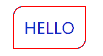
/* HTML */

<a href="#" class="border-radius">HELLO</a>

/* CSS */

.border-radius {
    border: 1px solid red;
    border-radius: 10px 0 10px 0;  // 设置圆角(四个值分别为top-left、top-right、bottom-right和bottom-left)
     60px;
    padding: 10px;
    text-align: center;
    transition: all .3s ease-in-out;  // 设置过渡效果
    text-decoration: none;  // 去除链接下划线
}
.border-radius:hover {
    background-color: red;
    color: white;
}
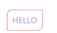
4.2 阴影(shadow)(box-shadow IE9+ text-shadow IE10+)
给按钮加上盒阴影和文本阴影。

/* HTML */

<a href="#" class="border-radius">HELLO</a>

/* CSS */

.border-radius {
    border: 1px solid red;
    border-radius: 10px 0 10px 0;
     60px;
    padding: 10px;
    text-align: center;
    transition: all .3s ease-in-out;
    text-decoration: none;
}
.border-radius:hover {
    background-color: red;
    color: white;
    box-shadow: -10px -10px 5px gray;  // 盒子阴影(四个值分别是x轴、y轴、模糊距离和颜色)
    text-shadow: -5px -5px 3px black;  // 文本阴影
}
4.3 透明度(opacity)
再加上透明度。默认透明度为0.5,悬浮在按钮上后变为1.0.
/* HTML */

<a href="#" class="border-radius">HELLO</a>

/* CSS */

.border-radius {
    border: 1px solid red;
    border-radius: 10px 0 10px 0;
     60px;
    padding: 10px;
    text-align: center;
    transition: all .3s ease-in-out;
    text-decoration: none;
	opacity: .5;  // 设置默认透明度为0.5
}
.border-radius:hover {
    background-color: red;
    color: white;
    box-shadow: -10px -10px 5px gray;
    text-shadow: -5px -5px 3px black;
	opacity: 1;  // 设置按钮悬浮之后的透明度为1
}

/* 除了opacity,rgba同样具有透明度属性 */
五、可缩写属性
5.1 背景(background)
制作精灵图(sprite)可以用background-color:url() -20px -20px;,然后将元素的width和height设置成小图的大小。
background:red url(laughcry.gif) repeat top left;
background-color:color/transparent;
background-image:url()/none/inherit;
background-repeat:repeat/repeat-x/repeat-y/no-repeat/inherit;
background-position:left top/center top/right top...;

background-attachment:scroll/fixed/inherit;
background-size:length/percentage/cover/contain;  // cover为覆盖最小定位区域,contain为最大
background-clip:border-box/padding-box/content-box;  // 指定定位区域
background-origin:border-box/padding-box/content-box;  // 指定绘画区域

CSS3

多背景:(-image:url(bg.jpg),url(dog.jpg))定位源(-origin:content-box/padding-box/border-box)显示区域(-clip:content-box;)和尺寸(-size(80px 60px))
渐变(gradient)(IE10+,-webkit-,-o-,-moz-)(CSS3)
线性渐变(linear-gradient)
* background:linear-gradient(red,blue,green)
* 默认为从上到下渐变,to right(前缀写法中皆为left)可以设置从左到右渐变,to bottom right则对角线渐变(前缀写法中webkit为left top),180deg则可以设置按照角度渐变;
* background:linear-gradient(to right,red 10%,blue 50%,green 70%)
* background:linear-gradient(rgba(220,220,220,0),rgba(220,220,220,1))
径向渐变(radial-gradient)
* background:radial-gradient(red,blue,green)
* 颜色值前面可以设置形状elipse/circle(椭圆/圆)默认为elipse
* background:radial-gradient(60% 55%,closest-side,red,blue,green)
* 以上的参数还有farthest-side,closest-corner,farthest-corner,
5.2 字体(font)
文字溢出时可以使用word-break:break-all;进行字母级截断,也可以使用word-wrap:break-word;进行单词级的截断。
font:italic bold 1.2em/1.2 Arial,sans-serif;
font-style:normal/italic/oblique/inherit;
font-weight:normal/bold/bolder/lighter/100...900 400为normal 700为bold/inherit;
font-size:xx-small/x-small/small/medium/large/x-large/xx-large/smaller/larger/length/%/inherit;
line-height:normal/number/length/%/inherit;
font-family:family-name/generic-family;

CSS3

@font-face用来设置自定义字体。留坑,以后再来好好总结一下。以下代码直接粘贴自[菜鸟教程](http://www.runoob.com/try/try.php?filename=trycss3_font-face_rule)。

@font-face
{
	font-family: myFirstFont;
	src: url('Sansation_Light.ttf')
		,url('Sansation_Light.eot'); /* IE9 */
}

div
{
	font-family:myFirstFont;
}
5.3 边框(border)(border-image IE11+)
outline和border类似,但是不占用布局空间。
border:1px solid red;  // 值分别为border-width、border-style和border-color
border-style:none/hidden/dotted/dashed/solid/double/groove/ridge/inset/outset/inherit;

CSS3

border-image:url() 30 30 stretch;(round为边框重复,stretch为边框拉伸)
5.4 填充和边距(padding/margin)
垂直方向的margin会合并,水平方向的不会。实际显示的margin是两者中较大的那个。
padding:1px 2px 1px 2px;(top/right/bottom/left)
六、滤镜(filter)(notIE,-webkit-)
以下作为参考手册。
* 透明 filter:opacity(50%);
* 阴影 filter:drop-shadow(10px 10px 5px red);
* 模糊 filter:blur(5px);
* 对比度 filter:contrast(200%);
* 饱和度 filter:saturate(800%);
* 灰度 filter:grayscale(100%);
* 深褐色 filter:sepia(100%);
* 亮度 filter:brightness(200%);
* 色相旋转 filter:hue-rotate(90deg);
* 反转输入 filter:invert(100%);
* 多值空格隔开 filter:filter:opacity(50%) blur(5px);
七、补充
7.1 自定义鼠标指针(cursor)
cursor:pointer/help/wait/text/move/crosshair;
7.2 Canvas
待到总结js的时候,再一并总结。
7.3 SVG
SVG全称为可缩放矢量图像(Scalable Vector Graphics),参考教程有W3School和W3CPlus。成熟的库有D3.js,常用来进行数据可视化。以后学习,留坑。
7.4 WebGL
WebGL全称为网页图像库(Web Graphics Library)。成熟的库有three.js,常用来基于web的3D制作。以后学习,留坑。
总结
本文主要参考W3School,部分来自《CSS设计指南》和平常遇到问题时的一些总结,少部分来自菜鸟教程。GIF制作工具使用的是ScreenToGif 1.4.2。
码这篇文章码了好久啊,部分内容由于懒,就没有完整的写出来。
这是前端总结的第二篇文章,进度还是挺慢的。大概过了5天,才更新到第二篇。那我都在干啥呢?在总结JS啊。当然,只是做了大概的总结,并没有写成很详细的文档。因此,CSS基础篇的文档更新奇慢,接下来要做的事情就是提升更新的速度(保证质量的前提下)。Fighting。