单行文本截断
.text{
  width: 200px;
  text-overflow: ellipsis;
  white-space: nowrap;
  overflow: hidden;
}
多行文本截断
-webkit-line-clamp属性值为需要截断的行数
.text{
  display: -webkit-box;
  -webkit-line-clamp: 2;
  -webkit-box-orient: vertical ;
  overflow: hidden;
}
:not() 选择器
选中不在此范围内的元素,例如:div:not(:last-child),选中除最后一个div的所有div元素
有时候在做列表时需要为每项添加下边框线,但最后一个项不需要边框线
.item:not(:last-child){
    border-bottom: 1px solid #ddd;
}
阻止元素成为鼠标事件的target
pointer-events 指定鼠标如何与元素进行交互,设置为none,阻止任何鼠标事件对其的作用
.item{
  pointer-events: none;
}
设置行高,文字顶部对齐
vertical-align 用来指定行内元素(inline)或 表格单元格(table-cell)元素的垂直对齐方式。
子元素设置line-height:1,为了不继承父元素的行高
<p>
    <span>顶部对齐</span>
</p>
p{
  line-height:3;
}
span{
  line-height:1;
  vertical-align:top;
}
vue深度选择器
有时候需要在组件中局部修改第三方组件的样式,而又不想去除scoped属性造成组件之间的样式污染。
此时只能通过>>>,穿透scoped。
有些Sass 之类的预处理器无法正确解析 >>>。可以使用 /deep/ 操作符 或 ::v-deep( >>> 的别名)
<style scoped>

外层 >>> 第三方组件类名 {
      样式
}

/deep/  第三方组件类名 {
      样式
}

</style>
高宽等比例自适应正方形
当宽度设置为一些自适应的值时(%、vw等),高度的值无法确定,这时可以使用 padding-top:100% 来解决高度的问题,因为 padding 的值参照于 width
<div class="parent">
    <div class="child">
        这里是内容
    </div>
</div>
.parent{
  position: relative;
  width: 50vw;
  height: 0;
  padding-top: 100%;
}
.child{
  position: absolute;
  width: 100%;
  height: 100%;
}
改变input元素光标颜色
input{
  caret-color: #dd3131;
}
不规则投影
一般投影效果都会使用box-shadow来完成,但在一些不规则的形状下达不到预想的效果,这时可以使用drop-shadow来完成。
div{
  filter: drop-shadow(0 0 6px #ddd);
}
ios移动端滚动卡顿
在ios端中滚动容器不会有惯性滚动,用户在滑动时会出现明显的卡顿感,添加以下属性可解决问题
-webkit-overflow-scrolling: touch;
列表最后一行左对齐
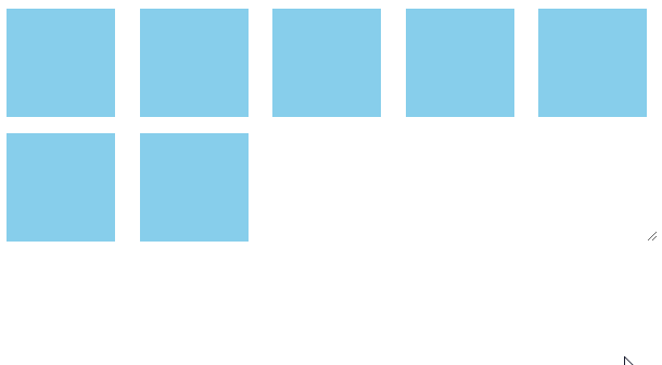
.list {
  display: grid;
  justify-content: space-between;
  grid-template-columns: repeat(auto-fill, 100px);
  grid-gap: 10px;
}
.item{
  width: 100px;
  background: skyblue;
}
@supports特性查询
检测浏览器是否支持CSS的属性值,通过则应用代码块
.box{
  width: 100px;
  height: 100px;
  background: skyblue;
}
@supports (display: grid) {
  .box{
    background: slateblue;
  }
}
/* 两个属性支持即通过,类比 && */
@supports (display: grid) and (display: flex) {
  /* css style */
}
/* 其中一个属性支持即通过,类比 || */
@supports (display: grid) or (display: flex) {
  /* css style */
}
/* 该属性不支持即通过,类比 ! */
@supports not (display: grid) {
  /* css style */
}
查看兼容性:https://www.caniuse.com/#search=%40supports
活动锚点选择器(:target)
地址栏后面跟有锚名称 #,指向文档内某个具体的元素。比如,地址为 loacalhost:3000#red,则选择中ID属性值为red的元素,可以应用到网页换肤功能中。
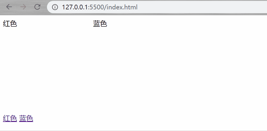
<style>
div{
  display: inline-block;
  width: 200px;
  height: 200px;
}
#red:target{
  background: lightpink;
}
#blue:target{
  background: lightblue;
}
</style>
<body>
  <div id="red">
    <span>红色</span>
  </div>
  <div id="blue">
    <span>蓝色</span>
  </div>
  <p>
    <a href="#red">红色</a>
    <a href="#blue">蓝色</a>
  </p>
</body>
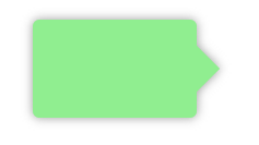
outline-offset 实现加号图标
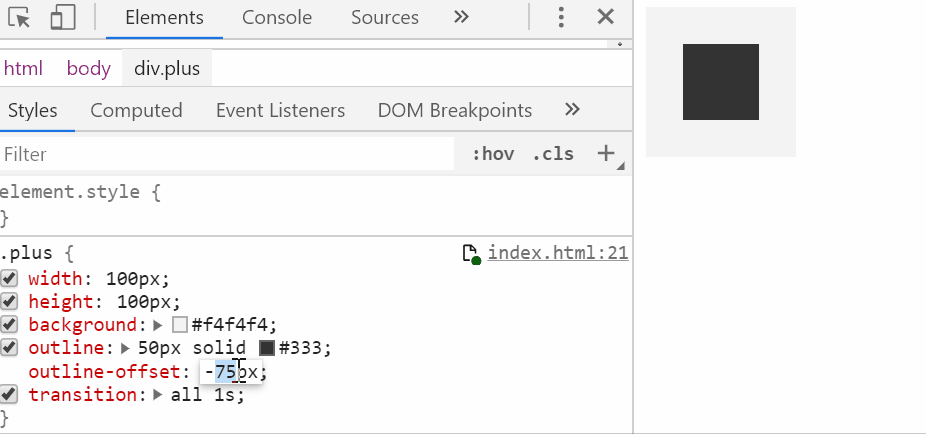
想要实现加号需要符合以下几点:
1.容器是个正方形
2.outline 边框的尺寸不能太小
3.outline-offset 的取值范围: -(容器宽度的一半 + outline宽度的一半) < x < -(容器宽度的一半 + outline宽度)
.plus {
    width: 100px;
    height: 100px;
    background: #f4f4f4;
    outline: 50px solid #333;
    outline-offset: -99px;
}
mask属性


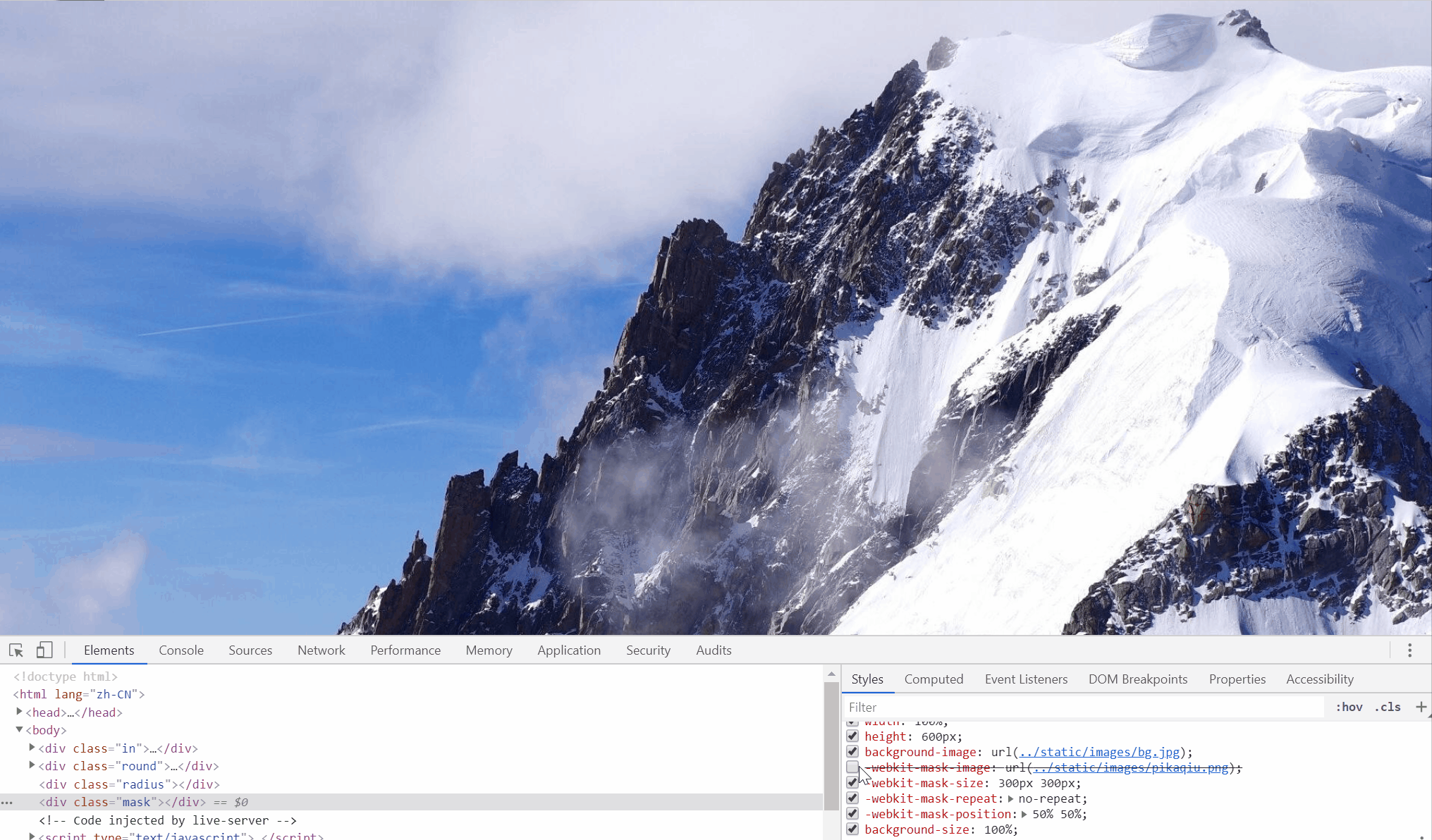
mask-image的图片一定要是png图片才看得出效果,两张图片结合会取相交的区域显示,如果用过ps的话,和蒙版是差不多的功能。
mask和background差不多,同样拥有size、repeat、position等属性。
除了IE不支持外,谷歌、火狐、Edge、Safari、Opera等主流的浏览器都支持该属性。
更多属性:https://developer.mozilla.org/en-US/docs/Web/CSS/mask
兼容性:https://www.caniuse.com/#search=mask-image
.mask{
    width: 100%;
    height: 600px;
    background-image: url(../static/images/bg.jpg);
    -webkit-mask-image: url(../static/images/pikaqiu.png);
    -webkit-mask-size: 300px 300px;
    -webkit-mask-repeat: no-repeat;
    -webkit-mask-position: 50% 50%;
}
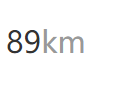
attr函数
attr() 函数返回选择元素的属性值
<p data-unit="km">89</p>
p[data-unit]{
  font-size: 20px;
  color: #333;
}
p[data-unit]::after{
  content: attr(data-unit);
  color: #999;
}
currentColor

currentColor不是一个css属性,而是color的属性值,currentColor 返回当前元素继承的文字颜色。
比如当前元素 color 属性值为 red,currentColor 的值也为 red。currentColor相当于color属性值的别名,利用这一特点,我们可以统一管理元素的颜色。
div{
  width: 100px;
  height: 100px;
  color: red;
  border: 1px solid currentColor;
}
selection

::selection伪元素应用于文档中被用户选中的部分
<div class="demo">我是一段很长很长很长很长很长很长长很长很长长很长很长的文字</div>
.demo::selection{
  background: purple;
  color: #fff;
}
一根细线
高度为1px的伪元素,利用背景渐变可以得到比1px更细的边线
.comment-bar::after{
  content: '';
  position: absolute;
  top: 0;
  left: 0;
  width: 100%;
  height: 1px;
  background: linear-gradient(to bottom, rgba(172,172,172,.3), transparent);
}
两端文本对齐
text-align-last: justify;
以下为 text-align-last 属性值:
- justify: 两端对齐
- center: 居中对齐
- start: 左对齐(也可用left)
- end: 右对齐(也可用right)

margin排版重轻布局
一个flex布局的列表想要实现左重右轻的布局(即最后一个元素右对齐),可以为最后一个元素添加 margin-left: auto
当然,如果你需要最后两个元素右对齐,只需为倒数第二个加上。

不定时更新~