效果如下:
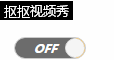
思路:
先在按钮的外面套一个标签(overflow:hidden,position:relative),
然后在按钮前面插入input标签透明度为0,然后使用绝对定位覆盖在按钮上面
按钮使用相对定位,底色为灰色,然后再添加伪类元素:before做开启状态的按钮(底色为黄色),使用绝对定位在按钮右边
圆球为按钮的伪元素:after,使用绝对定位,圆球中心点在按钮右边
当input为:checked状态改变时,配合transition来改变按钮的left值
示例代码:
CSS:
.switch{display:block;position:relative;overflow:hidden;margin:10px;width:70px;height:20px;border-radius:20px;border:1px solid #ccc;font-size: 12px;}
.switch>input{position:absolute;top:0;left:0;width:100%;height:100%;opacity:0;z-index:1;margin:0;}
.switch>.button,.switch>.button:before{width:60px;height:100%;text-align:center;line-height:20px;font-weight:bold;color:#fff;}
.switch>.button{position:relative;left:0;background:#6d6d6d;transition:all 0.3s;-webkit-transition:all 0.3s;-moz-transition:all 0.3s;-o-transition:all 0.3s;}
.switch>.button:before{position:absolute;top:0;left:60px;content:"ON";background:#FFA500;}
.switch>.button:after{position:absolute;top:0;left:50px;content:"";width:18px;height:18px;border-radius:100%;border:1px solid #ddd;background:#f7f7f7;}
.switch>input:checked+.button{left:-50px;}
HTML:
    <div class="switch">
        <input type="checkbox"/>
        <div class="button">OFF</div>
    </div>
在线演示:http://sandbox.runjs.cn/show/n9q9lbv4