关键字:
border-radius 圆角实现
box-shadow 阴影实现
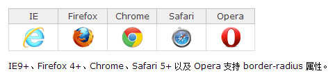
浏览器支持:
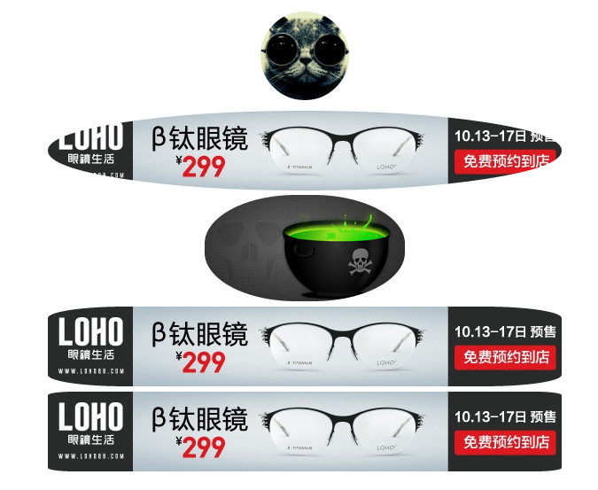
效果图:

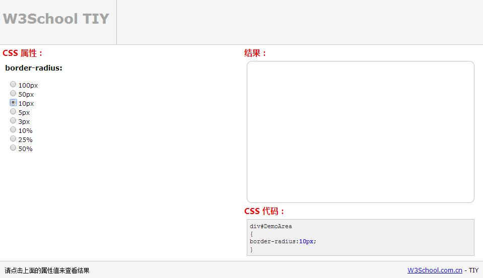
w3school在线测试工具 v1.2 http://www.w3school.com.cn/tiy/c.asp?f=css_border-radius&p=6
去试试 W3School在线测试工具 V2 http://www.w3school.com.cn/tiy/t.asp?f=css3_border-top-left-radius
本例开始效果,实现代码:
1 <!-- 圆形头像 -->
2 <div align="center">
3 <img src="100.jpg" style="margin:10px auto;border-radius:50%"/>
4 <div> <img src="glass.jpg" style="margin:2px auto;border-radius:50%" /> </div>
5 <div> <img src="eat.jpg" style="margin:3px auto;border-radius:46%" /> </div>
6 <div> <img src="glass.jpg" style="margin:3px auto;border-radius:15%" /> </div>
7 <div> <img src="glass.jpg" style="margin:3px auto;border-radius:5%" /> </div>
8 </div>
参考:
http://www.divcss5.com/wenji/w732.shtml
CSS3 border-radius 属性
http://www.w3school.com.cn/cssref/pr_border-radius.asp
CSS3 border-top-left-radius 属性
http://www.w3school.com.cn/cssref/pr_border-top-left-radius.asp
border-radius
http://msdn.microsoft.com/zh-cn/library/gg721784(v=expression.40).aspx
http://www.cnblogs.com/rainman/archive/2011/06/21/2085800.html
http://www.cnblogs.com/lianjun/archive/2011/03/11/1981606.html
另外:
阴影效果:

实现代码:
1 <div style="-webkit-box-shadow:5px 2px 6px #eee;-moz-box-shadow:5px 2px 6px #eee;padding:4px 10px;">阴影效果实现</div>
圆形 + 阴影效果:
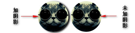
实现代码:
1 <div align="center">
2     <img src="100.jpg"
3     style="margin:3px auto;border-radius:50%;-webkit-box-shadow:5px 2px 6px #000;-moz-box-shadow:5px 2px 6px #fff;padding:0px 0px;" />
4     <img src="100.jpg" style="margin:3px auto;border-radius:50%" />
5 </div>
参考:
box-shadow 在线手册
http://www.php100.com/manual/css3_0/box-shadow.shtml
CSS3 border-radius
http://demo.doyoe.com/css3/border-radius/
CSS3 box-shadow
http://demo.doyoe.com/css3/box-shadow/
纯CSS实现简单的显示隐藏效果
http://demo.doyoe.com/css3/switch/?
CSS+Div布局实现圆角表格边框_源码爱好者
http://www.codefans.net/jscss/code/4268.shtml
纯CSS圆角边框_源码爱好者
http://www.codefans.net/jscss/code/381.shtml