1.响应式布局:
<link rel="stylesheet" href="1.css" media="screen and (min-1000px)">
<style>
@media screen and (min- 600px) {
.one{
border:1px solid red;
height:100px;
100px;
}
}
</style>
and 逻辑与 not only ,设备列表
**这是一个简单的demo*******
<style>
@media screen and (min-1024px){
.list{
min-1024px;
height:300px;
border:1px solid red;
}
.left{
70%;height:100%;float:left;background:blue;
}
.right{
30%;height:100%;float:left;background:green;
}
}
@media screen and (max-1024px){
.list{
min-1024px;
height:300px;
border:1px solid red;
}
.left{
100%;height:100%;float:left;background:blue;
}
.right{
display:none;
}
}
</style>
这里我们需要记住一点,min-width必须是小的值,先写,然后大的值后写,有覆盖的问题。
*****************************
2.边框
border-style:solid;
border-2px;
border-radius:0;
border-color:red;
做兼容
box_round {
-moz-border-radius: 30px; /* FF1+ */
-o-border-radius: 30px; /* opera */
-webkit-border-radius: 30px; /* Saf3+, Chrome */
border-radius: 30px; /* Opera 10.5, IE 9 */
}
********************
box-shadow:2px 2px 5px #000;//x方向的偏移量,y方向的偏移量,阴影的模糊程度,阴影的颜色。
IE8需要做兼容的。
border-image-source:url(border.png);//用在边框图片的路径
border-image-slice:26; //图片边框向内偏移
border-image-26;//
border-image-outset:5;//边框图片超出边框的量
border-image-repeat:stretch round;//边框图片应该平铺repeat,铺满round,或拉伸stretch
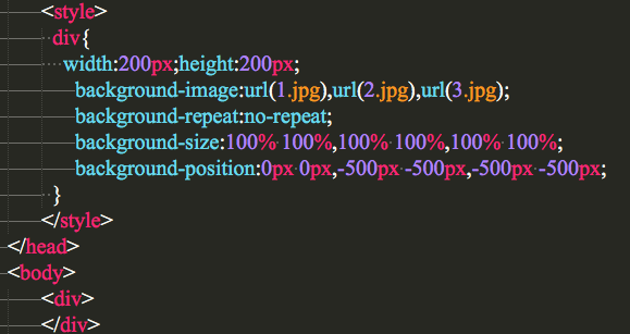
/********这是利用背景属性的一个轮播图的demo**********/
2.5如何让四周都有阴影。
http://blog.csdn.net/freshlover/article/details/7610269
3.一些先进选中的方法
::selection
:focus
div:hover
p:first-line{//第一行
color:red;font-size:2em;
}
p:first-letter{//第一行的字母
font-weight:bold;font-size:1.3em;
}
p:before,p:after{//前后
content:"yansir"
}
属性方面的
div[aa]{
border:1px solid pink;
}
div[aa*=aa]{
border:10px solid blue;
}
li a[title$=txt]{
background:url(txt.jpg) no-repeat;
}
li a[title$=zip]{
background:url(zip.jpg) no-repeat;
}
一个比较重要的
:target{
background:red;
}
<a href="#con1">Á´½ÓÒ»</a><br>
<a href="#con2">Á´½Ó¶þ</a><br>
<p id="con1">我们都是好孩子</p>
<br>
:disabled{
background:red;
}
:enabled {
border:1px solid green;
}
:checked{
border:2px solid blue;
background:red;
}
/*******************/
4.文本模型:
使用文字溢出隐藏 text-overflow 属性: div.test { text-overflow:ellipsis; }
注:该容器必须设置 overflow:hidden
允许对长单词进行拆分,并换行到下一行: p {word-wrap:break-word;}
white-space:nowrap;中文强制不换行
/*简单的demo*/
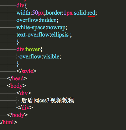
<style>
div{
50px;border:1px solid red;
overflow:hidden;
white-space:nowrap;
text-overflow:ellipsis ;//变为了..
}
div:hover{
overflow:visible;
}
</style>
</head>
<body>
<div>
我们都是祖国的花朵
</div>
</body>
****************************
-webkit-text-fill-color:blue;
-webkit-text-stroke:1px red;//stroke可以理解为边框的意思
-webkit-text-stroke-1px;
-webkit-text-stroke-color:pink;
text-shadow: 5px 5px 5px #FF0000;//水平阴影、垂直阴影、模糊距离,以及阴影的颜色
/*这是一个简单的demo*/
<style>
div{
cursor:pointer;font-size:40px;
}
div:hover{
/*text-shadow:1px 1px 3px #000000;*/
}
</style>
</head>
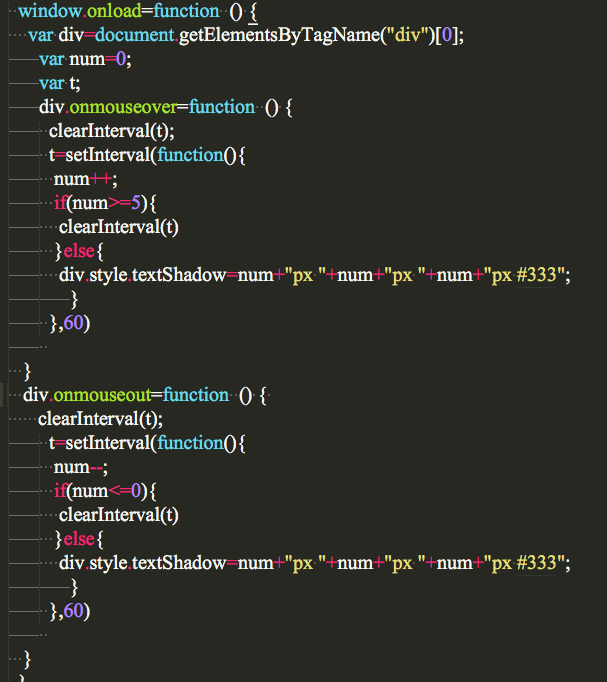
<body>
<div>
这是一首欢快的欢乐颂,哈哈哈,
</div>
5.颜色和渐变
HSL色彩模式是工业界的一种颜色标准,
background:hsla(0,100%,60%,0.5);// 色调,饱和度,亮度,透明度
rgb
background:rgb(255,0,0);
opacity:0.5;
filter:Alpha(opacity=50);
注意:如果想让背景实现全透明,可以使用,background:transparent
简单的css3线性渐变 有一些版本较低的浏览器需要前缀,最新版本的都不需要加前缀
background: -webkit-linear-gradient(red, blue);
background: -o-linear-gradient(red, blue);
background: -moz-linear-gradient(red, blue);
background: linear-gradient(red, blue);
/* 标准的语法 */ 默认的渐变方向从上到下
从左到右的渐变
background: -webkit-linear-gradient(left, red , blue);
background: -o-linear-gradient(right, red, blue);
background: -moz-linear-gradient(right, red, blue);
background: linear-gradient(to right, red , blue);
/* 标准的语法 */ (从右向左 to left)
从左上角到右下角
background: -webkit-linear-gradient(left top, red , blue);
background: -o-linear-gradient(bottom right, red, blue);
background: -moz-linear-gradient(bottom right, red, blue);
background: linear-gradient(to bottom right, red , blue);
/* 标准的语法 */ (同理 其他对角线) 使用角度
background: -webkit-linear-gradient(40deg, red, blue);
background: -o-linear-gradient(40deg, red, blue);
background: -moz-linear-gradient(40deg, red, blue);
background: linear-gradient(40deg, red, blue);
/* 标准的语法 */
*************************************************************
多个颜色节点的渐变
渐变
background: -webkit-linear-gradient(red, green, blue);
background: -o-linear-gradient(red, green, blue);
background: -moz-linear-gradient(red, green, blue);
background: linear-gradient(red, green, blue);
/* 标准的语法 */ 示例:
彩虹渐变
background: -webkit-linear-gradient(left,red,orange,yellow,green,blue,indigo,violet);
background: -o-linear-gradient(left,red,orange,yellow,green,blue,indigo,violet);
background: -moz-linear-gradient(left,red,orange,yellow,green,blue,indigo,violet);
background: linear-gradient(to right, red,orange,yellow,green,blue,indigo,violet);
/*标准的语法*/
需要定义每种颜色所在的位置可以在颜色后面跟上百分号
background:linear-gradient(to right bottom,red 0%, green 50%, blue 100%);
/*标准的写法*/ 需要使用透明度可以将颜色格式设置为
rgba(255,255,255,0);
重复的线性渐变
background: -webkit-repeating-linear-gradient(red, yellow 10%, green 20%);
background: -o-repeating-linear-gradient(red, yellow 10%, green 20%);
background: -moz-repeating-linear-gradient(red, yellow 10%, green 20%);
background: repeating-linear-gradient(red, yellow 10%, green 20%); /* 标准的语法 */
矢量渐变:
简单的css3径向渐变 颜色结点均匀分布的径向渐变:
background: -webkit-radial-gradient(red, green, blue);
background: -o-radial-gradient(red, green, blue);
background: -moz-radial-gradient(red, green, blue);
background: radial-gradient(red, green, blue);
/* 标准的语法 */ 颜色节点分布不均匀的径向渐变:
background: -webkit-radial-gradient(red 5%, green 15%, blue 60%);
background: -o-radial-gradient(red 5%, green 15%, blue 60%);
background: -moz-radial-gradient(red 5%, green 15%, blue 60%);
background: radial-gradient(red 5%, green 15%, blue 60%);
/* 标准的语法 */
重复的径向渐变
background: -webkit-repeating-radial-gradient(red, yellow 10%, green 15%);
background: -o-repeating-radial-gradient(red, yellow 10%, green 15%);
background: -moz-repeating-radial-gradient(red, yellow 10%, green 15%);
background: repeating-radial-gradient(red, yellow 10%, green 15%); /* 标准的语法 */
**********************************************************
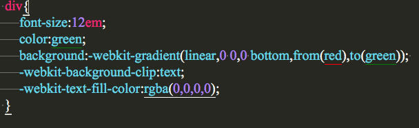
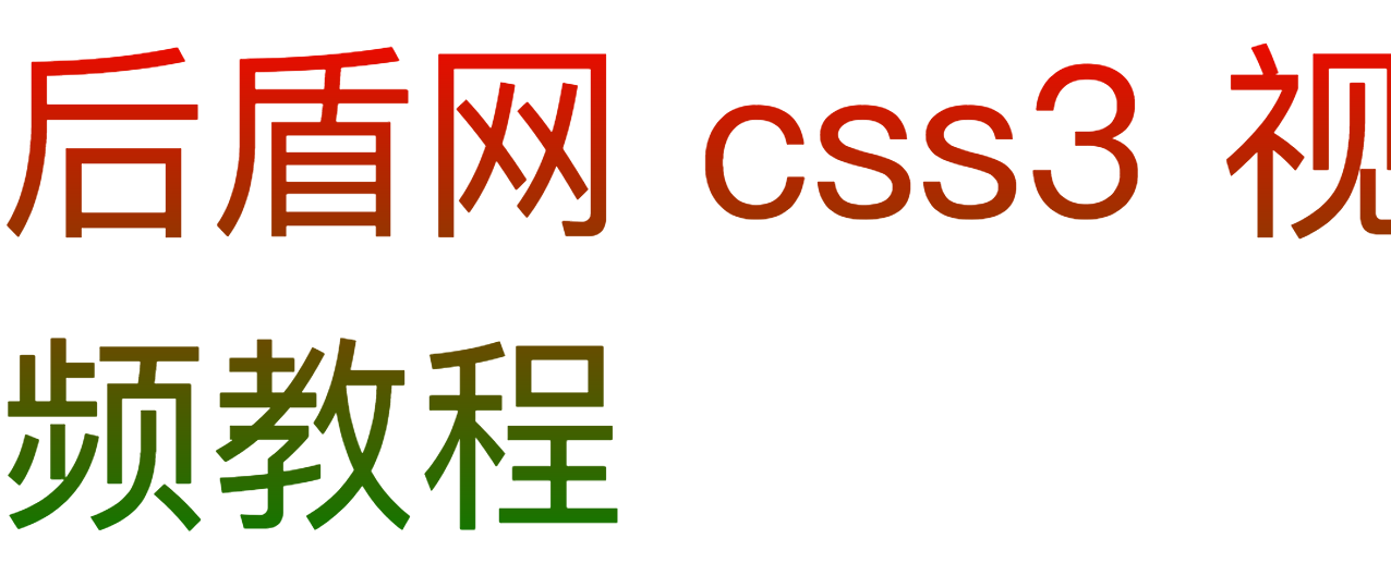
还有一种特殊的文字的渐变:

<style>
div{
font-size:12em;
color:green;
background:-webkit-gradient(linear,0 0,0 bottom,from(red),to(green));
-webkit-background-clip:text;
-webkit-text-fill-color:rgba(0,0,0,0);
}
</style>
</head>
<body>
<div>
莫愁前路无知己,天下谁人不识君
</div>
*********************************************************************
6.列的几个属性:
column-count 规定元素应该被分隔的列数。
column-gap 规定列之间的间隔。
column-rule 设置所有 column-rule-* 属性的简写属性。
-webkit-column-gap:10px;
-moz-column-rule:1px solid red;
column-width 规定列的宽度。
7. resize: none|both|horizontal|vertical; //最后两个属性的意思是,一个表示可以调整的宽度,一个表示可以调整的高度。
8. box-sizing: content-box|border-box|inherit;
9.除了IE剩下都支持
outline:2px solid green;
outline-offset:9px;
10.css3清楚浮动
selector:before,selector:after { content: " "; display: block; } selector:after { clear: both; }
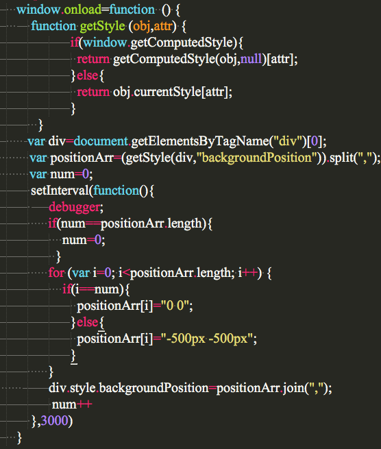
11.通过css3背景实现的轮播。
12.
background-clip: border-box|padding-box|content-box;
border-box 背景被裁剪到边框盒。
padding-box 背景被裁剪到内边距框。
content-box 背景被裁剪到内容框。
13.利用背景的渐变,文字渐变。
14.
box-sizing: content-box|border-box|inherit;
content-box
这是由 CSS2.1 规定的宽度高度行为。
宽度和高度分别应用到元素的内容框。
在宽度和高度之外绘制元素的内边距和边框。
border-box
为元素设定的宽度和高度决定了元素的边框盒。
就是说,为元素指定的任何内边距和边框都将在已设定的宽度和高度内进行绘制。
通过从已设定的宽度和高度分别减去边框和内边距才能得到内容的宽度和高度。
inherit 规定应从父元素继承 box-sizing 属性的值。
15.180deg (度)=  rad(弧度)
16.transform3d更好的了解。
http://www.cnblogs.com/xiaohuochai/p/5351477.html
17. css3 matrix3d的值