border-1px($color)
  position: relative
  &:after
    display: block
    position: absolute
    left: 0
    bottom: 0
     100%
    border-top: 1px solid $color
    content: ' '

border-none()
  &:after
    display: none
使用时首先
@import "../../common/stylus/mixin.styl";
为匹配不同设备,定义基本样式
@media (-webkit-min-device-pixel-ratio: 1.5),(min-device-pixel-ratio: 1.5)
  .border-1px
    &::after
      -webkit-transform: scaleY(0.7)
      transform: scaleY(0.7)

@media (-webkit-min-device-pixel-ratio: 2),(min-device-pixel-ratio: 2)
  .border-1px
    &::after
      -webkit-transform: scaleY(0.5)
      transform: scaleY(0.5)
转自:http://www.cnblogs.com/jiangyangchang/p/6530385.html
注: 先定义一个 mixin (mixin 是 css 预处理器提供的一个方法,它可以通过定义一个函数,比如 border-1px($color),在其中定义的css代码,可以在其他css中直接通过调用函数来引用)
通过对伪类的缩放,来实现在不同屏幕下的1px 效果。
为了方便依赖所有的公共样式,创建一个 index.scss ,引入其他的公共scss,当应用到其他 css 时,直接引入index即可(@import "./index")
mixin.scss
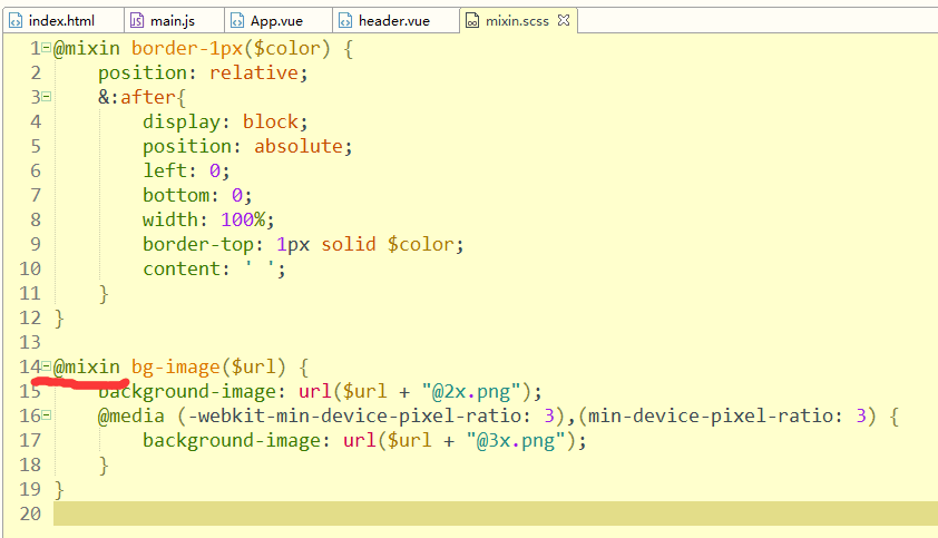
/**
 * 解决1px问题
 */
@mixin border-1px($color) {
  position: relative;
  &:after {
    display: block;
    position: absolute;
    left: 0;
    bottom: 0;
     100%;
    border-top: 1px solid $color;
    content: ' ';
  }
}
base.scss
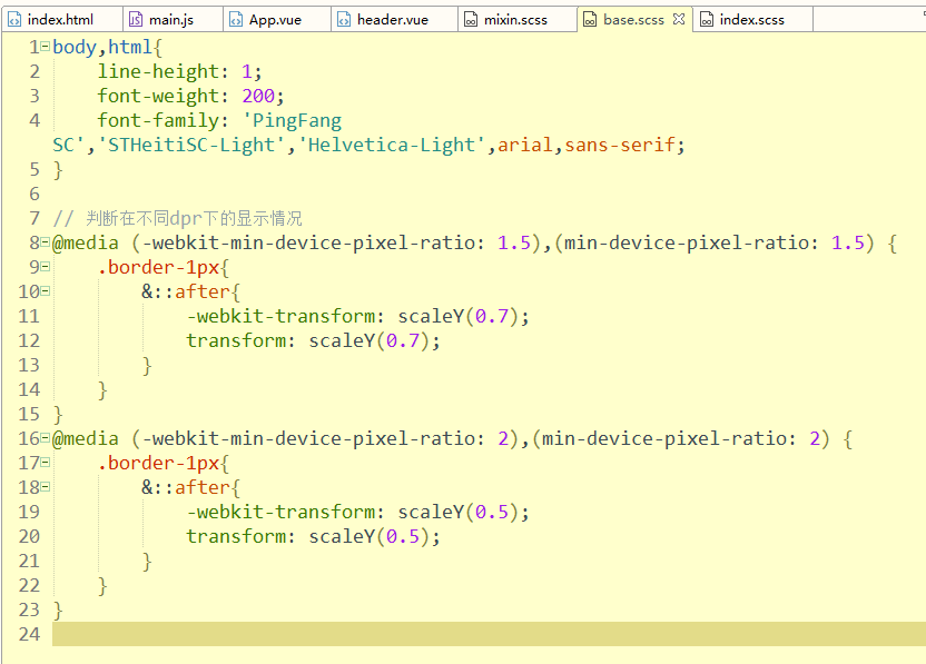
/**
 * 判断在不同 dpr 下的显示情况
 */
@media (-webkit-min-device-pixel-ratio: 1.5),(min-device-pixel-ratio: 1.5) {
  .border-1px {
    &::after {
      -webkit-transform: scaleY(0.7);
      transform: scaleY(0.7);
    }
  }
}

@media (-webkit-min-device-pixel-ratio: 2),(min-device-pixel-ratio: 2) {
  .border-1px {
    &::after {
      -webkit-transform: scaleY(0.5);
      transform: scaleY(0.5);
    }
  }
}

/**
 * 等同于
 */
[data-dpr='1.5'] & {
  .border-1px {
    &::after {
      -webkit-transform: scaleY(0.7);
      transform: scaleY(0.7);
    }
  }
}

[data-dpr='2'] & {
  .border-1px {
    &::after {
      -webkit-transform: scaleY(0.5);
      transform: scaleY(0.5);
    }
  }
}
index.scss

注:@import 后面的 ';'不能省略,否则会报错
.