在实际开发中,我们经常遇见边框需要背景渐变的实现要求,那么如何去实现呢,今天给大家分享依稀几种情况
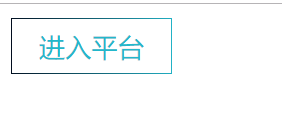
1.直角的背景渐变
<!DOCTYPE html>
<html lang="en">
<head>
    <meta charset="UTF-8">
    <meta name="viewport" content="width=device-width, initial-scale=1.0">
    <meta http-equiv="X-UA-Compatible" content="ie=edge">
    <meta http-equiv="X-UA-Compatible" content="ie=edge">
    <title>border渐变</title>
    <style>
     button{
        background:transparent;
        color:#23b7cb;
        font-size:15px;
        padding:5px 15px;
        border:1px transparent solid;
        border-image:linear-gradient(to right,#000718,#23b7cb) 1 10;
     }

    </style>
</head>
<body>
    <button>进入平台</button>
</body>
</html>
注意问题:border-image的使用是不能实现圆角的效果,各位需要注意这个属性
2.圆角的背景渐变

代码如下:利用伪类元素去实现背景边的渐变效果,同时我们还可以加上动画效果,利用的是transtion:all ease 300ms即可,主要使用了
linear-gradient这个属性
<!DOCTYPE html>
<html lang="en">
<head>
    <meta charset="UTF-8">
    <meta name="viewport" content="width=device-width, initial-scale=1.0">
    <meta http-equiv="X-UA-Compatible" content="ie=edge">
    <meta http-equiv="X-UA-Compatible" content="ie=edge">
    <title>border渐变</title>
    <style>
     button{
        color: #23b7cb;
        font-size: 15px;
        padding: 5px 15px;
        background: #fff;
        border: 1px transparent solid;
        border-radius: 30px;
        position: relative;
     }
     button:after{
         content:'';
         position: absolute;
        top: -3px; bottom: -3px;
        left: -3px; right: -3px;
        background: linear-gradient(135deg,#000781, #23b7cb);
        border-radius: 30px;
        content: '';
        z-index: -1;
     }

    </style>
</head>
<body>
    <button>进入平台</button>
</body>
</html>
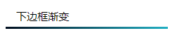
3. 下边框渐变
或者 分割线 的边框渐变
<!DOCTYPE html>
<html lang="en">
<head>
    <meta charset="UTF-8">
    <meta name="viewport" content="width=device-width, initial-scale=1.0">
    <meta http-equiv="X-UA-Compatible" content="ie=edge">
    <meta http-equiv="X-UA-Compatible" content="ie=edge">
    <title>border渐变</title>
    <style>
      div{
          200px;
          padding-bottom: 15px;
        background:transparent;
        /*color:#23b7cb;*/
        font-size:15px;
        padding:5px 15px;
        border-bottom:3px transparent solid;
        border-image:linear-gradient(to right,#000718,#23b7cb) 1 10;
     }
    </style>
</head>
<body>

    <div>下边框渐变</div>
</body>
</html>