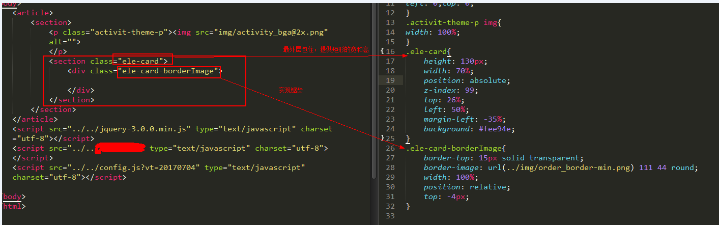
css如何实现这样的样式:
解决方案:
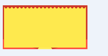
- 这里需要用到的技术是border-image的灵活运用,首先需要一张图片,这里我选中的是这样子的,此后 的图片可以拿这个更改圆形的颜色以更改锯齿颜色:

底部透明,正方形,ps截图如下:
好了,下面咱们就开始真正的代码:
html:
<section class="ele-card">
    <div class="ele-card-borderImage"></div>
</section>
css:
.ele-card{
    height: 130px;
    width: 70%;
    position: absolute;
    z-index: 99;
    top: 26%;
    left: 50%;
    margin-left: -35%;
    background: #fee94e;
}
.ele-card-borderImage{
    border-top: 15px solid transparent;
    border-image: url(../img/order_border-min.png) 111 44 round;
    width: 100%;
    position: relative;
    top: -4px;
}