1.Matplotlib是python的一个绘图库,可以方便的绘制各种图标,是数据可视化的利器。
2.本文我就给大家介绍一下条形图或者说柱状图的绘制
3.代码如下:
《1》首先导入模块
1 import matplotlib.pyplot as plt
《2》准备数据
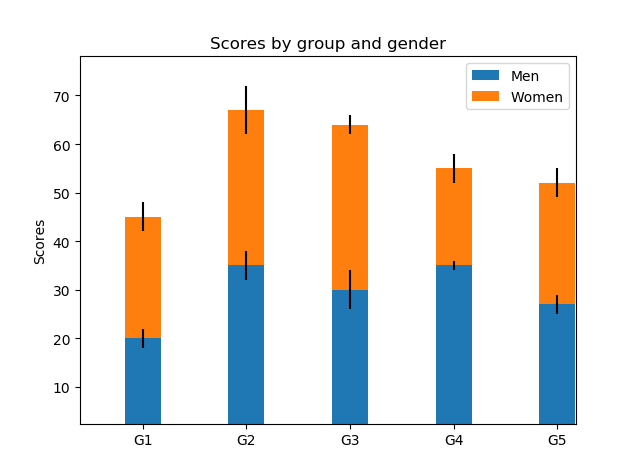
labels = ['G1', 'G2', 'G3', 'G4', 'G5']

men_means = [20, 35, 30, 35, 27]
women_means = [25, 32, 34, 20, 25]
men_std = [2, 3, 4, 1, 2]
women_std = [3, 5, 2, 3, 3]
《3》设置宽度
width = 0.35 # 条形图的宽度
《4》获取子图对象
fig,ax = plt.subplots()
《5》绘制第一层柱状图和第二层柱状图
ax.bar(labels, men_means,width,yerr=men_std,label='Men')
ax.bar(labels,women_means,width,yerr=women_std,bottom=men_means,label='Women')
《6》设置标题和标签
ax.set_ylabel('Scores')
ax.set_title('Scores by group and gender')
《7》图例和显示
ax.legend()

plt.show()
4.全部代码如下
import matplotlib.pyplot as plt
#条形图的绘制
labels = ['G1', 'G2', 'G3', 'G4', 'G5']

men_means = [20, 35, 30, 35, 27]
women_means = [25, 32, 34, 20, 25]
men_std = [2, 3, 4, 1, 2]
women_std = [3, 5, 2, 3, 3]
width = 0.35  # 条形图的宽度
fig,ax = plt.subplots()
ax.bar(labels, men_means,width,yerr=men_std,label='Men')
ax.bar(labels,women_means,width,yerr=women_std,bottom=men_means,label='Women')

ax.set_ylabel('Scores')
ax.set_title('Scores by group and gender')
ax.legend()

plt.show()
5.效果展示