作为Material Design风格的重要组件,CoordinatorLayout协调多种组件的联动,实现各种复杂的效果,在实际项目中扮演着越来越重要的角色。本篇博客将由浅到深,带你一起玩转CoordinatorLayout。
官方文档对CoordinatorLayout是这样描述的:
CoordinatorLayout是一个加强版的FrameLayout,本质是一个ViewGroup,主要有两个用途:
1.用作应用的顶层布局管理器,作为界面其他控件的父容器
2.用作相互之间有特定交互行为的控件的父容器
通过为CoordinatorLayout的子View指定不同的Behavior(默认的Behavior或自定义的Behavior),就可以实现它们之间许多复杂的交互行为,例如侧滑,移动,滑动等。Behavior在后面会详谈,最后我们再来瞅一眼源码:
1 public class CoordinatorLayout extends ViewGroup implements NestedScrollingParent {}
先来了解一下NestedScrolling—Android嵌套滑动机制,用来完成复杂的滑动效果。要完成这样的交互,父View需要实现 NestedScrollingParent 接口,而子View需要实现 NestedScrollingChild 接口。CoordinatorLayout其实是NestedScrollingParent的实现类,也就意味着它的子View一定会实现NestedScrollingChild接口,这样一起协同完成复杂的滑动交互。
介绍工作就到这里,接下来通过三个例子,一起学习CoordinatorLayout(协调布局)。
一.CoordinatorLayout与AppBarLayout
官方文档中对AppBarLayout是这样描述的:AppBarLayout是一个垂直的LinearLayout,只有作为CoordinatorLayout的直接子View时才能正常工作,可以通过设置layout_scrollFlags属性或setScrollFlags()方法让AppBarLayout的子View具有“滚动行为”。我们先来看一个例子,再来分析这段描述。
列表向上滑动,布局收缩;列表向下滑动,布局向下展开到一定高度,待列表完全向下滑动到起始位置,布局再次向下展开。看看怎么实现的:
布局代码:
 1 <?xml version="1.0" encoding="utf-8"?>
 2 <LinearLayout xmlns:android="http://schemas.android.com/apk/res/android"
 3     xmlns:app="http://schemas.android.com/apk/res-auto"
 4     android:layout_width="match_parent"
 5     android:layout_height="match_parent"
 6     android:orientation="vertical">
 7
 8     <android.support.design.widget.CoordinatorLayout
 9         android:layout_width="match_parent"
10         android:layout_height="match_parent">
11
12         <android.support.design.widget.AppBarLayout
13             android:layout_width="match_parent"
14             android:layout_height="wrap_content">
15
16             <LinearLayout
17                 android:layout_width="match_parent"
18                 android:layout_height="100dp"
19                 android:background="@color/colorPrimary"
20                 android:minHeight="50dp"
21                app:layout_scrollFlags="scroll|enterAlways|enterAlwaysCollapsed"></LinearLayout>
22
23             <android.support.v7.widget.Toolbar
24                 android:id="@+id/toolbar"
25                 android:layout_width="match_parent"
26                 android:layout_height="wrap_content"></android.support.v7.widget.Toolbar>
27
28         </android.support.design.widget.AppBarLayout>
29
30         <android.support.v7.widget.RecyclerView
31             android:id="@+id/recycler"
32             android:layout_width="match_parent"
33             android:layout_height="match_parent"
34             app:layout_behavior="@string/appbar_scrolling_view_behavior"></android.support.v7.widget.RecyclerView>
35
36     </android.support.design.widget.CoordinatorLayout>
37
38 </LinearLayout>
CoordinatorLayout中,AppBarLayout与RecyclerView竖直排列;AppBarLayout中,LinearLayout与Toolbar竖直排列。AppBarLayout的官方文档告诉我们,通过设置layout_scrollFlags属性可以让子View具有滑动行为。结合布局文件可以看到,我们给LinearLayout设置了三个属性,都代表什么意思呢:
scroll:设成这个值的效果就是该View和scrolling view形成一个整体,示例中我们滑动RecyclerView时,LinearLayout也会响应滑动。有一点特别需要我们的注意,为了其他的滚动行为生效,必须同时指定scroll和其他标记。
exitUntilCollapsed:设成这个值的效果就是该View离开屏幕时,会被折叠到最小高度。该View已完全折叠后,再向下滚动scrolling view,直到scrolling view顶部的内容完全显示后,该View才会开始向下滚动以显现出来。
enterAlways:设成这个值的效果就是当scrolling view向下滚动时,该View会一起跟着向下滚动,示例图中有所体现。
enterAlwaysCollapsed:设成这个值的效果就是当我们开始向下滚动scrolling view时,该View会一起跟着滚动直到达到其最小高度。然后当scrolling view滚动至顶部内容完全显示后,再向下滚动scrolling view,该View会继续滚动到完全显示出来。示例图中有所体现。
篇幅有限,这里就不多做演示了,大家可以自己试试,组合成不同的效果。
通过分析CoordinatorLayout我们知道它的子View一定会实现NestedScrollingChild接口,这样一起完成复杂的滑动交互,我们看到布局中有一个RecyclerView,先瞅一眼源码:
1 public class RecyclerView extends ViewGroup implements ScrollingView, NestedScrollingChild {}
2 1
Bingo!RecyclerView其实就是NestedScrollingChild的实现类,这也就解释了嵌套滑动的实现。这里如果使用NestedScrollView,然后在里面嵌套一个布局也是可以的。最后我们还为RecyclerView设置了这样一个属性:
1 app:layout_behavior="@string/appbar_scrolling_view_behavior">
这是因为CoordinatorLayout包含的子视图中,带有滚动属性的View必须设置app:layout_behavior属性,设置的这个属性到底是什么呢:
1 android.support.design.widget.AppBarLayout$ScrollingViewBehavior
原来是AppBarLayout自带一个Behivior,直接在源码里注解声明的,这个Behivior也只能用于AppBarLayout,作用是让他根据CoordinatorLayout上的手势进行一些效果(比如收缩,滚动)。关于CoordinatorLayout与Behivior工作原理,我们后面再谈。
二.CoordinatorLayout与CollapsingToolbarLayout
CollapsingToolbarLayout(折叠布局)继承至FrameLayout,通过给它设置layout_scrollFlags,它以控制子View响应layout_behavior事件并作出相应的变化(移除屏幕或固定在屏幕顶端)。我们看一个例子:
很常见也很好看的一个界面,看看布局代码:
 1 <?xml version="1.0" encoding="utf-8"?>
 2 <android.support.design.widget.CoordinatorLayout xmlns:android="http://schemas.android.com/apk/res/android"
 3     xmlns:app="http://schemas.android.com/apk/res-auto"
 4     android:layout_width="match_parent"
 5     android:layout_height="match_parent">
 6
 7     <android.support.design.widget.AppBarLayout
 8         android:layout_width="match_parent"
 9         android:layout_height="250dp">
10
11         <android.support.design.widget.CollapsingToolbarLayout
12             android:id="@+id/collapsing_toolbar"
13             android:layout_width="match_parent"
14             android:layout_height="match_parent"
15             app:contentScrim="?attr/colorPrimary"
16             app:expandedTitleMarginEnd="60dp"
17             app:expandedTitleMarginStart="50dp"
18             app:layout_scrollFlags="scroll|exitUntilCollapsed">
19
20             <ImageView
21                 android:layout_width="match_parent"
22                 android:layout_height="match_parent"
23                 android:scaleType="fitXY"
24                 android:src="@drawable/bg"
25                 app:layout_collapseMode="parallax"
26                 app:layout_collapseParallaxMultiplier="0.7" />
27
28
29             <android.support.v7.widget.Toolbar
30                 android:id="@+id/toolbar"
31                 android:layout_width="match_parent"
32                 android:layout_height="?attr/actionBarSize"
33                 app:layout_collapseMode="pin" />
34
35         </android.support.design.widget.CollapsingToolbarLayout>
36     </android.support.design.widget.AppBarLayout>
37
38     <android.support.v7.widget.RecyclerView
39         android:id="@+id/recycler"
40         android:layout_width="match_parent"
41         android:layout_height="match_parent"
42         app:layout_behavior="@string/appbar_scrolling_view_behavior" />
43
44 </android.support.design.widget.CoordinatorLayout>
结合代码我们看看CollapsingToolbarLayout的使用方法:
1.AppBarLayout与Toolbar的高度一定要设置具体值,这是最后展开与固定的值
2.CollapsingToolbarLayout的属性设置:layout_scrollFlags一定是必不可少的,属性值上文提过,这里不再重复了;contentScrim设置CollapsingToolbarLayout折叠后的背景颜色;expandedTitleMarginStart 设置没有收缩时title向左填充的距离;expandedTitleMarginEnd设置收缩结束时title向左填充的距离
3.ImageView的属性设置:layout_collapseMode (折叠模式)一定是必不可少的,一共有两种模式。pin:设置为这个模式时,当CollapsingToolbarLayout完全收缩后,Toolbar还可以保留在屏幕上;parallax:设置为这个模式时,在内容滚动时,CollapsingToolbarLayout中的View(比如ImageView)也可以同时滚动,实现视差滚动效果,通常和视差因子搭配使用;layout_collapseParallaxMultiplier设置视差滚动因子,值为0~1,值越大视察越大。
4.CollapsingToolbarLayout的折叠、展开状态监听: CollapsingToolbarLayout是通过实现AppBarLayout的OnOffsetChangedListener接口,根据AppBarLayout的偏移来实现子View视差移动和显示。通过调用AppBarLayout的addOnOffsetChangedListener方法监听AppBarLayout的位移,从而判断CollapsingToolbarLayout的状态。
三.CoordinatorLayout与Behavior
前面提到,CoordinatorLayout的子View之间许多复杂的交互行为是通过指定Behavior实现的。那么实现原理是什么,我们看个例子:
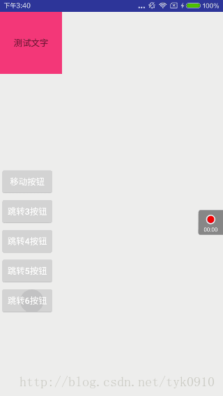
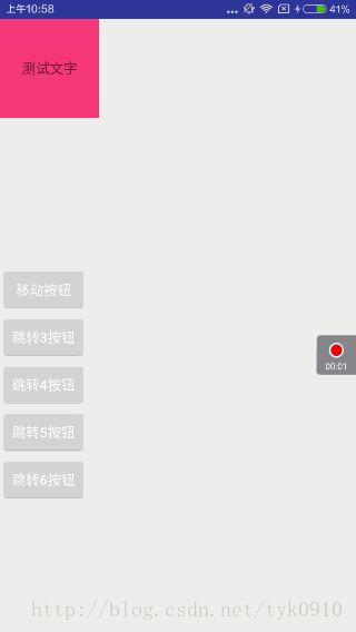
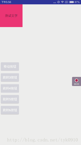
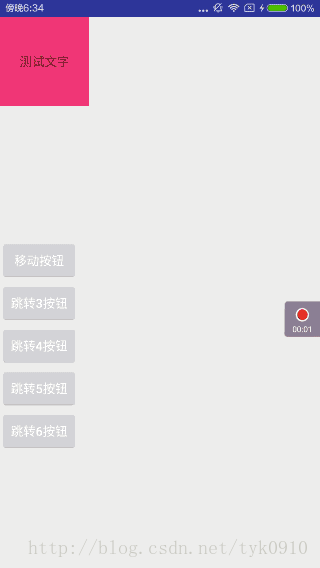
TextView的位置会随着Button的改变而改变,并且显示当前的坐标。其实Behavior的原理就是观察者模式的应用,被观察者就是事件源dependency,观察者就是做出改变的child。具体看看怎么实现的:
 1 public class FollowBehavior extends CoordinatorLayout.Behavior<TextView> {
 2
 3     public FollowBehavior(Context context, AttributeSet attrs) {
 4         super(context, attrs);
 5     }
 6
 7     @Override
 8     public boolean layoutDependsOn(CoordinatorLayout parent, TextView child, View dependency) {
 9         return dependency instanceof Button;
10     }
11
12
13     @Override
14     public boolean onDependentViewChanged(CoordinatorLayout parent, TextView child, View dependency) {
15
16         child.setX(dependency.getX() + 200);
17         child.setY(dependency.getY() + 200);
18         child.setText("观察者:" + dependency.getX() + "," + dependency.getY());
19         return true;
20     }
21 }
1.自定义一个FollowBehavior继承自Behavior,泛型就是child的类型,也就是观察者View
2.重写构造函数,因为CoordinatorLayout源码中会通过反射调用这个构造函数
3.重写layoutDependsOn():用来确定本次交互行为中的dependent view,在上面的代码中,当dependency是Button类的实例时返回true,就可以让系统知道布局文件中的Button就是本次交互行为中的被观察者。
4.重写onDependentViewChanged:当dependent view发生变化时,这个方法会被调用,参数中的child相当于本次交互行为中的观察者,观察者可以在这个方法中对被观察者的变化做出响应,从而完成一次交互行为。
代码布局中的应用:
 1 <?xml version="1.0" encoding="utf-8"?>
 2 <android.support.design.widget.CoordinatorLayout xmlns:android="http://schemas.android.com/apk/res/android"
 3     xmlns:app="http://schemas.android.com/apk/res-auto"
 4     android:layout_width="match_parent"
 5     android:layout_height="match_parent">
 6
 7     <TextView
 8         android:layout_width="wrap_content"
 9         android:layout_height="wrap_content"
10         app:layout_behavior=".FollowBehavior" />
11
12     <Button
13         android:id="@+id/btn"
14         android:layout_width="wrap_content"
15         android:layout_height="wrap_content"
16         android:layout_gravity="center"
17         android:text="被观察者" />
18
19
20 </android.support.design.widget.CoordinatorLayout>
21
22
23         btn.setOnTouchListener(new View.OnTouchListener() {
24             @Override
25             public boolean onTouch(View v, MotionEvent event) {
26                 if (event.getAction() == MotionEvent.ACTION_MOVE) {
27                     v.setX(event.getRawX() - v.getWidth() / 2);
28                     v.setY(event.getRawY() - v.getHeight() / 2 - getStatusBarHeight(getApplicationContext()));
29                 }
30                 return true;
31             }
32         });
xml布局文件中,只需指定
1 app:layout_behavior=“你的Behavior包含包名的类名”
CoordinatorLayout就会反射生成你的Behavior,这样自定义的Behavior就能工作了。在Activity代码中,添加OnTouchListener,获取触摸点坐标,这里竖直方向上减去了状态栏的高度。
既然熟悉了Behavior的原理,这里我在之前的例子上升级了一下。先看效果图:
折叠布局中加了一个圆形头像,并且圆形头像的大小,位置会随着列表上下滑动而改变。没有美工设计,交互是自己瞎想的,大家凑合看看。重点是掌握自定义Behavior。
这里的圆形ImageView就是我们的观察者,给它指定Behavior,从而响应手势事件。谁是被观察者呢?这里我选择的是AppBarLayout,因为上文提到过,可以通过AppBarLayout的addOnOffsetChangedListener方法监听AppBarLayout的位移,从而判断CollapsingToolbarLayout的状态。既然能够获取到这个位移,那就可以让观察者对被观察者的位移变化做出响应。看看具体实现:
 1 public class FollowBehavior extends CoordinatorLayout.Behavior<ImageView> {
 2
 3     private int width, height, top, left;
 4
 5     public FollowBehavior(Context context, AttributeSet attrs) {
 6         super(context, attrs);
 7     }
 8
 9     @Override
10     public boolean layoutDependsOn(CoordinatorLayout parent, ImageView child, View dependency) {
11         return dependency instanceof AppBarLayout;
12     }
13
14     @Override
15     public boolean onDependentViewChanged(CoordinatorLayout parent, ImageView child, View dependency) {
16
17
18         if (dependency.getY() == 0) {
19             width = child.getWidth();
20             height = child.getHeight();
21             top = child.getTop();
22             left = child.getLeft();
23         }
24         float percent = Math.abs(dependency.getY()) / SixActivity.scrollRange;
25         float yPercent = (float) (percent * 0.85);
26         child.setY(top * (1 - yPercent));
27         child.setX(left + 300 * percent);
28         CoordinatorLayout.LayoutParams layoutParams =
29                 (CoordinatorLayout.LayoutParams) child.getLayoutParams();
30         layoutParams.width = (int) (width * (1 - percent * 3 / 4));
31         layoutParams.height = (int) (height * (1 - percent * 3 / 4));
32         child.setLayoutParams(layoutParams);
33         return true;
34     }
35 }
具体分析一下onDependentViewChanged这个方法,AppBarLayout的折叠范围scrollRange是通过 appBarLayout.getTotalScrollRange()获取到的,这里我设置成了静态常量;当AppBarLayout完全展开,没有折叠时,获取到ImageView的基本属性;当AppBarLayout状态改变时,同时改变ImageView的坐标与大小,达到示例效果。使用时很简单,直接在CoordinatorLayout的XML布局加上即可。
1 <de.hdodenhof.circleimageview.CircleImageView
2         android:id="@+id/img"
3         android:layout_width="100dp"
4         android:layout_height="100dp"
5         android:layout_gravity="center"
6         android:layout_marginTop="-340dp"
7         android:src="@drawable/head"
8         app:layout_behavior=".FollowBehavior" />
关于CoordinatorLayout的用法到这里差不多也就结束了,希望能对你有所帮助,如有不足与错误的地方随时向我提问,我会认真采纳。项目源码已经同步上传到我的github上,欢迎star,fork,提issues,一起进步!
https://github.com/18722527635/AndroidArtStudy