原文链接:https://www.cnblogs.com/wangyawei/p/9103573.html
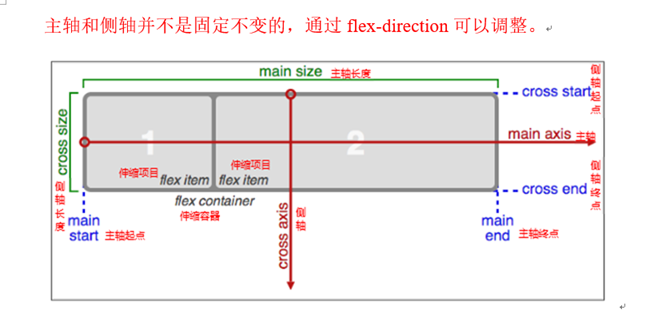
采用Flex布局的元素,被称为Flex容器(flex container),简称"容器"。其所有子元素自动成为容器成员,成为Flex项目(Flex item),简称"项目"
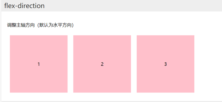
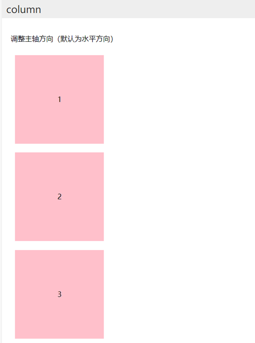
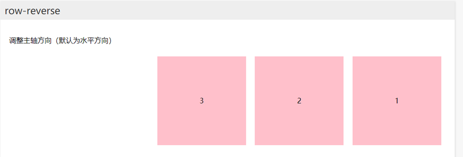
Flex-direction调整主轴方向(默认为水平方向)包括row、column、row-reverse、column-reverse
代码
<!DOCTYPE html>
<html lang="en">
<head>
<meta charset="UTF-8">
<title>CSS3伸缩布局</title>
<style>
body {
margin: 0;
padding: 0;
font-family: '微软雅黑';
background-color: #F7F7F7;
}
ul {
margin: 0;
padding: 0;
list-style: none;
}
.wrapper {
1024px;
margin: 0 auto;
}
.wrapper > section {
min-height: 300px;
margin-bottom: 30px;
box-shadow: 1px 1px 4px #DDD;
background-color: #FFF;
}
.wrapper > header {
text-align: center;
line-height: 1;
padding: 20px;
margin-bottom: 10px;
font-size: 30px;
}
.wrapper section > header {
line-height: 1;
padding: 10px;
font-size: 22px;
color: #333;
background-color: #EEE;
}
.wrapper .wrap-box {
padding: 20px;
}
.wrapper .brief {
min-height: auto;
}
.wrapper .flex-img {
100%;
}
/*全局设置*/
section ul {
display: flex;
}
section li {
200px;
height: 200px;
text-align: center;
line-height: 200px;
margin: 10px;
background-color: pink;
}
/*垂直方向*/
section:nth-child(2) ul {
display: flex;
}
.column ul {
flex-direction: column;
}
.row-reverse ul {
flex-direction: row-reverse;
}
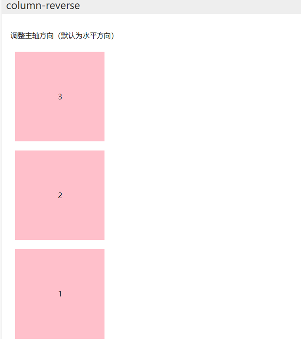
.column-reverse ul {
flex-direction: column-reverse;
}
/*1、指定一个盒子为伸缩盒子 display: flex*/
/*2、设置属性来调整此盒的子元素的布局方式 例如 flex-direction*/
/*3、明确方向*/
/*4、它可互换主侧轴,也可改变方向*/
</style>
</head>
<body>
<div class="wrapper">
<header>CSS3-伸缩布局详解</header>
<!-- 简介 -->
<section class="brief">
<header>flex-direction</header>
<div class="wrap-box">
<p>调整主轴方向(默认为水平方向)包括row、column、row-reverse、column-reverse</p>
</div>
</section>
<!-- 分隔线 -->
<section>
<header>flex-direction</header>
<div class="wrap-box">
<p>调整主轴方向(默认为水平方向)</p>
<ul>
<li>1</li>
<li>2</li>
<li>3</li>
</ul>
</div>
</section>
<section class="column">
<header>column</header>
<div class="wrap-box">
<p>调整主轴方向(默认为水平方向)</p>
<ul>
<li>1</li>
<li>2</li>
<li>3</li>
</ul>
</div>
</section>
<section class="row-reverse">
<header>row-reverse</header>
<div class="wrap-box">
<p>调整主轴方向(默认为水平方向)</p>
<ul>
<li>1</li>
<li>2</li>
<li>3</li>
</ul>
</div>
</section>
<section class="column-reverse">
<header>column-reverse</header>
<div class="wrap-box">
<p>调整主轴方向(默认为水平方向)</p>
<ul>
<li>1</li>
<li>2</li>
<li>3</li>
</ul>
</div>
</section>
</div>
</body>
</html>