固定宽度布局
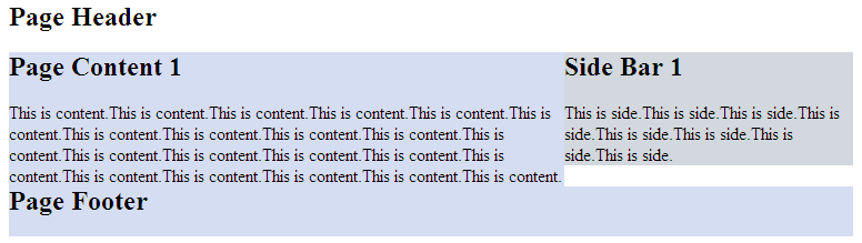
1-2-1布局(浮动)
<html xmlns="http://www.w3.org/1999/xhtml">
<head>
<title>固定宽度-float</title>
<style type="text/css">

#header,#footer,#container{
    width: 760px;
    margin: 0 auto;
}
#content {
    float: left;
    width: 500px;
    background: #d5ddf3;
}
#side {
    float: left;
    width: 260px;
    background: #d2d8de;
}
#footer {
    clear: both;
    background: #d5ddf3;
}
</style>
</head>
<body>

    <h2>Page Header</h2>
</div>
<div id="container">
    <div id="content">
        <h2>Page Content 1</h2>
        <p>This is content.This is content.This is content.This is content.This is content.This is content.This is content.This is content.This is content.This is content.This is content.This is content.This is content.This is content.This is content.This is content.This is content.This is content.This is content.This is content.This is content.</p>
    </div>
    <div id="side">
        <h2>Side Bar 1</h2>
        <p>This is side.This is side.This is side.This is side.This is side.This is side.This is side.This is side.</p>
    </div>
</div>
<div id="footer">
        <h2>Page Footer</h2>
</div>

</body>
</html>
效果图:

正中间的两个div都浮动起来,且包含块的宽度是固定值。Footer清除浮动防止浮动块覆盖。
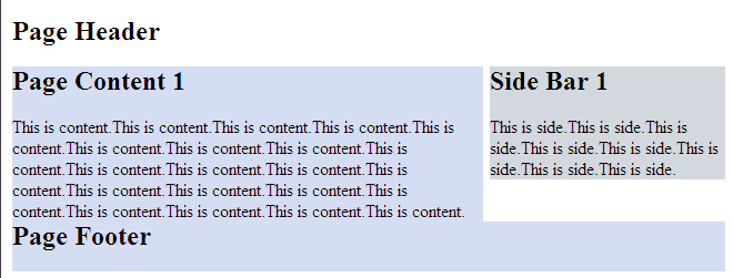
1-2-1布局(绝对定位)
<html xmlns="http://www.w3.org/1999/xhtml">
<head>
<title>固定宽度-absolute</title>
<style type="text/css">

#header,#footer,#container{
    width: 760px;
    margin: 0 auto;
}
#container{
    position:relative;
}
#content {
    width: 500px;
    margin-right:260px;
    background: #d5ddf3;
}
#side {
    position:absolute;
    top:0;
    right:0;
    width: 260px;
    background: #d2d8de;
}
#footer {
    background: #d5ddf3;
}
</style>
</head>
<body>

    <h2>Page Header</h2>
</div>
<div id="container">
    <div id="content">
        <h2>Page Content 1</h2>
        <p>This is content.This is content.This is content.This is content.This is content.This is content.This is content.This is content.This is content.This is content.This is content.This is content.This is content.This is content.This is content.This is content.This is content.This is content.This is content.This is content.This is content.</p>
    </div>
    <div id="side">
        <h2>Side Bar 1</h2>
        <p>This is side.This is side.This is side.This is side.This is side.This is side.This is side.This is side.</p>
    </div>
</div>
<div id="footer">
        <h2>Page Footer</h2>
</div>

</body>
</html>
效果图:
但是有一点要注意,由于用绝对定位的块脱离的文档流,当绝对定位块高度小于旁边块高度的时候,会与其他块重叠。
流式布局
<html xmlns="http://www.w3.org/1999/xhtml">
<head>
<title>float</title>
<style type="text/css">

#header,#footer,#container{
    width: 85%;
    margin:0 auto;
}
#content {
    float:left;
    width: 66%;
    background: #d5ddf3;
}
#side {
    float:right;
    width: 33%;
    background: #d2d8de;
}
#footer {
    cleat:both;
    background: #d5ddf3;
}
</style>
</head>
<body>

<div id="header">
    <h2>Page Header</h2>
</div>
<div id="container">
    <div id="content">
        <h2>Page Content 1</h2>
        <p>This is content.This is content.This is content.This is content.This is content.This is content.This is content.This is content.This is content.This is content.This is content.This is content.This is content.This is content.This is content.This is content.This is content.This is content.This is content.This is content.This is content.</p>
    </div>
    <div id="side">
        <h2>Side Bar 1</h2>
        <p>This is side.This is side.This is side.This is side.This is side.This is side.This is side.This is side.</p>
    </div>
</div>
<div id="footer">
        <h2>Page Footer</h2>
</div>

</body>
</html>
效果图:
注意:确保不要使得某列的宽度太大。
另外,百分比布局经常会结合min-width和max-width使用。