 <script type="text/javascript" src="js/jquery-1.7.2.js"></script>
    <script type="text/javascript" src="js/highcharts/highcharts.js"></script>
<!DOCTYPE HTML PUBLIC "-//W3C//DTD HTML 4.01 Transitional//EN">
<html>
<head>
<title>highcharts.html</title>
<meta http-equiv="content-type" content="text/html; charset=UTF-8">
<script type="text/javascript" src="js/jquery-1.7.2.js"></script>
<script type="text/javascript" src="js/highcharts/highcharts.js"></script>
<script type="text/javascript">
$(function(){
$("#container").highcharts({
title:{ //图表标题
text:'标题', //图表的标题名,如果不想显示标题,可以设置为null
x:30 //相对于垂直对齐的偏移量,取值范围:图表的上边距到图表的下边距,可以是负值,单位是px
},
subtitle:{ //图表的副标题
text:'副标题',//副标题的内容
x:10 //相对于垂直的偏移量
},
xAxis:{
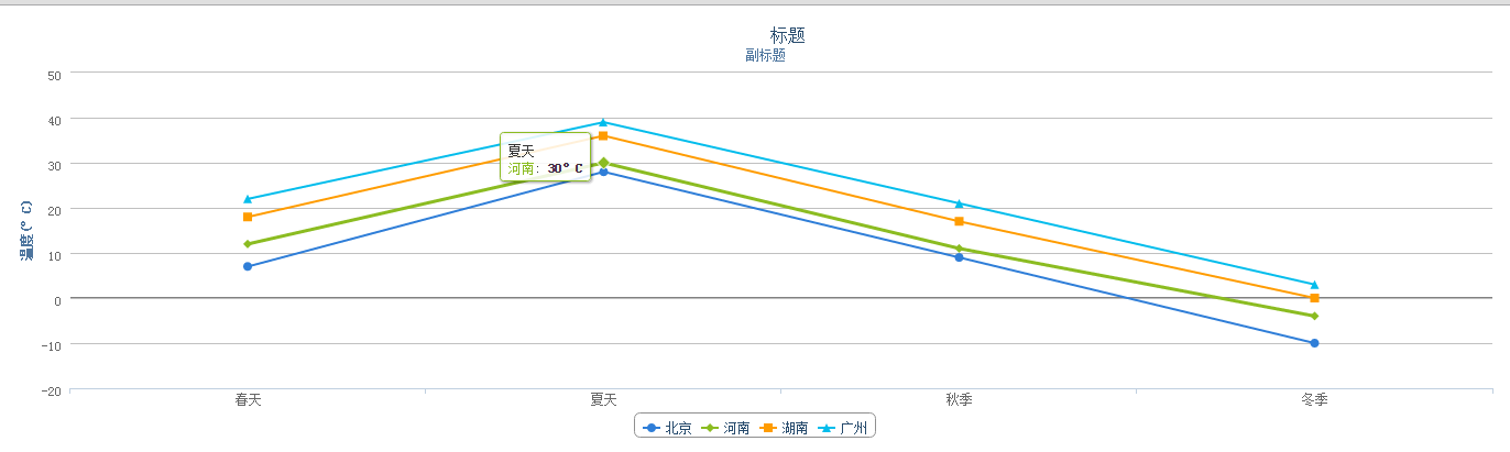
categories:['春天','夏天','秋季','冬季']//对应点的x所要显示的数据,在这里以数组的形式存储
},
yAxis:{
title:{
text:'温度(°C)' //设置y轴显示的文字
},
plotLines:[{
value:0, //设置一个基准线
2, //设置基准线的宽度
color:'#808080' //区域划分线的颜色
}]
},
tooltip:{ //数据提示框。当鼠标悬停在某点上时,以框的形式提示该点的数据
valueSuffix:'°C' //当鼠标悬浮到每个点的时候会跟有显示框内显示的文字后面的一个单位
},
legend:{
layout:'horizontal', //数据项的布局。布局类型:水平或垂直。默认是:水平(horizontal)
align:'center', //图例容器(中的图例)水平对齐在图表区,合法值有"left", "center" 和 "right". 默认是: center
verticalAlign:'bottom', //垂直对齐。能取"top", "middle" or "bottom"之一。
borderWhidth:10
},
series:[//设置折线图表所需要的数据
{
name:'北京',
data:[7,28,9,-10]
},
{
name:'河南',
data:[12,30,11,-4]
},
{
name:'湖南',
data:[18,36,17,0]
},
{
name:'广州',
data:[22,39,21,3]
}
]
});
//柱形图表
$("#container1").highcharts({
chart:{
type:'column' //指定绘制区所要绘制的图的类型,例如:type=bar为柱图,type=line为线图
},
title:{
text:'标题'
},
subtitle:{
text:'副标题'
},
xAxis:{
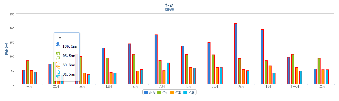
categories:['一月','二月','三月','四月','五月','六月','七月','八月','九月','十月','十一月','十二月']
},
yAxis:{
min:0,
title:{
text:'降雨(mm)'
}
},
tooltip:{ //提示框
headerFormat:'<span style="font-size:10px">{point.key}</span><table>', //point.key获取到对应的x轴上的值,也就是1-12月
pointFormat:'<tr><td style="color:{series.color};padding:0">{series.name}:</td>'+//series.name获取到series对应数据中的所有的name
'<td style="padding:0"><b>{point.y:.1f}mm</b></td></tr>',//获取到每个name所对应的data值
footerFormat:'</table>',
shared:true, //当提示框被共享时,整个绘图区都将捕捉鼠标指针的移动
useHTML:true //使用HTML代码渲染提示框的内容用以代替SVG(可伸缩向量图形Scalable Vector Graphics)
},
plotOptions:{
column:{
pointPadding:0.2, //每个圆柱之间的宽度
borderWidth:2, //每个圆柱的边框的宽度
borderColor:'red' //边框的颜色
}
},
series:[
{
name:'北京',
data:[49.9, 71.5, 106.4, 129.2, 144.0, 176.0, 135.6, 148.5, 216.4, 194.1, 95.6, 54.4]
},
{
name:'纽约',
data:[83.6, 78.8, 98.5, 93.4, 106.0, 84.5, 105.0, 104.3, 91.2, 83.5, 106.6, 92.3]
},
{
name:'伦敦',
data:[48.9, 38.8, 39.3, 41.4, 47.0, 48.3, 59.0, 59.6, 52.4, 65.2, 59.3, 51.2]
},
{
name:'柏林',
data:[42.4, 33.2, 34.5, 39.7, 52.6, 75.5, 57.4, 60.4, 47.6, 39.1, 46.8, 51.1]
}
]
});
//饼状图表
$("#container2").highcharts({
chart:{
poltBackgroundColor:null, //绘制图形区域的背景
poltBorderWidth:null, //绘制区域的边框的宽度,默是0
poltShadow:false //区域投影
},
title:{
text:'标题'
},
tooltip:{
pointFormat:'{series.name}:<b>{point.percentage:.1f}%</b>'
},
plotOptions:{
pie:{
allowPointSelect:true, //设置能否被选中true是可以被选中的
cursor:'pointer', //设置光标的图形,为手形
daraLabels:{
enabled:true,
color:'#000000',
connectorColor:'#000000',
format:'<b>{ponit.name}</b>:{point.percentage:.1f} %'
}
}
},
series:[//所需数据
{
type:'pie', //饼状图
name:'占用份额',
data:[
['Firefox', 45.0],
['IE', 26.8],
{
name:'Chrome',
y:12.8,
sliced:true, //区域分离
selected:true //设置选中状态
},
['Safari(苹果)', 8.5],
['Opera(欧朋)', 6.2],
['Others', 0.7]
]
}
]
});
})
</script>
</head>
<body>
<div id="container"></div>
<div id="container1"></div>
<div id="container2"></div>
</body>
</html>
所产生的效果
折线图
柱形统计图
饼状图
