R语言简介:
R语言是一门专用于统计分析的语言,有大量的内置函数和第三方库来制作基于数据的表格
准备工作
安装R语言
https://cran.rstudio.com/bin/windows/base/R-3.4.3-win.exe
安装Rstudio
https://download1.rstudio.org/RStudio-1.1.383.exe
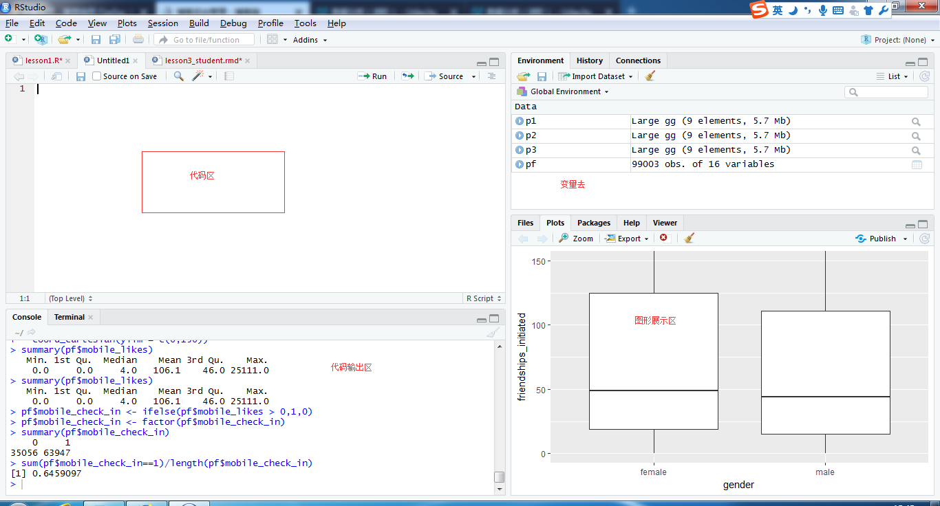
打开Rstudio可以看到如下界面
目录类命令:
1.getwd() #查看当前目录

2.setwd('') #设置当前文件保存的目录
加载excel文件:
#<-表示赋值运算,

#使用read.csv()读取本地的csv文件,加载到当前的变量中

statinfo <- read.csv('stateData.csv')
获取子集:
#使用subset()函数,根据数据的不同的条件,划分子集

stateSubset <- subset(statinfo,state.region==1)

highschool <- subset(statinfo,highSchoolGrad > 50)

stateSubsetBracket <- statinfo[statinfo$state.region==1,]
统计分析与分组:
#使用table()函数按照条件对数据集进行分组统计,类似group by
#使用levels()函数将数据进行分段
reddit <- read.csv('reddit.csv')

table(reddit$employment.status)

levels(reddit$age.range)
画图:
1.首先安装并引入ggplot2
#安装并导入ggplot2
install('ggplot2')
library(ggplot2)
2.开始作图
#调用qplot方法作图,最少要指定x值和data数据集

qplot(data=reddit,x = age.range)

qplot(data=reddit,x = income.range)
3.将图形按照年龄或收入进行排序展示
#对年龄进行排序
reddit$age.range <- ordered(reddit$age.range,
                            levels=c('Under 18','18-24',
                                    '25-34','35-44','45-54','55-64','65 of Above'))
#画出年龄的分布直方图
qplot(data=reddit,x = age.range)

#查看薪水分布
levels(reddit$income.range)

#对薪水进行排序
reddit$income.range <- factor(reddit$income.range,
                              levels = c('Under $20,000','$20,000 - $29,999','$30,000 - $39,999',
                                         '$40,000 - $49,999','$50,000 - $69,999','$70,000 - $99,999',
                                         '$100,000 - $149,999','$150,000 or more'),ordered = TRUE)
#画出薪水的分布直方图
qplot(data=reddit,x = income.range)
二.单一变量分析
目的:根据提供的facebook的数据,对数据表中的变量进行分析,分析哪些值是异常值,如何修正异常值,如何做出箱线图,直方图等知识点
1.做出用户生日的直方图
#1.导入csv源文件
#2.导入作图包,ggplot
#3.根据日期进行作图
pf <- read.csv('pseudo_facebook.tsv',sep = '	')
library(ggplot2)
qplot(x=dob_day,data = pf)
2.根据月份统计每天出生的人数
此处要用到分面的知识点,分面是一种将查询的数据集进行在深化的一种途径,使用+号来完成
#1.载入数据集,并确定要展示的属性
#2.scale_x_continuous指的标度x轴连续
#breaks指如何去分割的字段
#3.facet_wrap指的是以dob_month进行分割,ncol指的是按照3列进行显示
qplot(x=dob_day,data = pf) +
scale_x_continuous(breaks = 1:31) +
facet_wrap(~dob_month,ncol = 3)
从图中我们可以看到1月1号出生的人数最多,有接近8000人,可以分析出这些数据有一部分是异常数据,用户在填写用户资料的时候没有正确的选择出身日期或不想要公开自己出身日期
3.好友数量
知识点:限制轴,组距,去除空值,根据性别进行分组
#1.调用is.na()来排除空值,binwidth表示组距是10
#2.limits表示只分析x轴上的0,1000的点
#3.breaks(起始,结束,步长)
#4.facet_wrap()根据字段分组 ~+字段
qplot(x=friend_count,data=subset(pf,!is.na(gender)),binwidth=10)+
  scale_x_continuous(limits = c(0,1000),
                     breaks = seq(0,1000,50))+
  facet_wrap(~gender)
4.获取详细的数据(按照性别显示统计值)
#使用by()函数,分组的值,分组字段,总计输出
by(pf$friend_count,pf$gender,summary)
5.做出按年展示用户使用facebook天数的用户的图形
知识点:颜色,坐标轴描述
#1.xlab,ylab表示坐标轴的说明
#2.color是边框色,fill是填充色
qplot(x=tenure/365,data = pf,binwidth=.25,
      xlab = 'Number of years using Facebook',
      ylab = 'Number of user in simple',
      color=I('black'),fill=I('#F79420'))+
  scale_x_continuous(breaks = seq(1,7,1),limits = c(0,7))
6.做出facebook用户年龄的图形
提示:可以使用summary(pf$age)来找出边界值
qplot(x=age,data=pf,binwidth=1,
      color=I('black'),fill=I('#5760AB'))+
  scale_x_continuous(breaks = seq(1,113,5))
7.将图形调整为正态分布
#1.导入gridExtra包
#2.先做出原始的图形
#3.对x轴取log10的对数
#4.对x轴取平方根
#5.将3个图形放在一起进行展示
library('gridExtra')
p1 <- ggplot(aes(x=friend_count),data=pf) + geom_histogram()
p2 <- p1 + scale_x_log10()
p3 <- p1 + scale_x_sqrt()
grid.arrange(p1,p2,p3,ncol=1)
8.做出男性,女性平均好友数量的图形
知识点:频率多边形
#1.将y轴表示成展示比例数据
ggplot(aes(x=friend_count,y=..count../sum(..count..)),
       data=subset(pf,!is.na(gender)))+
  geom_freqpoly(aes(color=gender),binwidth=10)+
  scale_x_continuous(limits = c(0,1000),breaks = seq(0,1000,50))+
  xlab('count of friends')+
  ylab('Percentage of users with that friend count')
9.做出男性,女性平均的点赞数的图形
#geom = 'freqpoly'表示做的是频率多边形
qplot(x=www_likes,data=subset(pf,!is.na(gender)),
      geom = 'freqpoly',color=gender)+
  scale_x_log10()
10做出男性,女性的数量的箱线图
知识点:箱线图
#1.geom = 'boxplot'表示图形是箱线图
#2. coord_cartesian(ylim=c(0,250))表示限定y轴的度量
qplot(x=gender,y=friend_count,
      data=subset(pf,!is.na(gender)),
      geom = 'boxplot')+
  coord_cartesian(ylim=c(0,250))
11.做出男性,女性谁获得的处事好友的图
qplot(x=gender,y=friendships_initiated,
      data=subset(pf,!is.na(gender)),
      geom = 'boxplot')+
  coord_cartesian(ylim = c(0,150))
12.查看手机端和pc端登录facebook的比例图
知识点:逻辑运算,逻辑值
#1.查看mobile端的统计数
#2.使用ifelse语句将mobile_likes大于1的数存到新的mobile_check_in变量中,逻辑运算
#3.将其变为因素变量
#4.计算手机端的使用率
summary(pf$mobile_likes)
pf$mobile_check_in <- ifelse(pf$mobile_likes > 0,1,0)
pf$mobile_check_in <- factor(pf$mobile_check_in)
summary(pf$mobile_check_in)
sum(pf$mobile_check_in==1)/length(pf$mobile_check_in)