目的:
通过探索文件pseudo_facebook.tsv数据来学会两个变量的分析流程
知识点:
1.ggplot语法
2.如何做散点图
3.如何优化散点图
4.条件均值
5.变量的相关性
6.子集散点图
7.平滑化
简介:
如果在探索单一变量时,使用直方图来表示该值和整体的关系,那么在探索两个变量的时候,使用散点图会更适合来探索两个变量之间的关系
案例分析:
1.根据年龄和好友数作出散点图
#导入ggplot2绘图包
library(ggplot2)
setwd('D:/Udacity/数据分析进阶/R')
#加载数据文件
pf <- read.csv('pseudo_facebook.tsv',sep='	')
#使用qplot语法作出散点图
qplot(x=age,y=friend_count,data=pf)
#使用ggplot语法作出散点图,此处使用ggplot作图语法上更清晰
ggplot(aes(x=age,y=friend_count),data=pf)+ geom_point()
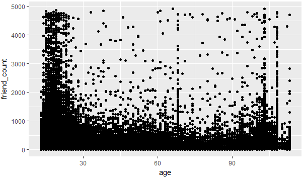
图 2-1
2.过渡绘制,因为图2-1有大部分的点都重叠,不太好区分哪个年龄和好友数的关系,所以使用alpha和geom_jitter来进行调整
#geom_jitter消除重合的点
#alpha=1/20表示20个值算1个点
#xlim(13,90)表示x轴的取值从13,90
ggplot(aes(x=age,y=friend_count),data=pf)+
  geom_jitter(alpha=1/20)+
  xlim(13,90)

图 2-2
3.coord_trans函数的用法,可以给坐标轴上应用函数,使其的可视化效果更好
#给y轴的好友数开根号,使其可视化效果更好
ggplot(aes(x=age,y=friend_count),data=pf)+
  geom_point(alpha=1/20)+
  xlim(13,90)+
  coord_trans(y="sqrt")

图2-3
4.条件均值,根据字段进行分组然后分组进行统计出新的DataFrame
#1.导入dplyr包
#2.使用group_by对年龄字段进行分组
#3.使用summarise统计出平均值和中位数
#4.再使用arrange进行排序
library('dplyr')
pf.fc_by_age <- pf %>%
  group_by(age) %>%
  summarise(friend_count_mean=mean(friend_count),
            friend_count_media = median(friend_count),
            n=n()) %>%
  arrange(age)
5.将该数据和原始数据进行迭加,根据图形,我们可以得出一个趋势,从13岁-26岁好友数在增加,从26开始慢慢的好友数开始下降
#1.通过限制x,y的值,做出年龄和好友数的散点图
#2.做出中位值的渐近线
#3.做出0.9的渐近线
#4.做出0.5的渐近线
#5.做出0.1的渐近线
ggplot(aes(x=age,y=friend_count),data=pf)+
  geom_point(alpha=1/10,
             position = position_jitter(h=0),
             color='orange')+
  coord_cartesian(xlim = c(13,90),ylim = c(0,1000))+
  geom_line(stat = 'summary',fun.y=mean)+
  geom_line(stat = 'summary',fun.y=quantile,fun.args=list(probs=.9),
            linetype=2,color='blue')+
  geom_line(stat='summary',fun.y=quantile,fun.args=list(probs=.5),
            color='green')+
  geom_line(stat = 'summary',fun.y=quantile,fun.args=list(probs=.1),
            color='blue',linetype=2)

图2-4
6.计算相关性
#使用cor.test函数来进行计算,在实际中可以对数据集进行划分
#pearson表示两个变量之间的关联强度的参数,越接近1关联性越强
with(pf,cor.test(age,friend_count,method = 'pearson'))
with(subset(pf,age<=70),cor.test(age,friend_count,method = 'pearson')
7.强相关参数,通过做出www_likes_received和likes_received的散点图来判断两个变量的关联程度,从图中看出两个值的关联性很大
#使用quantile来过限定一些极端值
#通过xlim和ylim实现过滤
#同时增加一条渐近线来查看整体的值
ggplot(aes(x=www_likes_received,y=likes_received),data=pf)+
  geom_point()+
  xlim(0,quantile(pf$www_likes_received,0.95))+
  ylim(0,quantile(pf$likes_received,0.95))+
  geom_smooth(method = 'lm',color='red')
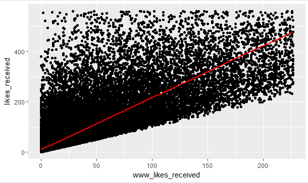
图2-5
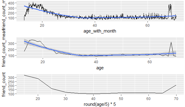
8.通过计算月平均年龄,平均年龄和年龄分布来做出三个有关年龄和好友数关系的折线图
从该图中我们可以发现p1的细节最多,p2展现的是每个年龄段不同的好友数量,p3展示的是年龄和好友数的大体趋势
#
library(gridExtra)
pf$age_with_month <- pf$age + (12-pf$dob_month)/12
pf.fc_by_age_months <- pf %>%
  group_by(age_with_months) %>%
  summarise(friend_count_mean = mean(friend_count),
            friend_count_median = median(friend_count),
            n=n()) %>%
  arrange(age_with_months)
p1 <- ggplot(aes(x=age_with_month,y=friend_count_mean),
       data=subset(pf.fc_by_age_months,age_with_month<71))+
  geom_line()+
  geom_smooth()
p2 <- ggplot(aes(x=age,y=friend_count_mean),
             data=subset(pf.fc_by_age,age<71))+
  geom_line()+
  geom_smooth()
p3 <- ggplot(aes(x=round(age/5)*5,y=friend_count),
             data=subset(pf,age<71))+
  geom_line(stat = 'summary',fun.y=mean)


grid.arrange(p1,p2,p3,ncol=1)
习题:钻石数据集分析
1.价格与x的关系
ggplot(aes(x=x,y=price),data=diamonds)+
  geom_point()

2.价格和x的相关性
with(diamonds,cor.test(price,x,method = 'pearson'))
with(diamonds,cor.test(price,y,method = 'pearson'))
with(diamonds,cor.test(price,z,method = 'pearson'))
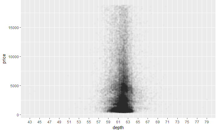
3.价格和深度的关系
ggplot(aes(x=depth,y=price),data=diamonds)+
  geom_point()

4.价格和深度图像的调整
ggplot(aes(x=depth,y=price),data=diamonds)+
  geom_point(alpha=1/100)+
  scale_x_continuous(breaks = seq(43,79,2))
5.价格和深度的相关性
with(diamonds,cor.test(price,depth,method = 'pearson'))
6.价格和克拉
ggplot(aes(x=carat,y=price),data=diamonds)+
  geom_point()+
  scale_x_continuous(limits = c(0,quantile(diamonds$carat,0.99)))

7.价格和体积
volume <- diamonds$x * diamonds$y * diamonds$z
ggplot(aes(x=volume,y=price),data=diamonds)+
  geom_point()

8.子集相关特性
diamonds$volume <- with(diamonds,x*y*z)
sub_data <- subset(diamonds,volume < 800 & volume >0)
cor.test(sub_data$volume,sub_data$price)
9.调整,价格与体积
ggplot(aes(x=price,y=volume),data=diamonds)+
  geom_point()+
  geom_smooth()

10.平均价格,净度
library(dplyr)
diamondsByClarity <- diamonds %>%
  group_by(clarity) %>%
  summarise(mean_price = mean(as.numeric(price)),
            median_price = median(as.numeric(price)),
            min_price = min(as.numeric(price)),
            max_price = max(as.numeric(price)),
            n= n()) %>%
  arrange(clarity)
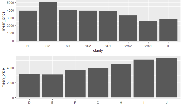
11.平均价格柱状图(探索每种净度和颜色的价格柱状图)
library(dplyr)
library(gridExtra)
diamonds_by_clarity <- group_by(diamonds, clarity)
diamonds_mp_by_clarity <- summarise(diamonds_by_clarity, mean_price = mean(price))

diamonds_by_color <- group_by(diamonds, color)
diamonds_mp_by_color <- summarise(diamonds_by_color, mean_price = mean(price))


p1 <- ggplot(aes(x=clarity,y=mean_price),data=diamonds_mp_by_clarity)+
  geom_bar(stat = "identity")


p2 <- ggplot(aes(x=color,y=mean_price),
             data=diamonds_mp_by_color)+
  geom_bar(stat = "identity")


grid.arrange(p1,p2,ncol=1)