Introduction
A few years ago, mobile web sites were more of an after-thought for many developers unless you were involved in developing apps specifically targeted for mobile devices. I was surprised to read on wiki that it was only March 2010 when Apple began taking pre-orders for the iPad. What a different landscape we have seen since. Desktops, Tablet and Mobile support are now a major design goal for any site that needs a broad reach and this is only set to increase.
This article will demonstrate how MVC4, almost out of the box allows us to deliver views that cater for specific mobile devices and keep the code base shared as much as possible, creating mobile friendly web applications.
Sample Application
The sample web application for this article uses MVC 4, Microsoft’s latest web development platform and Visual Studio 2012.
This article will walk through some fairly simple steps to mobile enable the ‘Internet Application’ template. By running the application, you will be able to send requests for the home page which targets a Desktop, iPad and iPhone either by using different devices to view the application or by sending a different User Agent string as explained in the article. The code supports Desktop, iPad and iPhone as examples of how to support mobile devices.
Background
There are a number of popular approaches for designing mobile sites including Dedicated sites and Responsive Design and in MVC4 the 'Mobile Website' template.
Dedicated sites for mobile and separate sites for desktops. One of the problems with this model is the maintenance of two (if not three) different sites.
Responsive Design where the site gets designed with stylesheets that adapt to screen size and available screen real-estate. When deciding on a responsive design model, the choice needs to be made as to whether to start with a mobile site and then perform progressive enhancement or whether to start with the desktop design and do graceful degradation, each of which has its own design challenges. Added to this is the need to cater for mobile devices with typically lower bandwidth and less visible content, where this can often lead to downloading less optimal pages over capped download limits.
MVC4 Mobile Website Template: When I first installed the preview release of MVC4, I was drawn to the new ‘mobile’ template. I was quite impressed as JQuery and JQuery mobile where baked in and it performed pretty well. It soon became apparent though that this was specifically a mobile orientated site and not suitable for the desktop.
Considering Layout
When designing for the mobile platform, some obvious differences exist with available real-estate. This commonly leads to single column layouts for mobiles, multi column layouts for desktops and something in the middle for tablets. As you start designing a mobile friendly site, it soon becomes apparent that to we are dealing with Small, Medium and Large layouts.
Creating the Web application
Choosing the “Internet Application” template gives us a site that is primarily optimised for the desktop. We will start by creating our mobile friendly site here as shown below.

After building and running this boiler plate site, results for a desktop and mobile can be seen below.

After re-sizing the browser window, the page re-flowed based on a responsive container.
The reason why this works is because of the following code snippet found in the layout file _Layout.cshtml.
 Collapse | Copy Code
<meta name="viewport" content="width=device-width" />
The webkit based browsers found in the majority of mobile phones will automatically attempt to reflow the page if this tag is present. Not too much work for a fairly impressive result. Still some way to go though for a truly mobile experience.
Detecting Mobile Devices
Time to enable our site to detect requests made to our site from different mobile devices. We are going to do this by examining the User Agent string and make decisions based on this understanding.
We will add a new method to our Global.asax.cs file that gets called in the method Application_Start() and name it EvaluateDisplayMode.
Collapse | Copy Code protected void Application_Start()
{
AreaRegistration.RegisterAllAreas();
WebApiConfig.Register(GlobalConfiguration.Configuration);
FilterConfig.RegisterGlobalFilters(GlobalFilters.Filters);
RouteConfig.RegisterRoutes(RouteTable.Routes);
BundleConfig.RegisterBundles(BundleTable.Bundles);
AuthConfig.RegisterAuth();
EvaluateDisplayMode(); }
The EvaluateDisplayMode() method itself.
Collapse | Copy Code private static void EvaluateDisplayMode()
{
DisplayModeProvider.Instance.Modes.Insert(0,
new DefaultDisplayMode("Phone")
{ ContextCondition = (ctx => (
(ctx.GetOverriddenUserAgent() != null) &&
( (ctx.GetOverriddenUserAgent().IndexOf("iPhone", StringComparison.OrdinalIgnoreCase) >= 0) ||
(ctx.GetOverriddenUserAgent().IndexOf("iPod", StringComparison.OrdinalIgnoreCase) >= 0)
)
))
});
DisplayModeProvider.Instance.Modes.Insert(0,
new DefaultDisplayMode("Tablet")
{
ContextCondition = (ctx => (
(ctx.GetOverriddenUserAgent() != null) &&
(
(ctx.GetOverriddenUserAgent().IndexOf("iPad", StringComparison.OrdinalIgnoreCase) >= 0) ||
(ctx.GetOverriddenUserAgent().IndexOf("Playbook", StringComparison.OrdinalIgnoreCase) >= 0)
)
))
});
}
The code evaluates the User Agent string and if it finds a match for an ‘iPad’ or ‘Playbook’ it adds an entry into the DisplayModes table for a ‘Tablet’. It also performs checks for an iPhone or iPod and sets the ‘Phone’ DisplayMode, respectively. In the case of a desktop, currently this is the default so no need to add anything else at the moment. You can see how easy it would be to add additional devices and the code could be refactored further.
Note* There are obviously other frameworks geared specifically to identifying requests to ascertain the client device but this method works with all the common device types I have come across for mass market coverage. What you do have here is a point in the pipeline to perform the necessary checks.
Delivering Device Specific Views
As a result of the Display Modes table having been updated from the detection above, the MVC engine will then modify the view it was going to serve, to match the mobile device request if available.
The table below shows examples of views that will be served if available based on the User Agent.
| Device |
Client Request |
View |
| PC |
/YourMVCApp/Home
(controller) |
Index.cshtml |
| iPad |
/YourMVCApp/Home (controller) |
Index.Tablet.cshtml |
| iPhone |
/YourMVCApp/Home (controller) |
Index.Phone.cshtml |
Well that’s a leap forward , we can now easily create a unique view based on different devices!
The Visual Studio 2012 Solution explorer screen shot below shows the views we created to support the new devices.

Testing what we have so far...
Although there is no substitute for testing on a hardware mobile device, during initial development, Safari makes it easy to send a request to the server with a specific user agent. You can also add your own User Agent strings for devices not available out of the box with Safari using Safari to send a specific User Agent.
You can set a new User agent string via Menu->Develop->User Agent. The Safari screen shot below shows the User Agent string being set for a request.

Note**
If you cannot see the ‘Develop’ menu, enable it via Settings -> Preferences -> Advanced and tick ‘Show Develop menu in menu bar’
It’s quite re-assuring to see this working and already at this point we have some reasonable control over the views we can render/return back to the client.
Enhancing our Mobile View
Although we have made good progress, our mobile views still leave a lot to be desired. We could just amend our mobile view at this point and in some circumstances that would be appropriate. We will take it one step further and create Layout pages for each of our device types as can be seen below.

Now we have the Layout pages in place, we need to update our views to use them.
Collapse | Copy Code @{
ViewBag.Title = "Tablet";
Layout = "../Shared/_Layout.Tablet.cshtml";
}
You can see we are also setting the title so that we can easily identify the current view in the title bar of the browser.
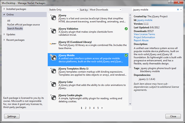
Adding Mobile scripts
Microsoft have fully embraced jQuery and jQuery Mobile now which is great. Because we started with the ‘Internet Application’ template, jQuery Mobile is not included so we will go ahead and include it via the ‘Package Manager’. Right click the solution and select ‘Package Manager’ (this can also be done via the cmd line if you prefer).
The screenshot below shows the package manager after we entered and selected JQuery Mobile.
Once this is added, we will see scripts and stylesheets added to ‘Scripts’ and ‘Content’ respectively as shown below in Solution Explorer.

Enabling Mobile scripts
Although we now have the mobile scripts available, we still need to reference them in our mobile views. The release of MVC4 Bundles appears to work well now for scripts and stylesheets. We will add our new mobile scripts and stylesheets to the bundling tables with the following entries inside the ‘RegisterBundles’ method located in ‘BundleConfig.cs’ in the ‘App_Start’ Solution folder.
Collapse | Copy Code bundles.Add(new StyleBundle("~/Content/mobilecss").Include("~/Content/jquery.mobile*"));
bundles.Add(new ScriptBundle("~/bundles/jquerymobile").Include("~/Scripts/jquery.mobile*"));
Now the scripts and stylesheets have been added to the bundling tables, we can utilise them inside our views by adding a render call in the _Layout.Mobile.cshtml head section as show below.
Collapse | Copy Code <head>
@Styles.Render("~/Content/mobileCss", "~/Content/css")
@Scripts.Render("~/bundles/modernizr")
</head>
Styling the mobile views with jQuery mobile
Although styling the mobile view with JQuery Mobile is beyond the scope of this article, I went ahead and added a little just to get our views looking differently.
Folowing convention (a touch of refactoring)
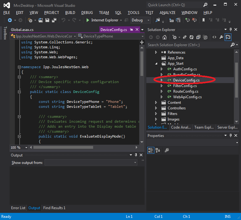
As we have added code to our Global.asax 'Application_Start()', it makes sense to extract our current 'EvaluateDisplayMode()' into it's own Device configuration, so that as it grows, it doesn't bloat the view of startup and makes it more maintainable. The other configuration classes reside in the 'App_Start' solution folder and we will use the same convention and create a static 'DeviceConfig' class as shown below.
This enables us to reduces our device evaluation to one line in 'Application_Start()' as shown below.
Collapse | Copy Code DeviceConfig.EvaluateDisplayMode();
This now fits in with the convention of the other configuration classes. (Maybe we will see something like this in the next release of MVC)
The new DeviceConfig class can be seen below.
Collapse | Copy Code using System;
using System.Collections.Generic;
using System.Linq;
using System.Web;
using System.Web.WebPages;
namespace MvcDesktop
{
public static class DeviceConfig
{
const string DeviceTypePhone = "Phone";
const string DeviceTypeTablet = "Tablet";
public static void EvaluateDisplayMode()
{
}
}
}
Limitations
- We did not add any web application tags or media queries to enhance our decisions when rendering views.
- We would in practice leverage more partial and shared views to ensure the content could be managed centrally in a real world project.
- The sample project only affects the Home page for the three devices.
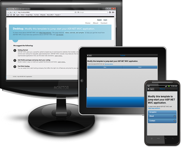
Final Results
Our home page when requested by a Mobile, Tablet or Desktop can be seen below.
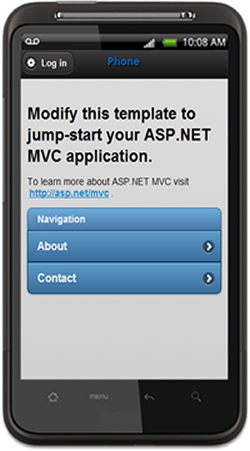
Mobile View
Tablet View

Desktop View

Conclusion
The separation of views for different device scenarios is certainly a model which sits comfortably with an MVC developer like myself and can if approached carefully, lead to very light weight views being served to mobile devices.
If you already possess MVC skills and spend most of your time developing for the Microsoft platform, the new MVC baked in support for mobile devices is the best we have had up to now. Of course you could have achieved the same in MVC3 but with a bit more work.
The areas we looked at
1. Developing a single site for all devices
2. Evaluating the client device making the request
3. Serving different views depending on device
4. Being able to leverage jQuery, jQuery Mobile and script management with Layouts.
Hope you enjoyed the article!
Revision History
10th Sept 2012 - new source code that removed un-needed wizard generated database and proved code builds...
11th Sept 2012 - added images for article local to codeproject for download convenience.
13th Sept 2012 - refactor, added DeviceConfig convention class, new build.