下拉框
根据官网提示:要使用需要导入popper.js,popper.js包含在了 bootstrap.bundle.js中,我导入了bootstrap.bundle.js但是仍然提示我没有popper.js。
所以我决定下载一个popper.js,安装过程请参考这篇:https://www.cnblogs.com/py-peng/p/12758395.html
基本实例
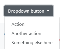
Button标签
<div class="dropdown">
  <button class="btn btn-secondary dropdown-toggle" type="button" id="dropdownMenuButton" data-toggle="dropdown" aria-haspopup="true" aria-expanded="false">
    Dropdown button
  </button>
  <div class="dropdown-menu" aria-labelledby="dropdownMenuButton">
    <a class="dropdown-item" href="#">Action</a>
    <a class="dropdown-item" href="#">Another action</a>
    <a class="dropdown-item" href="#">Something else here</a>
  </div>
</div>
a标签
<div class="dropdown">
  <a class="btn btn-secondary dropdown-toggle" href="#" role="button" id="dropdownMenuLink" data-toggle="dropdown" aria-haspopup="true" aria-expanded="false">
    Dropdown link
  </a>

  <div class="dropdown-menu" aria-labelledby="dropdownMenuLink">
    <a class="dropdown-item" href="#">Action</a>
    <a class="dropdown-item" href="#">Another action</a>
    <a class="dropdown-item" href="#">Something else here</a>
  </div>
</div>
拆分按钮
Similarly, create split button dropdowns with virtually the same markup as single button dropdowns, but with the addition of .dropdown-toggle-split for proper spacing around the dropdown caret.
<!-- Example split danger button -->
<div class="btn-group">
  <button type="button" class="btn btn-primary">Action</button>
  <button type="button" class="btn btn-primary dropdown-toggle dropdown-toggle-split" data-toggle="dropdown" aria-haspopup="true" aria-expanded="false">
    <span class="sr-only">Toggle Dropdown</span>
  </button>
  <div class="dropdown-menu">
    <a class="dropdown-item" href="#">Action</a>
    <a class="dropdown-item" href="#">Another action</a>
    <a class="dropdown-item" href="#">Something else here</a>
    <div class="dropdown-divider"></div>
    <a class="dropdown-item" href="#">Separated link</a>
  </div>
</div>
尺寸选择
Button dropdowns work with buttons of all sizes, including default and split dropdown buttons.
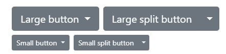
<!-- Large button groups (default and split) -->
<div class="btn-group">
  <button class="btn btn-secondary btn-lg dropdown-toggle" type="button" data-toggle="dropdown" aria-haspopup="true" aria-expanded="false">
    Large button
  </button>
  <div class="dropdown-menu">
    ...
  </div>
</div>
<div class="btn-group">
  <button class="btn btn-secondary btn-lg" type="button">
    Large split button
  </button>
  <button type="button" class="btn btn-lg btn-secondary dropdown-toggle dropdown-toggle-split" data-toggle="dropdown" aria-haspopup="true" aria-expanded="false">
    <span class="sr-only">Toggle Dropdown</span>
  </button>
  <div class="dropdown-menu">
    ...
  </div>
</div>

<!-- Small button groups (default and split) -->
<div class="btn-group">
  <button class="btn btn-secondary btn-sm dropdown-toggle" type="button" data-toggle="dropdown" aria-haspopup="true" aria-expanded="false">
    Small button
  </button>
  <div class="dropdown-menu">
    ...
  </div>
</div>
<div class="btn-group">
  <button class="btn btn-secondary btn-sm" type="button">
    Small split button
  </button>
  <button type="button" class="btn btn-sm btn-secondary dropdown-toggle dropdown-toggle-split" data-toggle="dropdown" aria-haspopup="true" aria-expanded="false">
    <span class="sr-only">Toggle Dropdown</span>
  </button>
  <div class="dropdown-menu">
    ...
  </div>
</div>
方向选择
dropup,dropdown,dropleft,dropright 上、下、左、右
替换的就像下面这样,和打开方向。

添加样式
添加active
Add .active to items in the dropdown to style them as active.
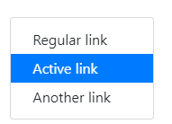
<div class="dropdown-menu">
  <a class="dropdown-item" href="#">Regular link</a>
  <a class="dropdown-item active" href="#">Active link</a>
  <a class="dropdown-item" href="#">Another link</a>
</div>
添加Disabled
Add .disabled to items in the dropdown to style them as disabled.
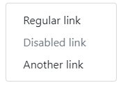
<div class="dropdown-menu">
  <a class="dropdown-item" href="#">Regular link</a>
  <a class="dropdown-item disabled" href="#" tabindex="-1" aria-disabled="true">Disabled link</a>
  <a class="dropdown-item" href="#">Another link</a>
</div>
菜单对齐
默认情况下,下拉菜单从左到右,你也可以指定从右到左。
Add .dropdown-menu-right to a .dropdown-menu
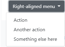
<div class="btn-group">
  <button type="button" class="btn btn-secondary dropdown-toggle" data-toggle="dropdown" aria-haspopup="true" aria-expanded="false">
    Right-aligned menu
  </button>
  <div class="dropdown-menu dropdown-menu-right">
    <button class="dropdown-item" type="button">Action</button>
    <button class="dropdown-item" type="button">Another action</button>
    <button class="dropdown-item" type="button">Something else here</button>
  </div>
</div>
菜单内容
header
Add a header to label sections of actions in any dropdown menu.
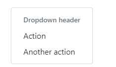
<div class="dropdown-menu">
  <h6 class="dropdown-header">Dropdown header</h6>
  <a class="dropdown-item" href="#">Action</a>
  <a class="dropdown-item" href="#">Another action</a>
</div>
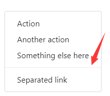
Dividers
Separate groups of related menu items with a divider.
Text
Place any freeform text within a dropdown menu with text and use spacing utilities. Note that you’ll likely need additional sizing styles to constrain the menu width.
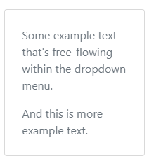
<div class="dropdown-menu p-4 text-muted" style="max- 200px;">
  <p>
    Some example text that's free-flowing within the dropdown menu.
  </p>
  <p class="mb-0">
    And this is more example text.
  </p>
</div>
Forms
Put a form within a dropdown menu, or make it into a dropdown menu, and use margin or padding utilities to give it the negative space you require.

<div class="dropdown-menu">
  <form class="px-4 py-3">
    <div class="form-group">
      <label for="exampleDropdownFormEmail1">Email address</label>
      <input type="email" class="form-control" id="exampleDropdownFormEmail1" placeholder="email@example.com">
    </div>
    <div class="form-group">
      <label for="exampleDropdownFormPassword1">Password</label>
      <input type="password" class="form-control" id="exampleDropdownFormPassword1" placeholder="Password">
    </div>
    <div class="form-group">
      <div class="form-check">
        <input type="checkbox" class="form-check-input" id="dropdownCheck">
        <label class="form-check-label" for="dropdownCheck">
          Remember me
        </label>
      </div>
    </div>
    <button type="submit" class="btn btn-primary">Sign in</button>
  </form>
  <div class="dropdown-divider"></div>
  <a class="dropdown-item" href="#">New around here? Sign up</a>
  <a class="dropdown-item" href="#">Forgot password?</a>
</div>
使用
data属性
Add data-toggle="dropdown" to a link or button to toggle a dropdown.
<div class="dropdown">
  <button id="dLabel" type="button" data-toggle="dropdown" aria-haspopup="true" aria-expanded="false">
    Dropdown trigger
  </button>
  <div class="dropdown-menu" aria-labelledby="dLabel">
    ...
  </div>
</div>
js属性
$('.dropdown-toggle').dropdown()
data-toggle="dropdown" still required
Regardless of whether you call your dropdown via JavaScript or instead use the data-api, data-toggle="dropdown" is always required to be present on the dropdown’s trigger element.
参数
Options can be passed via data attributes or JavaScript. For data attributes, append the option name to data-, as in data-offset="".
| Name | Type | Default | Description |
|---|---|---|---|
| offset | number | string | function | 0 |
Offset of the dropdown relative to its target. When a function is used to determine the offset, it is called with an object containing the offset data as its first argument. The function must return an object with the same structure. The triggering element DOM node is passed as the second argument. For more information refer to Popper.js's offset docs. |
| flip | boolean | true | Allow Dropdown to flip in case of an overlapping on the reference element. For more information refer to Popper.js's flip docs. |
| boundary | string | element | 'scrollParent' | Overflow constraint boundary of the dropdown menu. Accepts the values of 'viewport', 'window', 'scrollParent', or an HTMLElement reference (JavaScript only). For more information refer to Popper.js's preventOverflow docs. |
| reference | string | element | 'toggle' | Reference element of the dropdown menu. Accepts the values of 'toggle', 'parent', or an HTMLElement reference. For more information refer to Popper.js's referenceObject docs. |
| display | string | 'dynamic' | By default, we use Popper.js for dynamic positioning. Disable this with static. |
| popperConfig | null | object | null | To change Bootstrap's default Popper.js config, see Popper.js's configuration |
Note when boundary is set to any value other than 'scrollParent', the style position: static is applied to the .dropdown container.
方法
| Method | Description |
|---|---|
$().dropdown('toggle') |
Toggles the dropdown menu of a given navbar or tabbed navigation. |
$().dropdown('show') |
Shows the dropdown menu of a given navbar or tabbed navigation. |
$().dropdown('hide') |
Hides the dropdown menu of a given navbar or tabbed navigation. |
$().dropdown('update') |
Updates the position of an element’s dropdown. |
$().dropdown('dispose') |
Destroys an element’s dropdown. |
事件
All dropdown events are fired at the .dropdown-menu’s parent element and have a relatedTarget property, whose value is the toggling anchor element. hide.bs.dropdown and hidden.bs.dropdown events have a clickEvent property (only when the original event type is click) that contains an Event Object for the click event.
| Event | Description |
|---|---|
show.bs.dropdown |
This event fires immediately when the show instance method is called. |
shown.bs.dropdown |
This event is fired when the dropdown has been made visible to the user (will wait for CSS transitions, to complete). |
hide.bs.dropdown |
This event is fired immediately when the hide instance method has been called. |
hidden.bs.dropdown |
This event is fired when the dropdown has finished being hidden from the user (will wait for CSS transitions, to complete). |
$('#myDropdown').on('show.bs.dropdown', function () {
  // do something...
})
警告框
基本实例
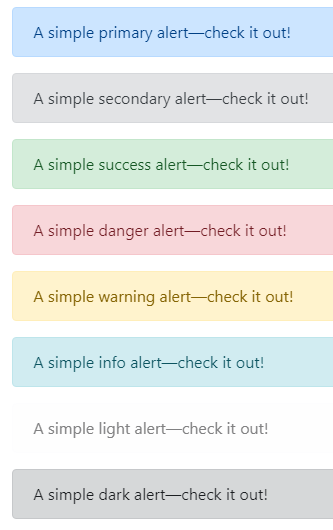
<div class="alert alert-primary" role="alert">
  A simple primary alert—check it out!
</div>
<div class="alert alert-secondary" role="alert">
  A simple secondary alert—check it out!
</div>
<div class="alert alert-success" role="alert">
  A simple success alert—check it out!
</div>
<div class="alert alert-danger" role="alert">
  A simple danger alert—check it out!
</div>
<div class="alert alert-warning" role="alert">
  A simple warning alert—check it out!
</div>
<div class="alert alert-info" role="alert">
  A simple info alert—check it out!
</div>
<div class="alert alert-light" role="alert">
  A simple light alert—check it out!
</div>
<div class="alert alert-dark" role="alert">
  A simple dark alert—check it out!
</div>
附加内容

<div class="alert alert-success" role="alert">
  <h4 class="alert-heading">Well done!</h4>
  <p>Aww yeah, you successfully read this important alert message. This example text is going to run a bit longer so that you can see how spacing within an alert works with this kind of content.</p>
  <hr>
  <p class="mb-0">Whenever you need to, be sure to use margin utilities to keep things nice and tidy.</p>
</div>
Dismissing

<div class="alert alert-warning alert-dismissible fade show" role="alert"> <strong>Holy guacamole!</strong> You should check in on some of those fields below. <button type="button" class="close" data-dismiss="alert" aria-label="Close"> <span aria-hidden="true">×</span> </button> </div>
使用
js属性
$('.alert').alert()
Note that closing an alert will remove it from the DOM.
方法
| Method | Description |
|---|---|
$().alert() |
Makes an alert listen for click events on descendant elements which have the data-dismiss="alert" attribute. (Not necessary when using the data-api’s auto-initialization.) |
$().alert('close') |
Closes an alert by removing it from the DOM. If the .fade and .show classes are present on the element, the alert will fade out before it is removed. |
$().alert('dispose') |
Destroys an element’s alert. |
$('.alert').alert('close')
事件
| Event | Description |
|---|---|
close.bs.alert |
This event fires immediately when the close instance method is called. |
closed.bs.alert |
This event is fired when the alert has been closed (will wait for CSS transitions to complete). |
$('#myAlert').on('closed.bs.alert', function () {
  // do something...
})
模态框
基本实例

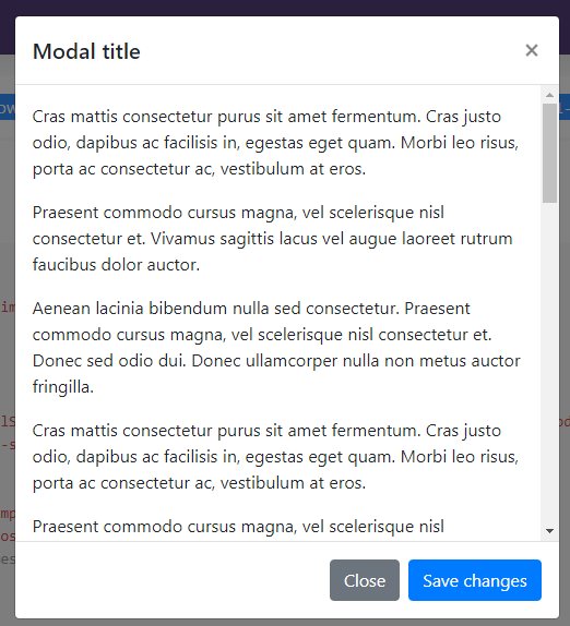
<div class="modal" tabindex="-1" role="dialog"> <div class="modal-dialog" role="document"> <div class="modal-content"> <div class="modal-header"> <h5 class="modal-title">Modal title</h5> <button type="button" class="close" data-dismiss="modal" aria-label="Close"> <span aria-hidden="true">×</span> </button> </div> <div class="modal-body"> <p>Modal body text goes here.</p> </div> <div class="modal-footer"> <button type="button" class="btn btn-secondary" data-dismiss="modal">Close</button> <button type="button" class="btn btn-primary">Save changes</button> </div> </div> </div> </div>
添加目标

点击按钮后,弹出模态框

<!-- Button trigger modal --> <button type="button" class="btn btn-primary" data-toggle="modal" data-target="#exampleModal"> Launch demo modal </button> <!-- Modal --> <div class="modal fade" id="exampleModal" tabindex="-1" role="dialog" aria-labelledby="exampleModalLabel" aria-hidden="true"> <div class="modal-dialog" role="document"> <div class="modal-content"> <div class="modal-header"> <h5 class="modal-title" id="exampleModalLabel">Modal title</h5> <button type="button" class="close" data-dismiss="modal" aria-label="Close"> <span aria-hidden="true">×</span> </button> </div> <div class="modal-body"> ... </div> <div class="modal-footer"> <button type="button" class="btn btn-secondary" data-dismiss="modal">Close</button> <button type="button" class="btn btn-primary">Save changes</button> </div> </div> </div> </div>
滚动条
第一种
你只需要在,.modal-body 添加自己的内容,内容过长时使用浏览器的滚动条。
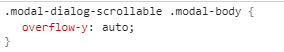
第二种
You can also create a scrollable modal that allows scroll the modal body by adding .modal-dialog-scrollable to .modal-dialog.
<!-- Button trigger modal --> <button type="button" class="btn btn-primary" data-toggle="modal" data-target="#exampleModalScrollable"> Launch demo modal </button> <!-- Modal --> <div class="modal fade" id="exampleModalScrollable" tabindex="-1" role="dialog" aria-labelledby="exampleModalScrollableTitle" aria-hidden="true"> <div class="modal-dialog modal-dialog-scrollable" role="document"> <div class="modal-content"> <div class="modal-header"> <h5 class="modal-title" id="exampleModalScrollableTitle">Modal title</h5> <button type="button" class="close" data-dismiss="modal" aria-label="Close"> <span aria-hidden="true">×</span> </button> </div> <div class="modal-body"> ... </div> <div class="modal-footer"> <button type="button" class="btn btn-secondary" data-dismiss="modal">Close</button> <button type="button" class="btn btn-primary">Save changes</button> </div> </div> </div> </div>
垂直居中
Add .modal-dialog-centered to .modal-dialog to vertically center the modal.
<!-- Button trigger modal --> <button type="button" class="btn btn-primary" data-toggle="modal" data-target="#exampleModalCenter"> Launch demo modal </button> <!-- Modal --> <div class="modal fade" id="exampleModalCenter" tabindex="-1" role="dialog" aria-labelledby="exampleModalCenterTitle" aria-hidden="true"> <div class="modal-dialog modal-dialog-centered" role="document"> <div class="modal-content"> <div class="modal-header"> <h5 class="modal-title" id="exampleModalCenterTitle">Modal title</h5> <button type="button" class="close" data-dismiss="modal" aria-label="Close"> <span aria-hidden="true">×</span> </button> </div> <div class="modal-body"> ... </div> <div class="modal-footer"> <button type="button" class="btn btn-secondary" data-dismiss="modal">Close</button> <button type="button" class="btn btn-primary">Save changes</button> </div> </div> </div> </div>
使用栅格
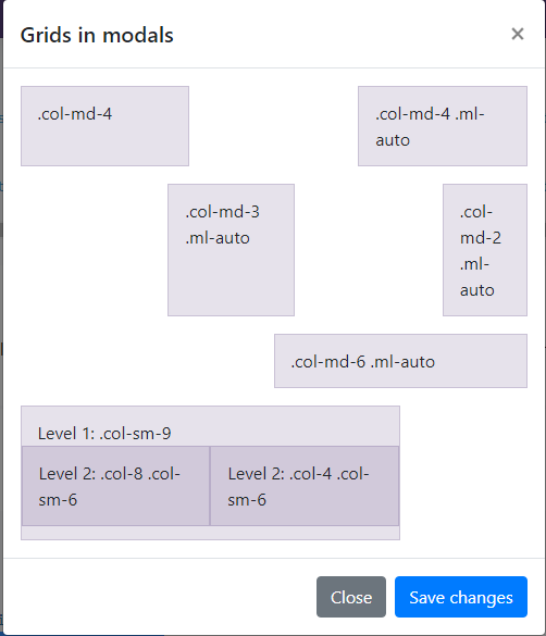
<div class="modal-body">
  <div class="container-fluid">
    <div class="row">
      <div class="col-md-4">.col-md-4</div>
      <div class="col-md-4 ml-auto">.col-md-4 .ml-auto</div>
    </div>
    <div class="row">
      <div class="col-md-3 ml-auto">.col-md-3 .ml-auto</div>
      <div class="col-md-2 ml-auto">.col-md-2 .ml-auto</div>
    </div>
    <div class="row">
      <div class="col-md-6 ml-auto">.col-md-6 .ml-auto</div>
    </div>
    <div class="row">
      <div class="col-sm-9">
        Level 1: .col-sm-9
        <div class="row">
          <div class="col-8 col-sm-6">
            Level 2: .col-8 .col-sm-6
          </div>
          <div class="col-4 col-sm-6">
            Level 2: .col-4 .col-sm-6
          </div>
        </div>
      </div>
    </div>
  </div>
</div>
选择尺寸
Modals have three optional sizes, available via modifier classes to be placed on a .modal-dialog. These sizes kick in at certain breakpoints to avoid horizontal scrollbars on narrower viewports.
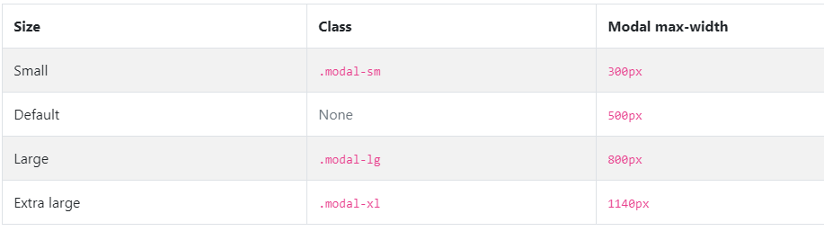
<div class="modal-dialog modal-xl" role="document">

<div class="modal-dialog modal-lg" role="document">

<div class="modal-dialog modal-sm" role="document">
使用
通过data属性
Activate a modal without writing JavaScript. Set data-toggle="modal" on a controller element, like a button, along with a data-target="#foo" or href="#foo" to target a specific modal to toggle.
<button type="button" data-toggle="modal" data-target="#myModal">Launch modal</button>
通过js属性
Call a modal with id myModal with a single line of JavaScript:
$('#myModal').modal(options)
参数
Options can be passed via data attributes or JavaScript. For data attributes, append the option name to data-, as in data-backdrop="".
| Name | Type | Default | Description |
|---|---|---|---|
| backdrop | boolean or the string 'static' |
true | Includes a modal-backdrop element. Alternatively, specify static for a backdrop which doesn't close the modal on click or on escape key press. |
| keyboard | boolean | true | Closes the modal when escape key is pressed |
| focus | boolean | true | Puts the focus on the modal when initialized. |
| show | boolean | true | Shows the modal when initialized. |
方法
.modal(options)
.modal('toggle')
.modal('show')
.modal('hide')
.modal('handleUpdate')
Manually readjust the modal’s position if the height of a modal changes while it is open (i.e. in case a scrollbar appears).
$('#myModal').modal('handleUpdate')
.modal('dispose')
Destroys an element’s modal.
事件
Bootstrap’s modal class exposes a few events for hooking into modal functionality. All modal events are fired at the modal itself (i.e. at the <div class="modal">).
| Event Type | Description |
|---|---|
| show.bs.modal | This event fires immediately when the show instance method is called. If caused by a click, the clicked element is available as the relatedTarget property of the event. |
| shown.bs.modal | This event is fired when the modal has been made visible to the user (will wait for CSS transitions to complete). If caused by a click, the clicked element is available as the relatedTarget property of the event. |
| hide.bs.modal | This event is fired immediately when the hide instance method has been called. |
| hidden.bs.modal | This event is fired when the modal has finished being hidden from the user (will wait for CSS transitions to complete). |
| hidePrevented.bs.modal | This event is fired when the modal is shown, its backdrop is static and a click outside the modal or an escape key press is performed. |
$('#myModal').on('hidden.bs.modal', function (e) {
  // do something...
})
弹出框
基本实例

<button type="button" class="btn btn-lg btn-danger" data-toggle="popover" title="Popover title" data-content="And here's some amazing content. It's very engaging. Right?">
Click to toggle popover
</button>
不同方向

<button type="button" class="btn btn-secondary" data-container="body" data-toggle="popover" data-placement="top" data-content="Vivamus sagittis lacus vel augue laoreet rutrum faucibus.">
  Popover on top
</button>

<button type="button" class="btn btn-secondary" data-container="body" data-toggle="popover" data-placement="right" data-content="Vivamus sagittis lacus vel augue laoreet rutrum faucibus.">
  Popover on right
</button>

<button type="button" class="btn btn-secondary" data-container="body" data-toggle="popover" data-placement="bottom" data-content="Vivamus
sagittis lacus vel augue laoreet rutrum faucibus.">
  Popover on bottom
</button>

<button type="button" class="btn btn-secondary" data-container="body" data-toggle="popover" data-placement="left" data-content="Vivamus sagittis lacus vel augue laoreet rutrum faucibus.">
  Popover on left
</button>
Dismiss on next click
Use the focus trigger to dismiss popovers on the user’s next click of a different element than the toggle element.
For proper cross-browser and cross-platform behavior, you must use the <a> tag, not the <button> tag, and you also must include a tabindex attribute.

<a tabindex="0" class="btn btn-lg btn-danger" role="button" data-toggle="popover" data-trigger="focus" title="Dismissible popover" data-content="And here's some amazing content. It's very engaging. Right?">Dismissible popover</a>
使用
data属性
根据data来添加更多选项
<button type="button" class="btn btn-lg btn-danger" data-toggle="popover" title="Popover title" data-content="And here's some amazing content. It's very engaging. Right?">
Click to toggle popover
</button>
js属性
$('#example').popover(options)
选项
Options can be passed via data attributes or JavaScript. For data attributes, append the option name to data-, as in data-animation="".
| Name | Type | Default | Description |
|---|---|---|---|
| animation | boolean | true | Apply a CSS fade transition to the popover |
| container | string | element | false | false |
Appends the popover to a specific element. Example: |
| content | string | element | function | '' |
Default content value if If a function is given, it will be called with its |
| delay | number | object | 0 |
Delay showing and hiding the popover (ms) - does not apply to manual trigger type If a number is supplied, delay is applied to both hide/show Object structure is: |
| html | boolean | false | Insert HTML into the popover. If false, jQuery's text method will be used to insert content into the DOM. Use text if you're worried about XSS attacks. |
| placement | string | function | 'right' |
How to position the popover - auto | top | bottom | left | right. When a function is used to determine the placement, it is called with the popover DOM node as its first argument and the triggering element DOM node as its second. The |
| selector | string | false | false | If a selector is provided, popover objects will be delegated to the specified targets. In practice, this is used to enable dynamic HTML content to have popovers added. See this and an informative example. |
| template | string | '<div class="popover" role="tooltip"><div class="arrow"></div><h3 class="popover-header"></h3><div class="popover-body"></div></div>' |
Base HTML to use when creating the popover. The popover's The popover's
The outermost wrapper element should have the |
| title | string | element | function | '' |
Default title value if If a function is given, it will be called with its |
| trigger | string | 'click' | How popover is triggered - click | hover | focus | manual. You may pass multiple triggers; separate them with a space. manual cannot be combined with any other trigger. |
| offset | number | string | 0 | Offset of the popover relative to its target. For more information refer to Popper.js's offset docs. |
| fallbackPlacement | string | array | 'flip' | Allow to specify which position Popper will use on fallback. For more information refer to Popper.js's behavior docs |
| boundary | string | element | 'scrollParent' | Overflow constraint boundary of the popover. Accepts the values of 'viewport', 'window', 'scrollParent', or an HTMLElement reference (JavaScript only). For more information refer to Popper.js's preventOverflow docs. |
| sanitize | boolean | true | Enable or disable the sanitization. If activated 'template', 'content' and 'title' options will be sanitized. |
| whiteList | object | Default value | Object which contains allowed attributes and tags |
| sanitizeFn | null | function | null | Here you can supply your own sanitize function. This can be useful if you prefer to use a dedicated library to perform sanitization. |
| popperConfig | null | object | null | To change Bootstrap's default Popper.js config, see Popper.js's configuration |
方法
$().popover(options)
Initializes popovers for an element collection.
.popover('show')
Reveals an element’s popover. Returns to the caller before the popover has actually been shown (i.e. before the shown.bs.popover event occurs). This is considered a “manual” triggering of the popover. Popovers whose title and content are both zero-length are never displayed.
.popover('hide')
Hides an element’s popover. Returns to the caller before the popover has actually been hidden (i.e. before the hidden.bs.popover event occurs). This is considered a “manual” triggering of the popover.
.popover('dispose')
Hides and destroys an element’s popover. Popovers that use delegation (which are created using the selector option) cannot be individually destroyed on descendant trigger elements.
.popover('enable')
Gives an element’s popover the ability to be shown. Popovers are enabled by default.
.popover('disable')
Removes the ability for an element’s popover to be shown. The popover will only be able to be shown if it is re-enabled.
.popover('toggleEnabled')
Toggles the ability for an element’s popover to be shown or hidden.
.popover('update')
Updates the position of an element’s popover.
事件
| Event Type | Description |
|---|---|
| show.bs.popover | This event fires immediately when the show instance method is called. |
| shown.bs.popover | This event is fired when the popover has been made visible to the user (will wait for CSS transitions to complete). |
| hide.bs.popover | This event is fired immediately when the hide instance method has been called. |
| hidden.bs.popover | This event is fired when the popover has finished being hidden from the user (will wait for CSS transitions to complete). |
| inserted.bs.popover | This event is fired after the show.bs.popover event when the popover template has been added to the DOM. |
$('#myPopover').on('hidden.bs.popover', function () {
  // do something...
})
工具提示框
基本实例
将鼠标悬停后
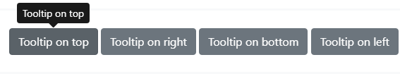
<button type="button" class="btn btn-secondary" data-toggle="tooltip" data-placement="top" title="Tooltip on top">
  Tooltip on top
</button>
<button type="button" class="btn btn-secondary" data-toggle="tooltip" data-placement="right" title="Tooltip on right">
  Tooltip on right
</button>
<button type="button" class="btn btn-secondary" data-toggle="tooltip" data-placement="bottom" title="Tooltip on bottom">
  Tooltip on bottom
</button>
<button type="button" class="btn btn-secondary" data-toggle="tooltip" data-placement="left" title="Tooltip on left">
  Tooltip on left
</button>
使用
data属性
使用不同data属性来实现不同效果
<button type="button" class="btn btn-secondary" data-toggle="tooltip" data-html="true" title="<em>Tooltip</em> <u>with</u> <b>HTML</b>">
  Tooltip with HTML
</button>
js属性
$('#example').tooltip(options)
选项
Options can be passed via data attributes or JavaScript. For data attributes, append the option name to data-, as in data-animation="".
| Name | Type | Default | Description |
|---|---|---|---|
| animation | boolean | true | Apply a CSS fade transition to the tooltip |
| container | string | element | false | false |
Appends the tooltip to a specific element. Example: |
| delay | number | object | 0 |
Delay showing and hiding the tooltip (ms) - does not apply to manual trigger type If a number is supplied, delay is applied to both hide/show Object structure is: |
| html | boolean | false |
Allow HTML in the tooltip. If true, HTML tags in the tooltip's Use text if you're worried about XSS attacks. |
| placement | string | function | 'top' |
How to position the tooltip - auto | top | bottom | left | right. When a function is used to determine the placement, it is called with the tooltip DOM node as its first argument and the triggering element DOM node as its second. The |
| selector | string | false | false | If a selector is provided, tooltip objects will be delegated to the specified targets. In practice, this is used to also apply tooltips to dynamically added DOM elements (jQuery.on support). See this and an informative example. |
| template | string | '<div class="tooltip" role="tooltip"><div class="arrow"></div><div class="tooltip-inner"></div></div>' |
Base HTML to use when creating the tooltip. The tooltip's
The outermost wrapper element should have the |
| title | string | element | function | '' |
Default title value if If a function is given, it will be called with its |
| trigger | string | 'hover focus' |
How tooltip is triggered - click | hover | focus | manual. You may pass multiple triggers; separate them with a space.
|
| offset | number | string | function | 0 |
Offset of the tooltip relative to its target. When a function is used to determine the offset, it is called with an object containing the offset data as its first argument. The function must return an object with the same structure. The triggering element DOM node is passed as the second argument. For more information refer to Popper.js's offset docs. |
| fallbackPlacement | string | array | 'flip' | Allow to specify which position Popper will use on fallback. For more information refer to Popper.js's behavior docs |
| boundary | string | element | 'scrollParent' | Overflow constraint boundary of the tooltip. Accepts the values of 'viewport', 'window', 'scrollParent', or an HTMLElement reference (JavaScript only). For more information refer to Popper.js's preventOverflow docs. |
| sanitize | boolean | true | Enable or disable the sanitization. If activated 'template' and 'title' options will be sanitized. |
| whiteList | object | Default value | Object which contains allowed attributes and tags |
| sanitizeFn | null | function | null | Here you can supply your own sanitize function. This can be useful if you prefer to use a dedicated library to perform sanitization. |
| popperConfig | null | object | null | To change Bootstrap's default Popper.js config, see Popper.js's configuration |
方法
$().tooltip(options)
Attaches a tooltip handler to an element collection.
.tooltip('show')
Reveals an element’s tooltip. Returns to the caller before the tooltip has actually been shown (i.e. before the shown.bs.tooltip event occurs). This is considered a “manual” triggering of the tooltip. Tooltips with zero-length titles are never displayed.
.tooltip('hide')
Hides an element’s tooltip. Returns to the caller before the tooltip has actually been hidden (i.e. before the hidden.bs.tooltip event occurs). This is considered a “manual” triggering of the tooltip.
.tooltip('toggle')
Toggles an element’s tooltip. Returns to the caller before the tooltip has actually been shown or hidden (i.e. before the shown.bs.tooltip or hidden.bs.tooltip event occurs). This is considered a “manual” triggering of the tooltip.
.tooltip('dispose')
Hides and destroys an element’s tooltip. Tooltips that use delegation (which are created using the selector option) cannot be individually destroyed on descendant trigger elements.
.tooltip('enable')
Gives an element’s tooltip the ability to be shown. Tooltips are enabled by default.
.tooltip('disable')
Removes the ability for an element’s tooltip to be shown. The tooltip will only be able to be shown if it is re-enabled.
.tooltip('toggleEnabled')
Toggles the ability for an element’s tooltip to be shown or hidden.
.tooltip('update')
Updates the position of an element’s tooltip.
事件
| Event Type | Description |
|---|---|
| show.bs.tooltip | This event fires immediately when the show instance method is called. |
| shown.bs.tooltip | This event is fired when the tooltip has been made visible to the user (will wait for CSS transitions to complete). |
| hide.bs.tooltip | This event is fired immediately when the hide instance method has been called. |
| hidden.bs.tooltip | This event is fired when the tooltip has finished being hidden from the user (will wait for CSS transitions to complete). |
| inserted.bs.tooltip | This event is fired after the show.bs.tooltip event when the tooltip template has been added to the DOM. |
$('#myTooltip').on('hidden.bs.tooltip', function () {
  // do something...
})
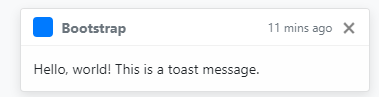
轻量弹框
基本实例
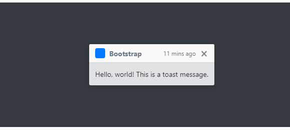
Toast headers use display: flex, allowing easy alignment of content thanks to our margin and flexbox utilities.
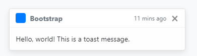
<div class="toast" role="alert" aria-live="assertive" aria-atomic="true"> <div class="toast-header"> <img src="..." class="rounded mr-2" alt="..."> <strong class="mr-auto">Bootstrap</strong> <small>11 mins ago</small> <button type="button" class="ml-2 mb-1 close" data-dismiss="toast" aria-label="Close"> <span aria-hidden="true">×</span> </button> </div> <div class="toast-body"> Hello, world! This is a toast message. </div> </div>
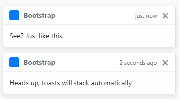
Stacking
When you have multiple toasts, we default to vertically stacking them in a readable manner.
<div class="toast" role="alert" aria-live="assertive" aria-atomic="true"> <div class="toast-header"> <img src="..." class="rounded mr-2" alt="..."> <strong class="mr-auto">Bootstrap</strong> <small class="text-muted">just now</small> <button type="button" class="ml-2 mb-1 close" data-dismiss="toast" aria-label="Close"> <span aria-hidden="true">×</span> </button> </div> <div class="toast-body"> See? Just like this. </div> </div> <div class="toast" role="alert" aria-live="assertive" aria-atomic="true"> <div class="toast-header"> <img src="..." class="rounded mr-2" alt="..."> <strong class="mr-auto">Bootstrap</strong> <small class="text-muted">2 seconds ago</small> <button type="button" class="ml-2 mb-1 close" data-dismiss="toast" aria-label="Close"> <span aria-hidden="true">×</span> </button> </div> <div class="toast-body"> Heads up, toasts will stack automatically </div> </div>
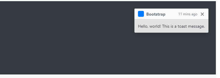
Placement
If you’re only ever going to show one toast at a time, put the positioning styles right on the .toast.
<div aria-live="polite" aria-atomic="true" style="position: relative; min-height: 200px;"> <div class="toast" style="position: absolute; top: 0; right: 0;"> <div class="toast-header"> <img src="..." class="rounded mr-2" alt="..."> <strong class="mr-auto">Bootstrap</strong> <small>11 mins ago</small> <button type="button" class="ml-2 mb-1 close" data-dismiss="toast" aria-label="Close"> <span aria-hidden="true">×</span> </button> </div> <div class="toast-body"> Hello, world! This is a toast message. </div> </div> </div>
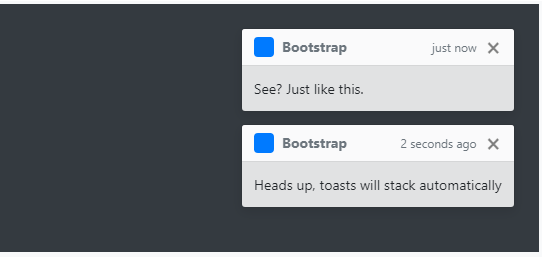
For systems that generate more notifications, consider using a wrapping element so they can easily stack.
<div aria-live="polite" aria-atomic="true" style="position: relative; min-height: 200px;"> <!-- Position it --> <div style="position: absolute; top: 0; right: 0;"> <!-- Then put toasts within --> <div class="toast" role="alert" aria-live="assertive" aria-atomic="true"> <div class="toast-header"> <img src="..." class="rounded mr-2" alt="..."> <strong class="mr-auto">Bootstrap</strong> <small class="text-muted">just now</small> <button type="button" class="ml-2 mb-1 close" data-dismiss="toast" aria-label="Close"> <span aria-hidden="true">×</span> </button> </div> <div class="toast-body"> See? Just like this. </div> </div> <div class="toast" role="alert" aria-live="assertive" aria-atomic="true"> <div class="toast-header"> <img src="..." class="rounded mr-2" alt="..."> <strong class="mr-auto">Bootstrap</strong> <small class="text-muted">2 seconds ago</small> <button type="button" class="ml-2 mb-1 close" data-dismiss="toast" aria-label="Close"> <span aria-hidden="true">×</span> </button> </div> <div class="toast-body"> Heads up, toasts will stack automatically </div> </div> </div> </div>
You can also get fancy with flexbox utilities to align toasts horizontally and/or vertically.
<!-- Flexbox container for aligning the toasts --> <div aria-live="polite" aria-atomic="true" class="d-flex justify-content-center align-items-center" style="min-height: 200px;"> <!-- Then put toasts within --> <div class="toast" role="alert" aria-live="assertive" aria-atomic="true"> <div class="toast-header"> <img src="..." class="rounded mr-2" alt="..."> <strong class="mr-auto">Bootstrap</strong> <small>11 mins ago</small> <button type="button" class="ml-2 mb-1 close" data-dismiss="toast" aria-label="Close"> <span aria-hidden="true">×</span> </button> </div> <div class="toast-body"> Hello, world! This is a toast message. </div> </div> </div>
Dismissing
When using autohide: false, you must add a close button to allow users to dismiss the toast.
<div role="alert" aria-live="assertive" aria-atomic="true" class="toast" data-autohide="false"> <div class="toast-header"> <img src="..." class="rounded mr-2" alt="..."> <strong class="mr-auto">Bootstrap</strong> <small>11 mins ago</small> <button type="button" class="ml-2 mb-1 close" data-dismiss="toast" aria-label="Close"> <span aria-hidden="true">×</span> </button> </div> <div class="toast-body"> Hello, world! This is a toast message. </div> </div>
使用
data属性
使用不同data属性来实现不同效果
<div role="alert" aria-live="assertive" aria-atomic="true" class="toast" data-autohide="false">
js属性
$('.toast').toast(option).toast("show")
选项
Options can be passed via data attributes or JavaScript. For data attributes, append the option name to data-, as in data-animation="".
| Name | Type | Default | Description |
|---|---|---|---|
| animation | boolean | true | Apply a CSS fade transition to the toast |
| autohide | boolean | true | Auto hide the toast |
| delay | number | 500 |
Delay hiding the toast (ms) |
方法
$().toast(options)
Attaches a toast handler to an element collection.
.toast('show')
Reveals an element’s toast. Returns to the caller before the toast has actually been shown (i.e. before the shown.bs.toast event occurs). You have to manually call this method, instead your toast won’t show.
.toast('hide')
Hides an element’s toast. Returns to the caller before the toast has actually been hidden (i.e. before the hidden.bs.toast event occurs). You have to manually call this method if you made autohide to false.
.toast('dispose')
Hides an element’s toast. Your toast will remain on the DOM but won’t show anymore.
事件
| Event Type | Description |
|---|---|
| show.bs.toast | This event fires immediately when the show instance method is called. |
| shown.bs.toast | This event is fired when the toast has been made visible to the user. |
| hide.bs.toast | This event is fired immediately when the hide instance method has been called. |
| hidden.bs.toast | This event is fired when the toast has finished being hidden from the user. |
$('#myToast').on('hidden.bs.toast', function () {
  // do something...
})